

AI Integration Quick Reference
AI Integration Quick Reference
When to use this
- You want to review the default UI Kit color palette.
- You need consistent colors across text, buttons, backgrounds, and icons.
- You want to override the primary brand color via theming.
- You want light and dark mode color consistency.
Prerequisites
- CometChat UI Kit for Android is installed and initialized.
- You can edit
app/src/main/res/values/color.xmlandapp/src/main/res/values-night/color.xml. - You can edit
app/src/main/res/values/themes.xml. - Your app theme extends
CometChatTheme.DayNight.
Quick start
1
Review light mode colors
File:
app/src/main/res/values/color.xml.2
Review dark mode colors
File:
app/src/main/res/values-night/color.xml.3
Override the UI Kit primary color
File:
app/src/main/res/values/themes.xml. Set cometchatPrimaryColor.4
Apply your theme
File:
AndroidManifest.xml. Set android:theme on <application>.5
Build and verify
Run the app and confirm UI Kit screens match your palette in light and dark mode.
Core concepts
- Primary colors define the main theme of the UI.
- Neutral colors are used for backgrounds, strokes, and secondary elements.
- Alert colors highlight success, warning, error, or info states.
- Text and icon colors control typography and icon appearance.
- Light mode colors live in
res/values/color.xmland dark mode colors inres/values-night/color.xml.
Implementation
Review the default light mode colors
What you’re changing: The color resources used in light mode.-
Where to change it:
app/src/main/res/values/color.xml. - Applies to: Light mode only.
- Default behavior: UI Kit uses its predefined light mode palette.
- Override: Edit the values or reference them in your theme.
- Code:
color.xml
- What this does: Shows the default light mode color definitions used by UI Kit.
- Verify: Light mode UI Kit screens match these colors.
Review the default dark mode colors
What you’re changing: The color resources used in dark mode.-
Where to change it:
app/src/main/res/values-night/color.xml. - Applies to: Dark mode only.
- Default behavior: UI Kit uses its predefined dark mode palette.
- Override: Edit the values or reference them in your theme.
- Code:
values-night/color.xml
- What this does: Shows the default dark mode color definitions used by UI Kit.
- Verify: Dark mode UI Kit screens match these colors.
To view the complete list of colors for both light and dark modes, use the Light mode colors and Dark mode colors.
Override the primary color via your theme
What you’re changing: The UI Kit primary color.-
Where to change it:
app/src/main/res/values/themes.xml. - Applies to: All UI Kit components.
- Default behavior: UI Kit uses the default primary color.
-
Override: Set
cometchatPrimaryColorin your app theme. - Code:
themes.xml
- What this does: Replaces the UI Kit primary color with your custom value.
- Verify: Buttons and highlights use the new primary color.
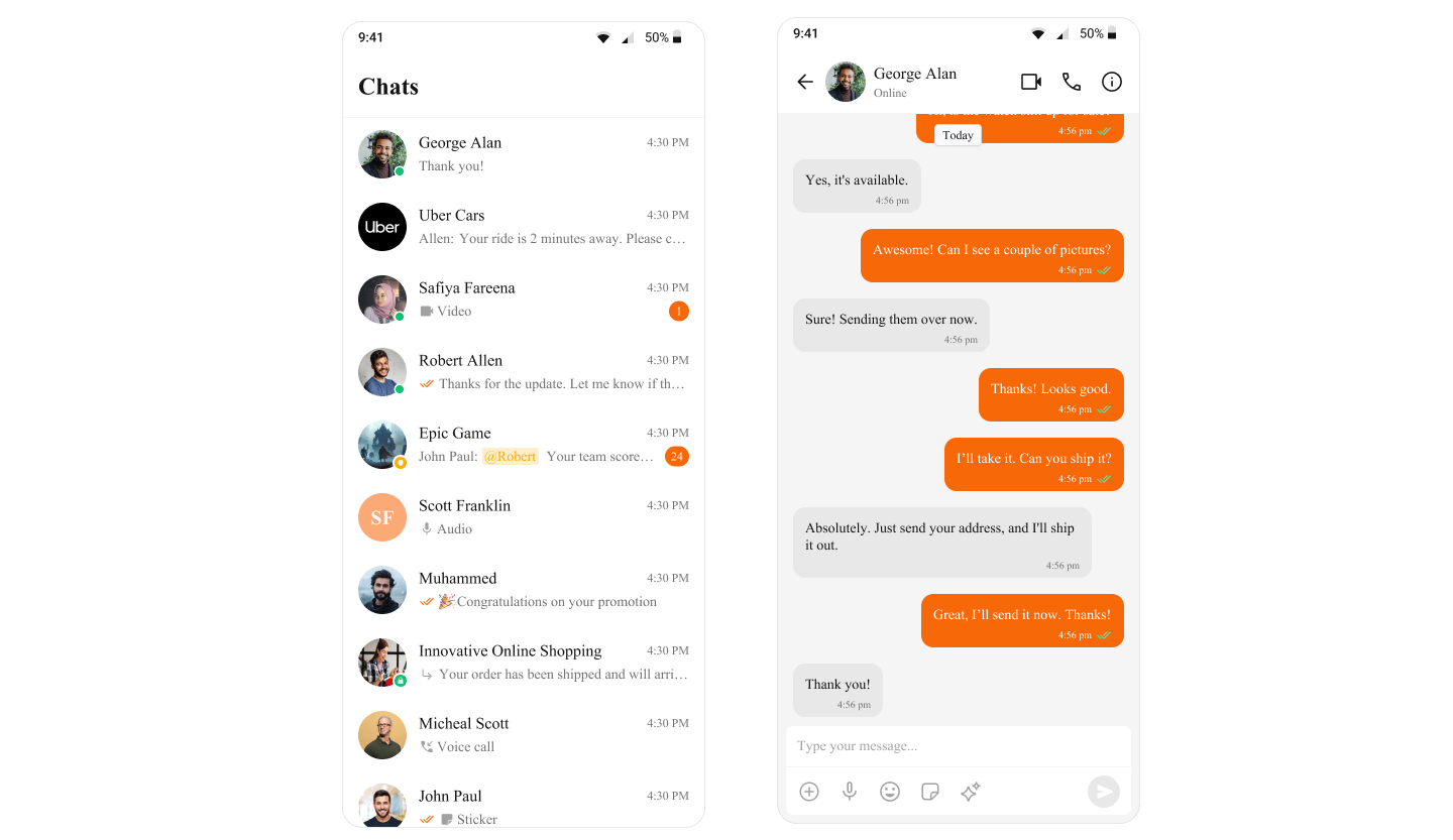
Apply your theme in the manifest
What you’re changing: The theme applied to your app.-
Where to change it:
AndroidManifest.xml. - Applies to: All activities unless overridden.
- Default behavior: The application theme is not set to your UI Kit theme.
-
Override: Set
android:themeon the<application>element. - Code:
AndroidManifest.xml
- What this does: Applies your theme to all app activities.
- Verify: UI Kit screens use your updated theme colors.