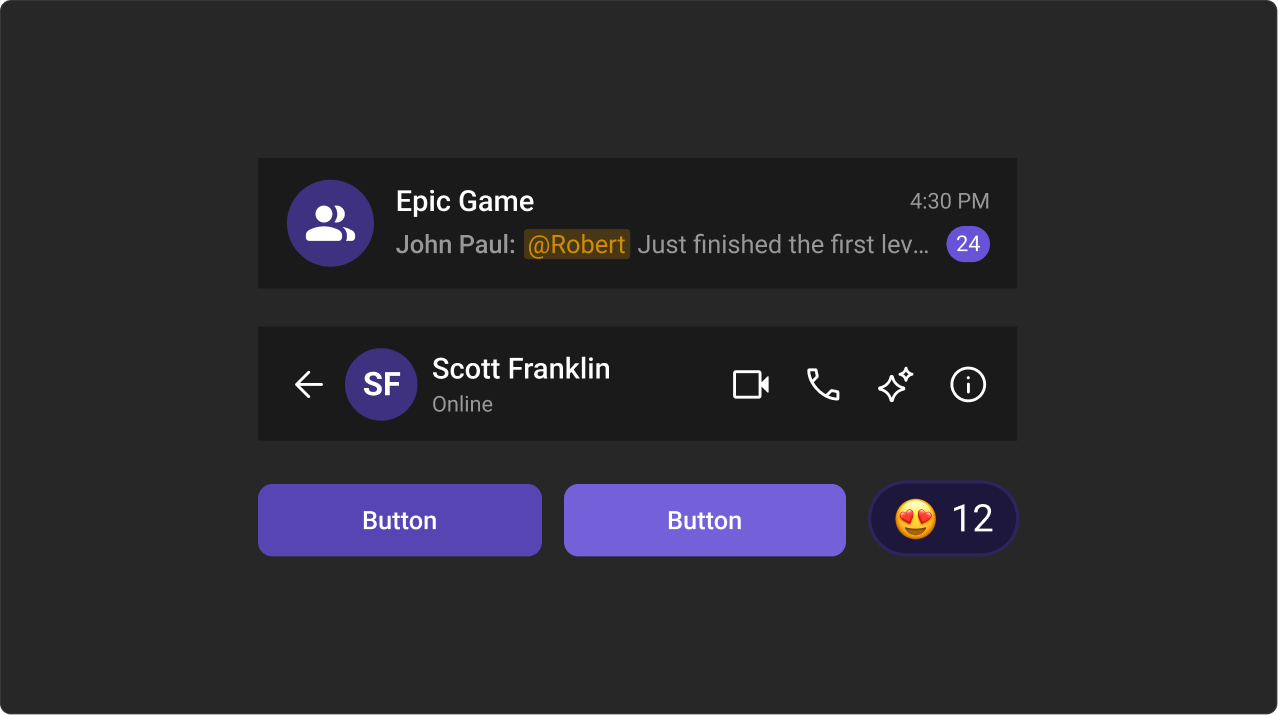
How It Works
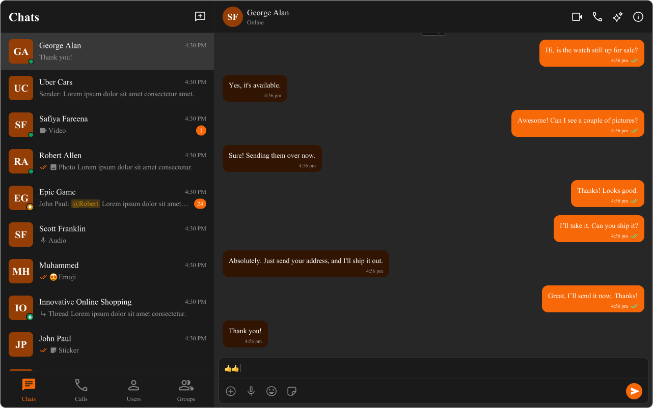
All design tokens are defined as CSS custom properties on:root in the UIKit’s css-variables.css. You override them in your own global CSS file to apply your brand.
Light / Dark Mode
Dark mode is activated by setting thedata-theme="dark" attribute on the <html> element:
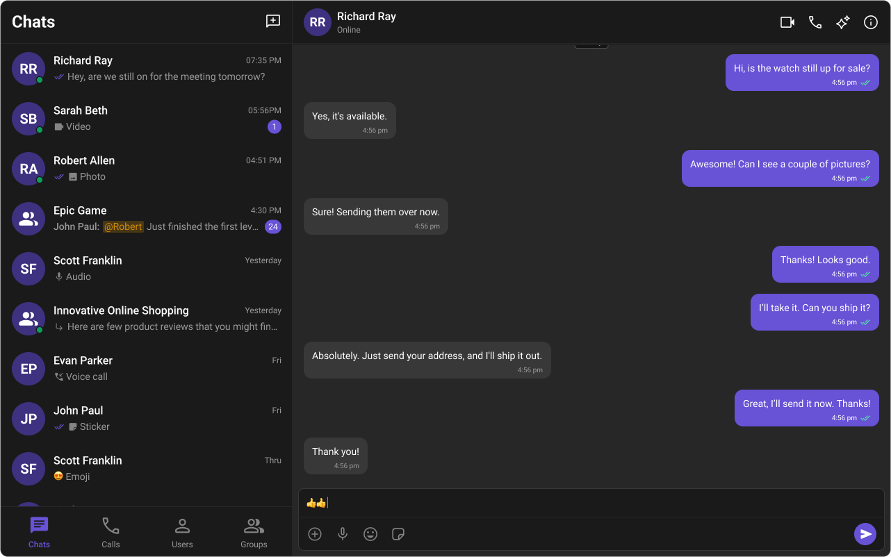
setTheme or toggleTheme directly:
SSR Note: Always use Angular’sDOCUMENTinjection token instead ofdocumentdirectly.
Customizing Colors
Override variables in your global stylesheet (styles.css or styles.scss):
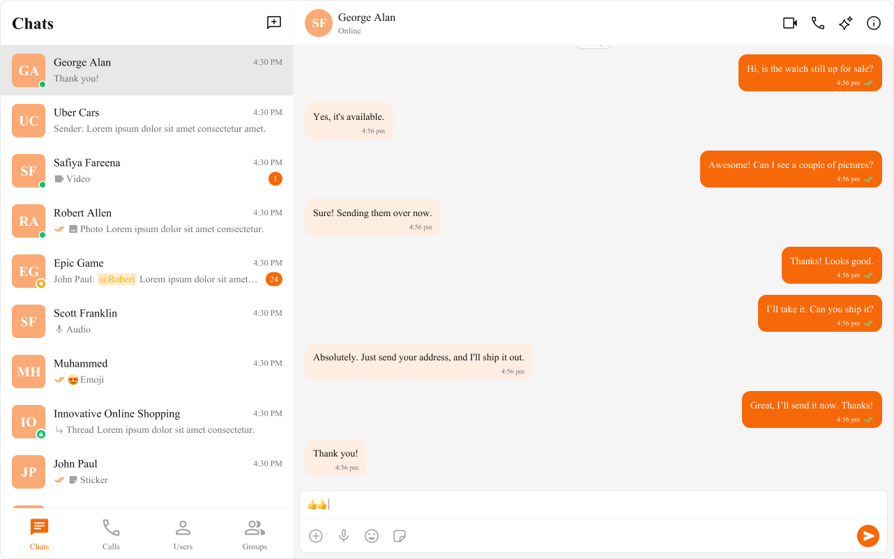
Typography
Spacing & Border Radius
Component-Level Scoping
To override styles for a specific instance, scope the variable override to that element’s selector: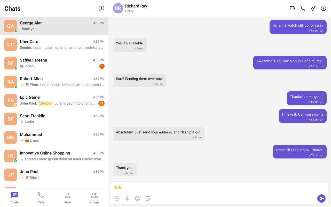
Shadows & Overlays
Avatars & Badges
Status Indicators
Complete Custom Theme Example
Sound Manager
CometChatSoundManager manages audio cues for incoming/outgoing calls and messages. Sound is a frozen object on CometChatSoundManager — access event keys via CometChatSoundManager.Sound.
Sound Events
Methods
Usage
Design Token Pipelines
If your team uses a design token pipeline (e.g. Style Dictionary, Theo), you can generate the CSS variable overrides as a build artifact and import the output file instyles.css. The UIKit’s variable names follow a consistent --cometchat-{category}-{scale} pattern that maps cleanly to token schemas.
Color Palette
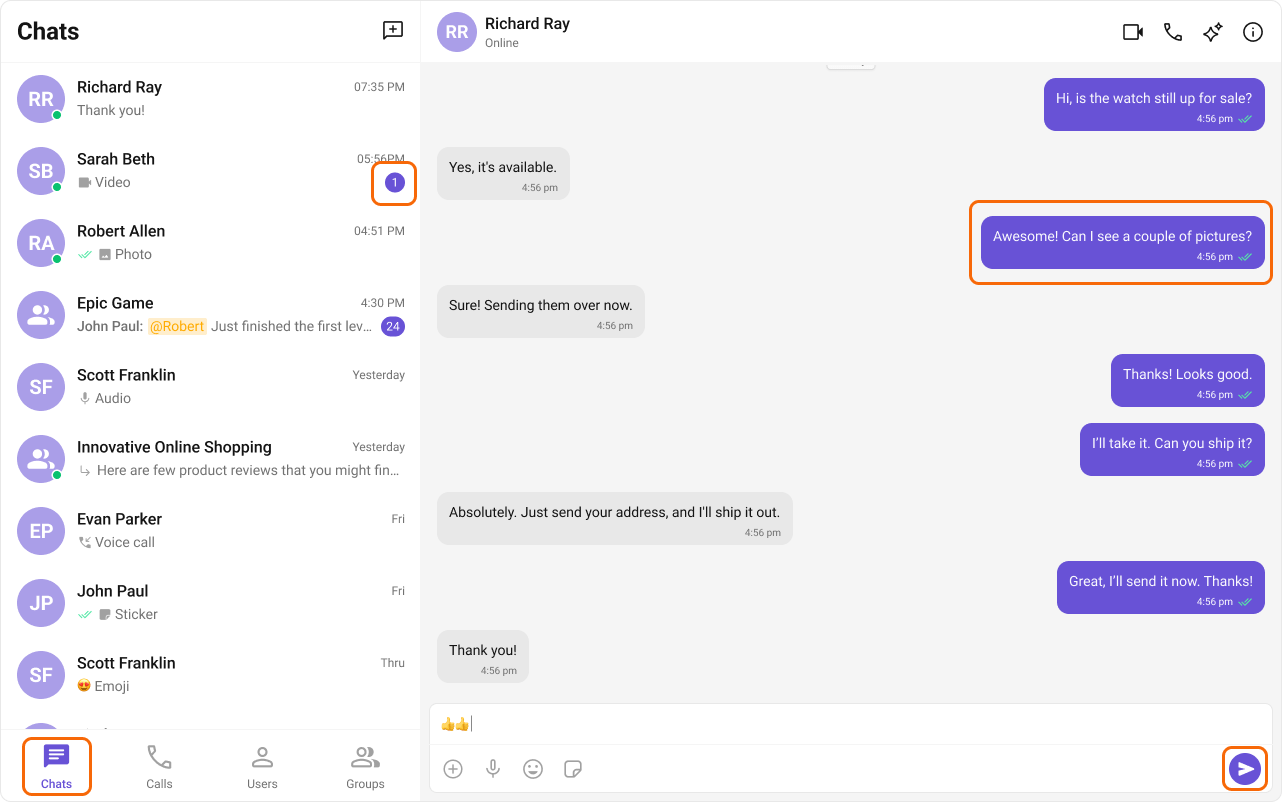
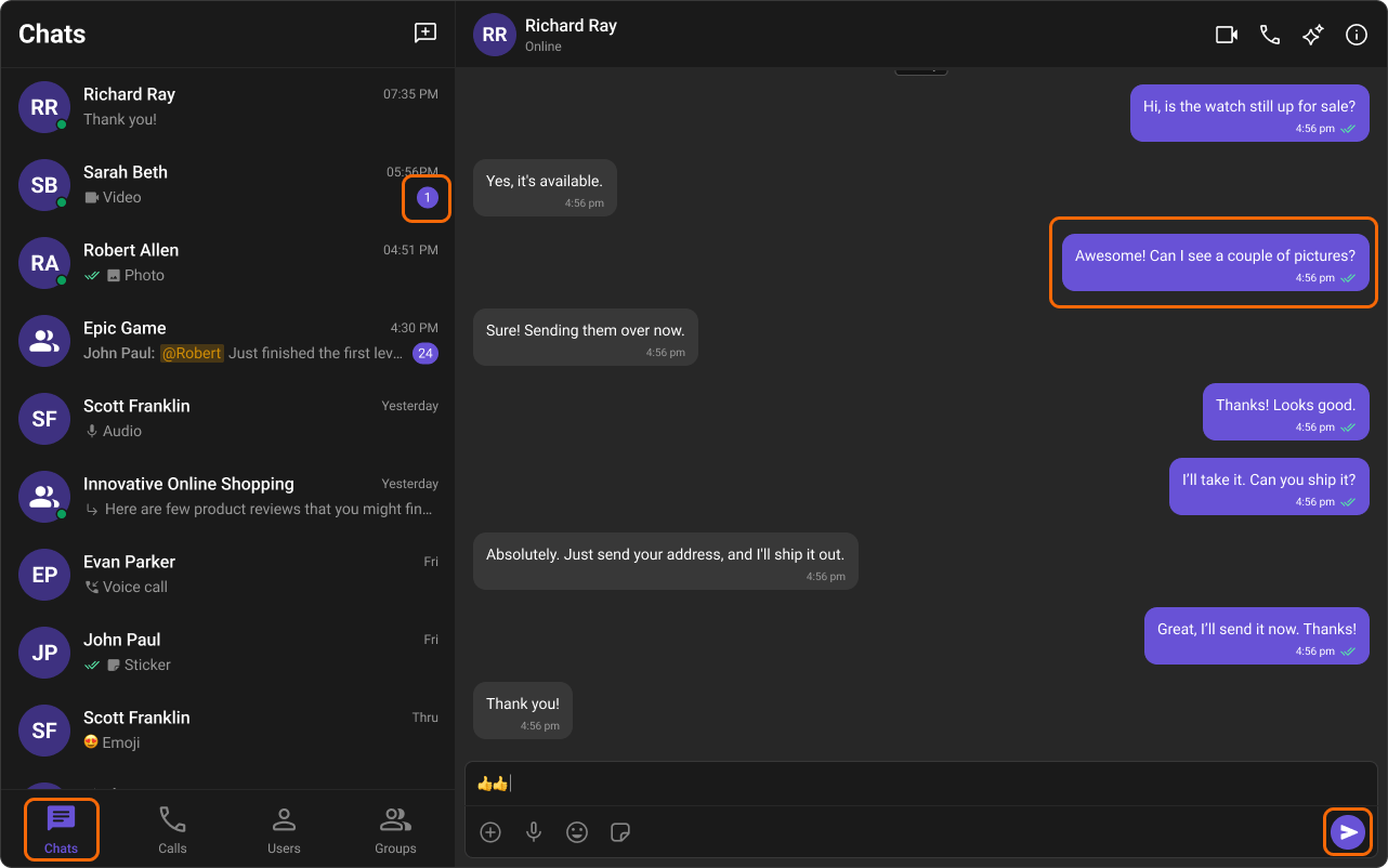
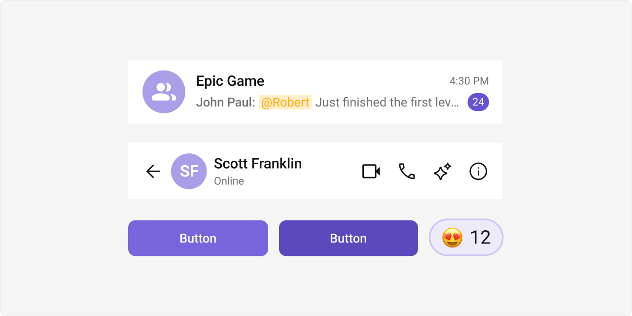
The primary color defines key actions, branding, and UI elements, while the extended primary palette provides variations for supporting components.Primary Color
Light Mode
Dark Mode
Extended Primary Colors
Light Mode
Dark Mode