

AI Integration Quick Reference
AI Integration Quick Reference
| Field | Value |
|---|---|
| Platform | iOS UI Kit |
| Theme Class | CometChatTheme |
| Primary Color | CometChatTheme.primaryColor — Main brand color (#6852D6 default) |
| Background Colors | backgroundColor01, backgroundColor02, backgroundColor03 |
| Text Colors | textColorPrimary, textColorSecondary, textColorTertiary |
| Alert Colors | successColor, errorColor, warningColor, infoColor |
| Dark Mode | Use UIColor { traitCollection in } for dynamic colors |
| Apply Timing | Set theme before CometChatUIKit.init() |
Overview
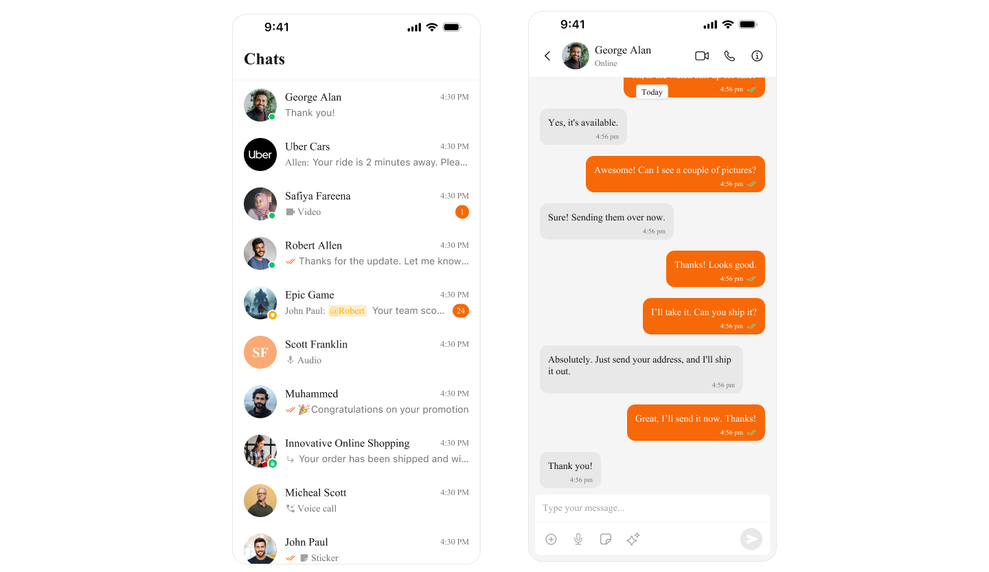
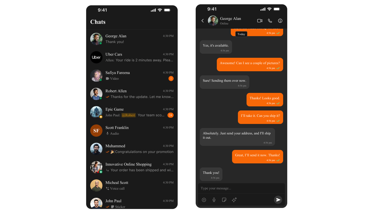
CometChat UI Kit usesCometChatTheme to manage colors across all components. Colors automatically adapt to Light and Dark mode, ensuring a consistent experience.
- Light Mode
- Dark Mode
Color Categories
| Category | Purpose | Examples |
|---|---|---|
| Primary | Main brand color, buttons, links | primaryColor |
| Background | Screen and component backgrounds | backgroundColor01, backgroundColor02 |
| Text | Typography colors | textColorPrimary, textColorSecondary |
| Border | Dividers and outlines | borderColorLight, borderColorDark |
| Alert | Status indicators | successColor, errorColor, warningColor |
| Icon | Icon tints | iconColorPrimary, iconColorSecondary |
Quick Start
Access Default Colors
- Swift
import CometChatUIKitSwift

// Primary brand color
let primary = CometChatTheme.primaryColor  // #6852D6

// Background colors
let background = CometChatTheme.backgroundColor01  // White (light) / #141414 (dark)
let secondaryBg = CometChatTheme.backgroundColor02

// Text colors
let primaryText = CometChatTheme.textColorPrimary
let secondaryText = CometChatTheme.textColorSecondary

// Alert colors
let success = CometChatTheme.successColor  // Green
let error = CometChatTheme.errorColor      // Red
let warning = CometChatTheme.warningColor  // Orange

// Icon colors
let iconPrimary = CometChatTheme.iconColorPrimary
let iconSecondary = CometChatTheme.iconColorSecondary
Customize Theme Colors
Change Primary Color (Brand Color)
- Swift
import CometChatUIKitSwift

// Set your brand color globally
CometChatTheme.primaryColor = UIColor(hex: "#FF5722")  // Orange brand

// All components will now use this color for:
// - Buttons
// - Links
// - Selected states
// - Accent elements
Complete Theme Customization
- Swift
import CometChatUIKitSwift

class ThemeManager {

    static func applyCustomTheme() {
        // Brand colors
        CometChatTheme.primaryColor = UIColor(hex: "#6200EE")  // Purple

        // Background colors
        CometChatTheme.backgroundColor01 = UIColor(hex: "#FFFFFF")
        CometChatTheme.backgroundColor02 = UIColor(hex: "#F5F5F5")
        CometChatTheme.backgroundColor03 = UIColor(hex: "#EEEEEE")

        // Text colors
        CometChatTheme.textColorPrimary = UIColor(hex: "#212121")
        CometChatTheme.textColorSecondary = UIColor(hex: "#757575")
        CometChatTheme.textColorTertiary = UIColor(hex: "#9E9E9E")

        // Border colors
        CometChatTheme.borderColorLight = UIColor(hex: "#E0E0E0")
        CometChatTheme.borderColorDark = UIColor(hex: "#BDBDBD")

        // Alert colors
        CometChatTheme.successColor = UIColor(hex: "#4CAF50")
        CometChatTheme.errorColor = UIColor(hex: "#F44336")
        CometChatTheme.warningColor = UIColor(hex: "#FF9800")
        CometChatTheme.infoColor = UIColor(hex: "#2196F3")

        // Icon colors
        CometChatTheme.iconColorPrimary = UIColor(hex: "#212121")
        CometChatTheme.iconColorSecondary = UIColor(hex: "#757575")
    }
}

// Apply in AppDelegate or SceneDelegate
ThemeManager.applyCustomTheme()
Dark Mode Support
CometChat automatically adapts to system appearance. You can also customize dark mode colors:- Swift
import CometChatUIKitSwift
import UIKit

class ThemeManager {

    static func applyTheme() {
        // Create dynamic colors that adapt to light/dark mode
        CometChatTheme.primaryColor = UIColor { traitCollection in
            return traitCollection.userInterfaceStyle == .dark
                ? UIColor(hex: "#BB86FC")  // Light purple for dark mode
                : UIColor(hex: "#6200EE")  // Purple for light mode
        }

        CometChatTheme.backgroundColor01 = UIColor { traitCollection in
            return traitCollection.userInterfaceStyle == .dark
                ? UIColor(hex: "#121212")  // Dark background
                : UIColor(hex: "#FFFFFF")  // White background
        }

        CometChatTheme.textColorPrimary = UIColor { traitCollection in
            return traitCollection.userInterfaceStyle == .dark
                ? UIColor(hex: "#FFFFFF")  // White text
                : UIColor(hex: "#212121")  // Dark text
        }
    }
}
Color Reference
Primary Colors
| Property | Light Mode | Dark Mode | Usage |
|---|---|---|---|
primaryColor | #6852D6 | #6852D6 | Buttons, links, accents |
Background Colors
| Property | Light Mode | Dark Mode | Usage |
|---|---|---|---|
backgroundColor01 | #FFFFFF | #141414 | Main background |
backgroundColor02 | #F5F5F5 | #1E1E1E | Secondary background |
backgroundColor03 | #EEEEEE | #2C2C2C | Tertiary background |
Text Colors
| Property | Light Mode | Dark Mode | Usage |
|---|---|---|---|
textColorPrimary | #141414 | #FFFFFF | Main text |
textColorSecondary | #727272 | #A0A0A0 | Secondary text |
textColorTertiary | #A0A0A0 | #727272 | Hints, placeholders |
Alert Colors
| Property | Color | Usage |
|---|---|---|
successColor | #09C26F | Success states |
errorColor | #F44649 | Errors, missed calls |
warningColor | #FFAB00 | Warnings |
infoColor | #2196F3 | Information |
Border Colors
| Property | Light Mode | Dark Mode | Usage |
|---|---|---|---|
borderColorLight | #E8E8E8 | #2C2C2C | Subtle borders |
borderColorDark | #CCCCCC | #404040 | Prominent borders |
Production Example
Complete app with custom branding:- Swift
import UIKit
import CometChatUIKitSwift

@main
class AppDelegate: UIResponder, UIApplicationDelegate {

    func application(_ application: UIApplication, didFinishLaunchingWithOptions launchOptions: [UIApplication.LaunchOptionsKey: Any]?) -> Bool {

        // Apply custom theme before initializing CometChat
        applyBrandTheme()

        return true
    }

    private func applyBrandTheme() {
        // Your brand colors
        let brandPrimary = UIColor(hex: "#1E88E5")      // Blue
        let brandSecondary = UIColor(hex: "#FFC107")   // Amber

        // Apply to CometChat theme
        CometChatTheme.primaryColor = brandPrimary

        // Customize backgrounds
        CometChatTheme.backgroundColor01 = UIColor { trait in
            trait.userInterfaceStyle == .dark
                ? UIColor(hex: "#0D1117")
                : UIColor(hex: "#FFFFFF")
        }

        CometChatTheme.backgroundColor02 = UIColor { trait in
            trait.userInterfaceStyle == .dark
                ? UIColor(hex: "#161B22")
                : UIColor(hex: "#F6F8FA")
        }

        // Customize text
        CometChatTheme.textColorPrimary = UIColor { trait in
            trait.userInterfaceStyle == .dark
                ? UIColor(hex: "#C9D1D9")
                : UIColor(hex: "#24292F")
        }

        CometChatTheme.textColorSecondary = UIColor { trait in
            trait.userInterfaceStyle == .dark
                ? UIColor(hex: "#8B949E")
                : UIColor(hex: "#57606A")
        }

        // Alert colors
        CometChatTheme.successColor = UIColor(hex: "#238636")
        CometChatTheme.errorColor = UIColor(hex: "#DA3633")
        CometChatTheme.warningColor = brandSecondary
    }
}

// UIColor extension for hex support
extension UIColor {
    convenience init(hex: String) {
        var hexSanitized = hex.trimmingCharacters(in: .whitespacesAndNewlines)
        hexSanitized = hexSanitized.replacingOccurrences(of: "#", with: "")

        var rgb: UInt64 = 0
        Scanner(string: hexSanitized).scanHexInt64(&rgb)

        let r = CGFloat((rgb & 0xFF0000) >> 16) / 255.0
        let g = CGFloat((rgb & 0x00FF00) >> 8) / 255.0
        let b = CGFloat(rgb & 0x0000FF) / 255.0

        self.init(red: r, green: g, blue: b, alpha: 1.0)
    }
}
Related
Component Styling
Style individual components
Theme Introduction
Complete theming guide
Getting Started
Initial setup