

AI Integration Quick Reference
AI Integration Quick Reference
Prerequisites
You need three things from the CometChat Dashboard:
You also need Node.js 18+ and npm/yarn installed.
Step 1 — Create a React Project with React Router
Step 2 — Install the UI Kit
- npm
- yarn
Step 3 — Initialize, Login, and Set Up Routes
CallCometChatUIKit.init() and CometChatUIKit.login() before rendering. Then wrap your chat route in CometChatProvider.
For development, use one of the pre-created test UIDs:
cometchat-uid-1 · cometchat-uid-2 · cometchat-uid-3 · cometchat-uid-4 · cometchat-uid-5
src/main.tsx
src/App.tsx
src/pages/ChatPage.tsx
CometChatProvider then supplies theme, locale, plugin registry, and event context. See the CometChatProvider guide for all props.
For production, use
CometChatUIKit.loginWithAuthToken(token) instead of login(uid). Generate auth tokens server-side via the CometChat REST API. Never ship auth keys in client code.Step 4 — Run
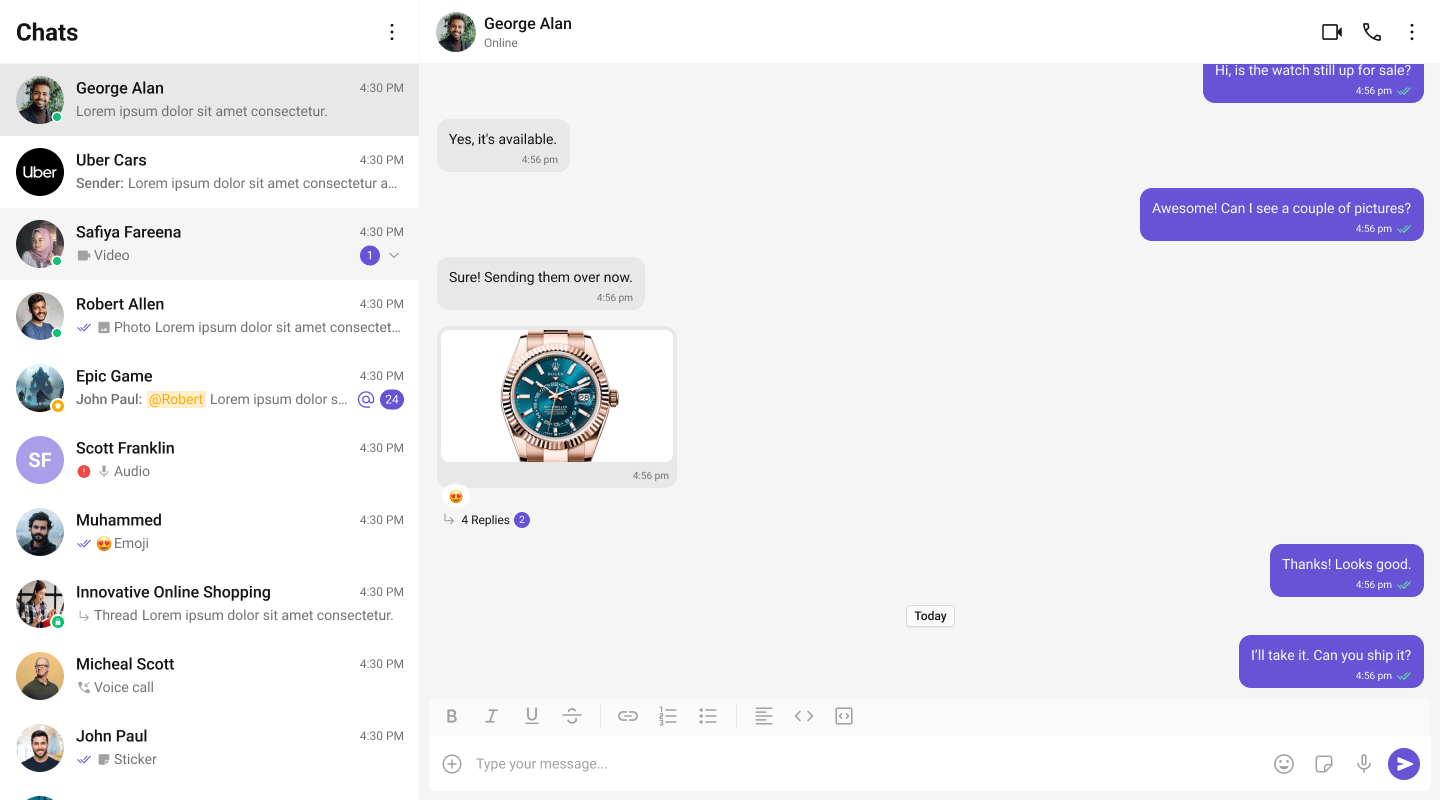
http://localhost:5173/chat. You should see the conversation list on the left. Click a conversation to open the message panel.
Choose a Chat Experience
Conversation List + Message View
Two-panel layout — conversation list on the left, messages on the right.One-to-One / Group Chat
Single chat window — no sidebar. Good for support chat or embedded widgets.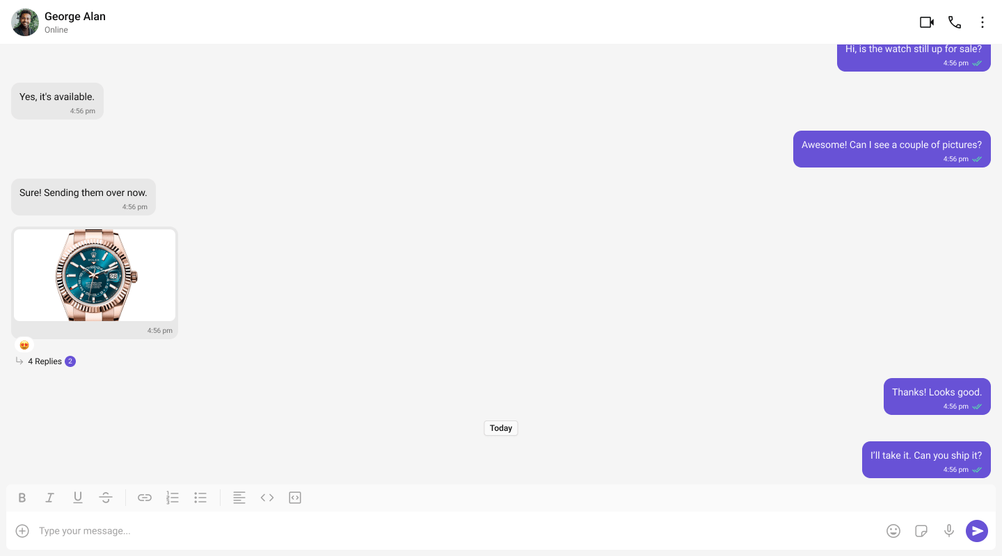
Tab-Based Chat
Tabbed navigation — Chat, Call Logs, Users, Settings in separate tabs.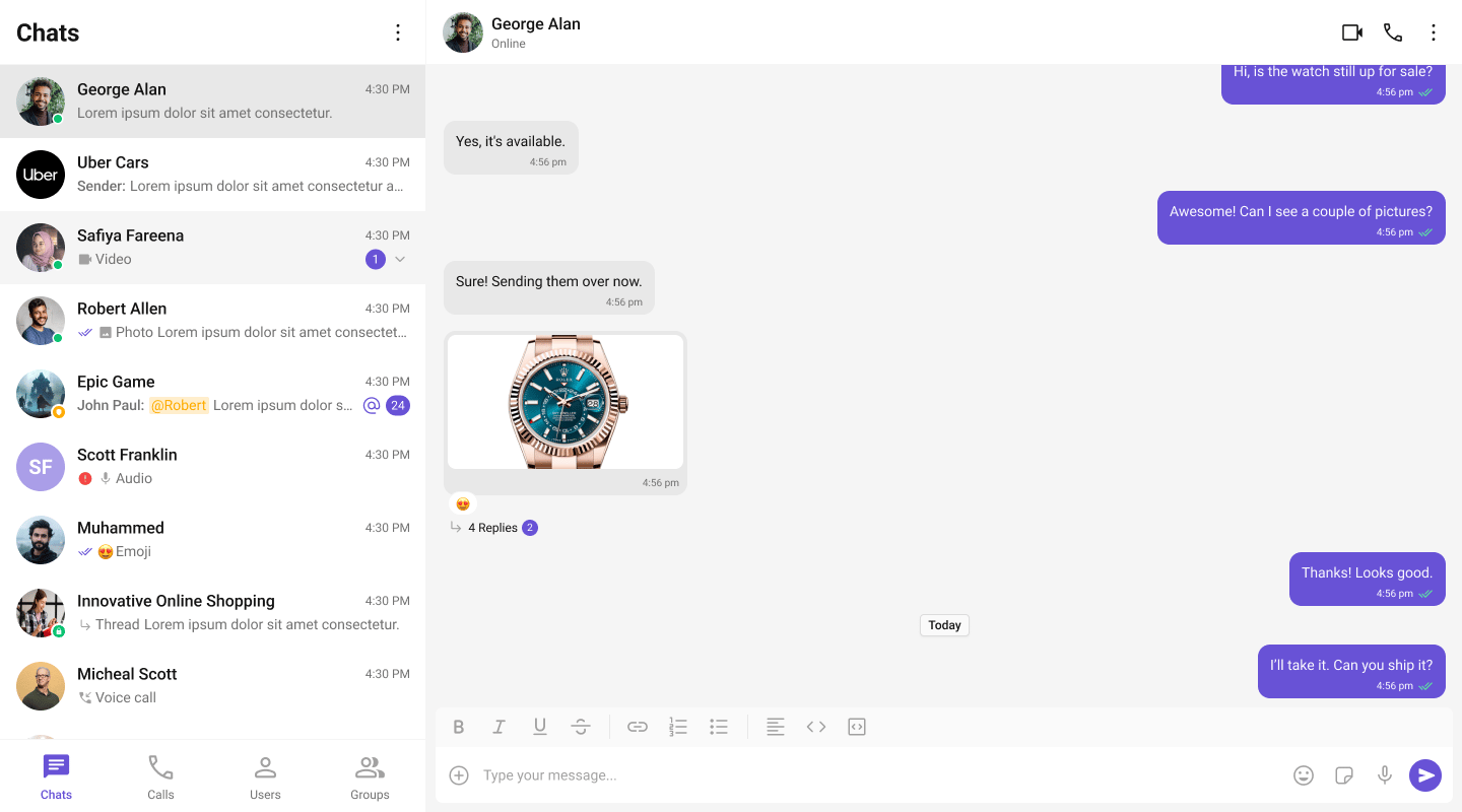
Build Your Own Chat Experience
Need full control over the UI? Use individual components, customize themes, and wire up your own layouts.- Sample App — Working reference app to compare against
- Components — All prebuilt UI elements with props and customization options
- Core Features — Messaging, real-time updates, and other capabilities
- Theming — Colors, fonts, dark mode, and custom styling
- Build Your Own UI — Skip the UI Kit entirely and build on the raw SDK
Next Steps
Components Overview
Browse all prebuilt UI components
Theming
Customize colors, fonts, and styles
Plugins
Customize message rendering
Troubleshooting
Common issues and fixes