

Overview
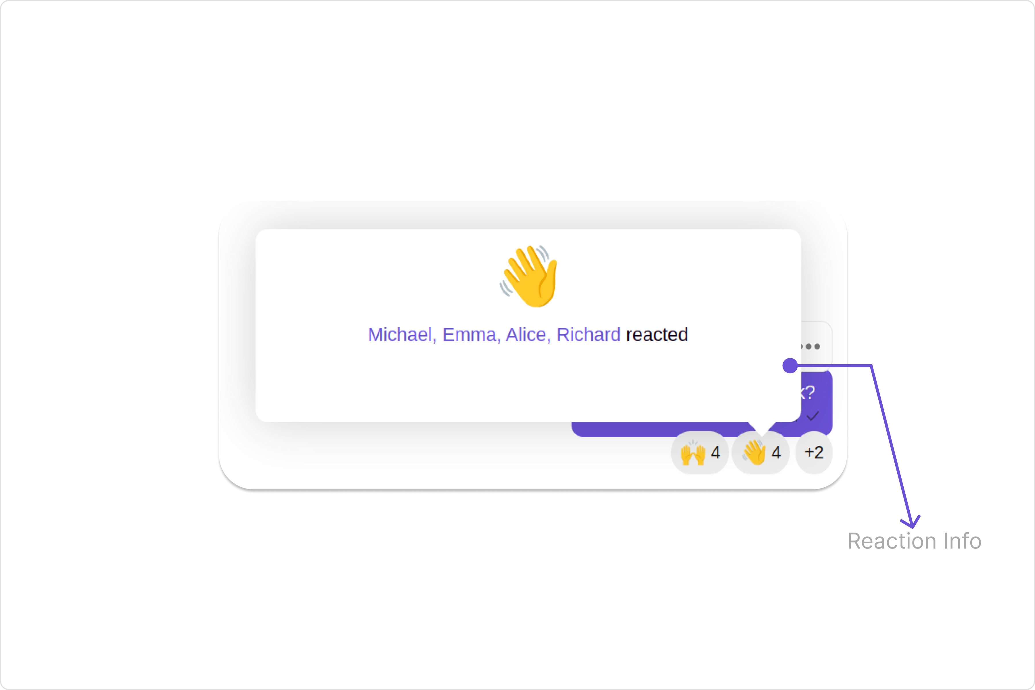
TheReaction Info component provides a visual representation of a tooltip details about emoji reactions on a message, helping users easily see which emojis were reacted by whom.
Usage
Integration
The following code snippet illustrates how you can directly incorporate the Reactions Info component into your app.- ReactionInfoDemo.tsx
- App.tsx
Actions
Actions dictate how a component functions. They are divided into two types: Predefined and User-defined. You can override either type, allowing you to tailor the behavior of the component to fit your specific needs. TheReactions Info component does not have any exposed actions.
Filters
Filters allow you to customize the data displayed in a list within aComponent. You can filter the list based on your specific criteria, allowing for a more customized. Filters can be applied using RequestBuilders of Chat SDK.
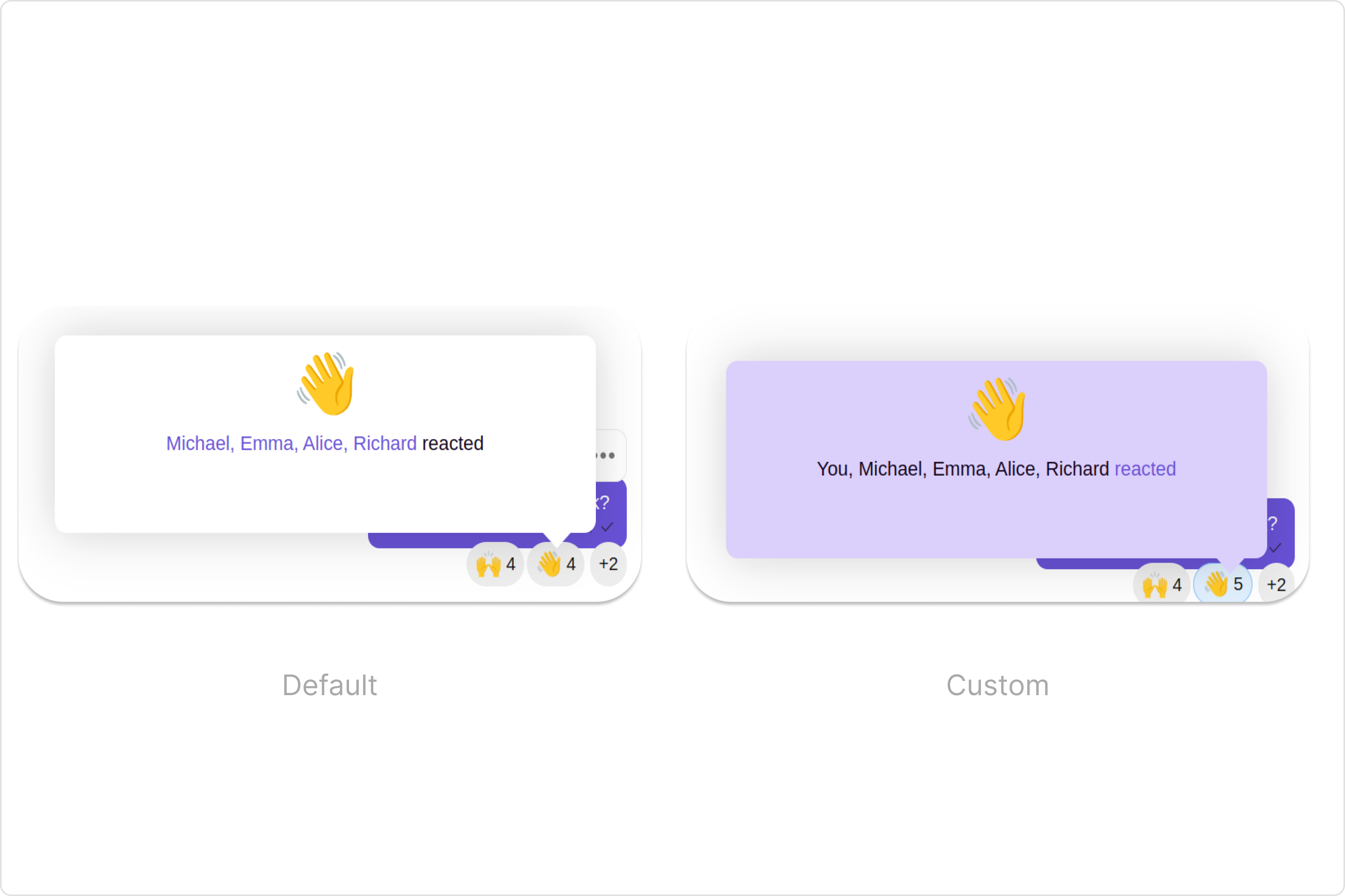
You can adjust the ReactionsRequestBuilder in the Reaction Info Component to customize your Reaction info. Numerous options are available to alter the builder to meet your specific needs. For additional details on ReactionsRequestBuilder, please visit ReactionsRequestBuilder.
In the example below, we demonstrate the application of a filter to the reactions info. This filter allows you to specify a limit on the number of users displayed who have reacted with the same emoji.
- ReactionInfoDemo.tsx
Events
Events are emitted by aComponent. By using event you can extend existing functionality. Being global events, they can be applied in Multiple Locations and are capable of being Added or Removed.
The Reactions Info component does not produce any events.
Customization
To fit your app’s design requirements, you can customize the appearance of the Reaction Info component. We provide exposed methods that allow you to modify the experience and behavior according to your specific needs.Style
Using Style you can customize the look and feel of the component in your app, These parameters typically control elements such as the color, size, shape, and fonts used within the component.1. reactionInfoStyle
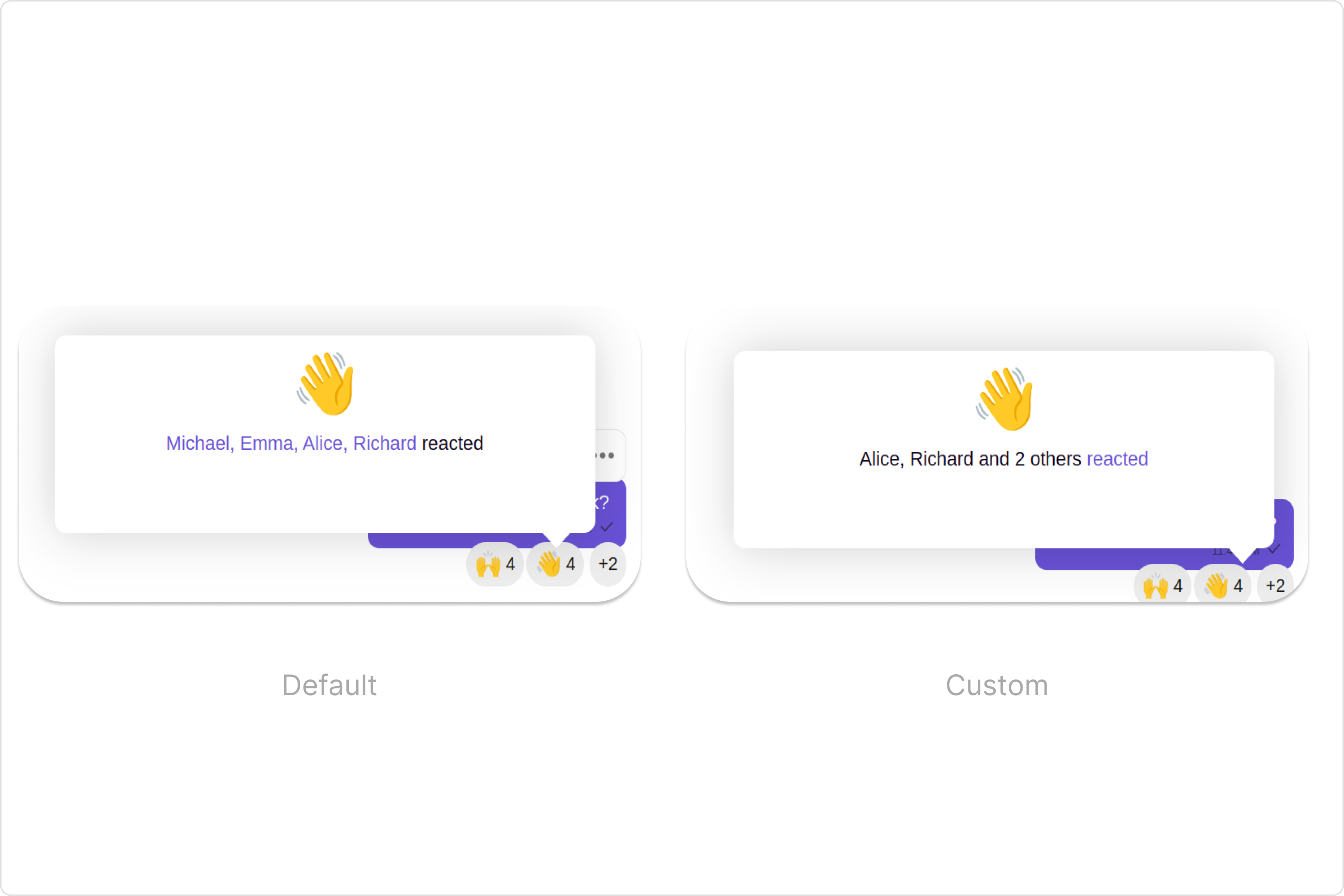
To customize the appearance, you can assign areactionInfoStyle object to the Reactions Info component.
Example
In this example, we are employing the reactionInfoStyle.
- ReactionInfoDemo.tsx
Functionality
These are a set of small functional customizations that allow you to fine-tune the overall experience of the component. With these, you can change text, set custom icons, and toggle the visibility of UI elements.- ReactionInfoDemo.tsx
Below is a customizations list along with corresponding code snippets