

AI Integration Quick Reference
AI Integration Quick Reference
Root Wrapper (.cometchat)
All selectors in this doc are scoped under .cometchat, the class the UI Kit renders on its root element.
data-theme, place it on the wrapper and scope dark theme overrides to .cometchat inside.
Theming Contract
Inputs- Base stylesheet import:
@import url("@cometchat/chat-uikit-react/css-variables.css"); - Global CSS variables on
.cometchat - Component-scoped variables on
.cometchat .cometchat-<component> - Optional element-level CSS overrides for specific selectors
- Optional theme mode selector:
.cometchat-root[data-theme="dark"] .cometchator@media (prefers-color-scheme: dark)
- Element-level CSS overrides (most specific)
- Component-scoped variables (
.cometchat .cometchat-conversations { --var }) - Global variables (
.cometchat { --var }) - Defaults from
css-variables.css(least specific)
- Primary tokens change outgoing bubbles, buttons, and active states
- Background tokens change panels and surfaces
- Text/icon tokens change highlight accents
- Font tokens change typography across the UI
Importing the Stylesheet
App.css
Global Theming with CSS Variables
Override CSS variables in the global stylesheet to customize the entire chat UI.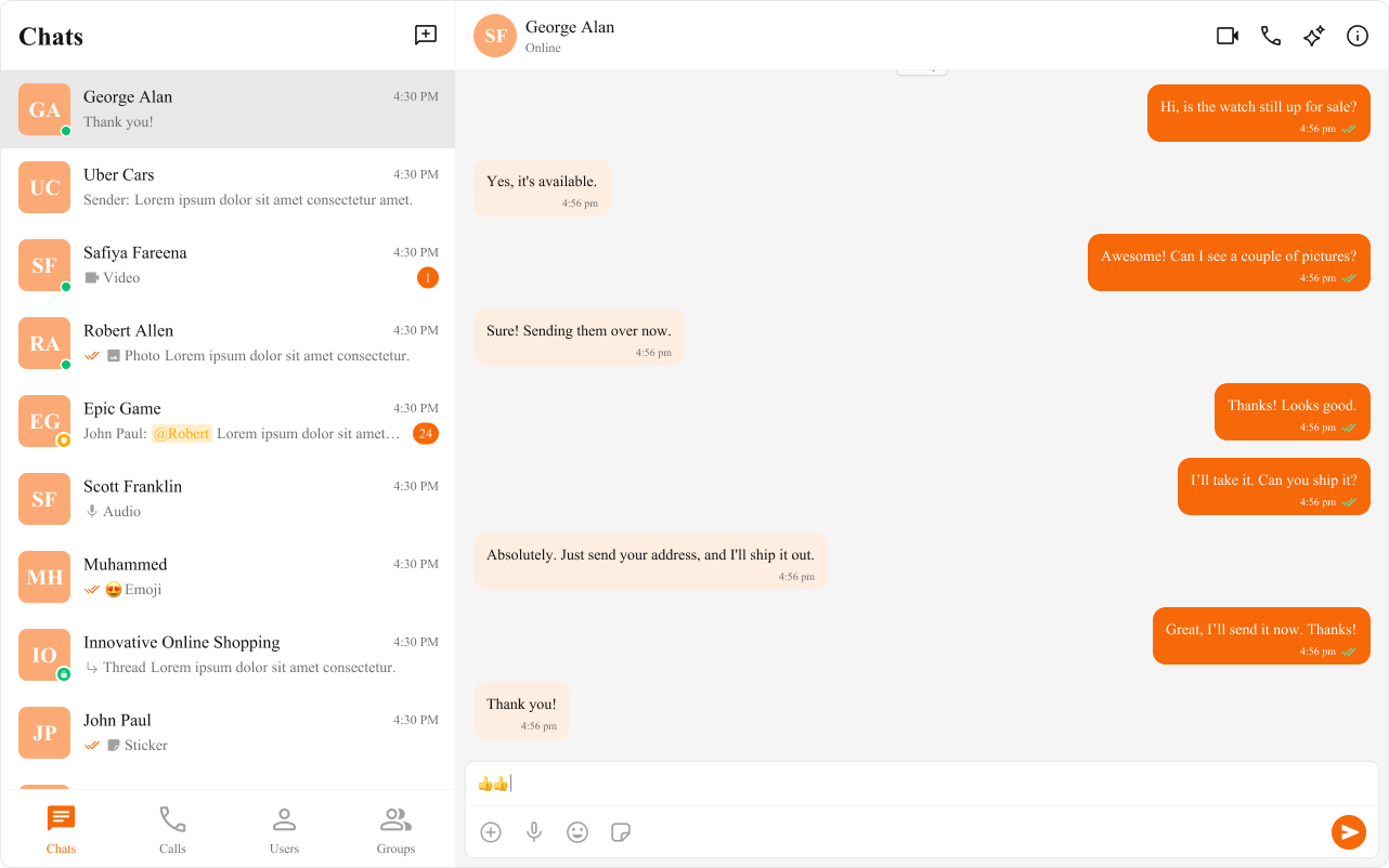
- App.css (Recommended)
- App.tsx (Runtime Only)
Top Tokens (Quick Mapping)
For the complete list, see Color Resources.Component-Specific Theming
Override CSS variables within a component’s class to apply different styles to specific components.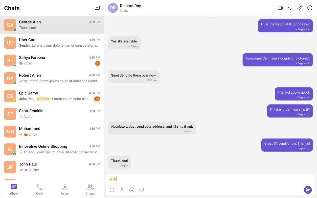
App.css
Advanced Customization with CSS Overrides
Target specific elements directly for full control over component styling.App.css
Dark and Light Theme Support
Enabling Dark Mode
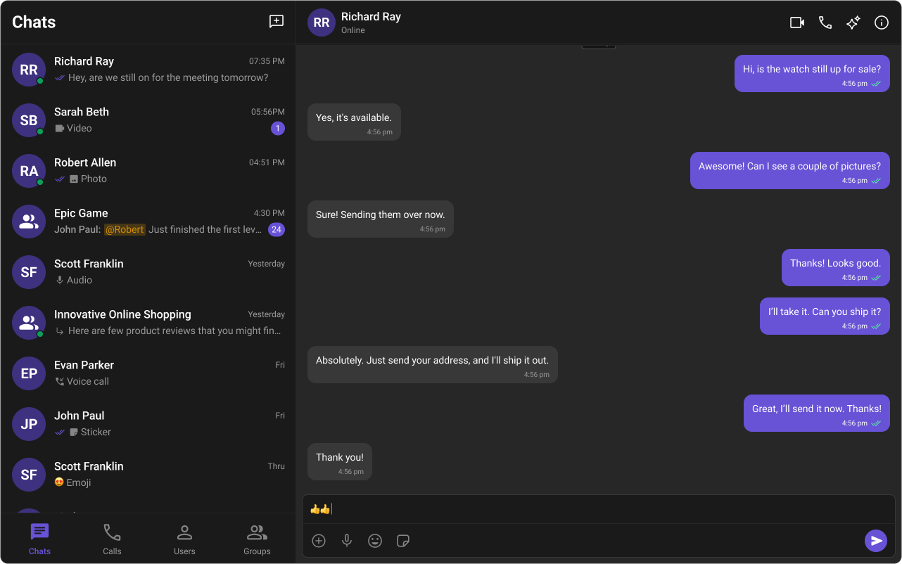
App.tsx
data-theme, which switches palettes in CSS.
Customizing Light and Dark Theme
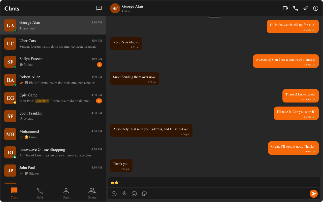
App.css
@media (prefers-color-scheme: dark) and keep the .cometchat scope.
Light mode uses orange (#f76808) with peach backgrounds; dark mode uses the same orange accent but with dark brown backgrounds (#311502, #451d02) for proper contrast.
Examples
Brand color swap (global)
App.css
Dark mode (app-controlled)
App.css
Conversations-only override
App.css
Bubble styling (incoming/outgoing)
App.css
Resources
UI Kit Source Code
Complete list of color variables and hex values on GitHub.View on GitHub
Figma UI Kit
Figma UI Kit with fully integrated color palette.View on Figma