Overview
CometChatGroupMembers is a versatile Widget designed to showcase all users who are either added to or invited to a group, thereby enabling them to participate in group discussions, access shared content, and engage in collaborative activities. CometChatGroupMembers have the capability to communicate in real-time through messaging, voice and video calls, and various other interactions. Additionally, they can interact with each other, share files, and join calls based on the permissions established by the group administrator or owner.
- Android
- iOS
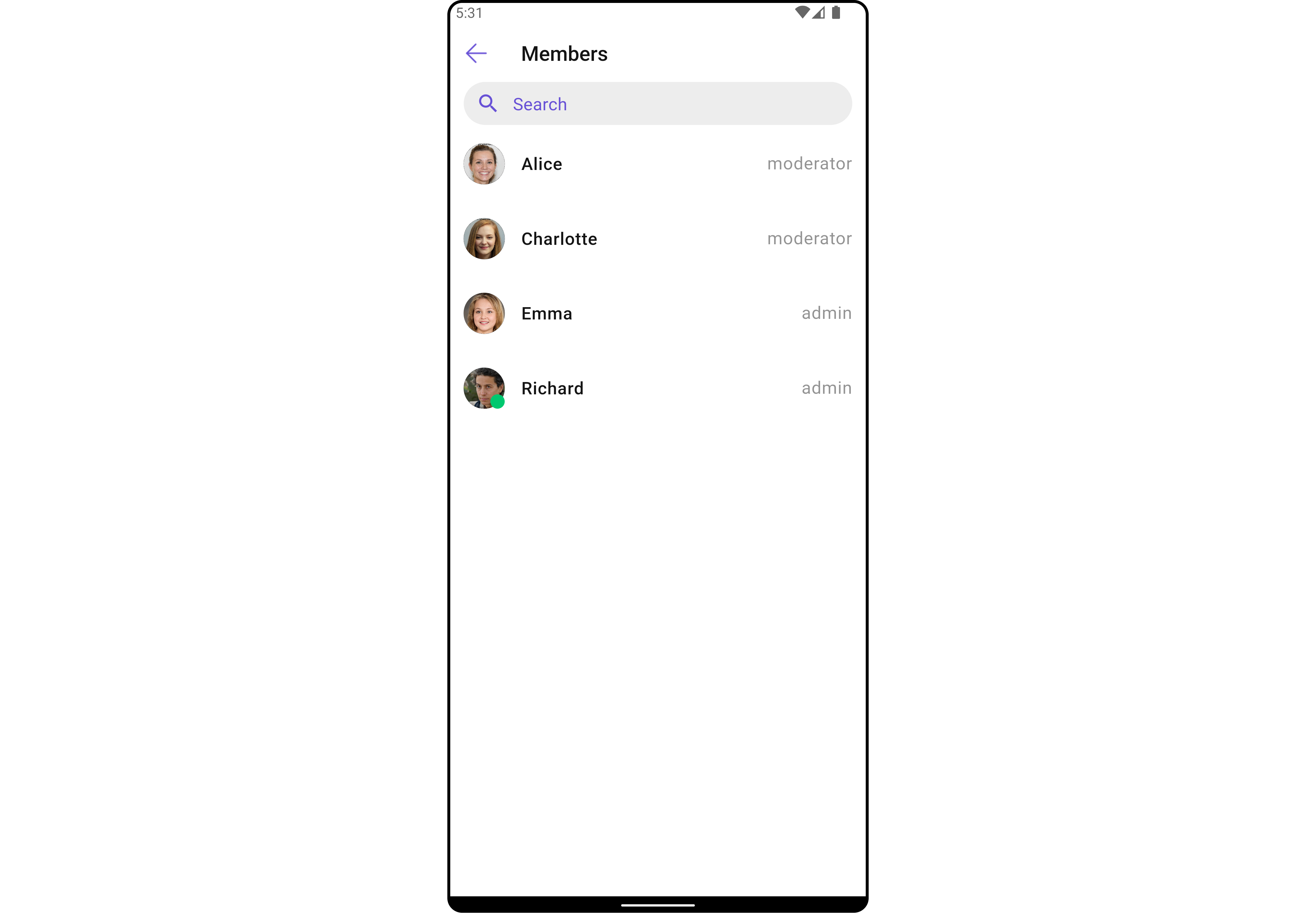
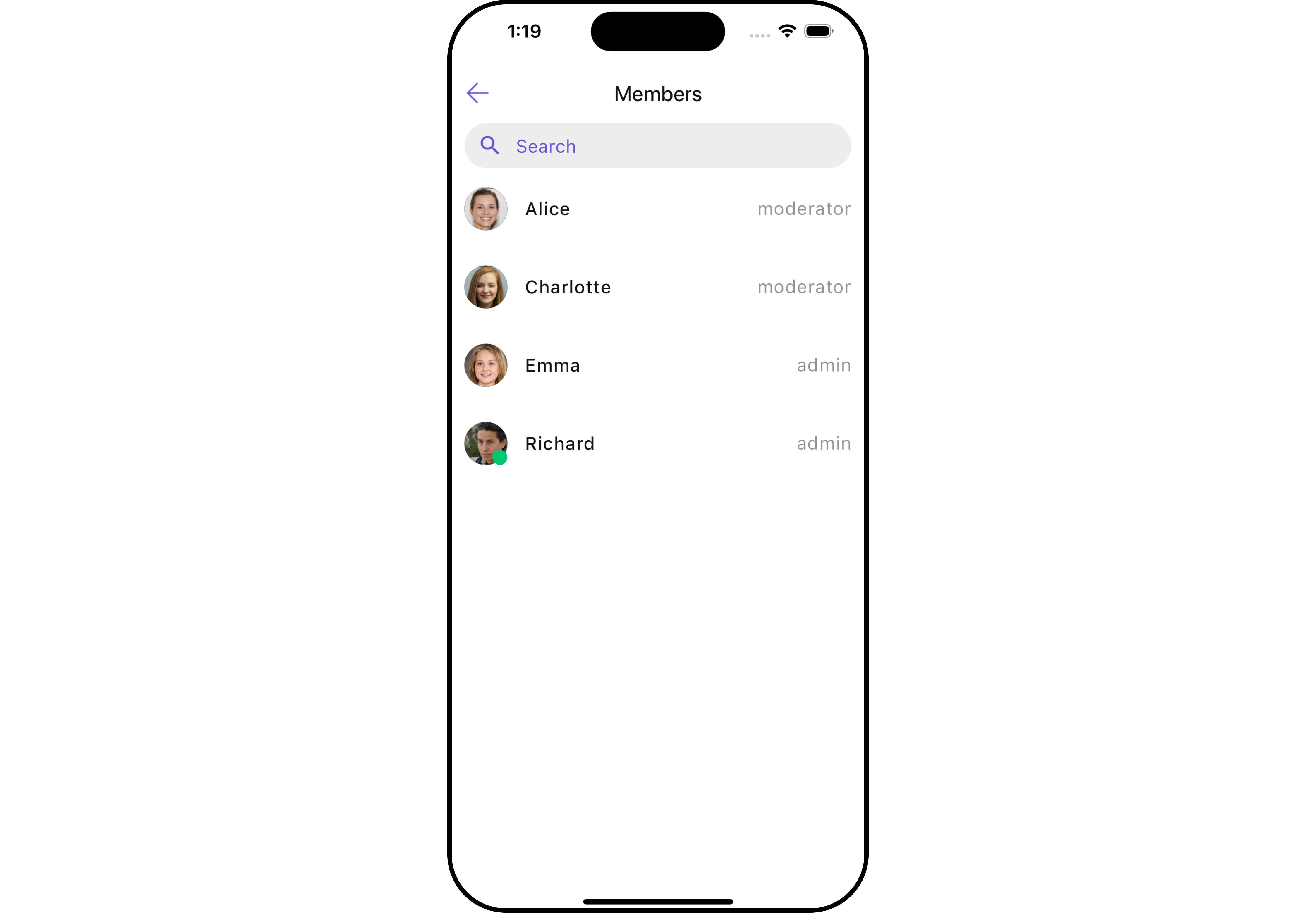
CometChatGroupMembers widget is composed of the following BaseWidgets:
Usage
Integration
CometChatGroupMembers , as a Composite Widget, offers flexible integration options, allowing it to be launched directly via button clicks or any user-triggered action.
You can launch CometChatGroupMembers directly using Navigator.push , or you can define it as a widget within the build method of your State class.
1. Using Navigator to Launch CometChatGroupMembers
- Dart
2. Embedding CometChatGroupMembers as a Widget in the build Method
- Dart
Actions
Actions dictate how a widget functions. They are divided into two types: Predefined and User-defined. You can override either type, allowing you to tailor the behavior of the widget to fit your specific needs.1. onItemTap
This method proves valuable when users seek to override onItemClick functionality withinCometChatGroupMembers , empowering them with greater control and customization options.
The onItemTap action doesn’t have a predefined behavior. You can override this action using the following code snippet.
- Dart
2. onItemLongPress
This method becomes invaluable when users seek to override long-click functionality withinCometChatGroupMembers , offering them enhanced control and flexibility in their interactions.
The onItemLongPress action doesn’t have a predefined behavior. You can override this action using the following code snippet.
- Dart
3. onBack
Enhance your application’s functionality by leveraging theonBack feature. This capability allows you to customize the behavior associated with navigating back within your app. Utilize the provided code snippet to override default behaviors and tailor the user experience according to your specific requirements.
- Dart
4. onError
You can customize this behavior by using the provided code snippet to override theonError and improve error handling.
- Dart
5. onSelection
When theonSelection event is triggered, it furnishes the list of selected members. This event can be invoked by any button or action within the interface. You have the flexibility to implement custom actions or behaviors based on the selected members.
This action does not come with any predefined behavior. However, you have the flexibility to override this event and tailor it to suit your needs using the following code snippet.
- Dart
Filters
Filters allow you to customize the data displayed in a list within aWidget . You can filter the list based on your specific criteria, allowing for a more customized. Filters can be applied using RequestBuilders of Chat SDK.
1. GroupMembersRequestBuilder
Example
In the example below, we are applying a filter to the Group List based on limit and scope.
- Dart
2. GroupMembersProtocol
TheGroupMembersProtocol uses GroupsRequestBuilder enables you to filter and customize the search list based on available parameters in GroupsRequestBuilder.
This feature allows you to keep uniformity between the displayed Group Members List and Searched Group Members List.
Here is the complete example for reference:
Example
- Dart
custom_protocol_builder.dart
- Dart
main.dart
Events
Events are emitted by aWidget . By using event you can extend existing functionality. Being global events, they can be applied in Multiple Locations and are capable of being Added or Removed.
Events emitted by the Join Group widget is as follows.
Example
- Dart
your_screen.dart
Customization
To fit your app’s design requirements, you can customize the appearance of the Groups widget. We provide exposed methods that allow you to modify the experience and behavior according to your specific needs.Style
Using Style you can customize the look and feel of the widget in your app, These parameters typically control elements such as the color, size, shape, and fonts used within the widget.1. GroupMembers Style
You can set theGroupMembersStyle to the CometChatGroupMembers Widget to customize the styling.
- Dart
- Android
- iOS
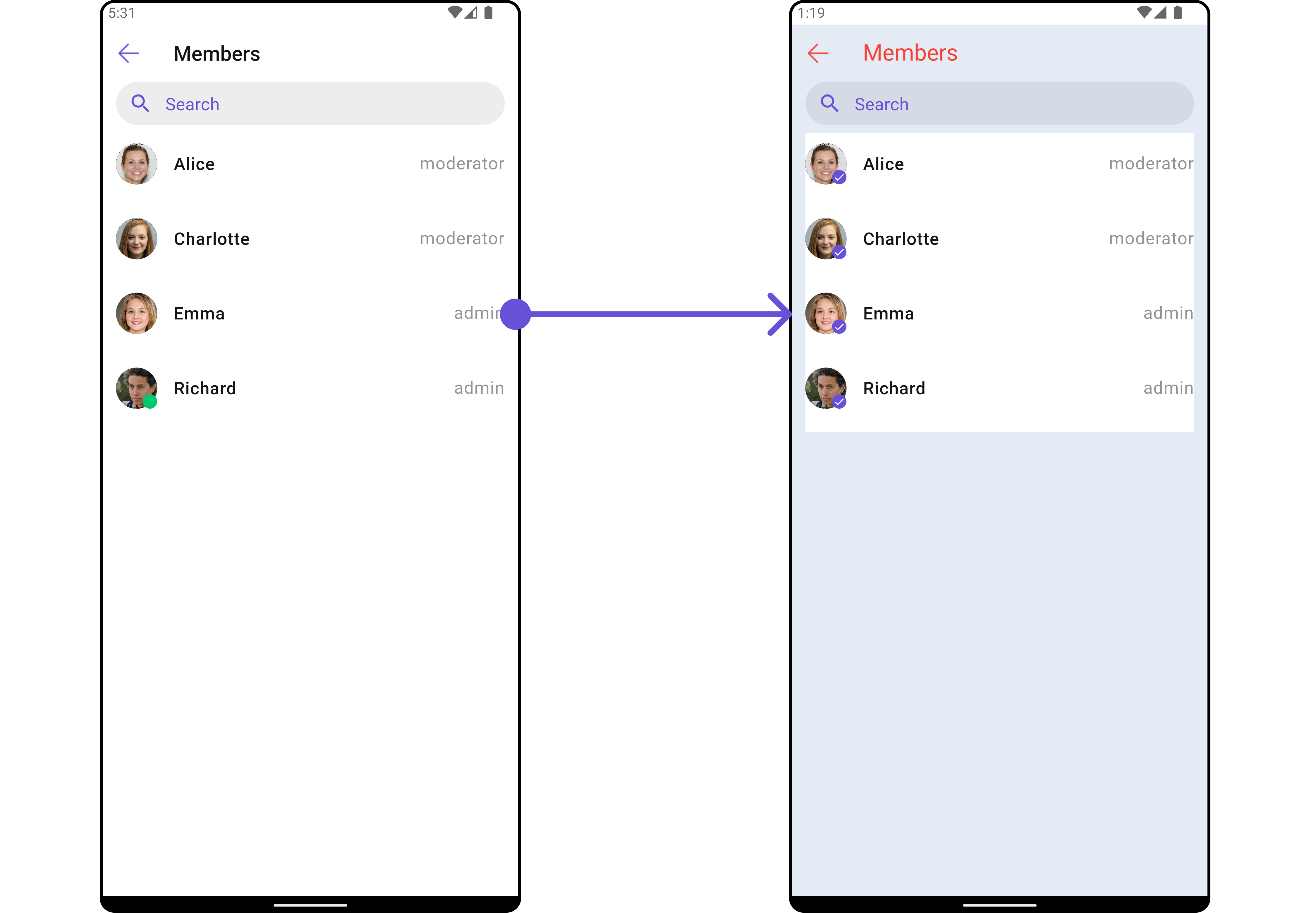
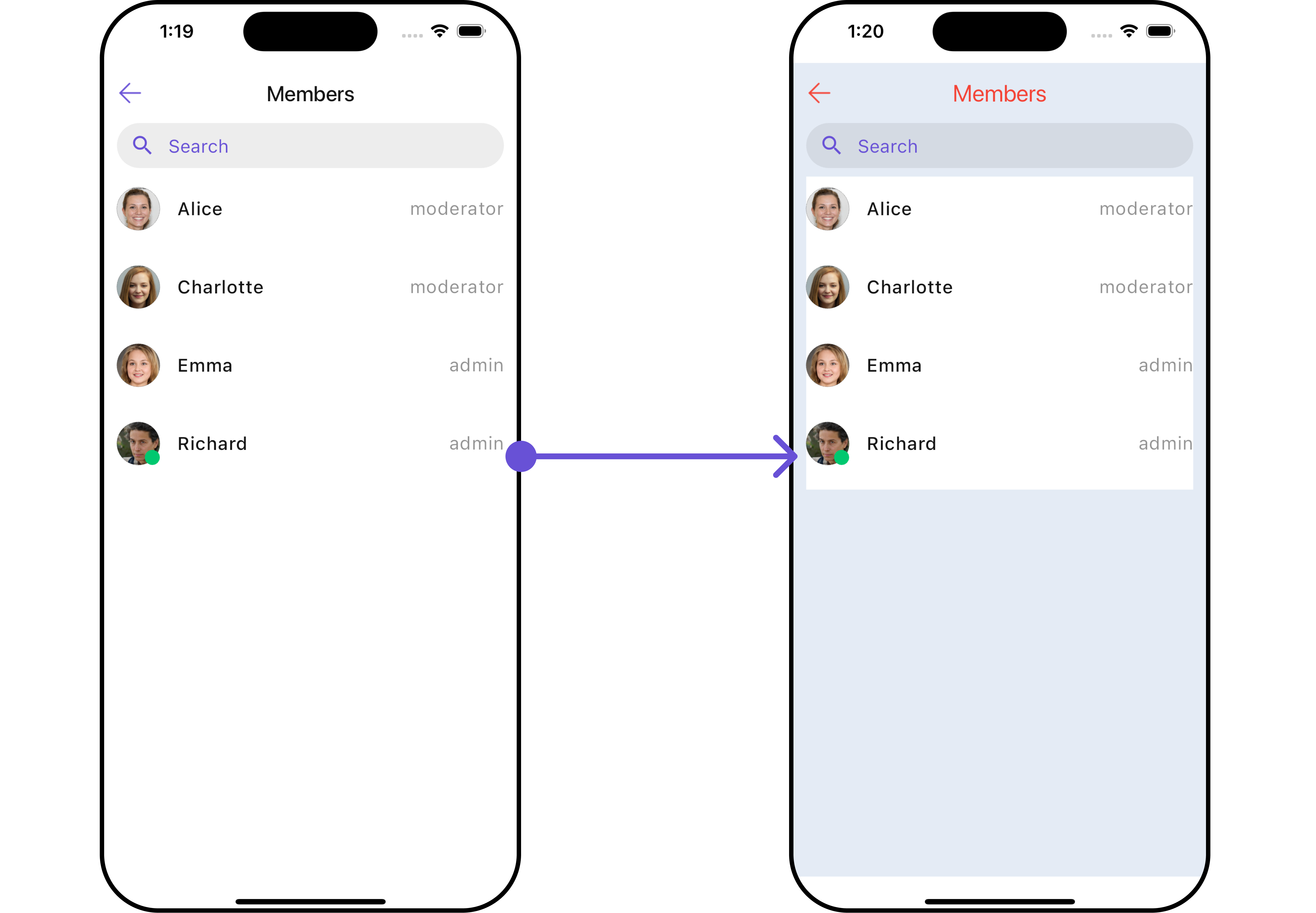
GroupMemberStyle
2. Avatar Style
To apply customized styles to theAvatar widget in the CometChatGroupMembers Widget, you can use the following code snippet. For further insights on Avatar Styles refer
- Dart
3. StatusIndicator Style
To apply customized styles to the Status Indicator widget in theCometChatGroupMembers Widget, You can use the following code snippet. For further insights on Status Indicator Styles refer
- Dart
4. ListItem Style
To apply customized styles to theList Item widget in the CometChatGroupMembers Widget, you can use the following code snippet. For further insights on List Item Styles refer
- Dart
Functionality
These are a set of small functional customizations that allow you to fine-tune the overall experience of the widget. With these, you can change text, set custom icons, and toggle the visibility of UI elements.- Dart
- Android
- iOS
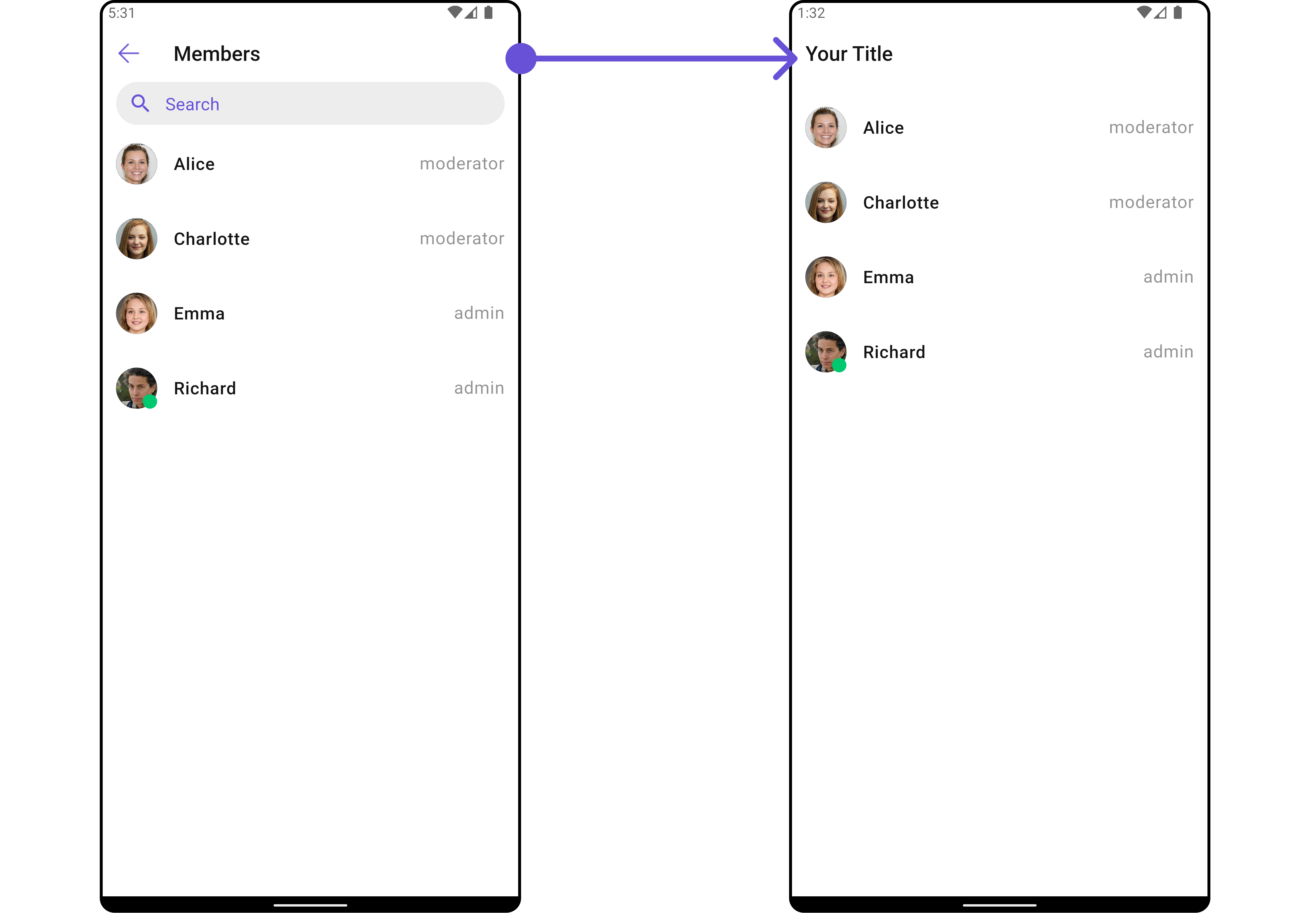
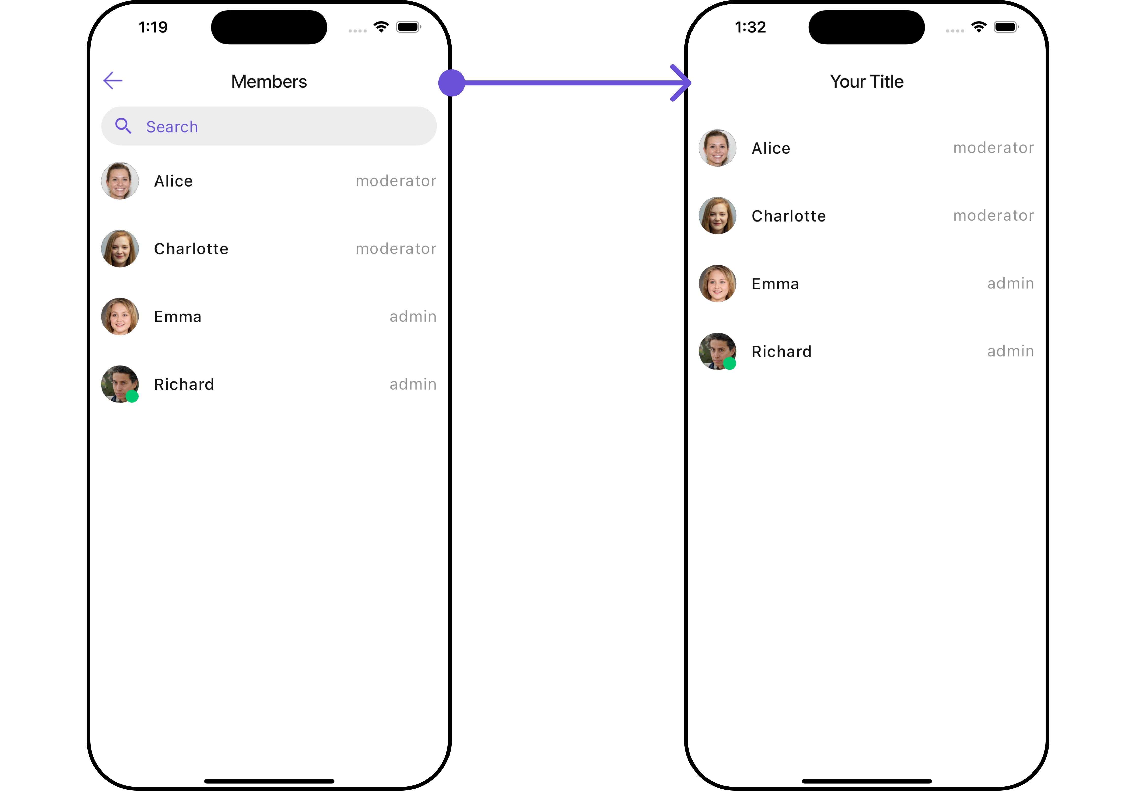
CometChatGroupMembers
Advanced
For advanced-level customization, you can set custom widgets to the widget. This lets you tailor each aspect of the widget to fit your exact needs and application aesthetics. You can create and define your own widgets and then incorporate those into the widget. TheCometChatGroupMembers widget does not provide additional functionalities beyond this level of customization.
ListItemView
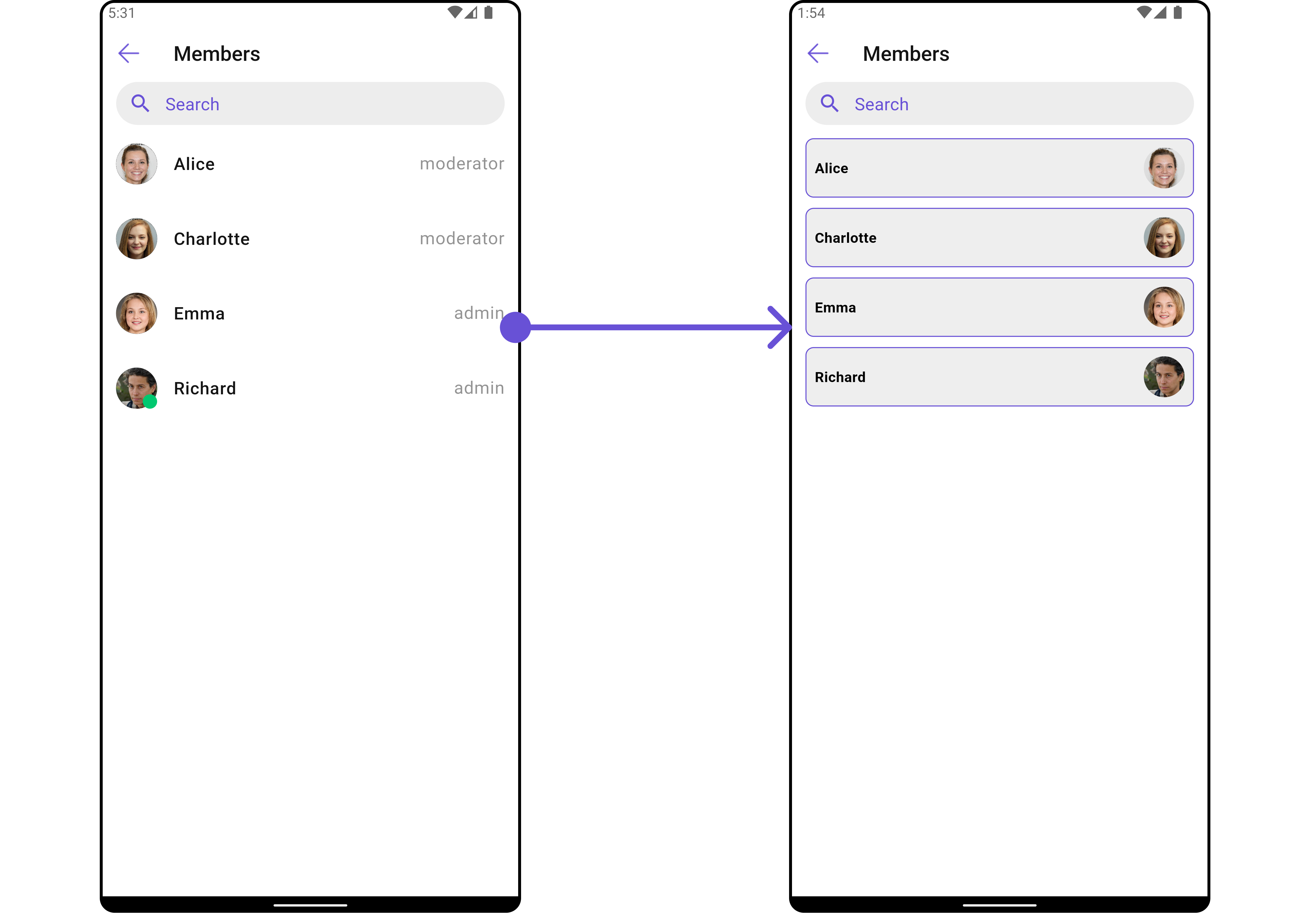
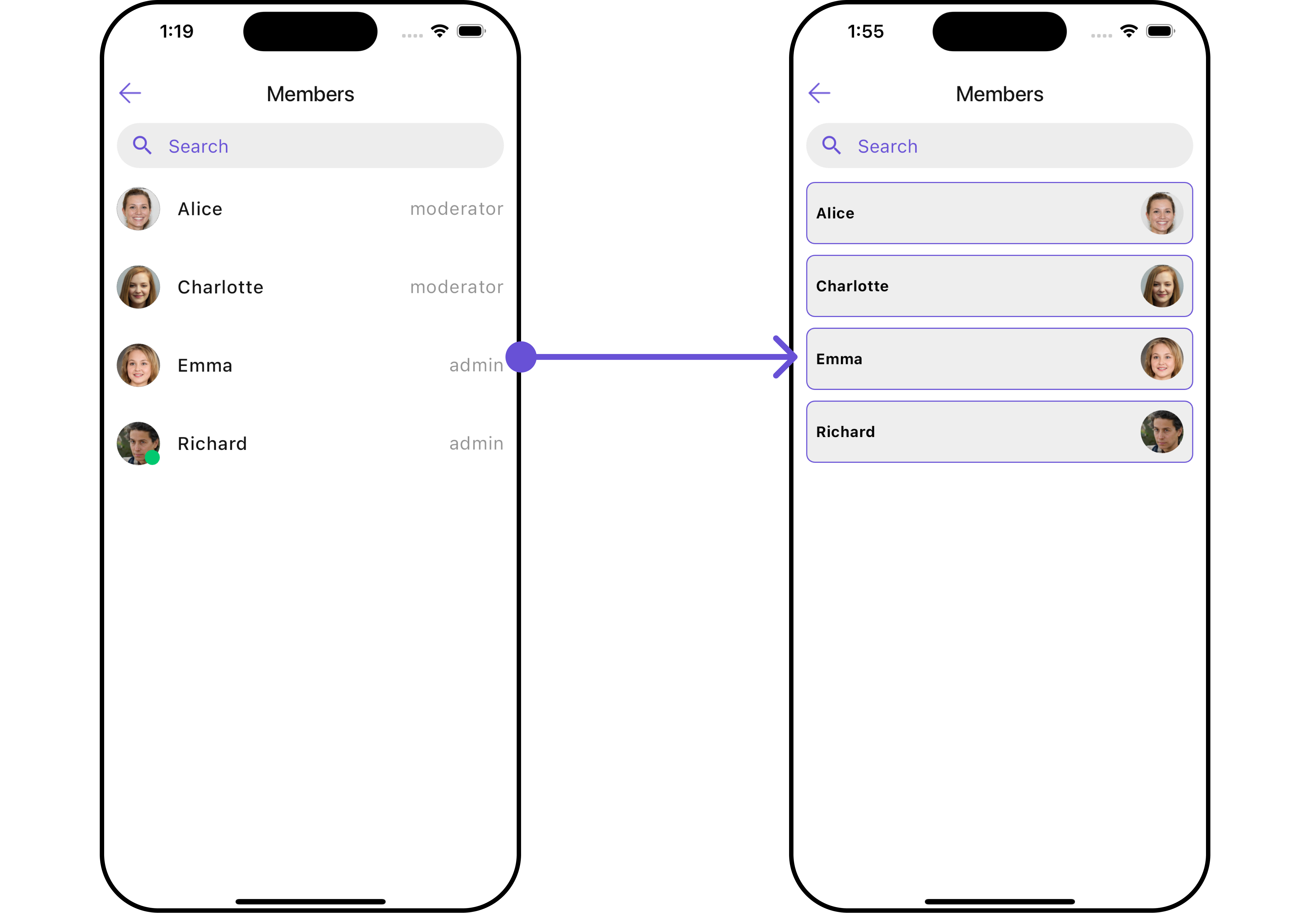
With this function, you can assign a custom ListItem to theCometChatGroupMembers Widget.
- Dart
widget
custom_list_item.dart for more complex or unique list items.
- Dart
custom_list_item.dart
- Dart
main.dart
- Android
- iOS
SubtitleView
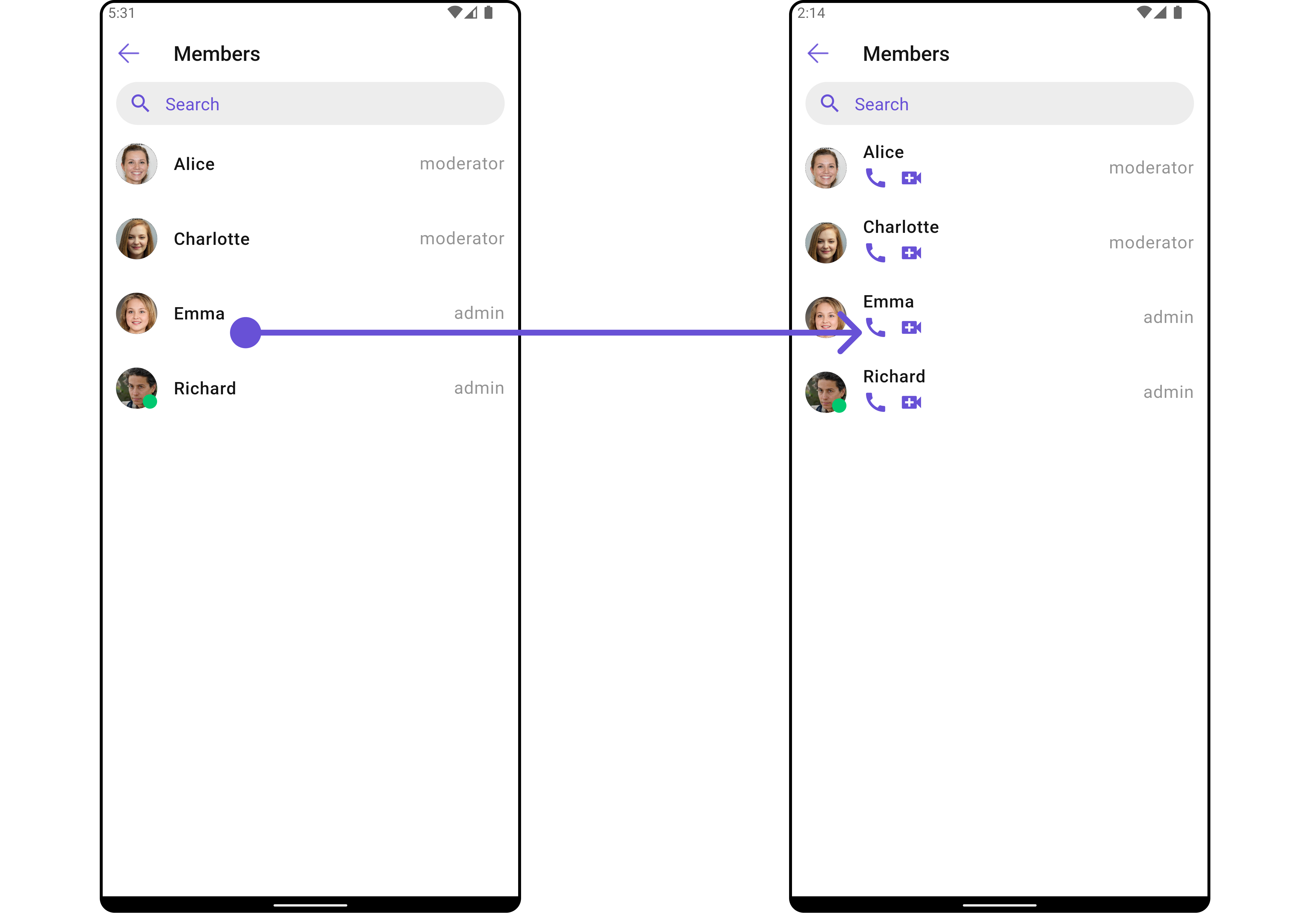
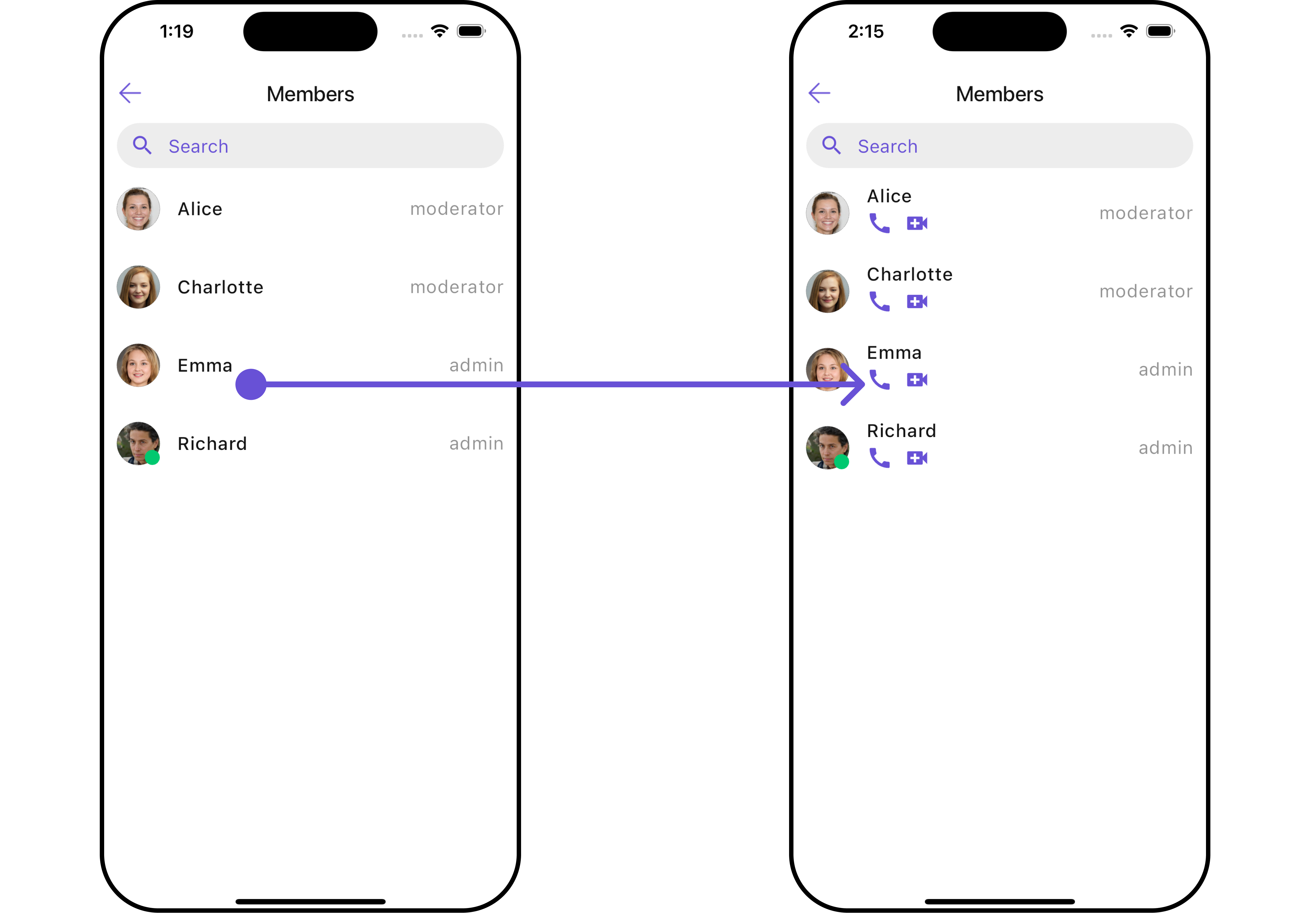
You can customize the subtitle view for each item to meet your specific preferences and needs.- Dart
widget
- Dart
main.dart
- Android
- iOS
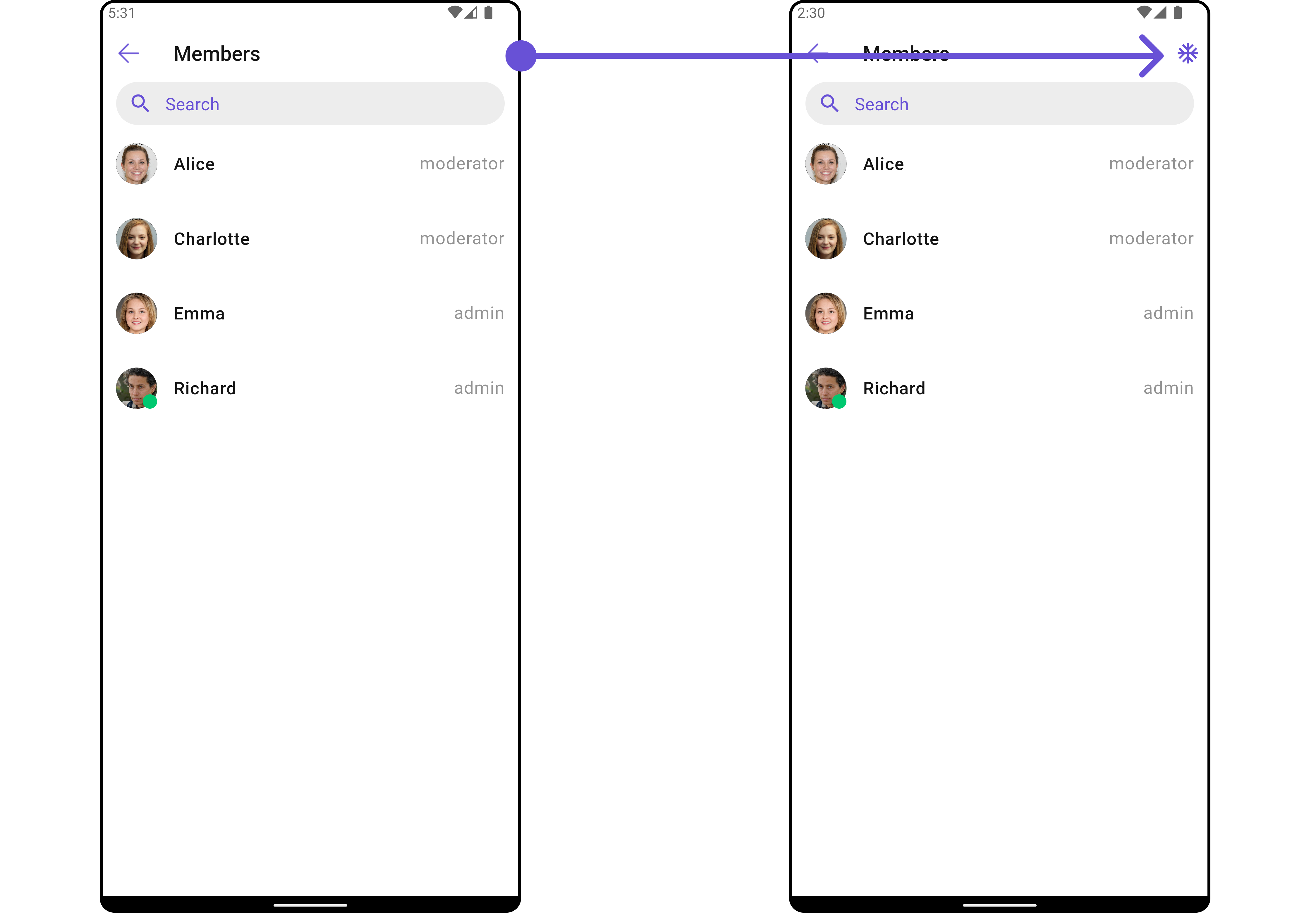
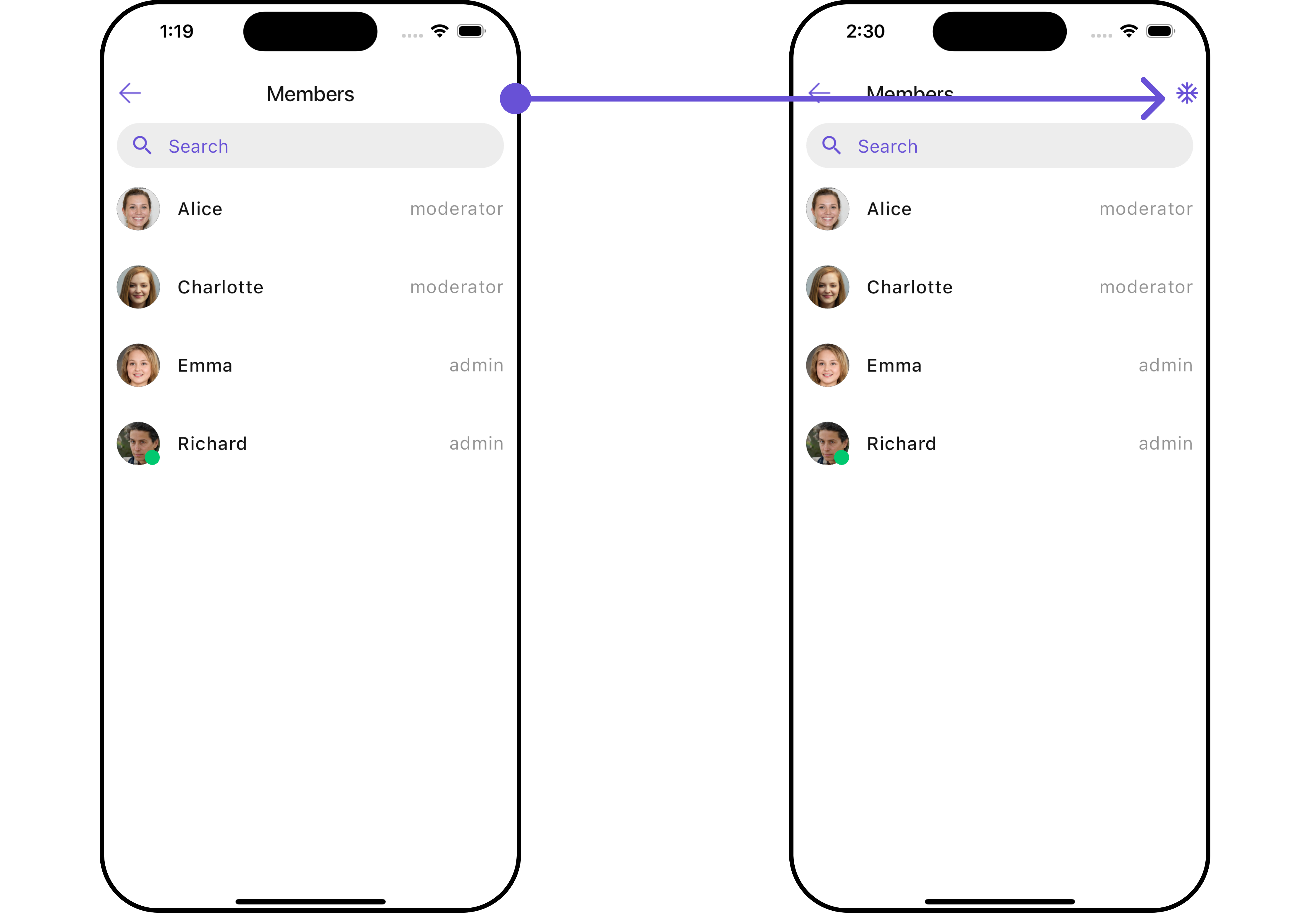
AppBarOptions
You can set the CustomappBarOptions to the CometChatGroupMembers widget.
- Dart
widget
- Dart
- Android
- iOS
TailView
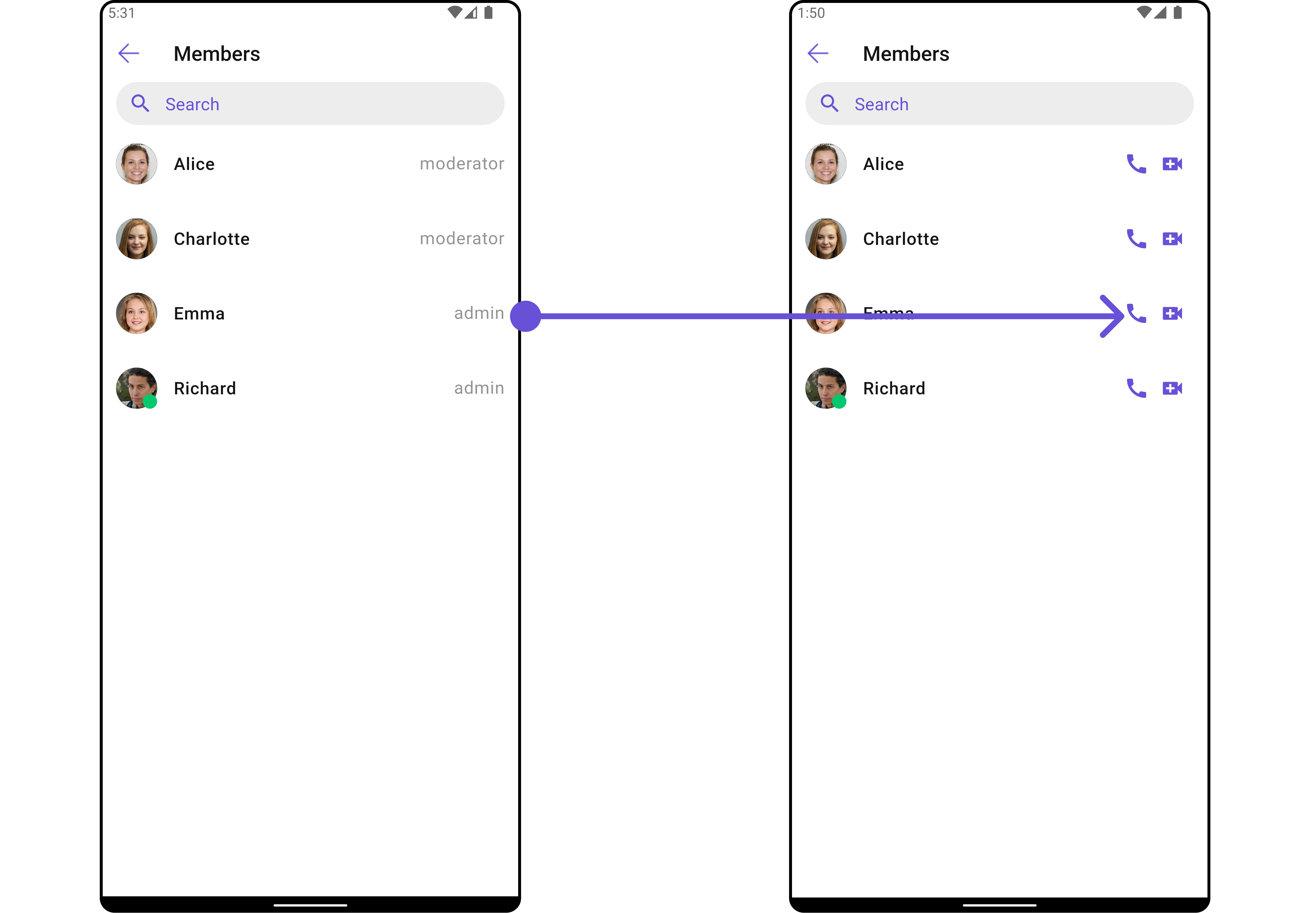
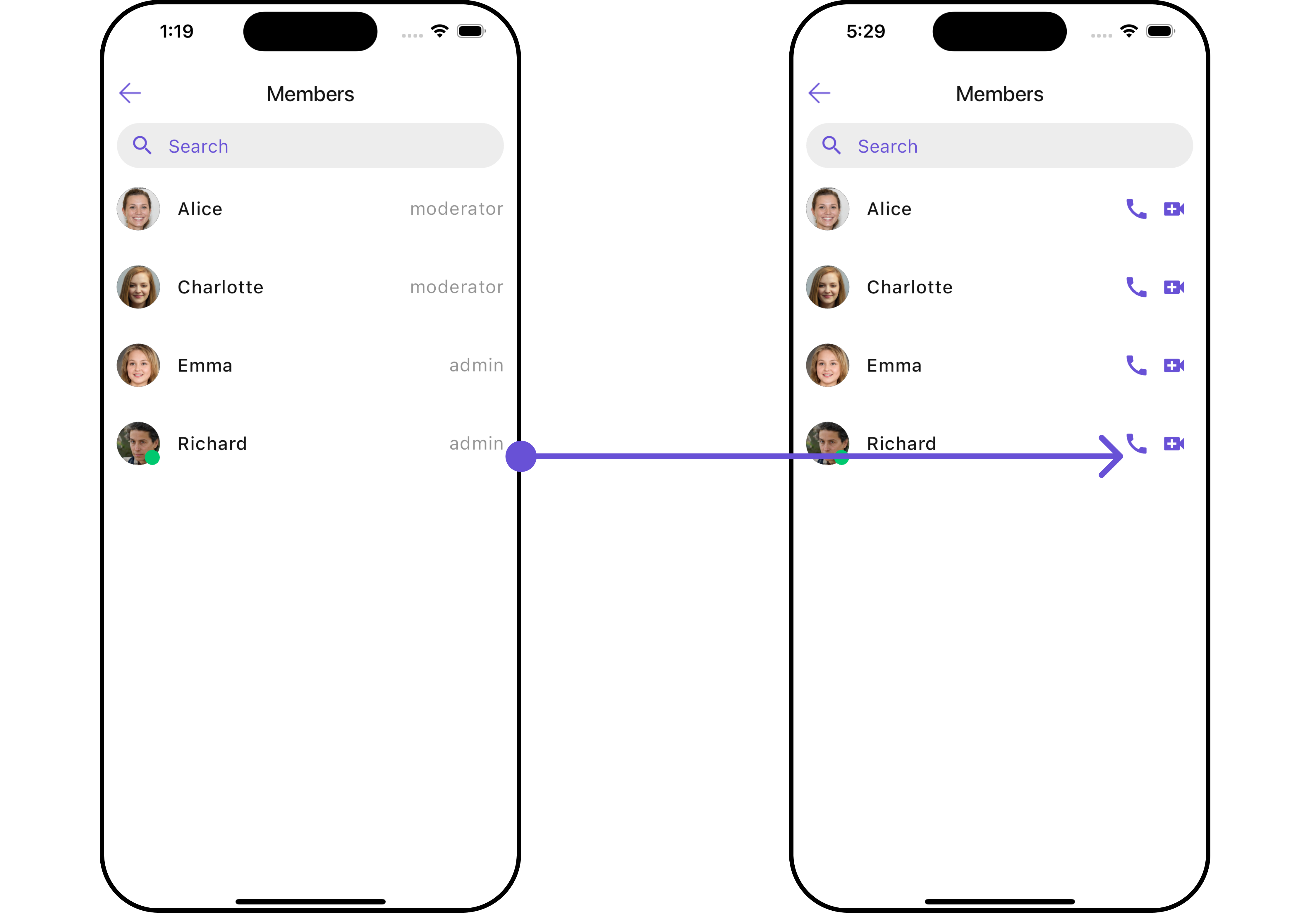
Used to generate a custom trailing widget for theCometChatGroupMembers widget. You can add a Tail widget using the following method.
- Dart
widget
- Dart
main.dart
- Android
- iOS
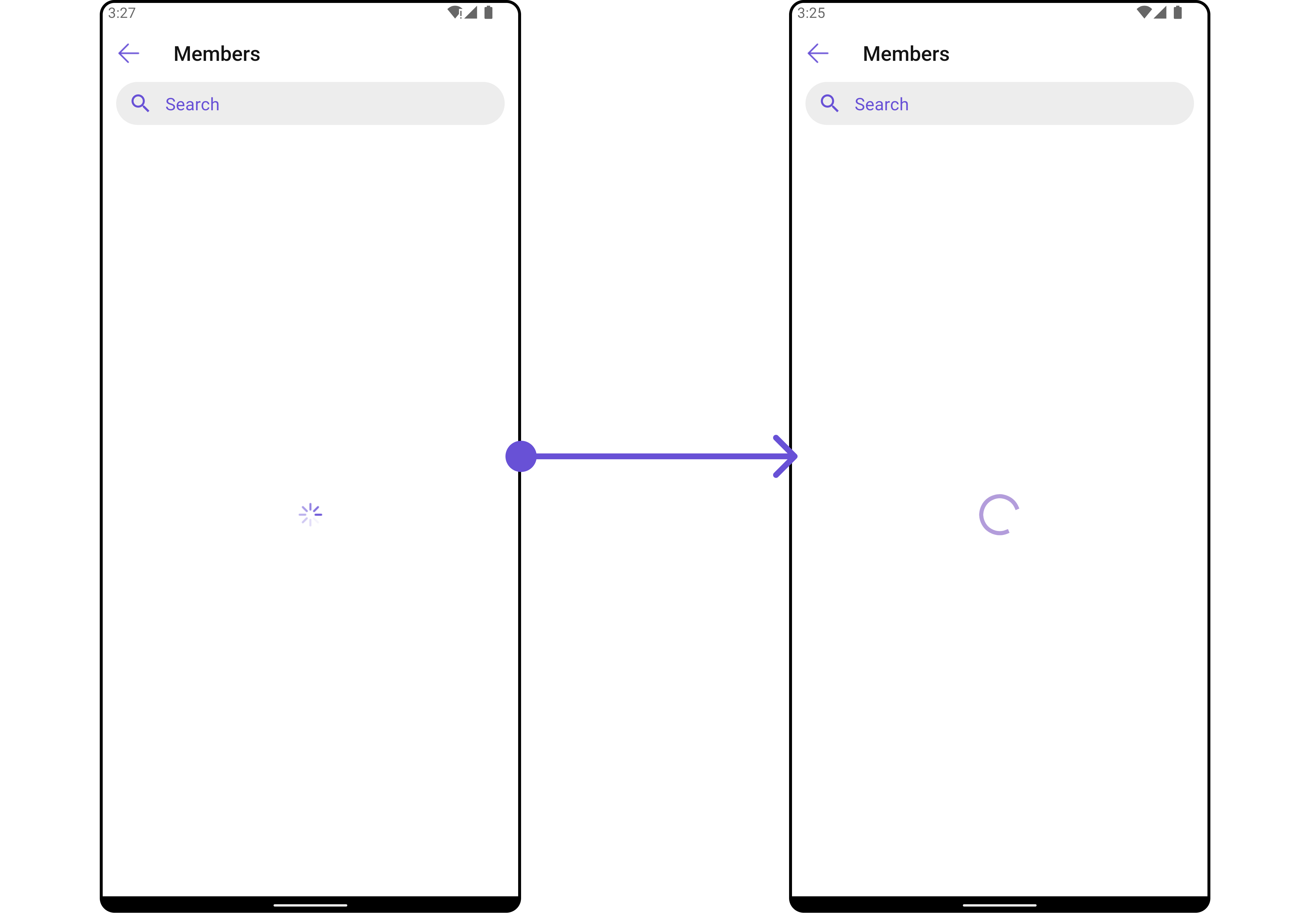
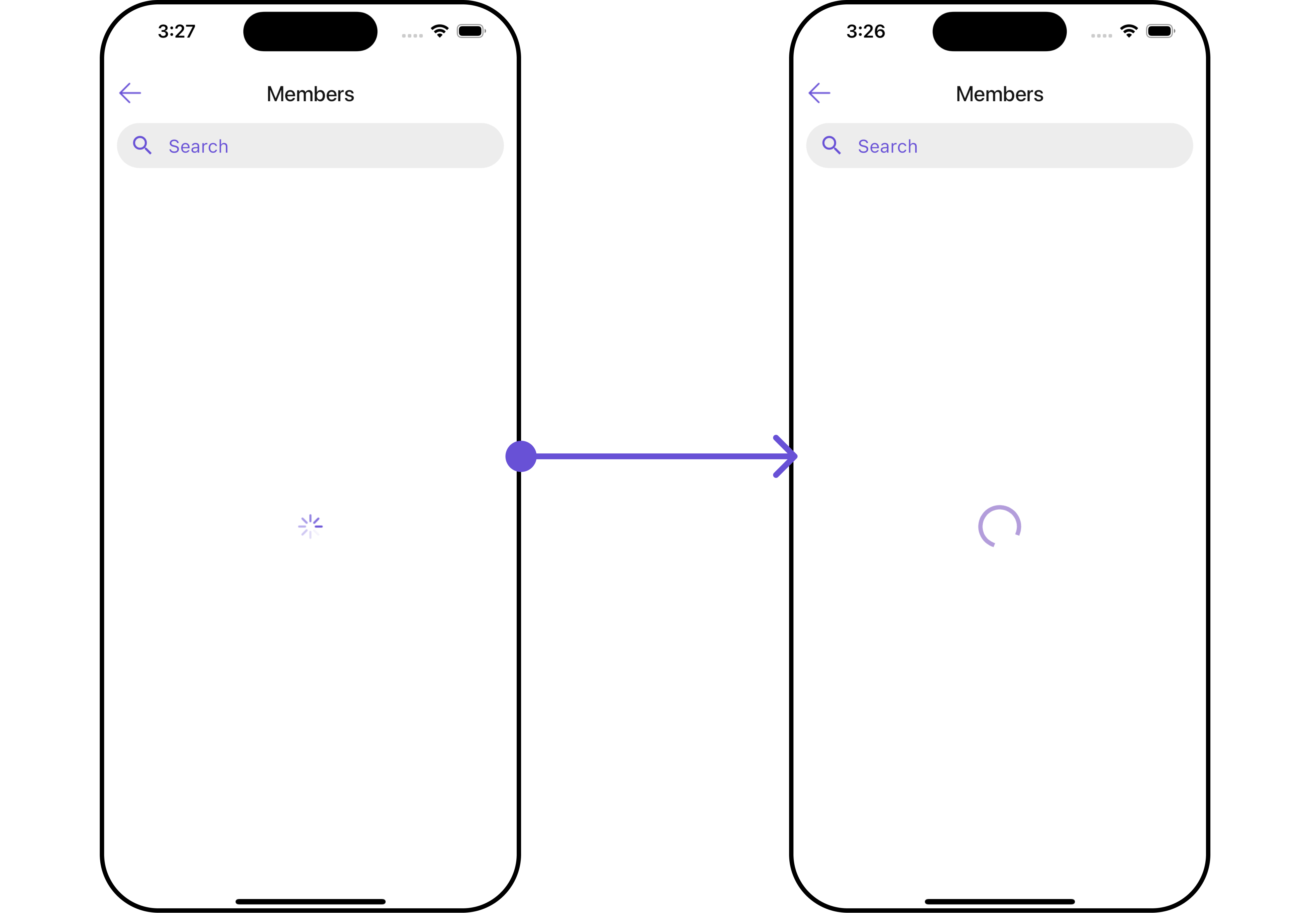
LoadingStateView
You can set a custom loader widget usingloadingStateView to match the loading UI of your app.
- Dart
widget
- Dart
main.dart
- Android
- iOS
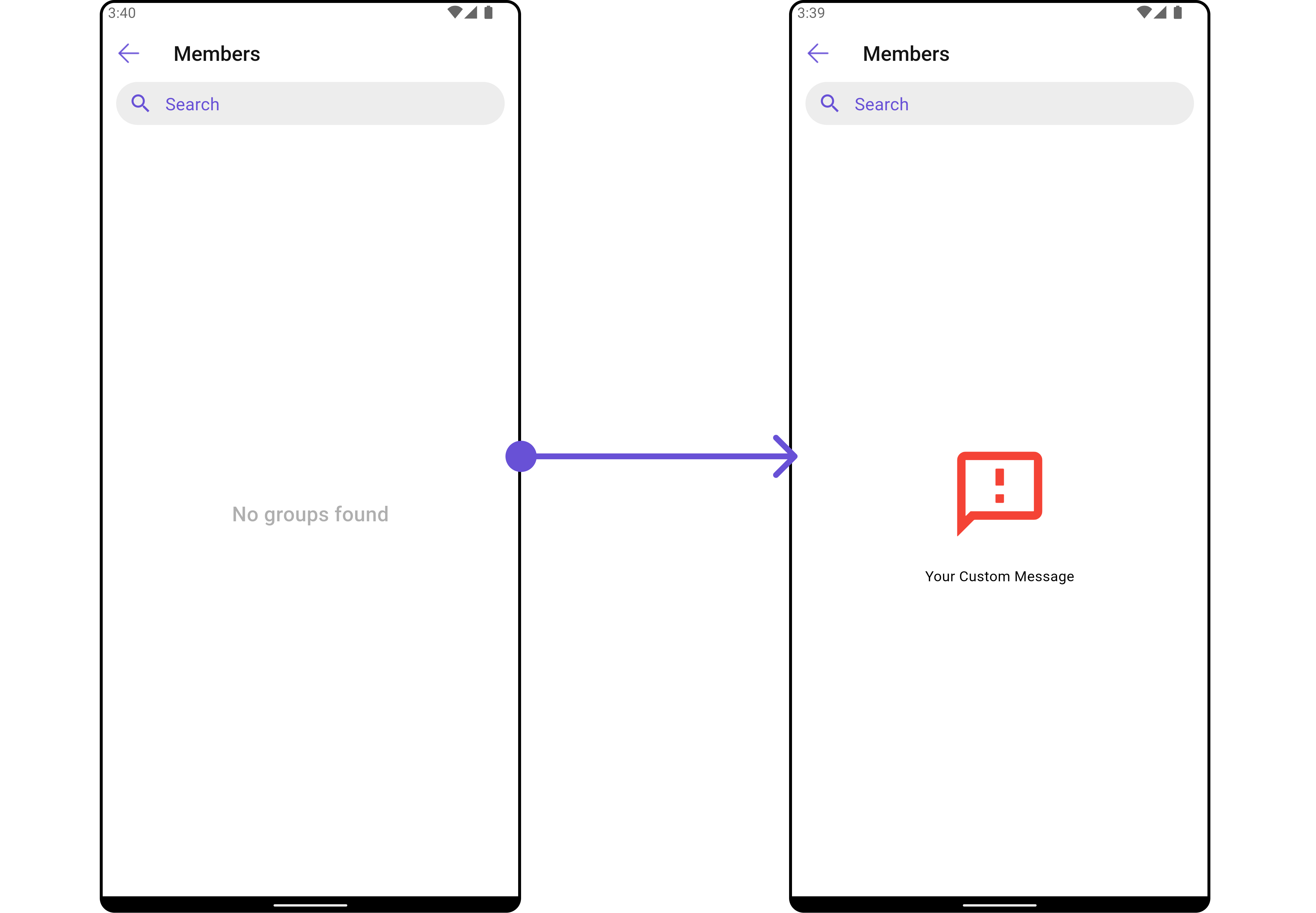
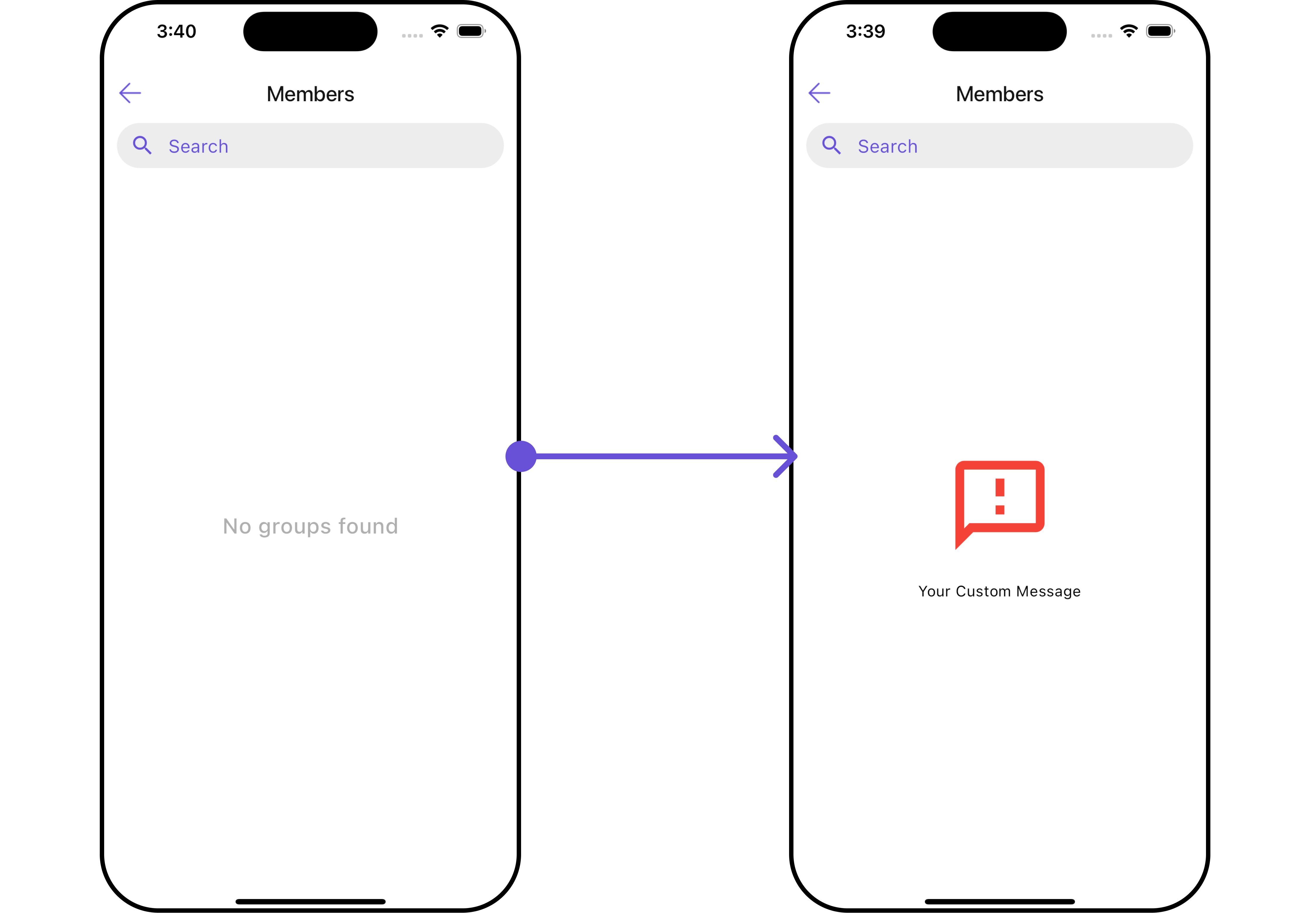
EmptyStateView
You can set a customEmptyStateView using emptyStateView to match the error UI of your app.
- Dart
widget
- Dart
main.dart
- Android
- iOS
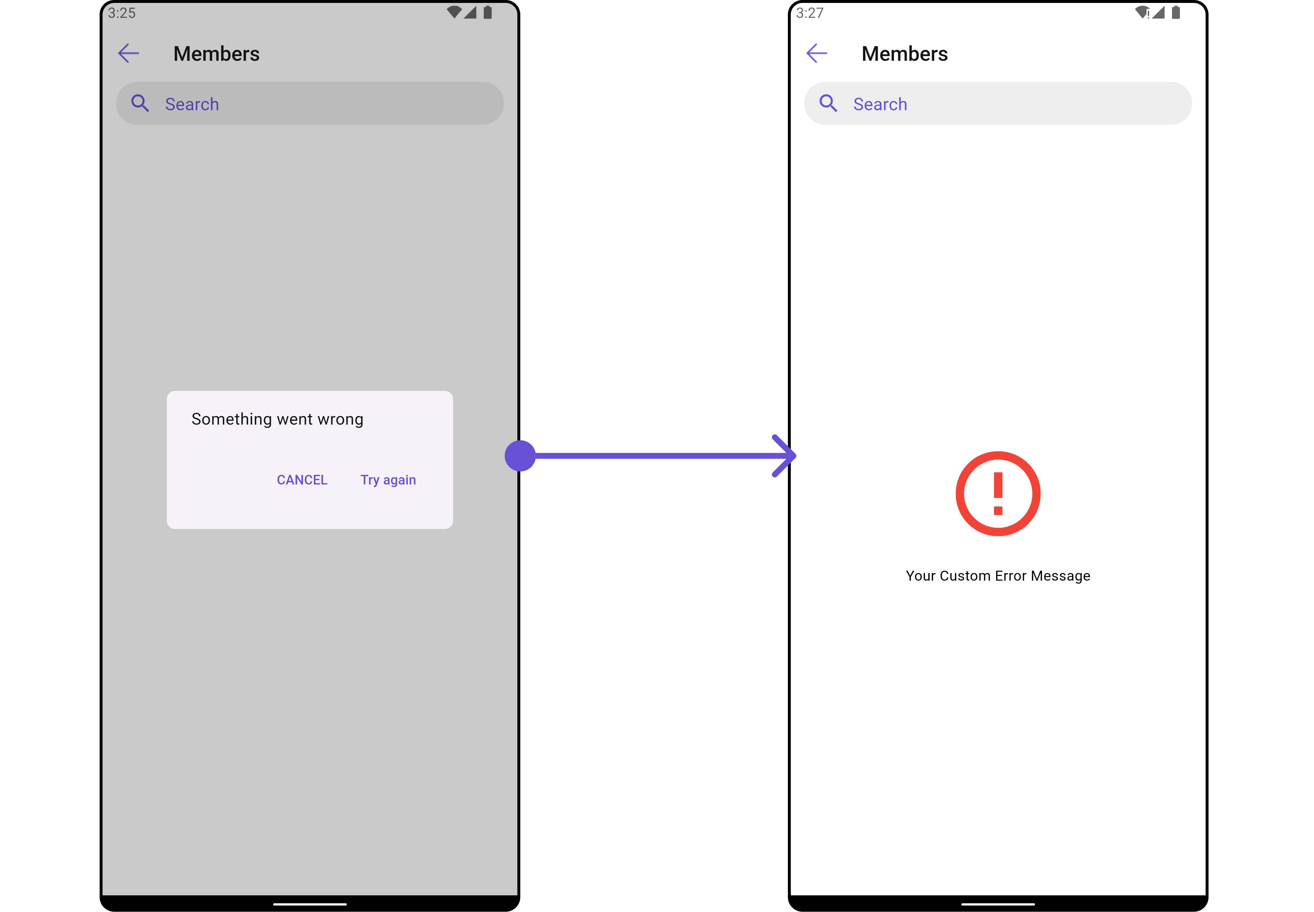
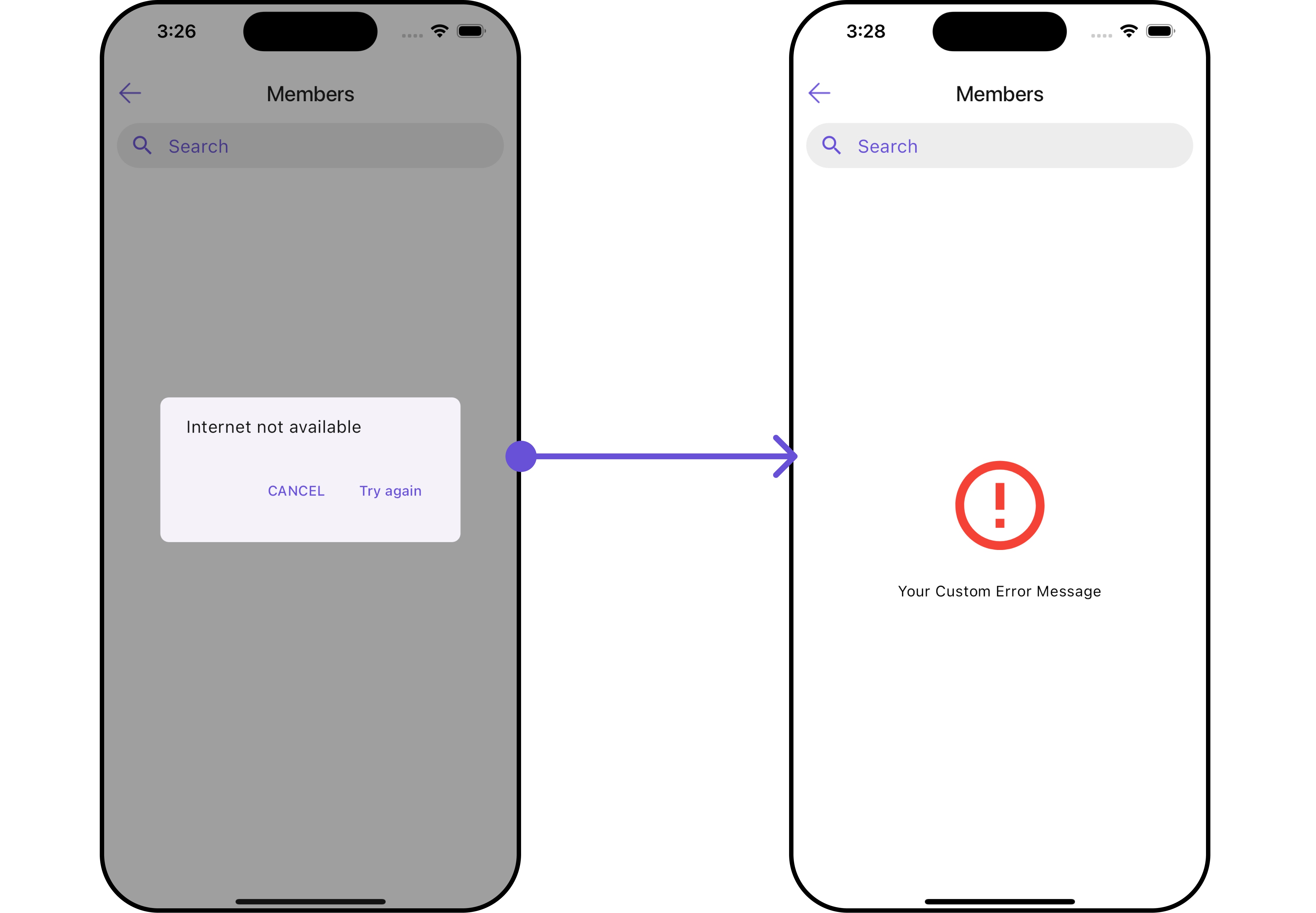
ErrorStateView
You can set a customErrorStateView using errorStateView to match the error UI of your app.
- Dart
widget
- Dart
main.dart
- Android
- iOS