

AI Agent Component Spec
AI Agent Component Spec
{
  "component": "CometChatMessageComposer",
  "package": "cometchat_chat_uikit",
  "import": "import 'package:cometchat_chat_uikit/cometchat_chat_uikit.dart';",
  "description": "A widget that enables users to write and send a variety of messages, including text, image, video, and custom messages. Features such as Live Reaction, Attachments, and Message Editing are also supported.",
  "primaryOutput": {
    "prop": "onSendButtonTap",
    "type": "Function(BuildContext, BaseMessage, PreviewMessageMode?)?"
  },
  "props": {
    "data": {
      "user": {
        "type": "User?",
        "default": "null",
        "note": "User object for the message composer (one of user or group is required)"
      },
      "group": {
        "type": "Group?",
        "default": "null",
        "note": "Group object for the message composer (one of user or group is required)"
      },
      "text": {
        "type": "String?",
        "default": "null",
        "note": "Initial text for the input field"
      },
      "parentMessageId": {
        "type": "int",
        "default": "0",
        "note": "ID of the parent message for threaded replies"
      }
    },
    "callbacks": {
      "onChange": "Function(String)?",
      "onSendButtonTap": "Function(BuildContext, BaseMessage, PreviewMessageMode?)?",
      "onError": "OnError?"
    },
    "visibility": {
      "hideVoiceRecordingButton": { "type": "bool?", "default": null },
      "hideSendButton": { "type": "bool?", "default": null },
      "hideAttachmentButton": { "type": "bool?", "default": null },
      "hideStickersButton": { "type": "bool?", "default": null },
      "disableMentions": { "type": "bool?", "default": null },
      "disableTypingEvents": { "type": "bool", "default": false }
    },
    "sound": {
      "disableSoundForMessages": { "type": "bool", "default": false },
      "customSoundForMessage": { "type": "String?", "default": null }
    },
    "viewSlots": {
      "auxiliaryButtonView": "ComposerWidgetBuilder?",
      "secondaryButtonView": "ComposerWidgetBuilder?",
      "sendButtonView": "Widget?",
      "headerView": "ComposerWidgetBuilder?",
      "footerView": "ComposerWidgetBuilder?"
    },
    "formatting": {
      "placeholderText": { "type": "String?", "default": null },
      "maxLine": { "type": "int?", "default": null },
      "padding": { "type": "EdgeInsetsGeometry?", "default": null }
    }
  },
  "events": [],
  "sdkListeners": [],
  "compositionExample": {
    "description": "CometChatMessageComposer is typically used at the bottom of a messaging screen, paired with CometChatMessageHeader and CometChatMessageList",
    "components": ["CometChatMessageHeader", "CometChatMessageList", "CometChatMessages"],
    "flow": "User types message → Composer sends message → MessageList updates"
  },
  "types": {
    "CometChatMessageComposerStyle": {
      "backgroundColor": "Color?",
      "border": "BoxBorder?",
      "borderRadius": "BorderRadiusGeometry?",
      "sendButtonIconColor": "Color?",
      "sendButtonIconBackgroundColor": "Color?",
      "textStyle": "TextStyle?",
      "placeHolderTextStyle": "TextStyle?"
    }
  }
}
Where It Fits
CometChatMessageComposer is a Widget that enables users to write and send a variety of messages, including text, image, video, and custom messages.
Features such as Live Reaction, Attachments, and Message Editing are also supported by it.

CometChatMessageComposer is comprised of the following Base Widgets:
| Base Widgets | Description |
|---|---|
| MessageInput | This provides a basic layout for the contents of this component, such as the TextField and buttons |
| ActionSheet | The ActionSheet widget presents a list of options in either a list or grid mode |
- Dart
import 'package:cometchat_chat_uikit/cometchat_chat_uikit.dart';

// CometChatMessageComposer is typically used at the bottom of a messaging screen
class MessagingScreen extends StatelessWidget {
  final User user;

  const MessagingScreen({required this.user});

  @override
  Widget build(BuildContext context) {
    return Scaffold(
      body: Column(
        children: [
          CometChatMessageHeader(user: user),
          Expanded(child: CometChatMessageList(user: user)),
          CometChatMessageComposer(user: user),
        ],
      ),
    );
  }
}
Minimal Render
The simplest way to renderCometChatMessageComposer:
- Dart
import 'package:cometchat_chat_uikit/cometchat_chat_uikit.dart';

// For a user conversation
CometChatMessageComposer(
  user: user,
)

// For a group conversation
CometChatMessageComposer(
  group: group,
)
Actions and Events
Callback Props
Component-level callbacks that fire on specific user interactions:| Callback | Signature | Fires When |
|---|---|---|
onSendButtonTap | Function(BuildContext, BaseMessage, PreviewMessageMode?)? | User taps the send button |
onChange | Function(String)? | Text in the input field changes |
onError | OnError? | An error occurs |
stateCallBack | Function(CometChatMessageComposerController)? | Controller state callback for accessing controller functions |
- Dart
CometChatMessageComposer(
  user: user,
  onSendButtonTap: (BuildContext context, BaseMessage baseMessage, PreviewMessageMode? previewMessageMode) {
    // Handle send button tap
  },
  onChange: (String? text) {
    // Handle text change
  },
  onError: (e) {
    // Handle error
  },
)
Custom View Slots
Customize the appearance ofCometChatMessageComposer by replacing default views with your own widgets.
| Slot | Signature | Replaces |
|---|---|---|
auxiliaryButtonView | ComposerWidgetBuilder? | Auxiliary button area (AI, stickers) |
secondaryButtonView | ComposerWidgetBuilder? | Secondary button area (attachment, voice) |
sendButtonView | Widget? | Send button |
headerView | ComposerWidgetBuilder? | Header section above input |
footerView | ComposerWidgetBuilder? | Footer section below input |
attachmentOptions | ComposerActionsBuilder? | Attachment options list |
Example: Custom Auxiliary Button View
- Dart
CometChatMessageComposer(
  user: user,
  auxiliaryButtonView: (context, user, group, id) {
    final existingAuxiliaryOptions = CometChatUIKit.getDataSource()
        .getAuxiliaryOptions(user, group, context, id, Color(0xFFA1A1A1));
    return Row(
      children: [
        existingAuxiliaryOptions,
        Icon(
          Icons.location_pin,
          color: Color(0xFF6852D6),
        ),
      ],
    );
  },
)

Example: Custom Secondary Button View
- Dart
CometChatMessageComposer(
  user: user,
  secondaryButtonView: (context, user, group, id) {
    return Icon(
      Icons.attach_file,
      color: Color(0xFF6852D6),
    );
  },
)

Example: Custom Send Button View
- Dart
CometChatMessageComposer(
  user: user,
  sendButtonView: IconButton(
    onPressed: () {},
    padding: EdgeInsets.all(4),
    style: IconButton.styleFrom(
      alignment: Alignment.center,
      backgroundColor: Color(0xFFEDEAFA),
      shape: RoundedRectangleBorder(
        borderRadius: BorderRadius.circular(4),
      ),
    ),
    icon: Transform.rotate(
      angle: 150,
      child: Icon(
        Icons.send,
        size: 20,
        color: Color(0xFF6852D6),
      ),
    ),
  ),
)

Example: Custom Header View
- Dart
CometChatMessageComposer(
  user: user,
  headerView: (context, user, group, id) {
    return Container(
      margin: EdgeInsets.only(bottom: 2, left: 8, right: 8),
      padding: EdgeInsets.all(8),
      decoration: BoxDecoration(
        color: Color(0xFFEDEAFA),
        borderRadius: BorderRadius.circular(8),
      ),
      child: Row(
        children: [
          Icon(Icons.volume_off, size: 20, color: Color(0xFF6852D6)),
          Text(
            "User has paused their notifications",
            style: TextStyle(fontSize: 14, fontWeight: FontWeight.w400),
          ),
        ],
      ),
    );
  },
)

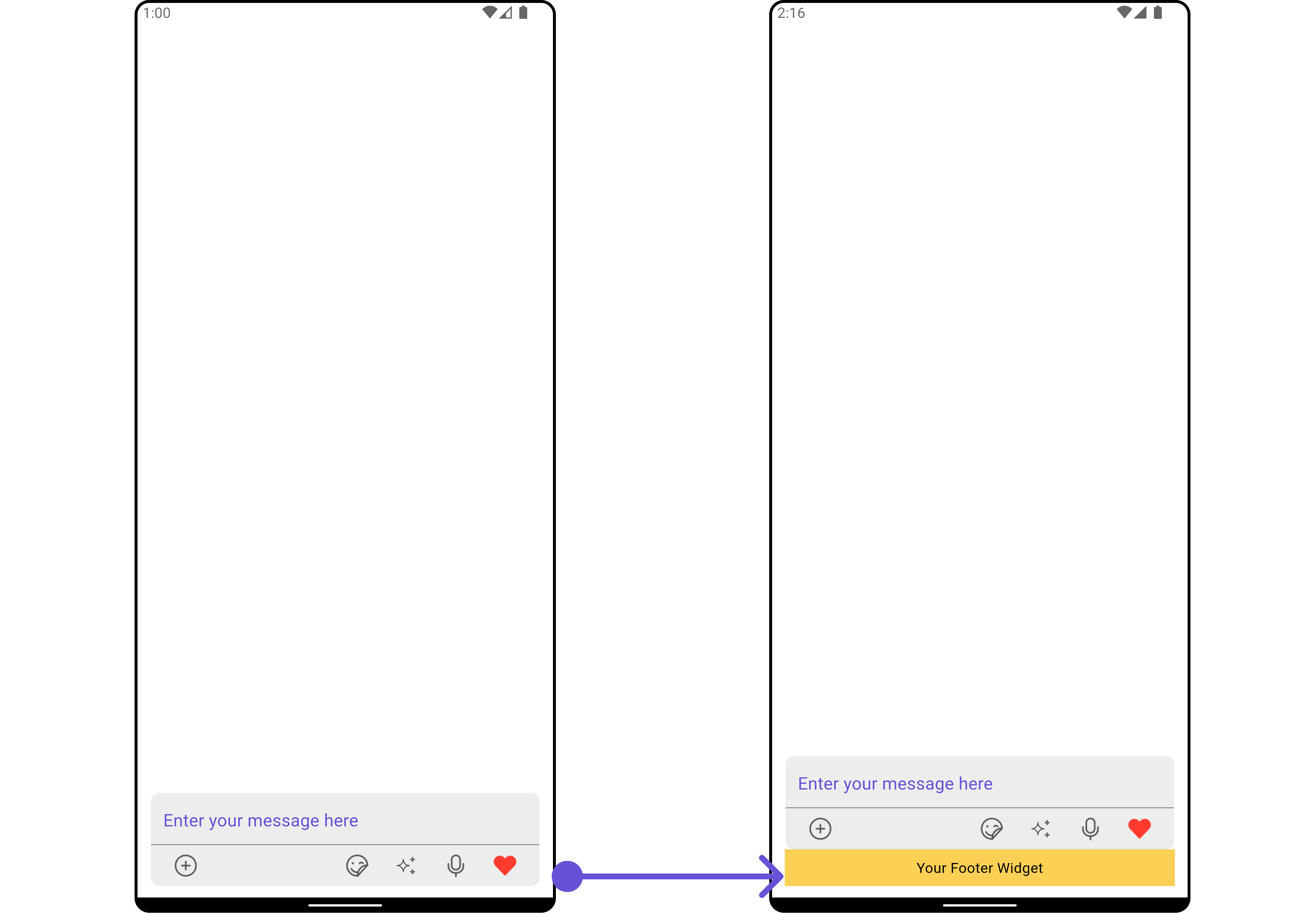
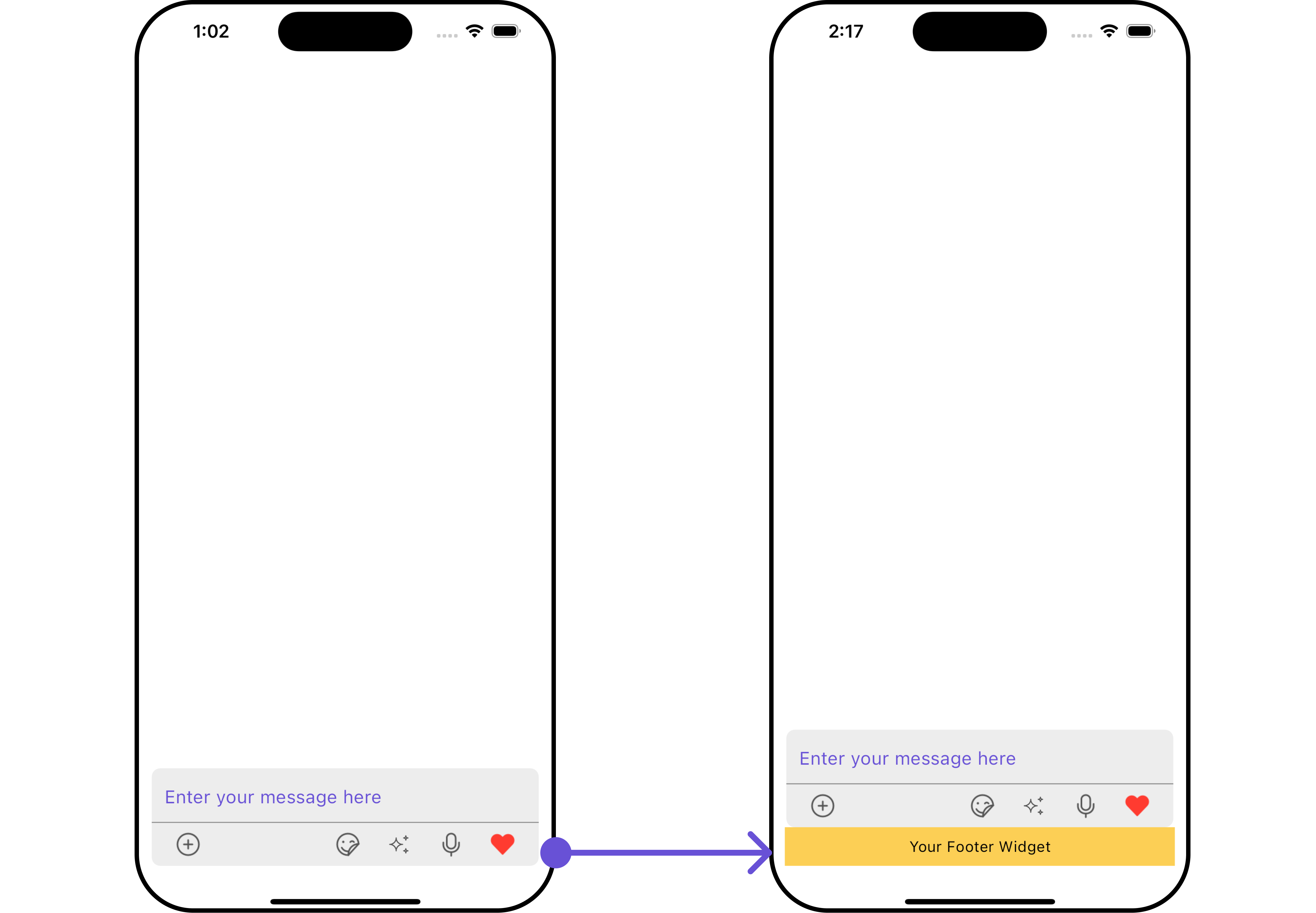
Example: Custom Footer View
- Dart
CometChatMessageComposer(
  user: user,
  footerView: (context, user, group, id) {
    return Container(
      width: MediaQuery.of(context).size.width / 1.08,
      color: Colors.yellow,
      padding: const EdgeInsets.all(8),
      child: const Center(child: Text("Your Footer Widget")),
    );
  },
)
- Android
- iOS
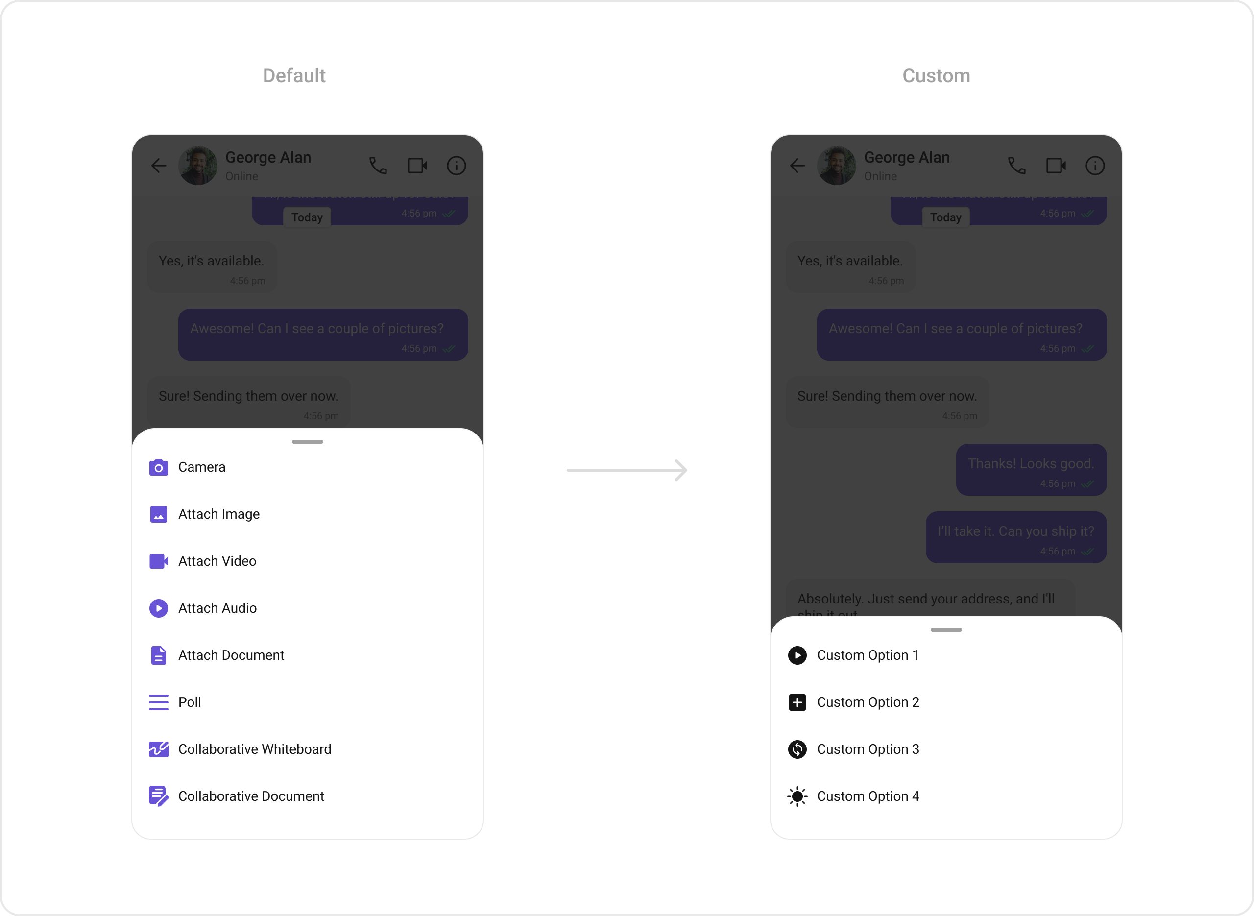
Example: Custom Attachment Options
- Dart
CometChatMessageComposer(
  user: user,
  attachmentOptions: (context, user, group, id) {
    return <CometChatMessageComposerAction>[
      CometChatMessageComposerAction(
        id: "Custom Option 1",
        title: "Custom Option 1",
        icon: Icon(Icons.play_circle, color: Colors.black),
      ),
      CometChatMessageComposerAction(
        id: "Custom Option 2",
        title: "Custom Option 2",
        icon: Icon(Icons.add_box, color: Colors.black),
      ),
    ];
  },
)
Styling
Customize the appearance ofCometChatMessageComposer using CometChatMessageComposerStyle.
Style Properties
| Property | Type | Description |
|---|---|---|
backgroundColor | Color? | Background color of the message composer |
border | BoxBorder? | Border of the message composer |
borderRadius | BorderRadiusGeometry? | Border radius of the message composer |
closeIconTint | Color? | Color for the close icon |
dividerColor | Color? | Color of the divider |
dividerHeight | double? | Height of the divider |
sendButtonIconColor | Color? | Color of the send button icon |
sendButtonIconBackgroundColor | Color? | Background color of the send button |
sendButtonBorderRadius | BorderRadiusGeometry? | Border radius of the send button |
secondaryButtonIconColor | Color? | Color of the secondary button icon |
secondaryButtonIconBackgroundColor | Color? | Background color of the secondary button |
secondaryButtonBorderRadius | BorderRadiusGeometry? | Border radius of the secondary button |
auxiliaryButtonIconColor | Color? | Color of the auxiliary button icon |
auxiliaryButtonIconBackgroundColor | Color? | Background color of the auxiliary button |
auxiliaryButtonBorderRadius | BorderRadiusGeometry? | Border radius of the auxiliary button |
textStyle | TextStyle? | Style of the text |
textColor | Color? | Color of the text |
placeHolderTextStyle | TextStyle? | Style of the placeholder text |
placeHolderTextColor | Color? | Color of the placeholder text |
filledColor | Color? | Background color of the text input |
mentionsStyle | CometChatMentionsStyle? | Style for mentions |
mediaRecorderStyle | CometChatMediaRecorderStyle? | Style for media recorder |
aiOptionStyle | AIOptionsStyle? | Style for AI options |
aiOptionSheetStyle | CometChatAiOptionSheetStyle? | Style for AI option sheet |
attachmentOptionSheetStyle | CometChatAttachmentOptionSheetStyle? | Style for attachment option sheet |
suggestionListStyle | CometChatSuggestionListStyle? | Style for suggestion list |
messagePreviewStyle | CometChatMessagePreviewStyle? | Style for message preview |
Example: Custom Styling
- Dart
CometChatMessageComposer(
  user: user,
  messageComposerStyle: CometChatMessageComposerStyle(
    sendButtonIconBackgroundColor: Color(0xFFF76808),
    secondaryButtonIconColor: Color(0xFFF76808),
    auxiliaryButtonIconColor: Color(0xFFF76808),
  ),
)

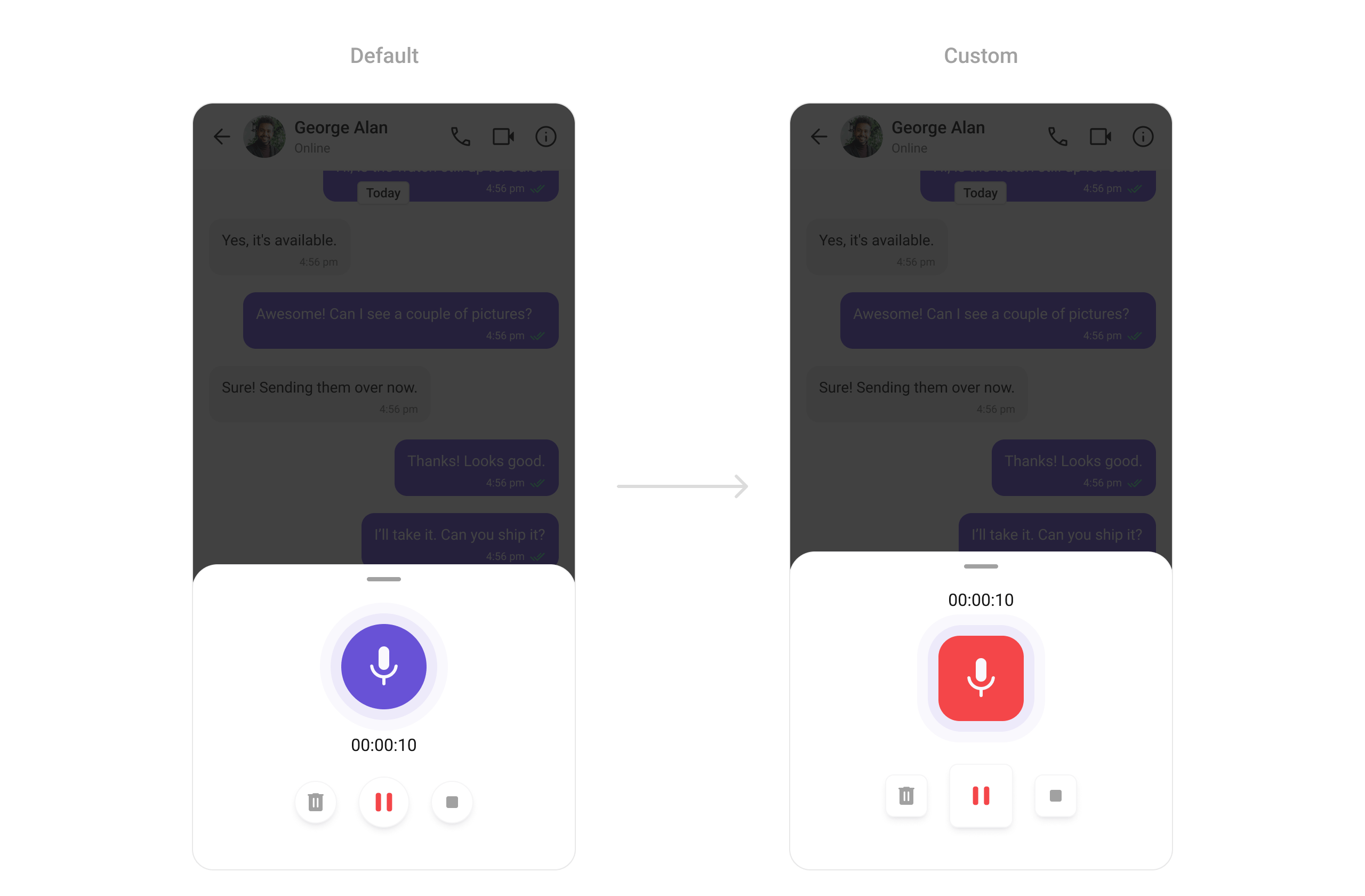
Example: Custom Media Recorder Style
- Dart
CometChatMessageComposer(
  user: user,
  messageComposerStyle: CometChatMessageComposerStyle(
    mediaRecorderStyle: CometChatMediaRecorderStyle(
      recordIndicatorBackgroundColor: Color(0xFFF44649),
      recordIndicatorBorderRadius: BorderRadius.circular(20),
      pauseButtonBorderRadius: BorderRadius.circular(8),
      deleteButtonBorderRadius: BorderRadius.circular(8),
      stopButtonBorderRadius: BorderRadius.circular(8),
    ),
  ),
)
Example: Custom AI Options Style
- Dart
CometChatMessageComposer(
  user: user,
  messageComposerStyle: CometChatMessageComposerStyle(
    aiOptionStyle: AIOptionsStyle(
      backgroundColor: Color(0xFFE4EBF5),
      border: Border.all(width: 3, color: Colors.red),
    ),
  ),
)
Advanced
Text Formatters
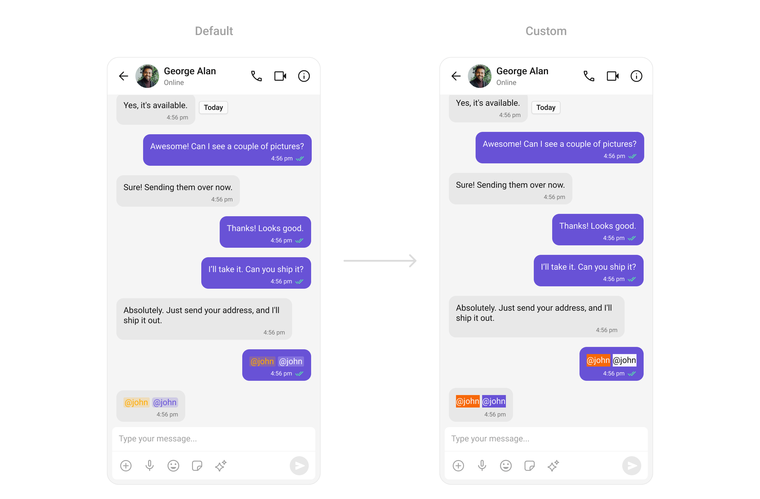
Assigns the list of text formatters. To configure the existing Mentions look and feel check out CometChatMentionsFormatter.- Dart
CometChatMessageComposer(
  user: user,
  textFormatters: [
    CometChatMentionsFormatter(
      style: CometChatMentionsStyle(
        mentionSelfTextBackgroundColor: Color(0xFFF76808),
        mentionTextBackgroundColor: Colors.white,
        mentionTextColor: Colors.black,
        mentionSelfTextColor: Colors.white,
      ),
    ),
  ],
)
Props Reference
| Prop | Type | Default | Description |
|---|---|---|---|
user | User? | null | User object for the message composer |
group | Group? | null | Group object for the message composer |
messageComposerStyle | CometChatMessageComposerStyle? | - | Sets style for the message composer |
placeholderText | String? | - | Hint text for the input field |
text | String? | - | Initial text for the input field |
onChange | Function(String)? | - | Callback triggered when text changes |
textEditingController | TextEditingController? | - | Controls the state of the text field |
maxLine | int? | - | Maximum number of lines allowed |
disableMentions | bool? | null | Disables mentions in the composer |
disableTypingEvents | bool | false | Disables typing events |
disableSoundForMessages | bool | false | Disables sound for sent messages |
customSoundForMessage | String? | - | URL for custom sound |
customSoundForMessagePackage | String? | - | Package name for custom sound asset |
parentMessageId | int | 0 | ID of the parent message |
padding | EdgeInsetsGeometry? | - | Sets padding for the message composer |
messageInputPadding | EdgeInsetsGeometry? | - | Sets padding for the message input field |
sendButtonView | Widget? | - | Custom send button widget |
attachmentIcon | Widget? | - | Custom attachment icon |
attachmentIconURL | String? | - | Path of the icon to show in the attachments button |
voiceRecordingIcon | Widget? | - | Custom voice recording icon |
aiIcon | Widget? | - | Custom AI button icon |
aiIconURL | String? | - | Path of the icon to show in the AI button |
aiIconPackageName | String? | - | Package name for AI icon asset |
auxiliaryButtonView | ComposerWidgetBuilder? | - | UI component for auxiliary button |
secondaryButtonView | ComposerWidgetBuilder? | - | UI component for secondary button |
auxiliaryButtonsAlignment | AuxiliaryButtonsAlignment? | - | Controls position of auxiliary button view |
hideVoiceRecordingButton | bool? | null | Hide/display voice recording button |
attachmentOptions | ComposerActionsBuilder? | - | Provides options for file attachments |
hideAttachmentButton | bool? | null | Hide/display attachment button |
hideImageAttachmentOption | bool? | null | Hide/display image attachment option |
hideVideoAttachmentOption | bool? | null | Hide/display video attachment option |
hideAudioAttachmentOption | bool? | null | Hide/display audio attachment option |
hideFileAttachmentOption | bool? | null | Hide/display file attachment option |
hidePollsOption | bool? | null | Hide/display polls option |
hideCollaborativeDocumentOption | bool? | null | Hide/display collaborative document option |
hideCollaborativeWhiteboardOption | bool? | null | Hide/display collaborative whiteboard option |
hideTakePhotoOption | bool? | null | Hide/display take photo option |
onSendButtonTap | Function(...)? | - | Callback when send button is tapped |
onError | OnError? | - | Callback to handle errors |
hideSendButton | bool? | null | Hide/display the send button |
hideStickersButton | bool? | null | Hide/display the sticker button |
sendButtonIcon | Widget? | - | Custom send button icon |
recorderStartButtonIcon | Widget? | - | Custom icon for media recorder start button |
recorderPauseButtonIcon | Widget? | - | Custom icon for media recorder pause button |
recorderDeleteButtonIcon | Widget? | - | Custom icon for media recorder delete button |
recorderStopButtonIcon | Widget? | - | Custom icon for media recorder stop button |
recorderSendButtonIcon | Widget? | - | Custom icon for media recorder send button |
disableMentionAll | bool | false | Disables @all mentions in groups |
mentionAllLabel | String? | - | Custom label for group mentions |
mentionAllLabelId | String? | - | Custom label ID for group mentions |
headerView | ComposerWidgetBuilder? | - | Custom header view |
footerView | ComposerWidgetBuilder? | - | Custom footer view |
textFormatters | List<CometChatTextFormatter>? | - | List of text formatters |
stateCallBack | Function(CometChatMessageComposerController)? | - | Callback to access controller functions |
Message Header
Display user or group details in the header
Message List
Display messages in a conversation
Mentions Formatter
Configure mentions look and feel
Theming
Learn how to customize the look and feel