

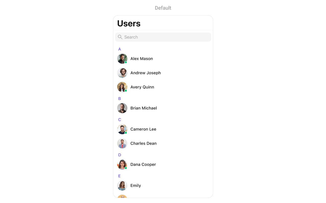
CometChatUsers component displays a searchable list of all available users. It shows user names, avatars, and online/offline status indicators. Users can be filtered, searched, and selected for starting conversations.
AI Integration Quick Reference
AI Integration Quick Reference
{
  "component": "CometChatUsers",
  "package": "CometChatUIKitSwift",
  "import": "import CometChatUIKitSwift\nimport CometChatSDK",
  "description": "Displays a searchable list of all available users with avatars, names, and online/offline status indicators.",
  "inherits": "UIViewController",
  "primaryOutput": {
    "callback": "onItemClick",
    "type": "(User, IndexPath) -> Void"
  },
  "props": {
    "data": {
      "usersRequestBuilder": {
        "type": "UsersRequest.UsersRequestBuilder?",
        "default": "nil",
        "note": "Custom request builder for filtering users"
      },
      "searchRequestBuilder": {
        "type": "UsersRequest.UsersRequestBuilder?",
        "default": "nil",
        "note": "Custom request builder for search"
      }
    },
    "callbacks": {
      "onItemClick": "(User, IndexPath) -> Void",
      "onItemLongClick": "(User, IndexPath) -> Void",
      "onBack": "() -> Void",
      "onSelection": "([User]) -> Void",
      "onSelectedItemProceed": "([User]) -> Void",
      "onError": "(CometChatException) -> Void",
      "onEmpty": "() -> Void",
      "onLoad": "([[User]]) -> Void"
    },
    "visibility": {
      "hideSearch": { "type": "Bool", "default": false },
      "hideNavigationBar": { "type": "Bool", "default": false },
      "hideBackButton": { "type": "Bool", "default": false },
      "hideUserStatus": { "type": "Bool", "default": false },
      "hideSectionHeader": { "type": "Bool", "default": false },
      "hideErrorView": { "type": "Bool", "default": false },
      "hideLoadingState": { "type": "Bool", "default": false }
    },
    "selection": {
      "selectionMode": { "type": "SelectionMode", "default": ".none" },
      "selectionLimit": { "type": "Int", "default": 0, "note": "0 means unlimited" },
      "selectedCellCount": { "type": "Int", "default": 0, "note": "Read-only count of selected users" }
    },
    "styling": {
      "avatarStyle": { "type": "AvatarStyle", "default": "AvatarStyle()" },
      "statusIndicatorStyle": { "type": "StatusIndicatorStyle", "default": "StatusIndicatorStyle()" }
    },
    "viewSlots": {
      "listItemView": "(User) -> UIView",
      "leadingView": "(User) -> UIView",
      "titleView": "(User?) -> UIView",
      "subtitleView": "(User?) -> UIView",
      "trailingView": "(User?) -> UIView",
      "emptyStateView": "() -> UIView",
      "errorStateView": "() -> UIView",
      "loadingStateView": "() -> UIView"
    }
  },
  "methods": {
    "swipeActions": {
      "set(options:)": "((User?) -> [CometChatUserOption])? - Sets custom swipe actions",
      "add(options:)": "((User?) -> [CometChatUserOption])? - Adds additional swipe actions"
    },
    "dataManipulation": {
      "add(user:)": "User - Adds a user to the list",
      "update(user:)": "User - Updates a user in the list",
      "remove(user:)": "User - Removes a user from the list",
      "getSelectedUsers()": "[User] - Returns selected users"
    }
  },
  "events": [
    {
      "name": "ccUserBlocked",
      "payload": "User",
      "description": "Fires when a user is blocked"
    },
    {
      "name": "ccUserUnblocked",
      "payload": "User",
      "description": "Fires when a user is unblocked"
    }
  ],
  "sdkListeners": [
    "onUserOnline",
    "onUserOffline"
  ],
  "compositionExample": {
    "description": "Users list for starting new conversations",
    "components": ["CometChatUsers", "CometChatMessages"],
    "flow": "User taps on a user → onItemClick fires → Navigate to CometChatMessages with selected user"
  },
  "types": {
    "User": {
      "uid": "String",
      "name": "String",
      "avatar": "String?",
      "status": "UserStatus",
      "role": "String?"
    },
    "UserStatus": {
      "online": "User is currently online",
      "offline": "User is currently offline"
    }
  }
}
| Field | Value |
|---|---|
| Component | CometChatUsers |
| Package | CometChatUIKitSwift |
| Inherits | UIViewController |
Where It Fits
CometChatUsers displays all available users for starting new conversations. It’s typically used as a standalone screen or within a tab view controller.
import UIKit
import CometChatUIKitSwift
import CometChatSDK

class UsersViewController: UIViewController {

    override func viewDidLoad() {
        super.viewDidLoad()
        setupUsers()
    }

    private func setupUsers() {
        let usersController = CometChatUsers()

        // Handle user selection - start a conversation
        usersController.set(onItemClick: { [weak self] user, indexPath in
            self?.startConversation(with: user)
        })

        let navController = UINavigationController(rootViewController: usersController)
        present(navController, animated: true)
    }

    private func startConversation(with user: User) {
        let messagesVC = CometChatMessages()
        messagesVC.set(user: user)
        navigationController?.pushViewController(messagesVC, animated: true)
    }
}
Minimal Render
import CometChatUIKitSwift

let users = CometChatUsers()
let navController = UINavigationController(rootViewController: users)
present(navController, animated: true)
Filtering
UseUsersRequest.UsersRequestBuilder to filter which users appear in the list. The builder pattern allows chaining multiple filter conditions.
import CometChatUIKitSwift
import CometChatSDK

// Create a custom request builder
let usersRequestBuilder = UsersRequest.UsersRequestBuilder(limit: 30)
    .friendsOnly(true)

let users = CometChatUsers(usersRequestBuilder: usersRequestBuilder)
Filter Recipes
| Recipe | Code |
|---|---|
| Friends only | .friendsOnly(true) |
| Online users only | .set(status: .online) |
| Search by name | .set(searchKeyword: "John") |
| Filter by role | .set(roles: ["admin", "moderator"]) |
| Filter by tags | .set(tags: ["premium"]) |
| Hide blocked users | .hideBlockedUsers(true) |
| Limit results | UsersRequestBuilder(limit: 20) |
| Specific UIDs | .set(UIDs: ["user1", "user2"]) |
Actions and Events
Callback Props
onItemClick
Fires when a user taps on a user in the list. Use this to start a conversation.import CometChatUIKitSwift
import CometChatSDK
let users = CometChatUsers()
users.set(onItemClick: { [weak self] user, indexPath in
guard let self = self else { return }
let messagesVC = CometChatMessages()
messagesVC.set(user: user)
self.navigationController?.pushViewController(messagesVC, animated: true)
})
onItemLongClick
Fires when a user long-presses on a user. Use this to show additional options.import CometChatUIKitSwift
import CometChatSDK
let users = CometChatUsers()
users.set(onItemLongClick: { [weak self] user, indexPath in
guard let self = self else { return }
let alert = UIAlertController(title: user.name, message: nil, preferredStyle: .actionSheet)
alert.addAction(UIAlertAction(title: "View Profile", style: .default) { _ in
// View profile
})
alert.addAction(UIAlertAction(title: "Block User", style: .destructive) { _ in
// Block user
})
alert.addAction(UIAlertAction(title: "Cancel", style: .cancel))
self.present(alert, animated: true)
})
onBack
Fires when the back button is pressed.import CometChatUIKitSwift
let users = CometChatUsers()
users.set(onBack: { [weak self] in
self?.navigationController?.popViewController(animated: true)
})
onSelection
Fires when users are selected in selection mode.import CometChatUIKitSwift
import CometChatSDK
let users = CometChatUsers()
users.selectionMode = .multiple
users.set(onSelection: { [weak self] selectedUsers in
print("Selected \(selectedUsers.count) users")
})
onError
Fires when an error occurs while loading users.import CometChatUIKitSwift
let users = CometChatUsers()
users.set(onError: { error in
print("Error loading users: \(error.errorDescription)")
})
onEmpty
Fires when the user list is empty.import CometChatUIKitSwift
let users = CometChatUsers()
users.set(onEmpty: {
print("No users found")
})
onLoad
Fires when users are successfully loaded. The callback receives a nested array where each inner array represents a section of users (grouped alphabetically).import CometChatUIKitSwift
import CometChatSDK
let users = CometChatUsers()
users.set(onLoad: { userSections in
let totalUsers = userSections.flatMap { $0 }.count
print("Loaded \(totalUsers) users across \(userSections.count) sections")
})
Actions Reference
| Method | Description | Example |
|---|---|---|
set(onItemClick:) | Triggered when a user is tapped | Start conversation |
set(onItemLongClick:) | Triggered on long press | Show options menu |
set(onBack:) | Triggered when back button is pressed | Custom navigation |
set(onSelection:) | Triggered in selection mode | Multi-select users |
set(onError:) | Triggered when an error occurs | Show error alert |
set(onEmpty:) | Triggered when list is empty | Show empty state |
set(onLoad:) | Triggered when users load | Analytics tracking |
Global UI Events
| Event | Fires when | Payload |
|---|---|---|
ccUserBlocked | A user is blocked | User |
ccUserUnblocked | A user is unblocked | User |
import CometChatUIKitSwift
import CometChatSDK

class MyViewController: UIViewController, CometChatUserEventListener {

    override func viewDidLoad() {
        super.viewDidLoad()
        CometChatUserEvents.addListener("my-listener", self)
    }

    override func viewWillDisappear(_ animated: Bool) {
        super.viewWillDisappear(animated)
        CometChatUserEvents.removeListener("my-listener")
    }

    func onUserBlock(user: User) {
        print("User blocked: \(user.name ?? "")")
    }

    func onUserUnblock(user: User) {
        print("User unblocked: \(user.name ?? "")")
    }
}
SDK Events (Real-Time, Automatic)
| SDK Listener | Internal behavior |
|---|---|
onUserOnline | Updates status indicator to online |
onUserOffline | Updates status indicator to offline |
Custom View Slots
| Slot | Signature | Replaces |
|---|---|---|
listItemView | (User) -> UIView | Entire user row |
leadingView | (User) -> UIView | Avatar / left section |
titleView | (User?) -> UIView | Name / title text |
subtitleView | (User?) -> UIView | Status / subtitle text |
trailingView | (User?) -> UIView | Right side content |
emptyStateView | () -> UIView | Empty state display |
errorStateView | () -> UIView | Error state display |
loadingStateView | () -> UIView | Loading state display |
listItemView
Replace the entire user row with a custom design.import UIKit
import CometChatUIKitSwift
import CometChatSDK
let users = CometChatUsers()
users.set(listItemView: { user in
let customView = UIView()
customView.backgroundColor = UIColor.systemBackground
let avatar = CometChatAvatar(image: UIImage())
avatar.setAvatar(avatarUrl: user.avatar, with: user.name ?? "")
let nameLabel = UILabel()
nameLabel.text = user.name
nameLabel.font = UIFont.systemFont(ofSize: 16, weight: .semibold)
let statusLabel = UILabel()
statusLabel.text = user.status == .online ? "🟢 Online" : "⚫ Offline"
statusLabel.font = UIFont.systemFont(ofSize: 12)
statusLabel.textColor = UIColor.secondaryLabel
customView.addSubview(avatar)
customView.addSubview(nameLabel)
customView.addSubview(statusLabel)
return customView
})
leadingView
Customize the leading view (avatar area) of a user cell.import UIKit
import CometChatUIKitSwift
import CometChatSDK
let users = CometChatUsers()
users.set(leadingView: { user in
let view = CustomLeadingView(image: UIImage(named: "avatar"))
return view
})
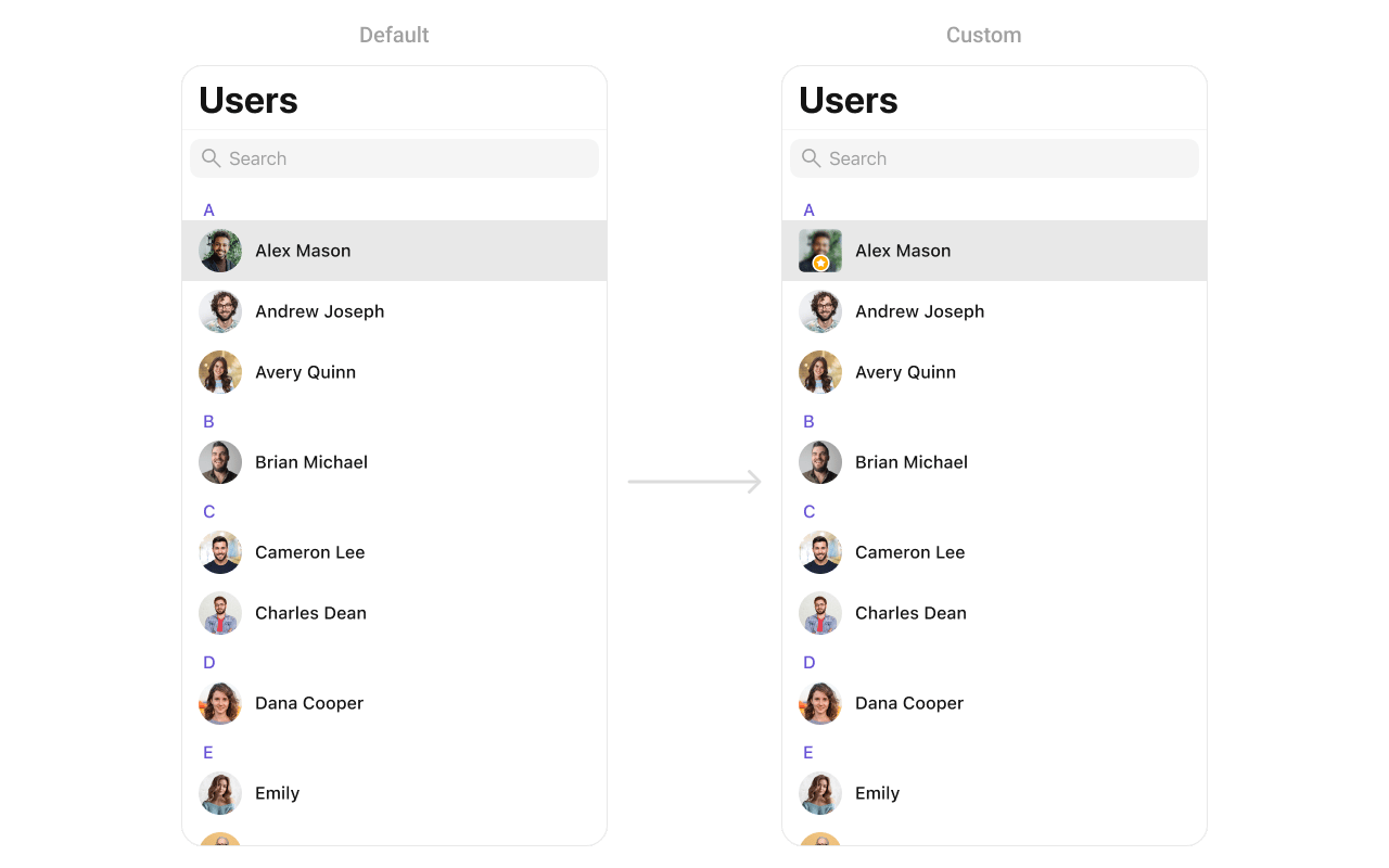
CustomLeadingView as a custom UIView:
import UIKit

class CustomLeadingView: UIView {

    // MARK: - UI Components
    private let imageView: UIImageView = {
        let imageView = UIImageView()
        imageView.contentMode = .scaleAspectFill
        imageView.clipsToBounds = true
        imageView.layer.cornerRadius = 10
        return imageView
    }()

    private let badgeView: UIView = {
        let view = UIView()
        view.backgroundColor = .orange
        view.layer.cornerRadius = 12
        view.layer.borderWidth = 2
        view.layer.borderColor = UIColor.white.cgColor

        let icon = UIImageView(image: UIImage(systemName: "star.fill"))
        icon.tintColor = .white
        icon.translatesAutoresizingMaskIntoConstraints = false
        view.addSubview(icon)

        NSLayoutConstraint.activate([
            icon.centerXAnchor.constraint(equalTo: view.centerXAnchor),
            icon.centerYAnchor.constraint(equalTo: view.centerYAnchor),
            icon.widthAnchor.constraint(equalToConstant: 14),
            icon.heightAnchor.constraint(equalToConstant: 14)
        ])

        return view
    }()

    // MARK: - Initialization
    init(image: UIImage?) {
        super.init(frame: .zero)
        imageView.image = image

        addSubview(imageView)
        addSubview(badgeView)

        imageView.translatesAutoresizingMaskIntoConstraints = false
        badgeView.translatesAutoresizingMaskIntoConstraints = false

        NSLayoutConstraint.activate([
            imageView.topAnchor.constraint(equalTo: topAnchor),
            imageView.leadingAnchor.constraint(equalTo: leadingAnchor),
            imageView.trailingAnchor.constraint(equalTo: trailingAnchor),
            imageView.bottomAnchor.constraint(equalTo: bottomAnchor),

            badgeView.widthAnchor.constraint(equalToConstant: 24),
            badgeView.heightAnchor.constraint(equalToConstant: 24),
            badgeView.bottomAnchor.constraint(equalTo: imageView.bottomAnchor, constant: -4),
            badgeView.trailingAnchor.constraint(equalTo: imageView.trailingAnchor, constant: -4)
        ])
    }

    required init?(coder: NSCoder) {
        fatalError("init(coder:) has not been implemented")
    }
}
titleView
Customize the title view of a user cell.import UIKit
import CometChatUIKitSwift
import CometChatSDK
let users = CometChatUsers()
users.set(titleView: { user in
let view = CustomTitleView(name: user.name ?? "", role: "Teacher")
return view
})
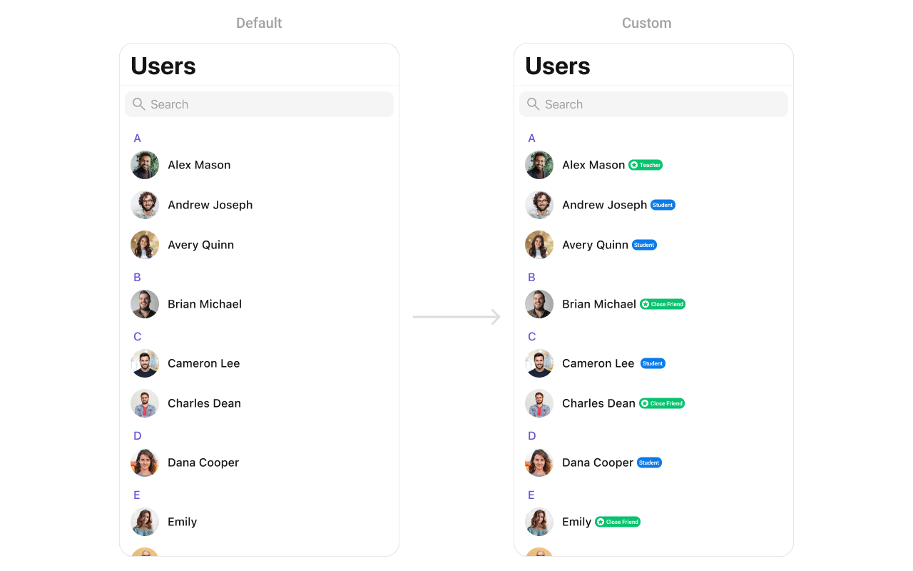
CustomTitleView as a custom UIView:
import UIKit

class CustomTitleView: UIView {

    // MARK: - UI Components
    private let nameLabel: UILabel = {
        let label = UILabel()
        label.font = UIFont.boldSystemFont(ofSize: 18)
        label.textColor = .black
        return label
    }()

    private let badgeLabel: UILabel = {
        let label = UILabel()
        label.font = UIFont.systemFont(ofSize: 14)
        label.textColor = .white
        label.backgroundColor = .systemGreen
        label.text = "Teacher"
        label.textAlignment = .center
        label.layer.cornerRadius = 8
        label.layer.masksToBounds = true
        return label
    }()

    // MARK: - Initialization
    init(name: String, role: String) {
        super.init(frame: .zero)
        nameLabel.text = name
        badgeLabel.text = " \(role) "

        let stackView = UIStackView(arrangedSubviews: [nameLabel, badgeLabel])
        stackView.axis = .horizontal
        stackView.spacing = 8
        stackView.alignment = .center

        addSubview(stackView)
        stackView.translatesAutoresizingMaskIntoConstraints = false

        NSLayoutConstraint.activate([
            stackView.leadingAnchor.constraint(equalTo: leadingAnchor),
            stackView.trailingAnchor.constraint(equalTo: trailingAnchor),
            stackView.topAnchor.constraint(equalTo: topAnchor),
            stackView.bottomAnchor.constraint(equalTo: bottomAnchor)
        ])
    }

    required init?(coder: NSCoder) {
        fatalError("init(coder:) has not been implemented")
    }
}
subtitleView
Customize the subtitle area below the user name.import UIKit
import CometChatUIKitSwift
import CometChatSDK
let users = CometChatUsers()
users.set(subtitleView: { user in
let view = CustomSubtitleView(lastActiveDate: "2 hours ago")
return view
})
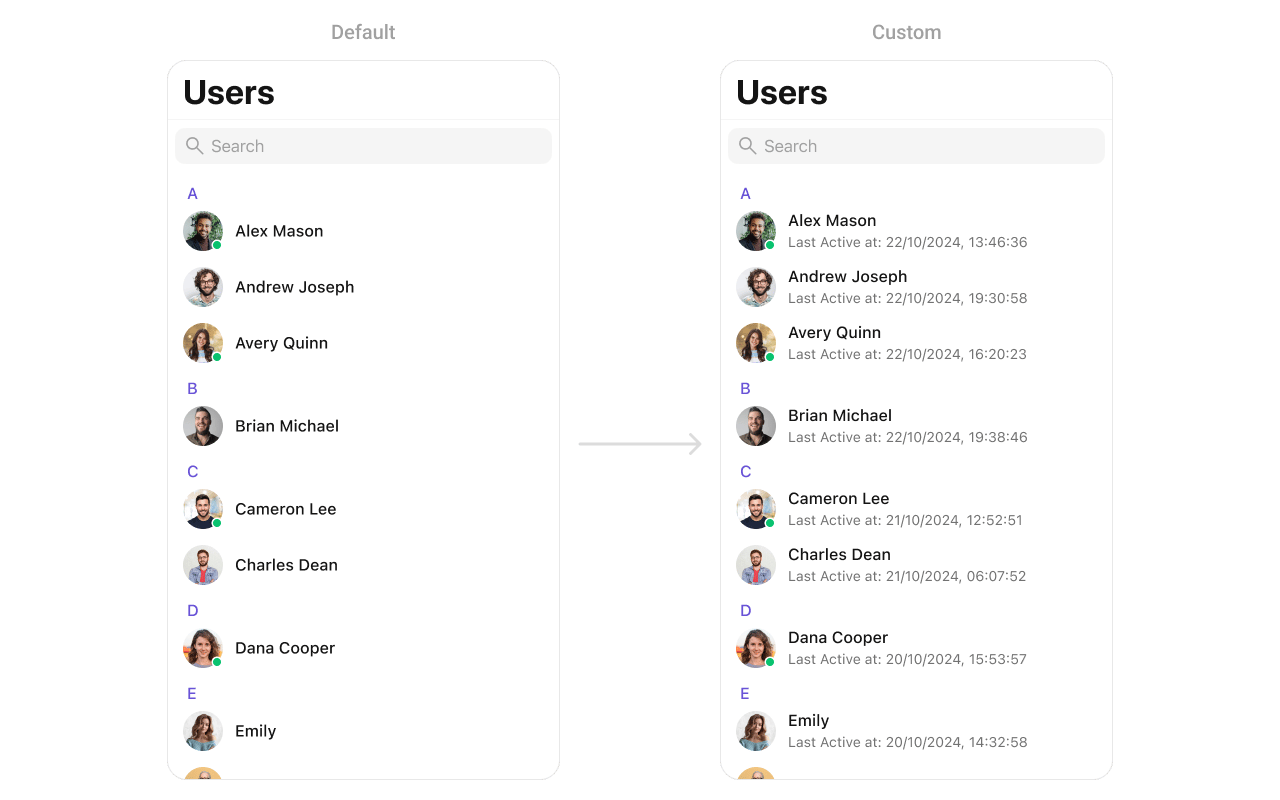
CustomSubtitleView as a custom UIView:
import UIKit

class CustomSubtitleView: UILabel {

    init(lastActiveDate: String) {
        super.init(frame: .zero)
        self.text = "Last Active at: \(lastActiveDate)"
        self.textColor = UIColor.gray
        self.font = UIFont.systemFont(ofSize: 14)
        self.numberOfLines = 1
    }

    required init?(coder: NSCoder) {
        fatalError("init(coder:) has not been implemented")
    }
}
trailingView
Customize the trailing view (right side) of a user cell.import UIKit
import CometChatUIKitSwift
import CometChatSDK
let users = CometChatUsers()
users.set(trailView: { user in
let view = CustomTrailView()
return view
})
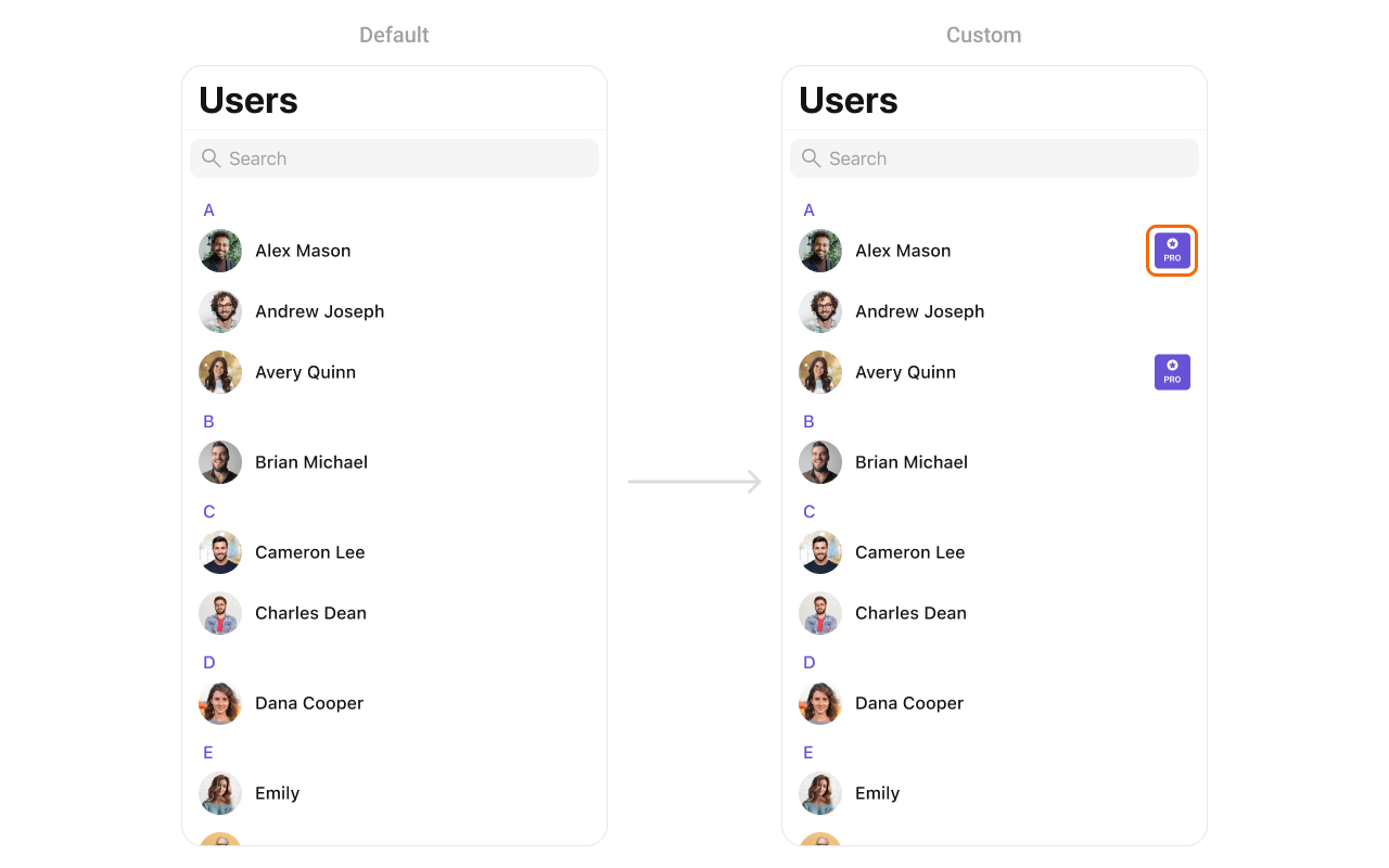
CustomTrailView as a custom UIView:
import UIKit

class CustomTrailView: UIView {

    // MARK: - UI Components
    private let badgeView: UIView = {
        let view = UIView()
        view.backgroundColor = .purple
        view.layer.cornerRadius = 12
        view.translatesAutoresizingMaskIntoConstraints = false
        return view
    }()

    private let icon: UIImageView = {
        let imageView = UIImageView(image: UIImage(systemName: "star.fill"))
        imageView.tintColor = .white
        imageView.translatesAutoresizingMaskIntoConstraints = false
        return imageView
    }()

    private let label: UILabel = {
        let label = UILabel()
        label.text = "PRO"
        label.font = UIFont.boldSystemFont(ofSize: 14)
        label.textColor = .white
        label.translatesAutoresizingMaskIntoConstraints = false
        return label
    }()

    // MARK: - Initialization
    init() {
        super.init(frame: .zero)

        addSubview(badgeView)
        badgeView.addSubview(icon)
        badgeView.addSubview(label)

        NSLayoutConstraint.activate([
            badgeView.leadingAnchor.constraint(equalTo: leadingAnchor),
            badgeView.trailingAnchor.constraint(equalTo: trailingAnchor),
            badgeView.topAnchor.constraint(equalTo: topAnchor),
            badgeView.bottomAnchor.constraint(equalTo: bottomAnchor),

            icon.centerXAnchor.constraint(equalTo: badgeView.centerXAnchor),
            icon.topAnchor.constraint(equalTo: badgeView.topAnchor, constant: 4),
            icon.widthAnchor.constraint(equalToConstant: 16),
            icon.heightAnchor.constraint(equalToConstant: 16),

            label.centerXAnchor.constraint(equalTo: badgeView.centerXAnchor),
            label.topAnchor.constraint(equalTo: icon.bottomAnchor, constant: 2),
            label.bottomAnchor.constraint(equalTo: badgeView.bottomAnchor, constant: -4)
        ])
    }

    required init?(coder: NSCoder) {
        fatalError("init(coder:) has not been implemented")
    }
}
loadingStateView
Customize the loading state view displayed while data is being fetched.import UIKit
import CometChatUIKitSwift
let users = CometChatUsers()
let loadingIndicator = UIActivityIndicatorView(style: .medium)
loadingIndicator.startAnimating()
users.set(loadingView: loadingIndicator)
errorStateView
Customize the error state view displayed when an error occurs.import UIKit
import CometChatUIKitSwift
let users = CometChatUsers()
let errorLabel = UILabel()
errorLabel.text = "Something went wrong!"
errorLabel.textColor = .red
users.set(errorView: errorLabel)
emptyStateView
Customize the empty state view displayed when no users are available.import UIKit
import CometChatUIKitSwift
let users = CometChatUsers()
let emptyLabel = UILabel()
emptyLabel.text = "No users found"
emptyLabel.textColor = .gray
emptyLabel.textAlignment = .center
users.set(emptyView: emptyLabel)
Methods
Swipe Action Methods
set(options:)
Sets custom swipe actions for user list items, replacing the default options. These options appear when the user swipes on a user cell.@discardableResult
public func set(options: ((_ user: User?) -> [CometChatUserOption])?) -> Self
| Parameter | Type | Description |
|---|---|---|
options | ((User?) -> [CometChatUserOption])? | Closure that returns an array of swipe action options for a user |
import UIKit
import CometChatUIKitSwift
import CometChatSDK

let users = CometChatUsers()

users.set(options: { user in
    var options = [CometChatUserOption]()

    // Add block option
    let blockOption = CometChatUserOption(
        id: "block",
        title: "Block",
        icon: UIImage(systemName: "hand.raised"),
        backgroundColor: .systemRed
    ) { selectedUser in
        // Handle block action
        print("Block user: \(selectedUser?.name ?? "")")
    }
    options.append(blockOption)

    // Add message option
    let messageOption = CometChatUserOption(
        id: "message",
        title: "Message",
        icon: UIImage(systemName: "message"),
        backgroundColor: .systemBlue
    ) { selectedUser in
        // Handle message action
        print("Message user: \(selectedUser?.name ?? "")")
    }
    options.append(messageOption)

    return options
})
add(options:)
Adds additional swipe actions to the existing default options.@discardableResult
public func add(options: ((_ user: User?) -> [CometChatUserOption])?) -> Self
| Parameter | Type | Description |
|---|---|---|
options | ((User?) -> [CometChatUserOption])? | Closure that returns additional swipe action options to append |
import UIKit
import CometChatUIKitSwift
import CometChatSDK

let users = CometChatUsers()

users.add(options: { user in
    var options = [CometChatUserOption]()

    // Add favorite option
    let favoriteOption = CometChatUserOption(
        id: "favorite",
        title: "Favorite",
        icon: UIImage(systemName: "star.fill"),
        backgroundColor: .systemOrange
    ) { selectedUser in
        print("Favorite user: \(selectedUser?.name ?? "")")
    }
    options.append(favoriteOption)

    return options
})
Data Manipulation Methods
add(user:)
Adds a new user to the user list.@discardableResult
public func add(user: User) -> Self
| Parameter | Type | Description |
|---|---|---|
user | User | The user to add to the list |
import CometChatUIKitSwift
import CometChatSDK

let users = CometChatUsers()

// Add a user programmatically
let newUser = User(uid: "user-123", name: "John Doe")
users.add(user: newUser)
update(user:)
Updates an existing user in the list.@discardableResult
public func update(user: User) -> Self
| Parameter | Type | Description |
|---|---|---|
user | User | The user with updated information |
import CometChatUIKitSwift
import CometChatSDK

let users = CometChatUsers()

// Update a user's information
if var existingUser = userToUpdate {
    existingUser.name = "Updated Name"
    users.update(user: existingUser)
}
remove(user:)
Removes a user from the list.@discardableResult
public func remove(user: User) -> Self
| Parameter | Type | Description |
|---|---|---|
user | User | The user to remove from the list |
import CometChatUIKitSwift
import CometChatSDK

let users = CometChatUsers()

// Remove a user from the UI
users.remove(user: userToRemove)
getSelectedUsers()
Returns an array of currently selected users when in selection mode.public func getSelectedUsers() -> [User]
import CometChatUIKitSwift
import CometChatSDK

let users = CometChatUsers()
users.selectionMode = .multiple

// Get all selected users
let selectedUsers = users.getSelectedUsers()
print("Selected \(selectedUsers.count) users")

for user in selectedUsers {
    print("User: \(user.name ?? "")")
}
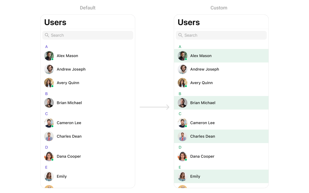
Custom ListItem
For more complex or unique list items, you can create a customUIView file named CustomListItem and integrate it into the set(listItemView:) method.
import UIKit
import CometChatUIKitSwift
import CometChatSDK

class CustomListItem: UIView {

    // MARK: - UI Components
    private var profileImageView: CometChatAvatar = {
        let imageView = CometChatAvatar(image: UIImage())
        imageView.translatesAutoresizingMaskIntoConstraints = false
        return imageView
    }()

    private var nameLabel: UILabel = {
        let label = UILabel()
        label.translatesAutoresizingMaskIntoConstraints = false
        return label
    }()

    // MARK: - Initialization
    override init(frame: CGRect) {
        super.init(frame: frame)
        setupUI()
    }

    required init?(coder aDecoder: NSCoder) {
        fatalError("init(coder:) has not been implemented")
    }

    // MARK: - Setup
    private func setupUI() {
        addSubview(profileImageView)
        addSubview(nameLabel)

        NSLayoutConstraint.activate([
            // Profile image constraints
            profileImageView.leadingAnchor.constraint(equalTo: leadingAnchor, constant: 8),
            profileImageView.centerYAnchor.constraint(equalTo: centerYAnchor),
            profileImageView.widthAnchor.constraint(equalToConstant: 40),
            profileImageView.heightAnchor.constraint(equalToConstant: 40),

            // Name label constraints
            nameLabel.leadingAnchor.constraint(equalTo: profileImageView.trailingAnchor, constant: 8),
            nameLabel.trailingAnchor.constraint(equalTo: trailingAnchor, constant: -8),
            nameLabel.centerYAnchor.constraint(equalTo: centerYAnchor)
        ])
    }

    // MARK: - Configuration
    func set(user: User) {
        nameLabel.text = user.name
        profileImageView.setAvatar(avatarUrl: user.avatar, with: user.name)
    }
}
import CometChatUIKitSwift
import CometChatSDK

let users = CometChatUsers()

users.set(listItemView: { user in
    let customItem = CustomListItem()
    customItem.set(user: user)
    return customItem
})
Styling
Style Hierarchy
- Global styles (
CometChatUsers.style) apply to all instances - Instance styles override global for specific instances
Global Level Styling
import UIKit
import CometChatUIKitSwift

// Apply global styles that affect all CometChatUsers instances
CometChatUsers.style.backgroundColor = UIColor.systemBackground
CometChatUsers.style.titleColor = UIColor.label
CometChatUsers.style.titleFont = UIFont.systemFont(ofSize: 34, weight: .bold)
CometChatUsers.style.listItemTitleTextColor = UIColor.label
CometChatUsers.style.listItemSubTitleTextColor = UIColor.secondaryLabel

// Custom avatar style
let avatarStyle = AvatarStyle()
avatarStyle.cornerRadius = CometChatCornerStyle(cornerRadius: 20)
CometChatUsers.avatarStyle = avatarStyle
Instance Level Styling
import UIKit
import CometChatUIKitSwift

// Create a custom style for a specific instance
var customStyle = UsersStyle()
customStyle.backgroundColor = UIColor(red: 0.95, green: 0.95, blue: 0.97, alpha: 1.0)
customStyle.titleColor = UIColor.darkGray
customStyle.listItemBackground = UIColor.white

let users = CometChatUsers()
users.style = customStyle
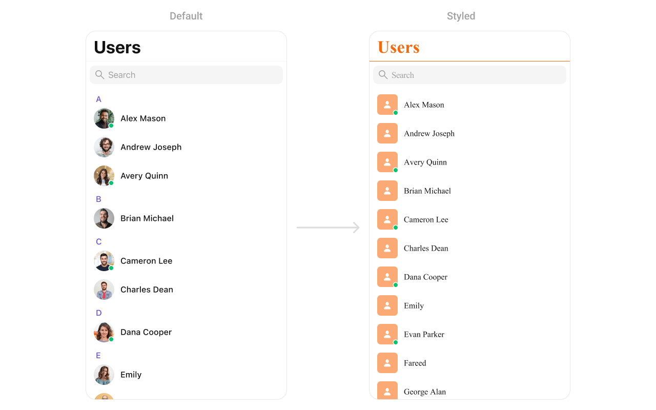
Key Style Properties
| Property | Type | Default | Description |
|---|---|---|---|
backgroundColor | UIColor | CometChatTheme.backgroundColor01 | Background color |
titleColor | UIColor | CometChatTheme.textColorPrimary | Navigation title color |
titleFont | UIFont | CometChatTypography.Heading4.medium | Navigation title font |
listItemTitleTextColor | UIColor | CometChatTheme.textColorPrimary | User name color |
listItemTitleFont | UIFont | CometChatTypography.Heading4.medium | User name font |
listItemSubTitleTextColor | UIColor | CometChatTheme.textColorSecondary | Status text color |
listItemSubTitleFont | UIFont | CometChatTypography.Body.regular | Status text font |
listItemBackground | UIColor | .clear | List item background |
searchBarBackgroundColor | UIColor? | nil | Search bar background |
searchBarTextColor | UIColor? | nil | Search bar text color |
headerTitleColor | UIColor | CometChatTheme.textColorHighlight | Section header color |
headerTitleFont | UIFont | CometChatTypography.Heading4.medium | Section header font |
Customization Matrix
| What to change | Where | Property/API | Example |
|---|---|---|---|
| Background color | Style | backgroundColor | UIColor.systemBackground |
| Title appearance | Style | titleColor, titleFont | Custom colors and fonts |
| List item look | Style | listItemBackground | UIColor.white |
| Avatar appearance | Style | avatarStyle | AvatarStyle() with custom radius |
| Search bar | Style | searchBarBackgroundColor | Custom background |
| Hide search | Property | hideSearch | users.hideSearch = true |
| Hide status | Property | hideUserStatus | users.hideUserStatus = true |
| Custom row | View Slot | set(listItemView:) | See Custom View Slots |
Props
All props are optional. Sorted alphabetically.avatarStyle
Customizes the appearance of avatars in user list items.| Type | AvatarStyle |
| Default | AvatarStyle() |
import CometChatUIKitSwift

let users = CometChatUsers()

let avatarStyle = AvatarStyle()
avatarStyle.backgroundColor = UIColor.systemBlue
avatarStyle.cornerRadius = CometChatCornerStyle(cornerRadius: 8)
avatarStyle.borderWidth = 1
avatarStyle.borderColor = UIColor.systemGray4

users.set(avatarStyle: avatarStyle)
hideBackButton
Hides the back button in the navigation bar.| Type | Bool |
| Default | false |
hideErrorView
Hides the error state view.| Type | Bool |
| Default | false |
hideLoadingState
Hides the loading state indicator.| Type | Bool |
| Default | false |
hideNavigationBar
Hides the entire navigation bar.| Type | Bool |
| Default | false |
hideSearch
Hides the search bar.| Type | Bool |
| Default | false |
hideSectionHeader
Hides the alphabetical section headers.| Type | Bool |
| Default | false |
hideUserStatus
Hides online/offline status indicators.| Type | Bool |
| Default | false |
onSelectedItemProceed
Callback triggered when the user confirms their selection in selection mode. Use this to handle the selected users.| Type | (([User]) -> Void)? |
| Default | nil |
import CometChatUIKitSwift
import CometChatSDK

let users = CometChatUsers()
users.selectionMode = .multiple
users.selectionLimit = 5

users.onSelectedItemProceed = { selectedUsers in
    print("Proceeding with \(selectedUsers.count) users")

    // Process the selected users
    for user in selectedUsers {
        print("User: \(user.name ?? "")")
    }
}
searchRequestBuilder
Custom request builder for search functionality.| Type | UsersRequest.UsersRequestBuilder? |
| Default | nil |
selectedCellCount
Returns the count of currently selected users in selection mode.| Type | Int |
| Default | 0 |
selectionLimit
Sets the maximum number of users that can be selected in selection mode. When the limit is reached, further selections are disabled.| Type | Int |
| Default | 0 (unlimited) |
import CometChatUIKitSwift

let users = CometChatUsers()
users.selectionMode = .multiple

// Limit selection to 5 users
users.selectionLimit = 5

// Handle selection confirmation
users.onSelectedItemProceed = { selectedUsers in
    print("Selected \(selectedUsers.count) users")

    // Process the selected users
    for user in selectedUsers {
        print("User: \(user.name ?? "")")
    }
}
selectionMode
Sets the selection mode for multi-select functionality.| Type | SelectionMode |
| Default | .none |
statusIndicatorStyle
Customizes the appearance of online/offline status indicators.| Type | StatusIndicatorStyle |
| Default | StatusIndicatorStyle() |
import CometChatUIKitSwift

let users = CometChatUsers()

let statusIndicatorStyle = StatusIndicatorStyle()
statusIndicatorStyle.backgroundColor = UIColor.systemGreen
statusIndicatorStyle.borderWidth = 2
statusIndicatorStyle.borderColor = UIColor.white

users.set(statusIndicatorStyle: statusIndicatorStyle)
usersRequestBuilder
Custom request builder for filtering users.| Type | UsersRequest.UsersRequestBuilder? |
| Default | nil |
Events
| Event | Payload | Fires when |
|---|---|---|
ccUserBlocked | User | A user is blocked |
ccUserUnblocked | User | A user is unblocked |
Common Patterns
Friends-only list
let friendsBuilder = UsersRequest.UsersRequestBuilder(limit: 30)
    .friendsOnly(true)

let users = CometChatUsers()
users.set(usersRequestBuilder: friendsBuilder)
Online users only
let onlineBuilder = UsersRequest.UsersRequestBuilder(limit: 30)
    .set(status: .online)

let users = CometChatUsers()
users.set(usersRequestBuilder: onlineBuilder)
Custom empty state with CTA
let users = CometChatUsers()

users.set(emptyStateView: {
    let emptyView = UIView()

    let label = UILabel()
    label.text = "No users found"
    label.textAlignment = .center
    label.textColor = .secondaryLabel

    let button = UIButton(type: .system)
    button.setTitle("Invite friends", for: .normal)

    // Add subviews and constraints...
    return emptyView
})
Hide all chrome — minimal list
let users = CometChatUsers()
users.hideSearch = true
users.hideUserStatus = true
users.hideSectionHeader = true
Multi-select users
let users = CometChatUsers()
users.selectionMode = .multiple

users.set(onSelection: { selectedUsers in
    print("Selected \(selectedUsers.count) users")
    // Create group with selected users, etc.
})
Related Components
- Messages - Display messages with a user
- Conversations - List all conversations
- Groups - List all groups
- Users With Messages - Combined users and messages view