

AI Integration Quick Reference
AI Integration Quick Reference
Where It Fits
CometChatConversations is a sidebar list component. It renders recent conversations and emits the selected CometChat.Conversation via onItemPress. Wire it to CometChatMessageHeader, CometChatMessageList, and CometChatMessageComposer to build a standard chat layout.
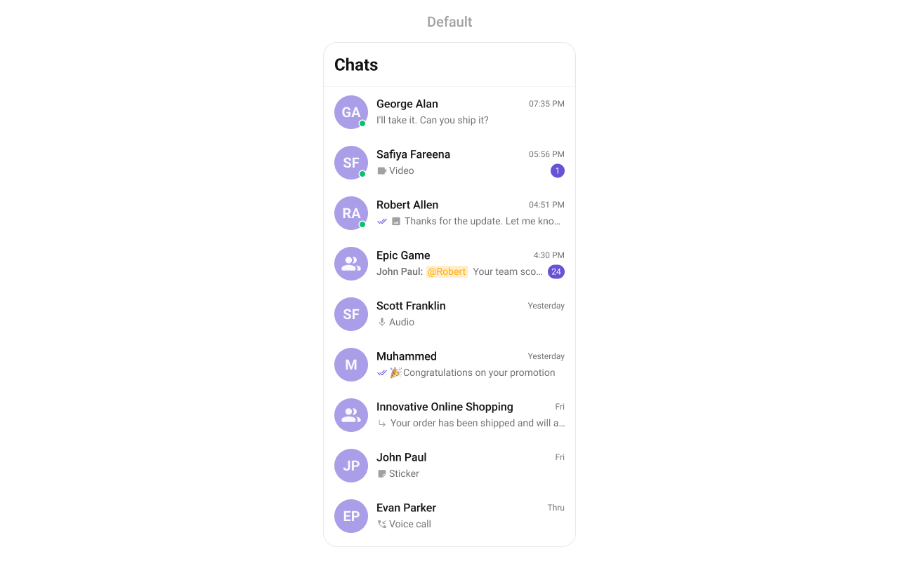
Minimal Render
Filtering Conversations
Pass aCometChat.ConversationsRequestBuilder to conversationsRequestBuilder. Pass the builder instance — not the result of .build().
Filter Recipes
Default page size is 30. The component uses infinite scroll — the next page loads as the user scrolls to the bottom.
Refer to ConversationRequestBuilder for the full builder API.
Actions and Events
Callback Props
onItemPress
Fires when a conversation row is tapped. Primary navigation hook — set the active conversation and render the message view.onItemLongPress
Fires when a conversation item is long-pressed, allowing additional actions like delete or select.onSelection
Fires when conversations are selected/deselected in selection mode. RequiresselectionMode to be set.
onError
Fires on internal errors (network failure, auth issue, SDK exception).onEmpty
Fires when the conversation list is empty.onLoad
Fires when the list is successfully fetched and loaded.Global UI Events
CometChatUIEventHandler emits events subscribable from anywhere in the application. Subscribe in a useEffect and unsubscribe on cleanup.
When to use: sync external UI with conversation state changes. For example, update an unread count badge in a tab bar when a conversation is deleted, or remove a conversation from a custom sidebar.
SDK Events (Real-Time, Automatic)
The component listens to these SDK events internally. No manual attachment needed unless additional side effects are required.
Automatic: new messages, typing indicators, receipts, user presence, group membership changes.
Manual: deleting a conversation via the SDK directly (not through the component’s context menu) requires emitting
ccConversationDeleted for the UI to update.
Custom View Slots
Each slot replaces a section of the default UI. Slots that accept a conversation parameter receive theCometChat.Conversation object for that row.
ItemView
Replace the entire list item row.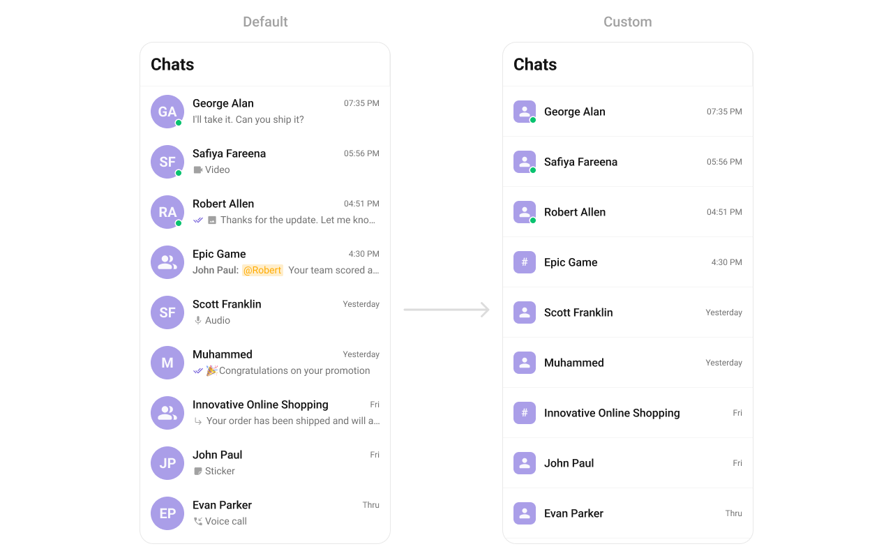
LeadingView
Replace the avatar / left section.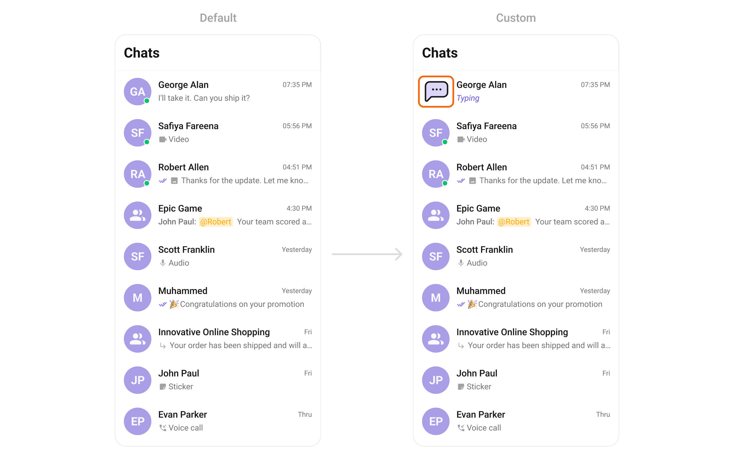
TrailingView
Replace the timestamp / badge / right section.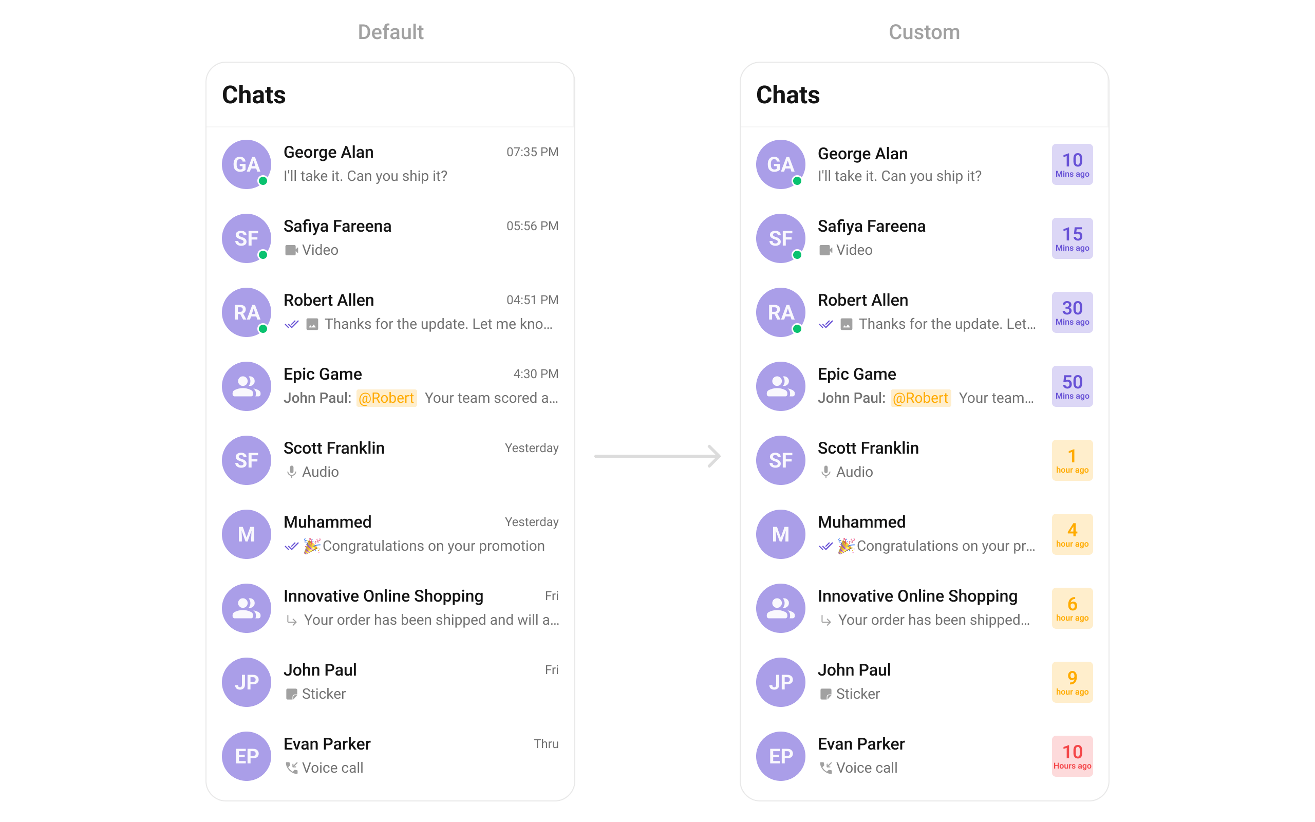
TitleView
Replace the name / title text.SubtitleView
Replace the last message preview text.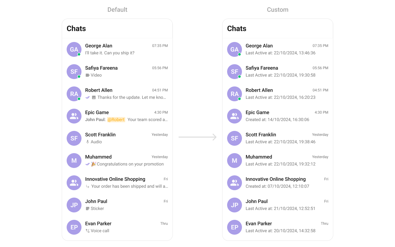
AppBarOptions
Custom view for the header bar options.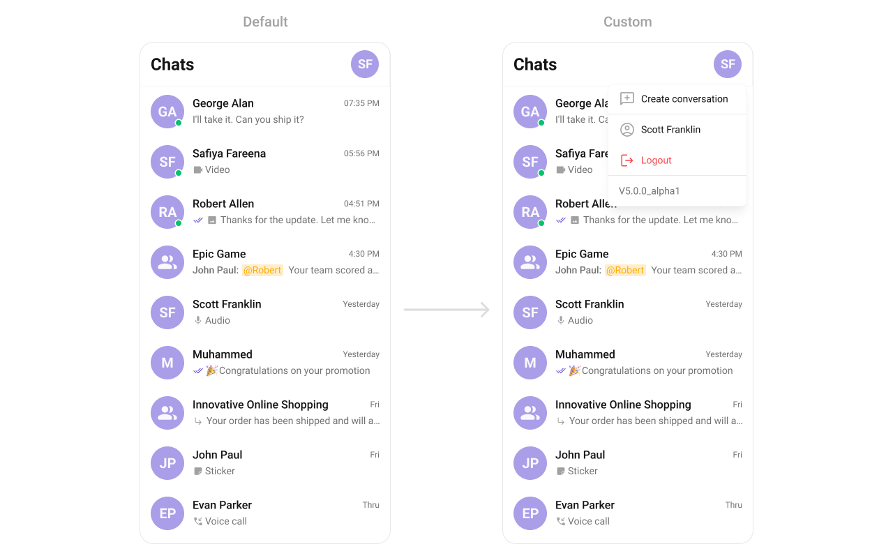
options
Custom context menu actions for each conversation item.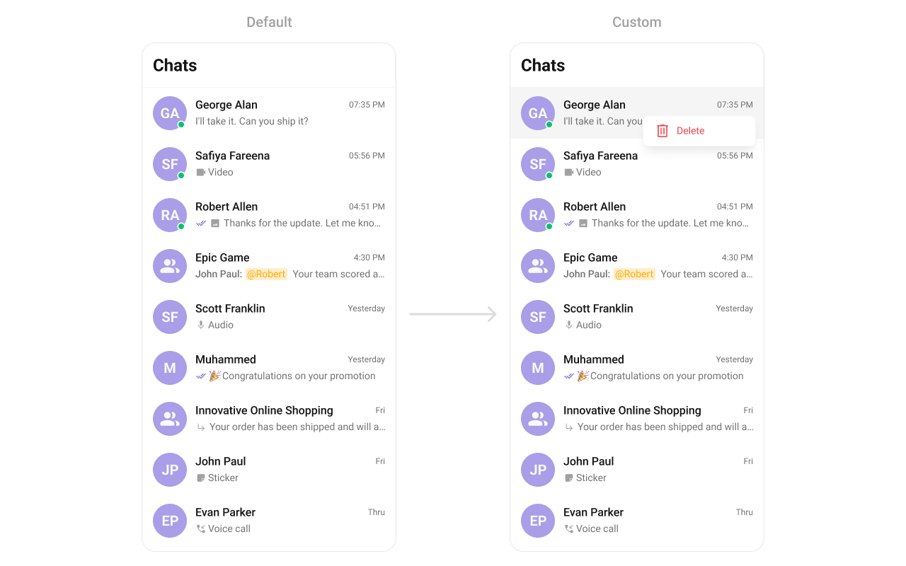
addOptions
Extends the default context menu actions with additional options.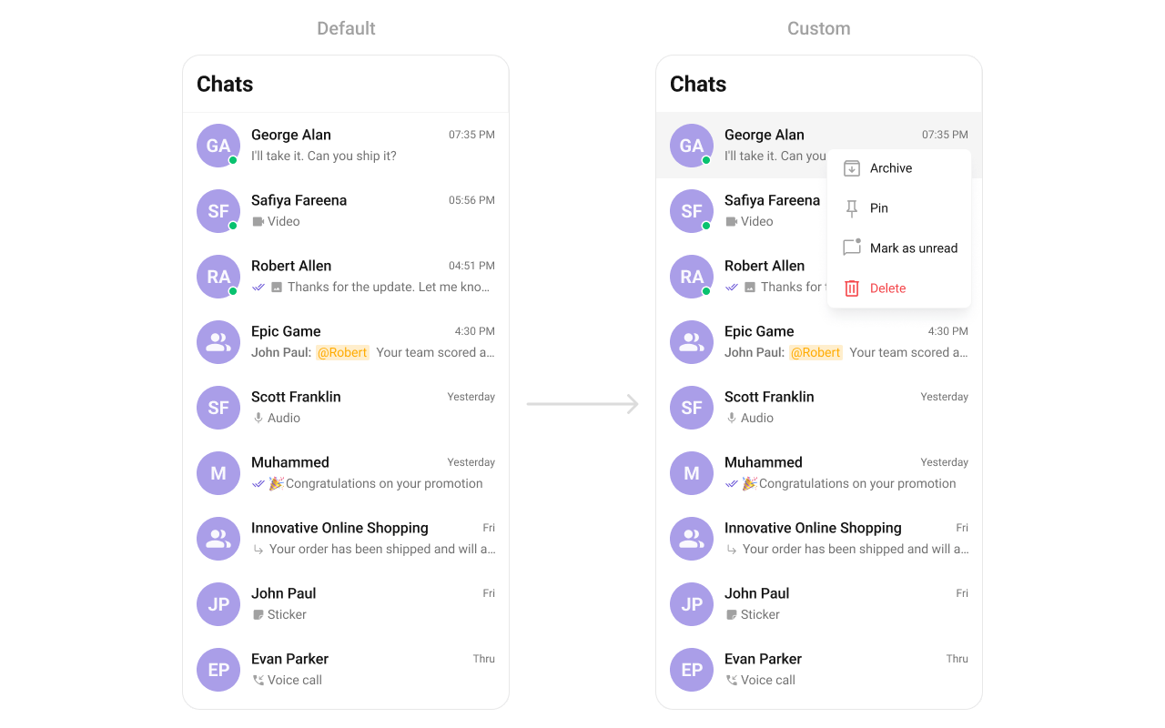
datePattern
Custom date format for displaying timestamps.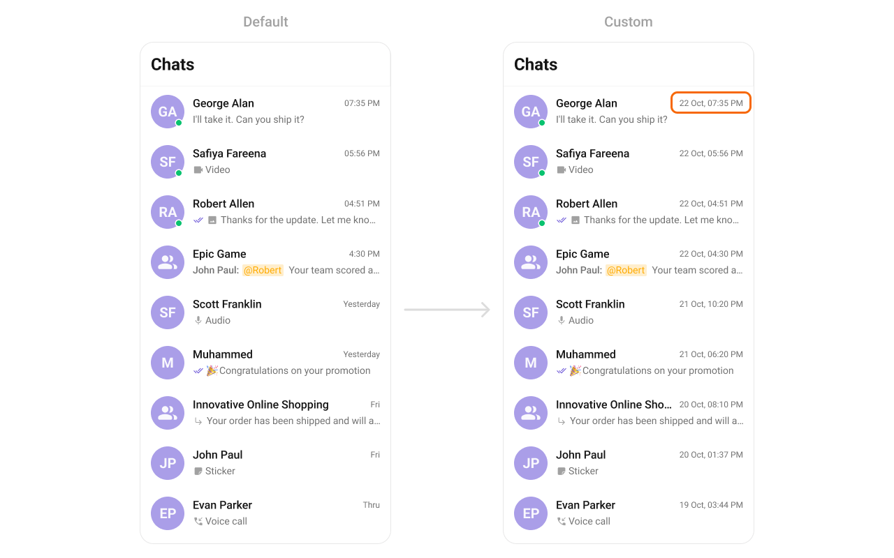
textFormatters
Custom text formatters for the conversation subtitle.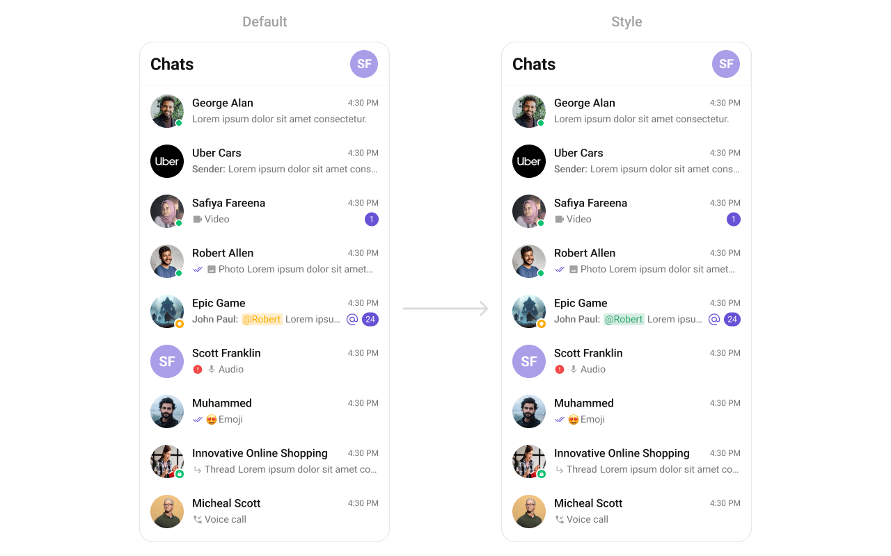
Common Patterns
Custom empty state with CTA
Hide all chrome — minimal list
Conversations with search
Multi-select with submit
Styling
The component uses the theme system fromCometChatThemeProvider. Pass a style prop to customize the appearance.
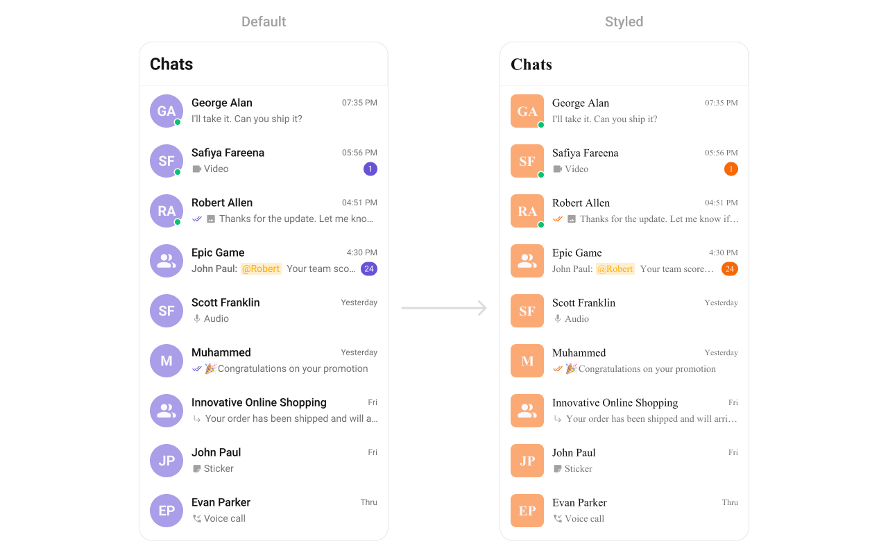
Style Properties
Avatar style override in Conversations:
CometChatConversations generates its own internal avatar style that overrides the base theme’s avatarStyle. To customize avatar appearance specifically within the conversation list, you must set avatarStyle through the itemStyle prop on CometChatConversations (i.e., style.itemStyle.avatarStyle). Setting avatarStyle at the theme level via CometChatThemeProvider will not take effect for the conversation list.Props
All props are optional unless noted.conversationsRequestBuilder
Controls which conversations load and in what order.
Pass the builder instance, not the result of
.build().
customSoundForMessages
Custom sound file for incoming message notifications.datePattern
Custom function to format conversation timestamps.deleteConversationOptionVisibility
Shows/hides the delete option in the context menu.disableSoundForMessages
Disables the notification sound for incoming messages.EmptyView
Custom component displayed when there are no conversations.ErrorView
Custom component displayed when an error occurs.groupTypeVisibility
Shows/hides the group type icon (public/private/password).hideBackButton
Hides the back button in the header.hideError
Hides the error state view.hideHeader
Hides the entire header bar.hideSubmitButton
Hides the submit button when selection mode is enabled.ItemView
Custom renderer for the entire list item row.LeadingView
Custom renderer for the avatar / left section.LoadingView
Custom component displayed during the loading state.onBack
Callback fired when the back button is pressed.onEmpty
Callback fired when the conversation list is empty.onError
Callback fired when the component encounters an error.onItemLongPress
Callback fired when a conversation row is long-pressed.onItemPress
Callback fired when a conversation row is tapped.onLoad
Callback fired when conversations are loaded.onSearchBarClicked
Callback fired when the search bar is clicked. RequiresshowSearchBar={true}.
onSearchTextChanged
Callback fired when search text changes. RequiresshowSearchBar={true}.
onSelection
Callback fired when conversations are selected/deselected. RequiresselectionMode to be set.
onSubmit
Callback fired when the submit button is pressed. RequiresselectionMode to be set.
receiptsVisibility
Shows/hides message read/delivery receipt indicators.SearchView
Custom search bar component.selectionMode
Enables single or multi-select mode on list items.searchText
Current search text value for the search bar.showSearchBar
Shows a search bar at the top of the list.SubtitleView
Custom renderer for the last message preview text.textFormatters
Custom text formatters for the conversation subtitle.TitleView
Custom renderer for the name / title text.TrailingView
Custom renderer for the timestamp / badge / right section.usersStatusVisibility
Shows/hides the online/offline status indicator.Next Steps
Message List
Display the full chat interface after selecting a conversation
Users
Display and interact with user lists
Groups
Display and manage group conversations
Component Styling
Customize the appearance of UI Kit components