

AI Integration Quick Reference
AI Integration Quick Reference
Where It Fits
CometChatGroupMembers is a panel component that renders the member list for a specific group. It requires a group prop and provides built-in member management actions (kick, ban, scope change) based on the logged-in user’s role. Typically rendered alongside the message view in a group chat layout.
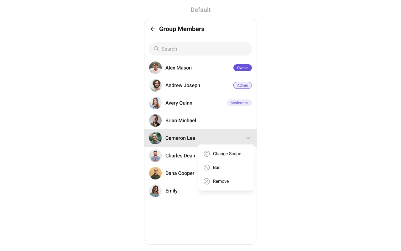
Minimal Render
Filtering Group Members
Pass aCometChat.GroupMembersRequestBuilder to groupMemberRequestBuilder. Pass the builder instance — not the result of .build().
The GroupMembersRequestBuilder enables you to filter and customize the group members list based on available parameters. The following are the parameters available in GroupMembersRequestBuilder:
Filter Recipes
Default page size is 30. The component uses infinite scroll — the next page loads as the user scrolls to the bottom.
SearchRequestBuilder
ThesearchRequestBuilder prop accepts a separate GroupMembersRequestBuilder for filtering when the search bar is active. This allows you to keep uniformity between the displayed Group Members List and searched Group Members List.
Actions and Events
Callback Props
onItemPress
Fires when a member row is tapped.onItemLongPress
Fires when a member item is long-pressed, allowing additional actions like delete or block.onBack
Fires when the back button in the app bar is pressed. RequiresshowBackButton={true}.
onSelection
Fires when members are selected/deselected in selection mode. RequiresselectionMode to be set.
onSubmit
Fires when the submit selection button is pressed. RequiresselectionMode to be set.
onError
Fires on internal errors (network failure, auth issue, SDK exception).onLoad
Fires when the list is successfully fetched and loaded.onEmpty
Fires when the member list is empty.Global UI Events
CometChatUIEventHandler emits events subscribable from anywhere in the application. Add listeners and remove them on cleanup.
When to use: sync external UI with group member state changes. For example, update a member list when a member is kicked, or refresh the UI when a member’s scope changes.
SDK Events (Real-Time, Automatic)
The component listens to these SDK events internally. No manual attachment needed unless additional side effects are required.In React 18 StrictMode,
useEffect runs twice on mount in development. The component handles listener cleanup internally, but any additional listeners added alongside the component need cleanup in the useEffect return function to avoid duplicate event handling.Custom View Slots
Each slot replaces a section of the default UI. Slots that accept a member parameter receive theCometChat.GroupMember object for that row.
LoadingView
Custom view displayed when data is being fetched.EmptyView
Custom view displayed when there are no group members.ErrorView
Custom view displayed when an error occurs.LeadingView
Custom view for the avatar / left section of each member item.TitleView
Custom view for the name / title text.SubtitleView
Custom view for the subtitle text.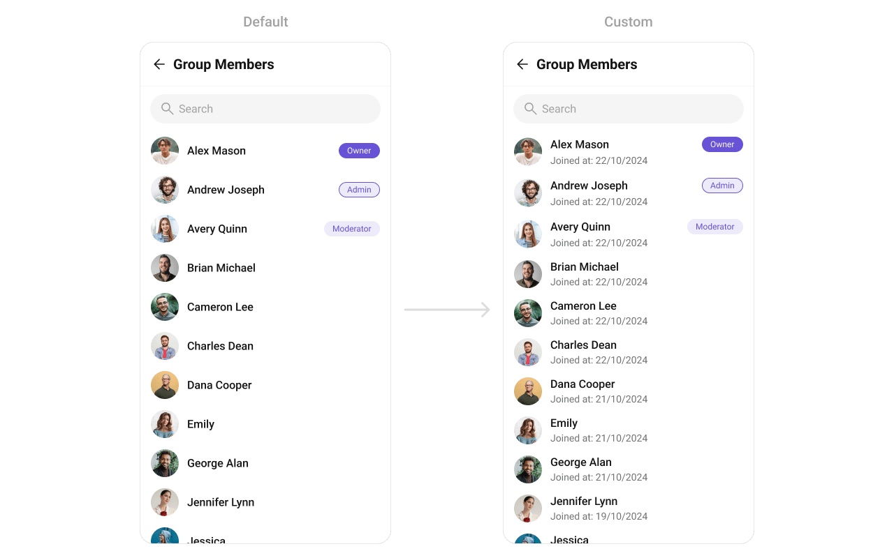
TrailingView
Custom view for the right section (scope badge / actions).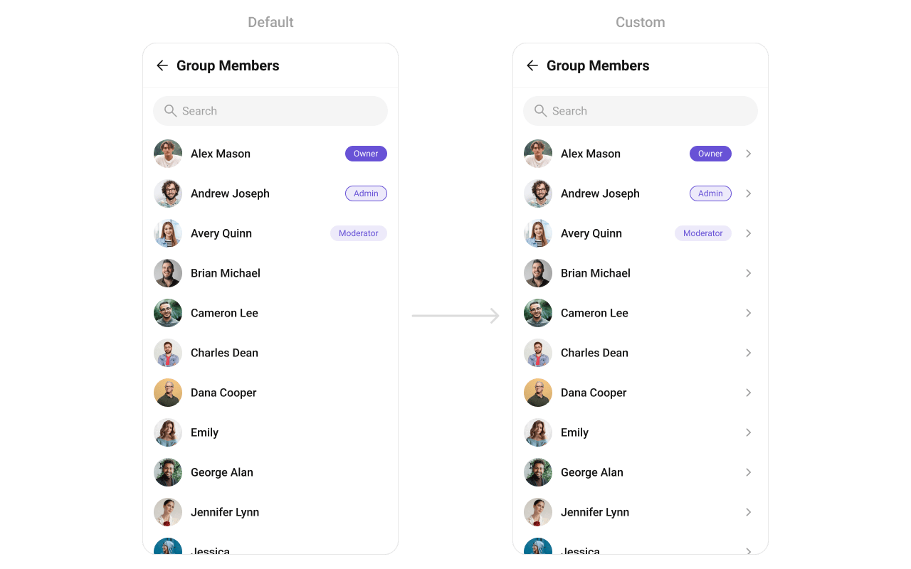
ItemView
Custom view for the entire list item row.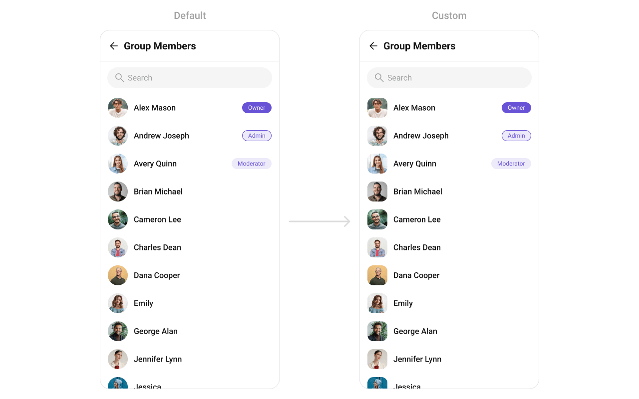
AppBarOptions
Custom view for the header bar options.options
Custom context menu actions for each member item.addOptions
Extends the default context menu actions with additional options.Styling
Using Style you can customize the look and feel of the component in your app. Pass a styling object as a prop to theCometChatGroupMembers component.
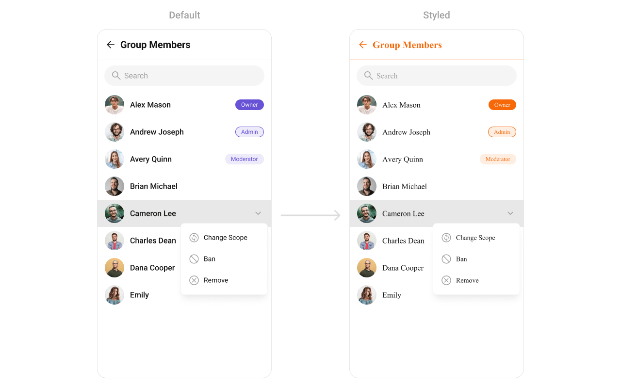
Visibility Props
Selection Mode
Next Steps
Groups
Display and manage group conversations
Add Members
Add new members to a group
Banned Members
View and manage banned group members
Component Styling
Customize the appearance of UI Kit components