

AI Integration Quick Reference
AI Integration Quick Reference
Overview
CometChatCompactMessageComposer is a Component that provides a compact, single-line message input with optional rich text formatting capabilities. It supports bold, italic, underline, strikethrough, code, links, lists, and blockquotes.
This is a compact variant of CometChatMessageComposer. It shares a similar props API but provides a streamlined, single-line interface with rich text formatting controls.
Wire it alongside CometChatMessageHeader and CometChatMessageList to build a standard chat view.
Features such as Rich Text Formatting, Attachments, Message Editing, Mentions, Link Previews, and Voice Recording are supported.

Before using this component: Ensure
CometChatUIKit.init(UIKitSettings) has completed and the user is logged in via CometChatUIKit.login("UID"). See React.js Integration.Minimal Render
Usage
Integration
The following code snippet illustrates how you can directly incorporate the CompactMessageComposer component into your app.- TypeScript
- JavaScript
- The
CometChatCompactMessageComposercomponent renders a compact, single-line message input - The input supports typing, sending messages, attachments, emoji, stickers, and voice recording
- Clicking the send button dispatches the message to the specified
user
Actions and Events
Callback Props
Actions dictate how a component functions. They are divided into two types: Predefined and User-defined. You can override either type, allowing you to tailor the behavior of the component to fit your specific needs.onSendButtonClick
Fires when the send message button is clicked. Overrides the default send behavior.- TypeScript
- JavaScript
onError
Fires on internal errors (network failure, auth issue, SDK exception). This action doesn’t change the behavior of the component but rather listens for any errors that occur in the CompactMessageComposer component.- TypeScript
- JavaScript
onTextChange
Fires as the user types in the composer input.- TypeScript
- JavaScript
Custom Mentions Request Builders
You can customize how mentioned users and group members are fetched by providing custom request builders.- TypeScript
- JavaScript
Filters
CompactMessageComposer component does not have any available filters.Global UI Events
Events are emitted by aComponent. By using events you can extend existing functionality. Being global events, they can be applied in multiple locations and are capable of being added or removed.
CometChatMessageEvents emits events subscribable from anywhere in the application. Add listeners and remove them on cleanup.
Each event has three states:
inProgress, success, and error.
When to use: sync external UI with message state changes. For example, update a notification badge when messages are sent, or trigger analytics when a message is edited.
- TypeScript
- JavaScript
In React 18 StrictMode,
useEffect runs twice on mount in development. The component handles listener cleanup internally, but any additional listeners added alongside the component need cleanup in the useEffect return function to avoid duplicate event handling.Customization
To fit your app’s design requirements, you can customize the appearance of the CompactMessageComposer component. We provide exposed methods that allow you to modify the experience and behavior according to your specific needs.Functionality
These are a set of small functional customizations that allow you to fine-tune the overall experience of the component. With these, you can change text, set custom icons, and toggle the visibility of UI elements.- TypeScript
Rich Text Formatting
The CompactMessageComposer includes a built-in rich text editor. Rich text must be explicitly enabled viaenableRichTextEditor={true} (defaults to false).
Formatting Toolbar
The toolbar provides the following formatting tools in a fixed order:Toolbar Visibility Modes
The toolbar supports multiple display modes controlled via props. When multiple props are set, they follow this priority order:enableRichTextEditor={false}— Highest priority, disables all rich text features (plain text only)hideRichTextFormattingOptions={true}— Toolbar visible by default above inputshowToolbarOnSelection={true}— Floating toolbar appears on text selection (desktop only)
Behavior Matrix
Mobile Behavior
On mobile devices, only the fixed toolbar is supported. The floating selection toolbar is disabled for better touch UX.Toolbar Configuration Examples
- Selection Toolbar
- Toolbar Always Visible
- Keyboard Shortcuts Only
- Combined Modes
Custom View Slots
Each slot replaces a section of the default UI. Slots that accept parameters receive the relevant data for customization.Advanced
For advanced-level customization, you can set custom views to the component. This lets you tailor each aspect of the component to fit your exact needs and application aesthetics. You can create and define your views, layouts, and UI elements and then incorporate those into the component.AttachmentOptions
By usingattachmentOptions, you can set a list of custom MessageComposerActions for the CompactMessageComposer Component. This will override the existing list of MessageComposerActions.
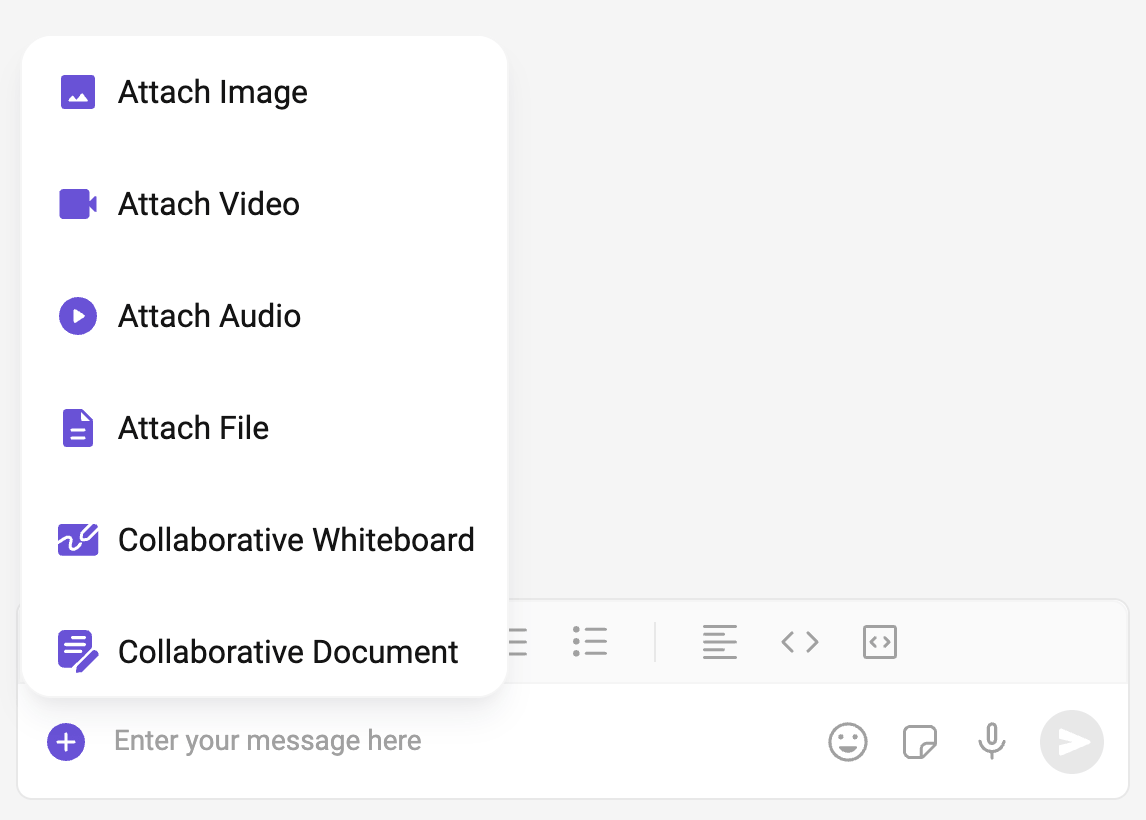
- TypeScript
- css
AuxiliaryButtonView
You can insert a custom view into the CompactMessageComposer component to add additional functionality using the following method.The CompactMessageComposer Component utilizes the AuxiliaryButton to provide sticker and AI functionality. Overriding the AuxiliaryButton will subsequently replace the sticker functionality.
- TypeScript
SendButtonView
You can set a custom view in place of the already existing send button view.- TypeScript
- css
HeaderView
You can set custom headerView to the CompactMessageComposer component using the following method.- TypeScript
- css
TextFormatters
Assigns the list of text formatters. If the provided list is not null, it sets the list. Otherwise, it assigns the default text formatters retrieved from the data source. To configure the existing Mentions look and feel check out CometChatMentionsFormatter- ShortCutFormatter.ts
- TypeScript
Next Steps
Message Composer
Full-featured multi-line message composer component.
Message List
Display messages with real-time updates.
Mentions Formatter
Implement @mentions in your chat application.
Theme Customization
Customize colors, fonts, and styling.