

Overview
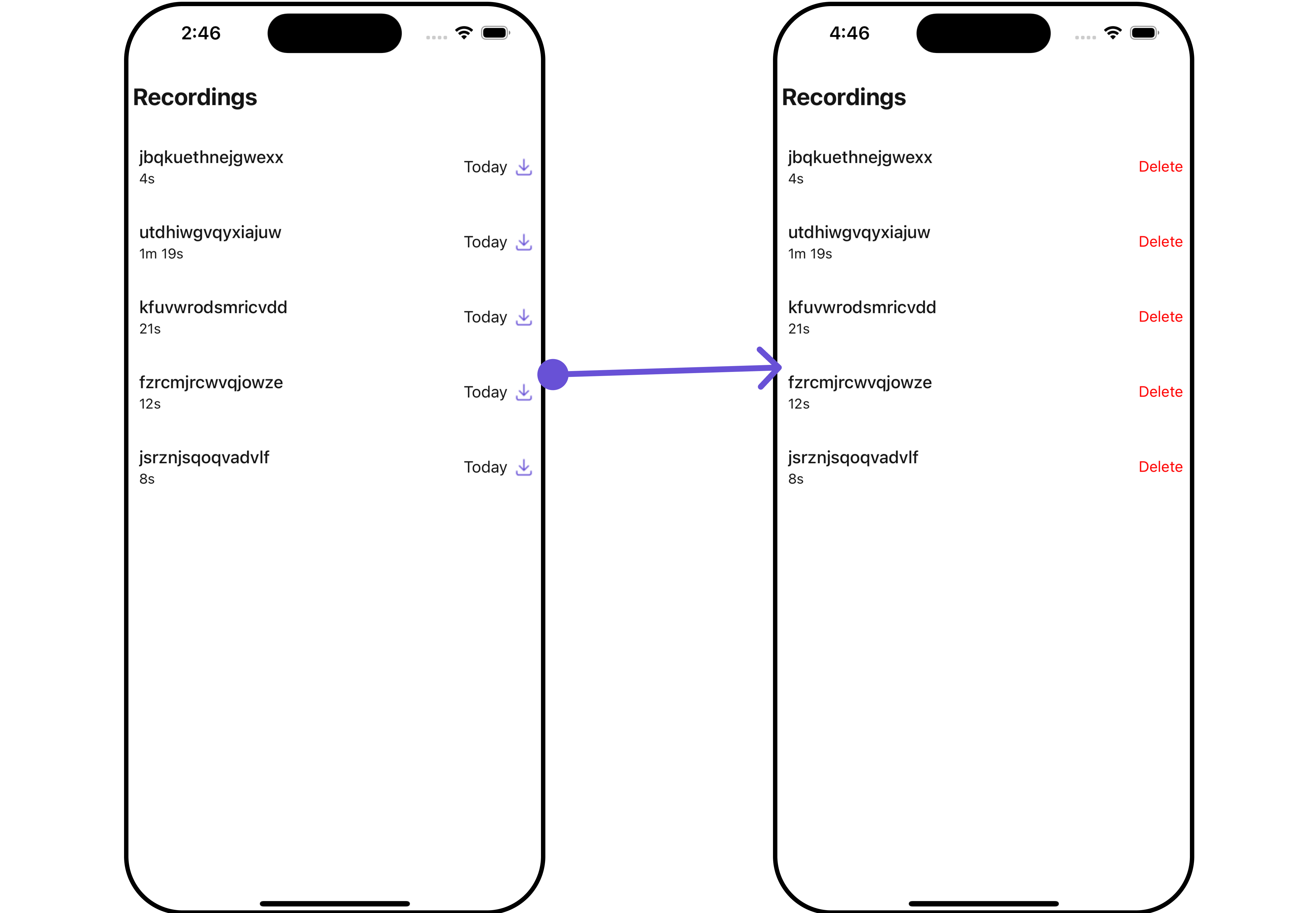
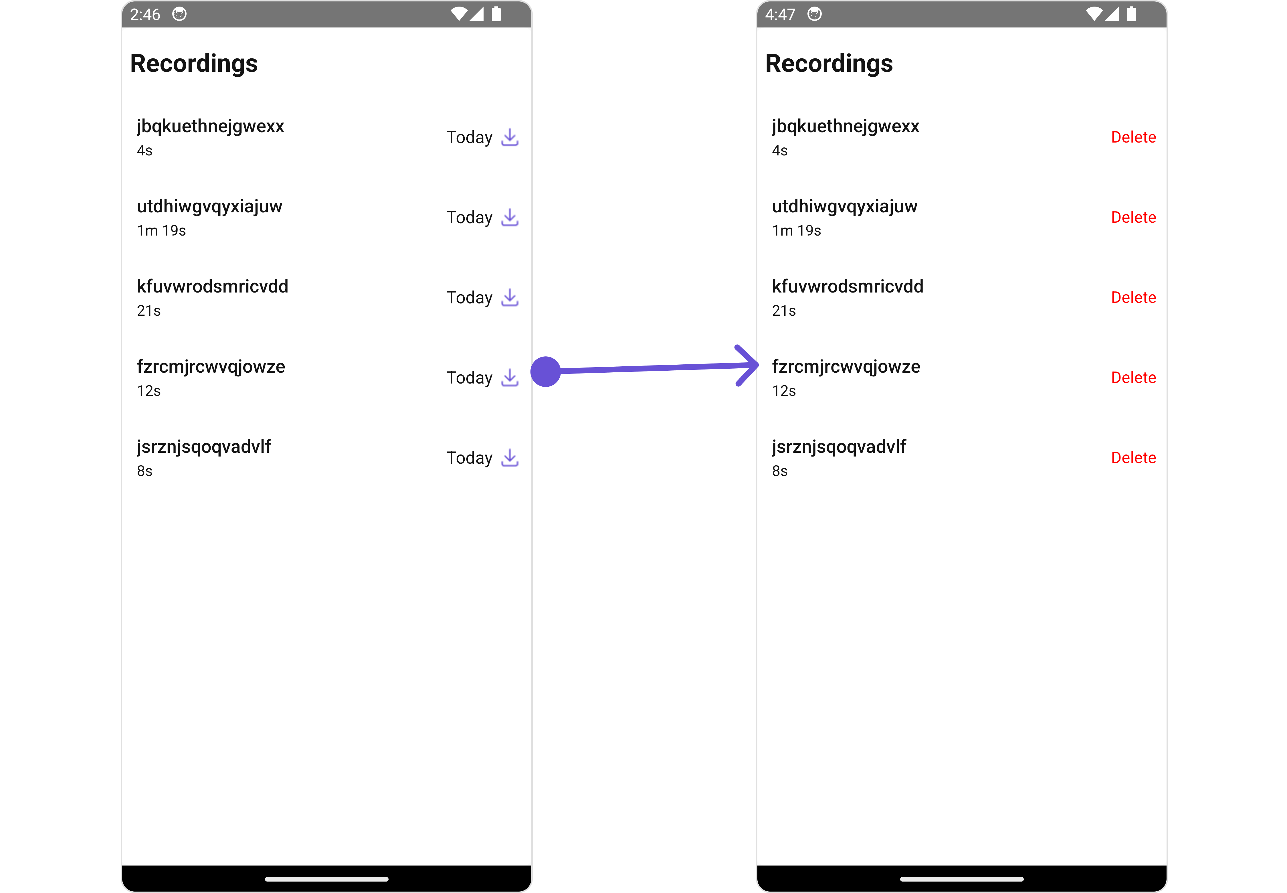
TheCometChatRecordings is a Component that shows a paginated list of recordings of a particular call. This allows the user to see all the recordings along with the duration as well as a download link using which one can download the recording.
- iOS
- Android
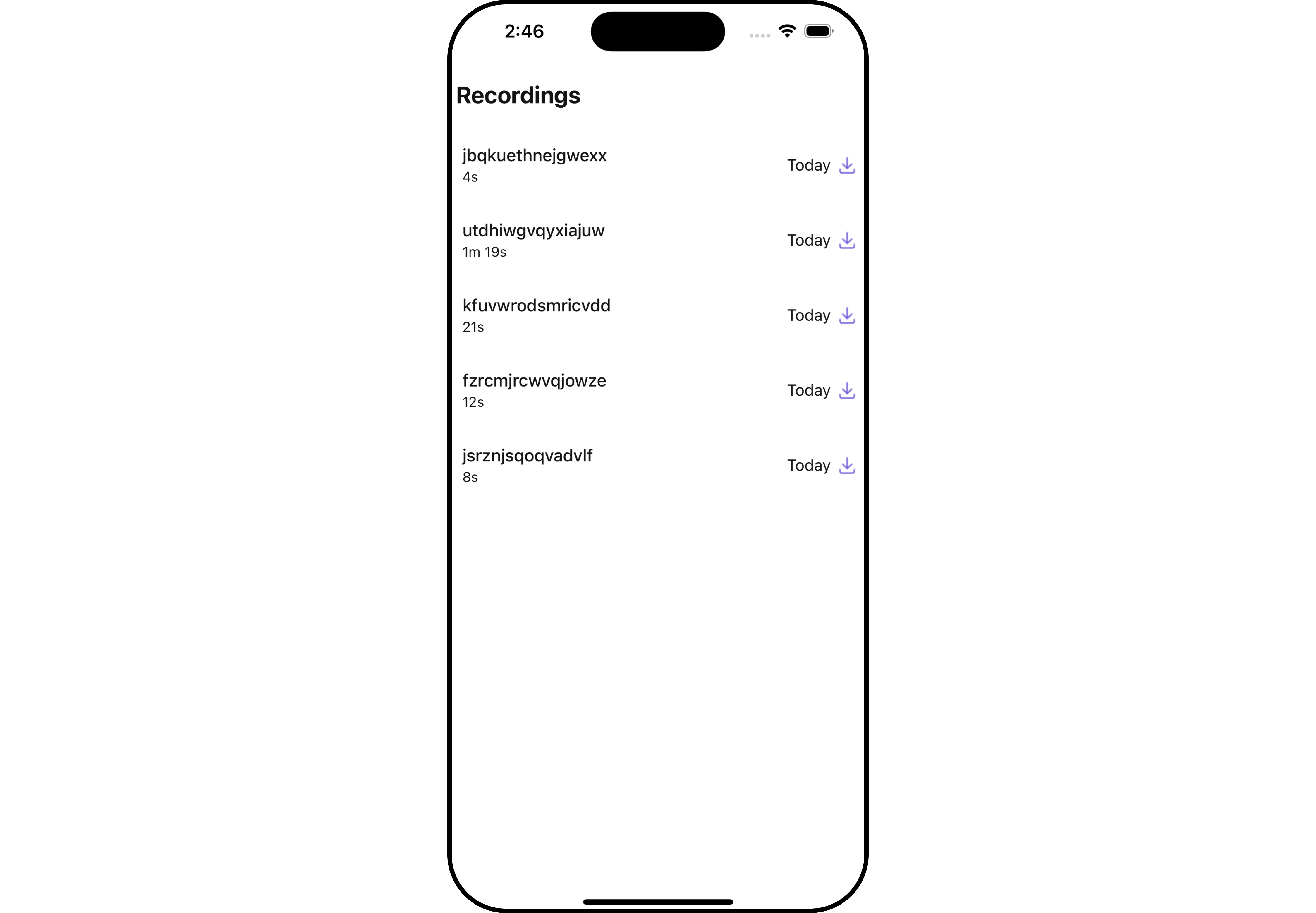
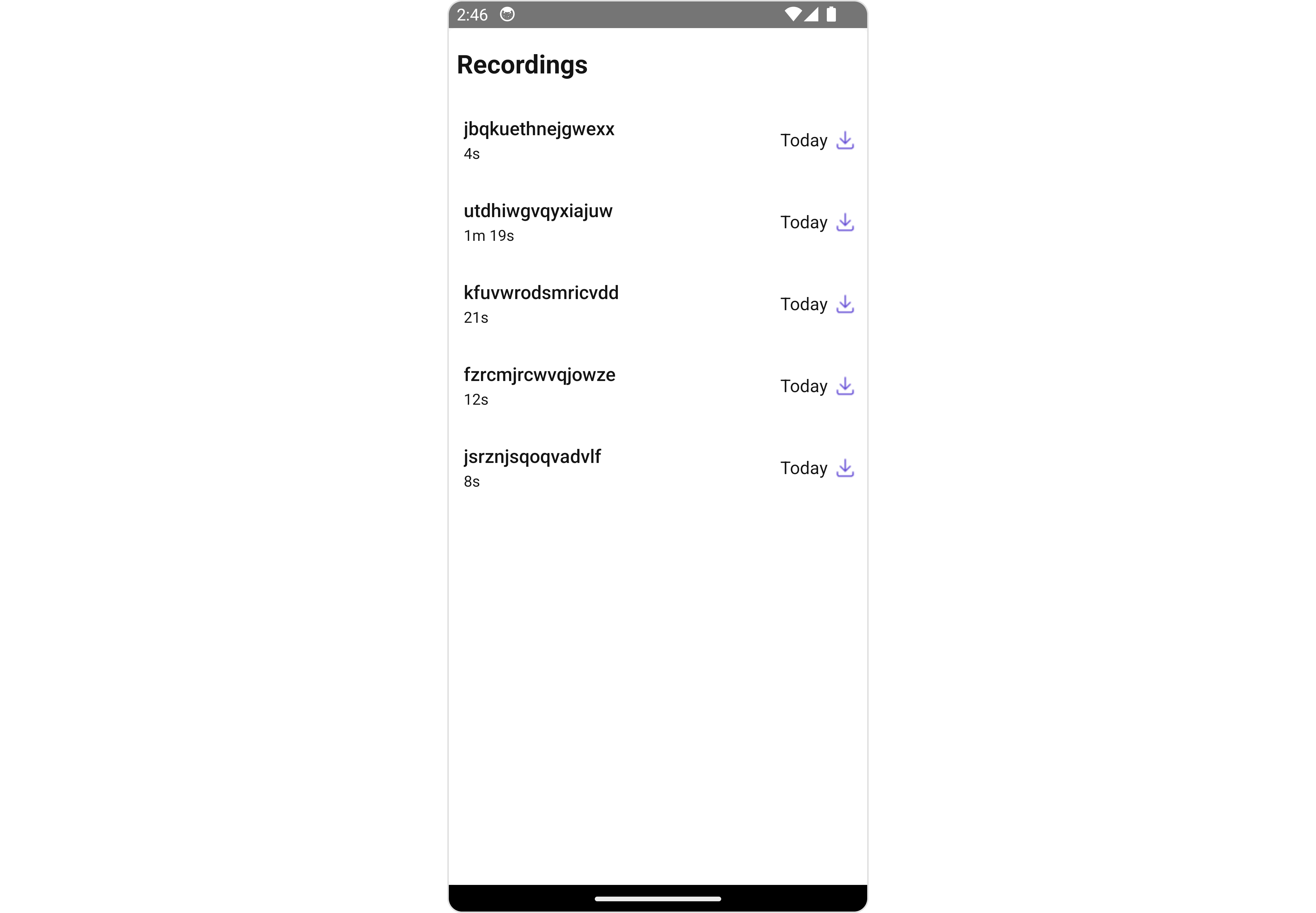
CallRecordings is comprised of the following components:
Usage
Integration
- App.tsx
Actions
Actions dictate how a component functions. They are divided into two types: Predefined and User-defined. You can override either type, allowing you to tailor the behavior of the component to fit your specific needs.1. onItemPress
onItemPress is triggered when you click on a ListItem of the of the CallRecordings component. It does not have a default behavior. However, you can override its behavior using the following code snippet.
- App.tsx
2. onBack
TheonBack function is built to respond when you press the back button in the AppBar. The back button is only displayed when the prop showBackButton is set to true.
- App.tsx
3. onDownloadIconPress
onDownloadIconPress is triggered when you click on the download of the of the CallRecordings component. you can override its behavior using the following code snippet.
- App.tsx
4. onError
This action doesn’t change the behavior of the component but rather listens for any errors that occur in theCallRecordings component.
- App.tsx
Filters
Filters allow you to customize the data displayed in a list within aComponent. You can filter the list based on your specific criteria, allowing for a more customized. Filters can be applied using RequestBuilders of Chat SDK.
The CallRecordings component does not have any exposed filters.
Events
Events are emitted by aComponent. By using event you can extend existing functionality. Being global events, they can be applied in Multiple Locations and are capable of being Added or Removed.
The CallRecordings does not produce any events.
Customization
To fit your app’s design requirements, you have the ability to customize the appearance of theCallLogRecordings component. We provide exposed methods that allow you to modify the experience and behavior according to your specific needs.
Style
Using Style you can customize the look and feel of the component in your app, These parameters typically control elements such as the color, size, shape, and fonts used within the component.1. ListItem Style
If you want to apply customized styles to theListItemStyle component within the CallRecordings Component, you can use the following code snippet. For more information, you can refer ListItem Styles.
- App.tsx
Functionality
These are a set of small functional customizations that allow you to fine-tune the overall experience of the component. With these, you can change text, set custom icons, and toggle the visibility of UI elements. Here is a code snippet demonstrating how you can customize the functionality of theCallRecordings component.
- App.tsx
- iOS
- Android
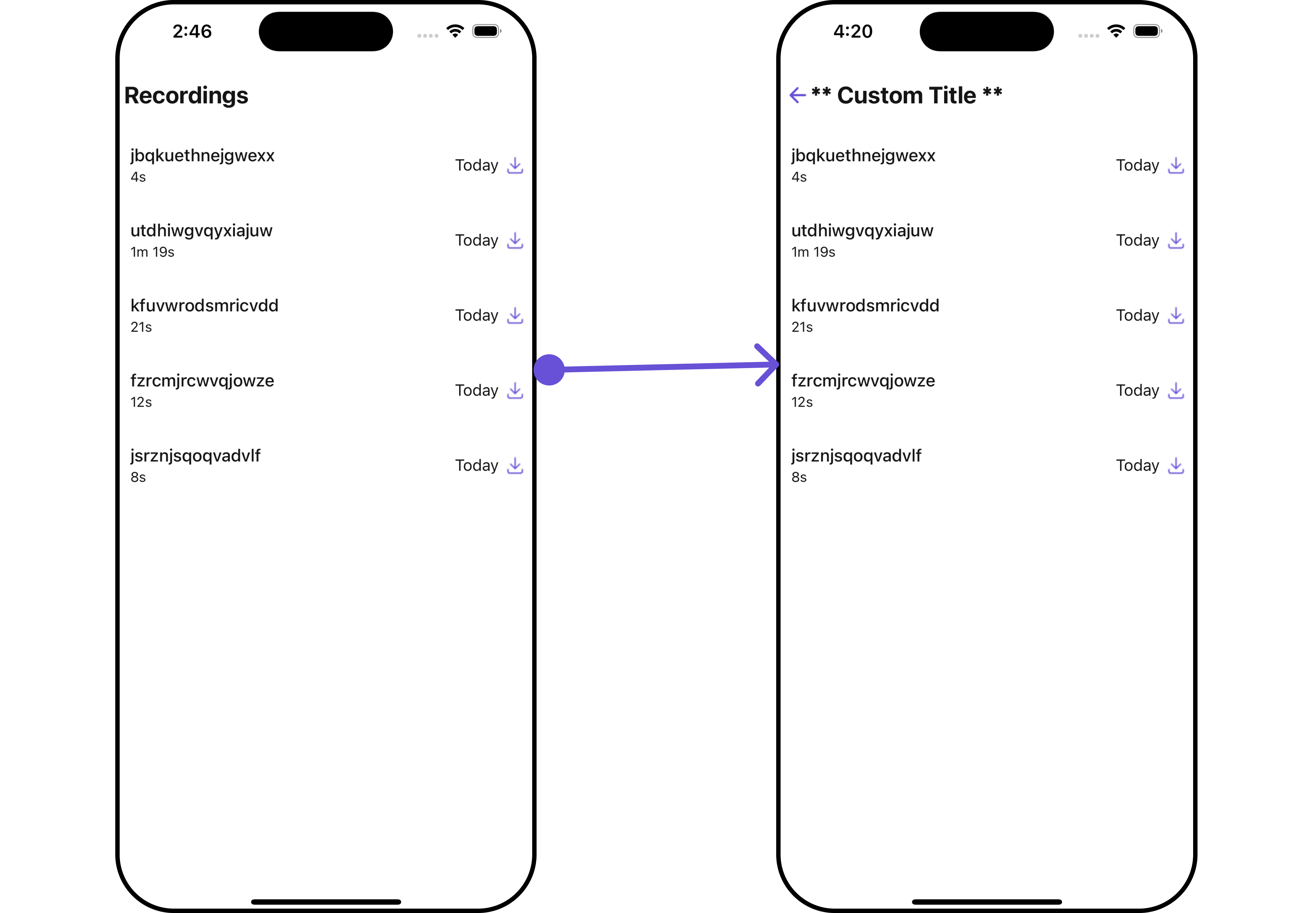
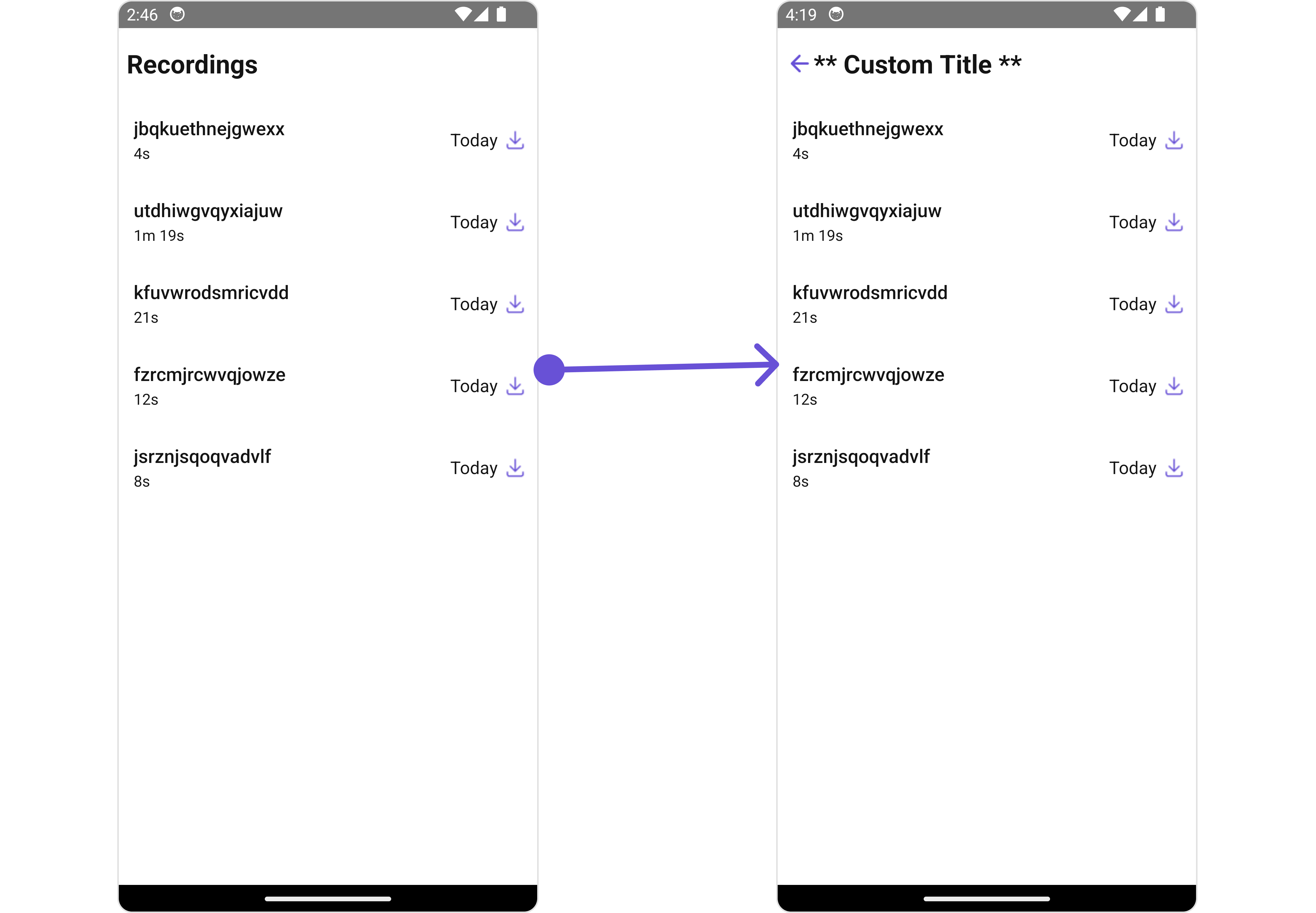
Below is a list of customizations along with corresponding code snippets
Advanced
For advanced-level customization, you can set custom views to the component. This lets you tailor each aspect of the component to fit your exact needs and application aesthetics. You can create and define your views, layouts, and UI elements and then incorporate those into the component.ListItemView
With this property, you can assign a custom ListItem to theCallRecordings Component.
- iOS
- Android
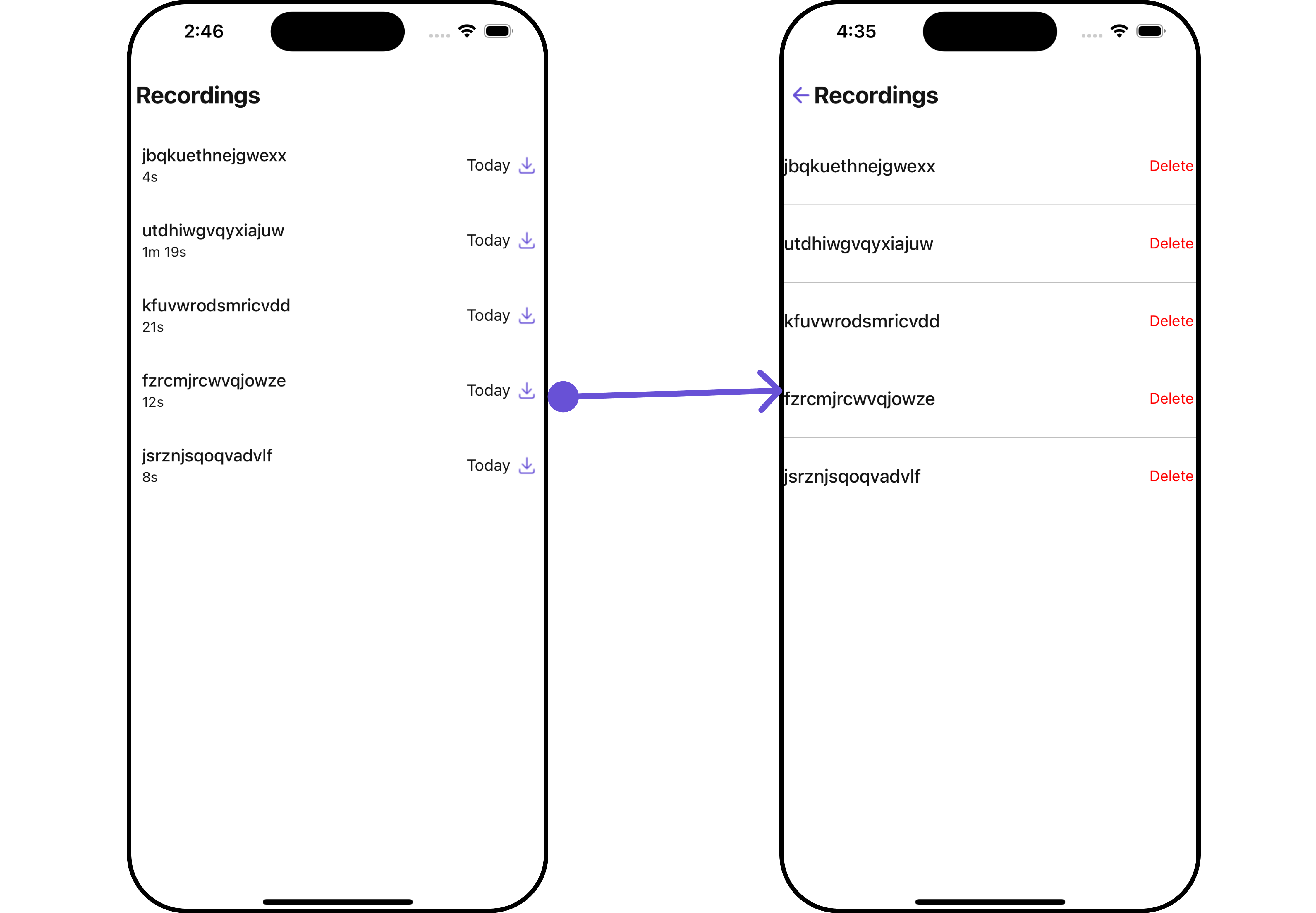
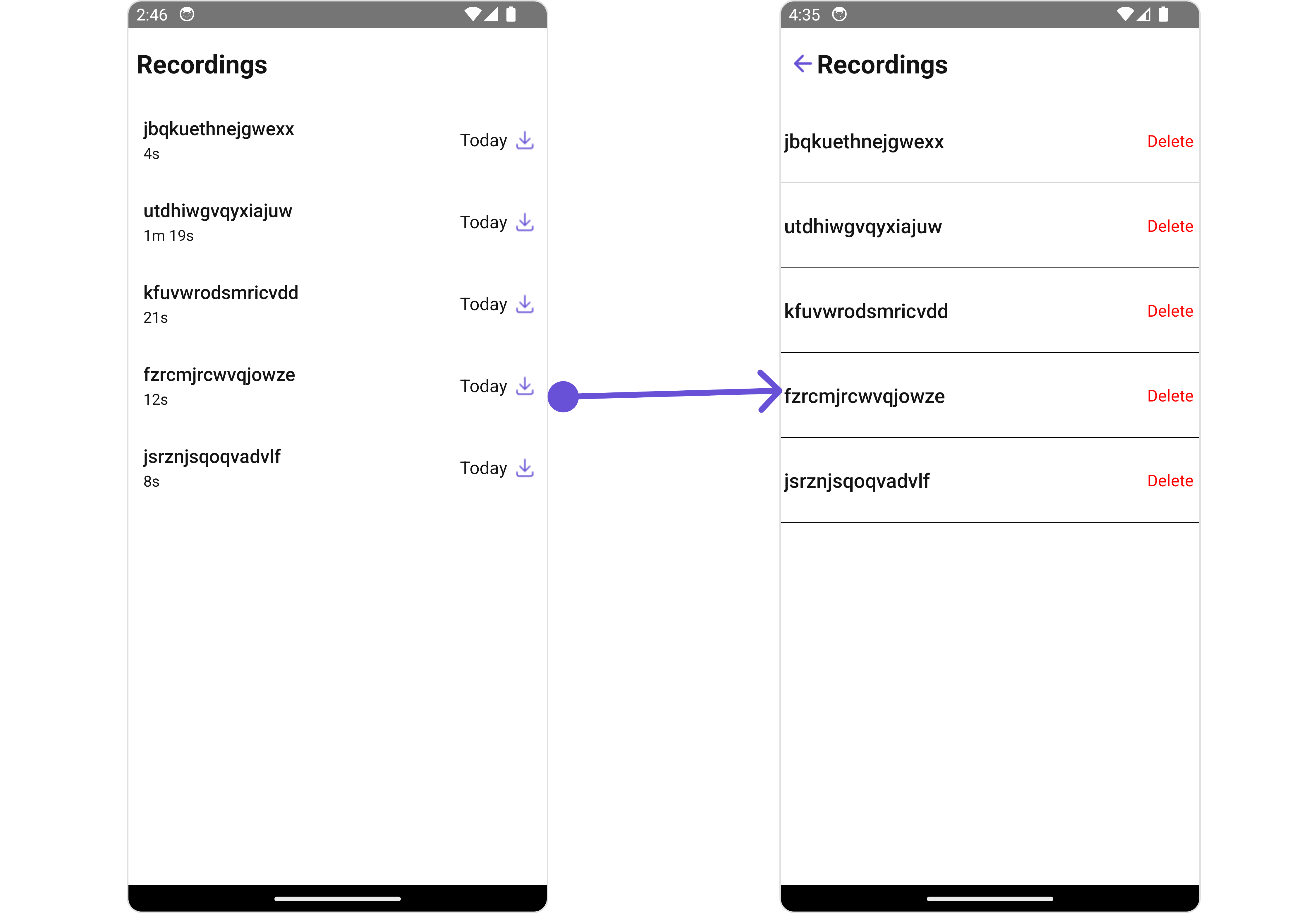
- App.tsx
SubtitleView
You can customize the subtitle view for each Call Recordings item to meet your requirements- iOS
- Android
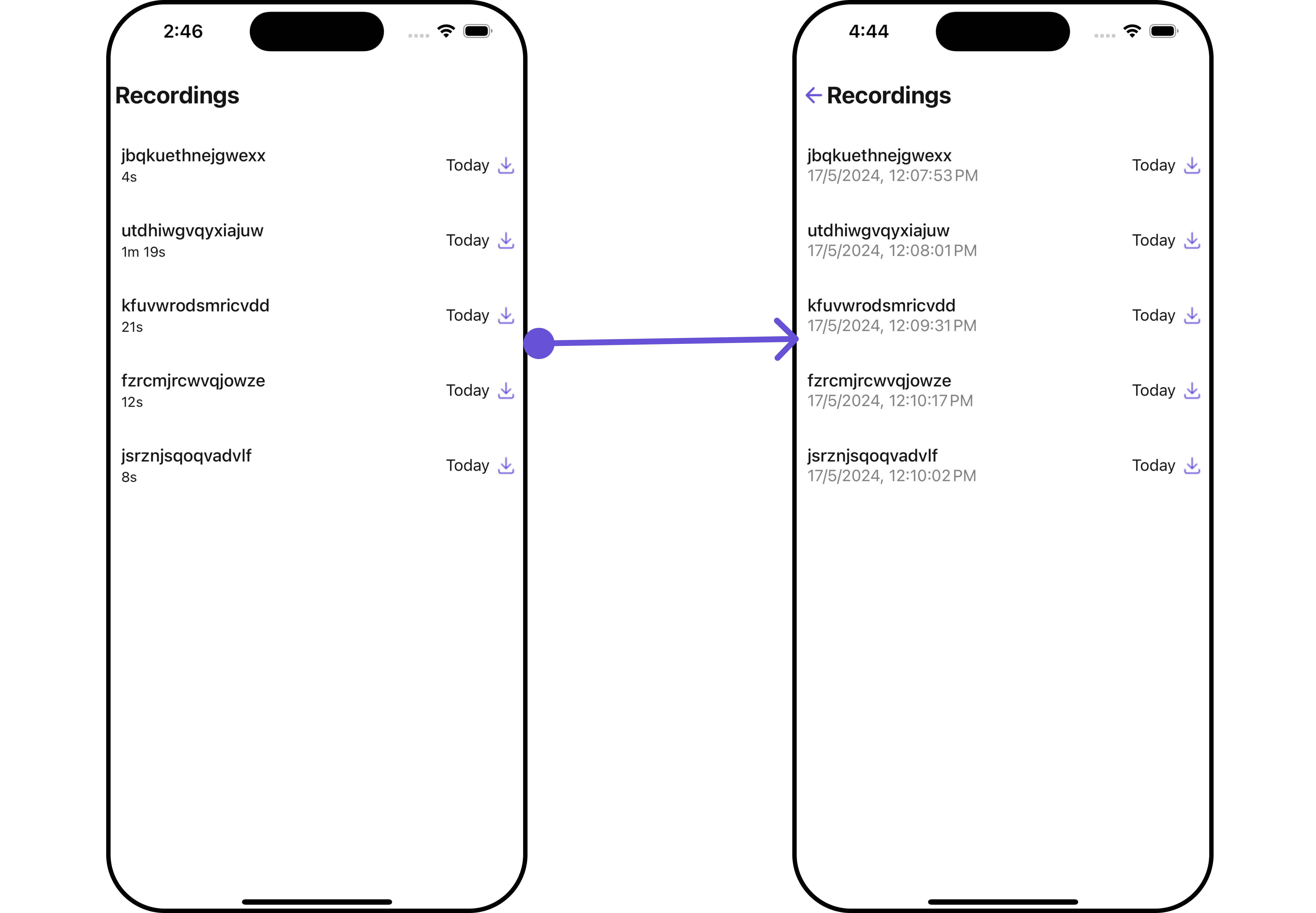
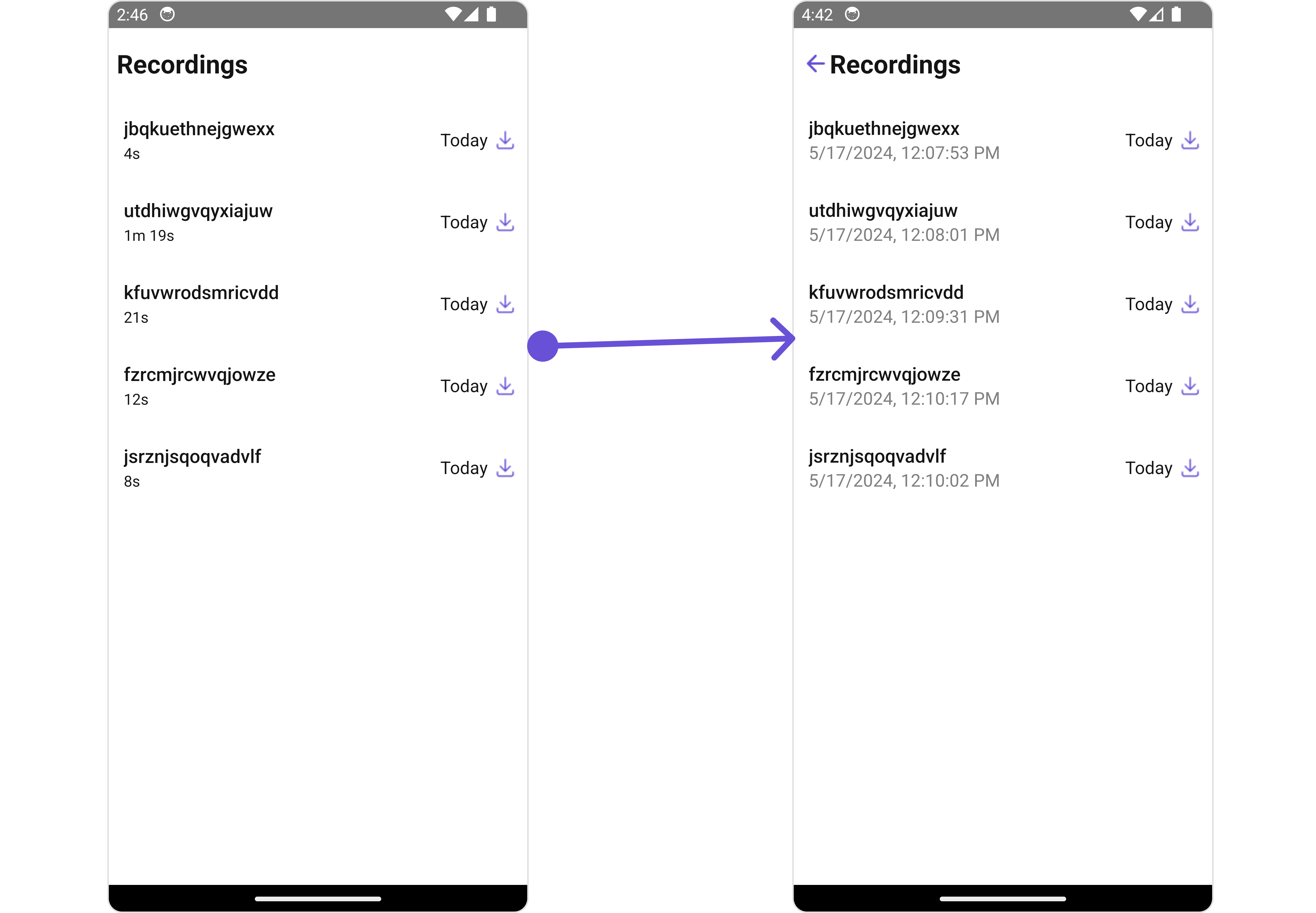
- App.tsx
TailView
You can customize the tail view for each call Recordings item to meet your requirements- iOS
- Android
- App.tsx