

Overview
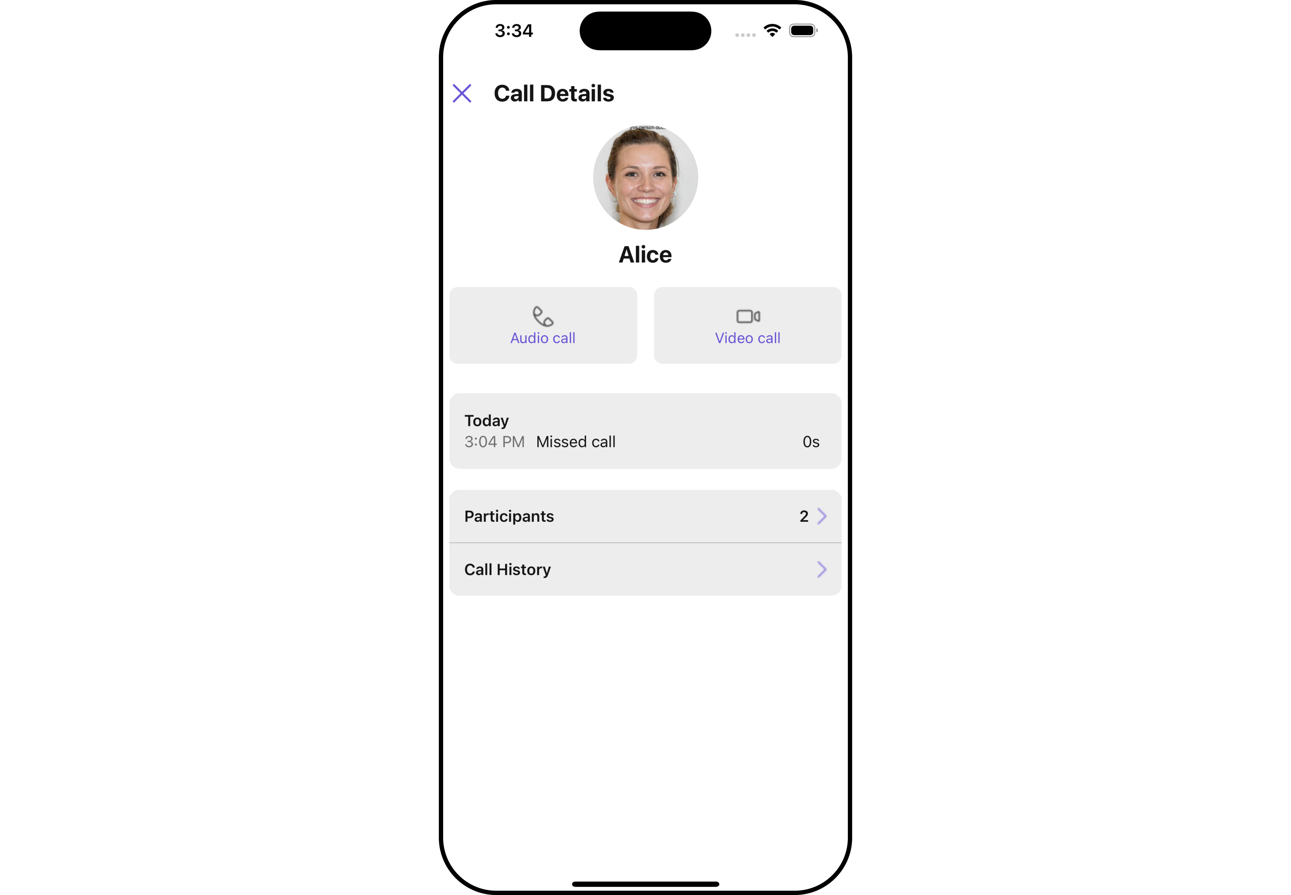
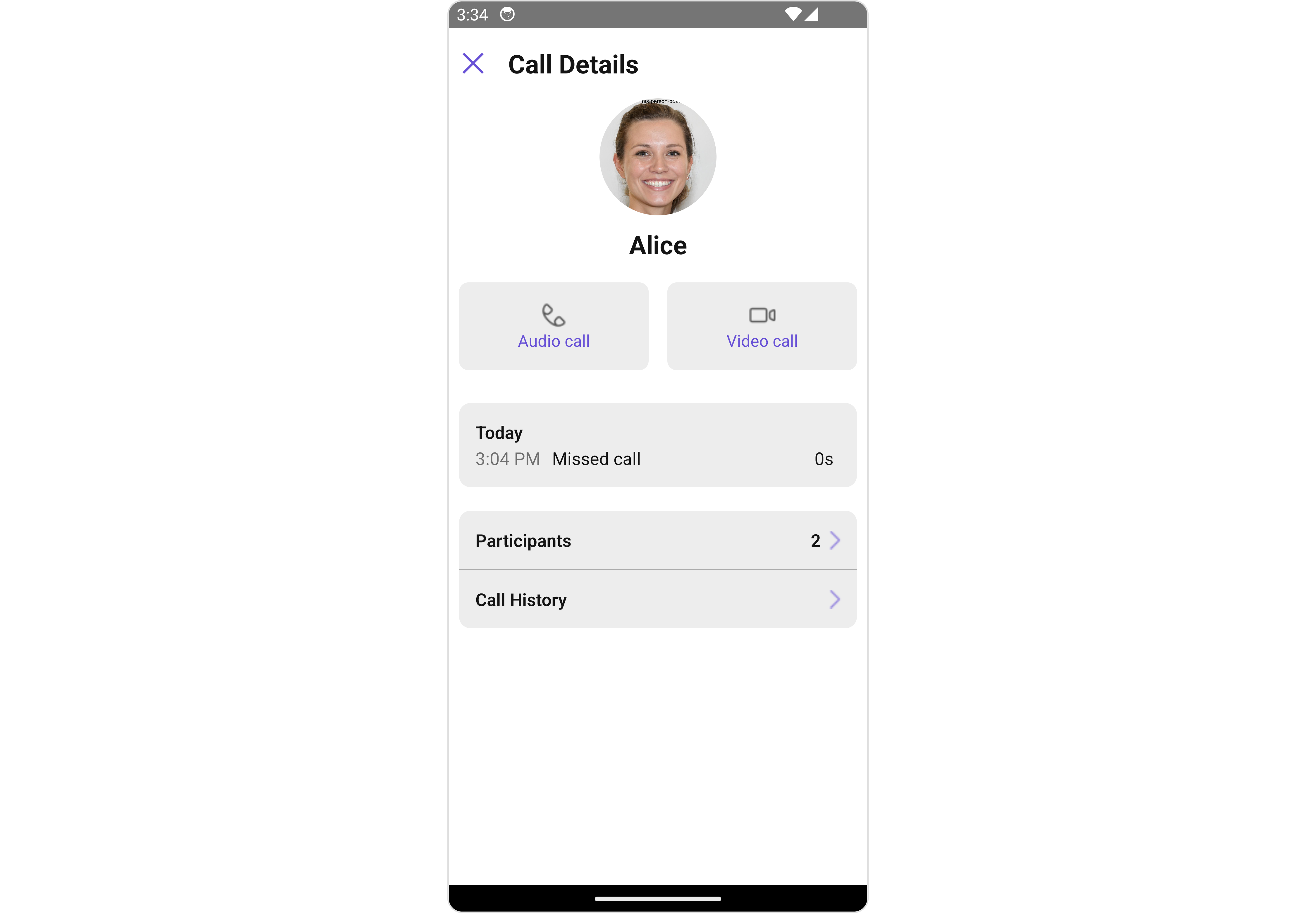
TheCallLogDetails is a Component that displays all the information related to a call. This component displays information like user/group information, participants of the call, recordings of the call (if available) & history of all the previous calls. Also, it has buttons to start a new call.
- iOS
- Android
Usage
Integration
- App.tsx
Actions
Actions dictate how a component functions. They are divided into two types: Predefined and User-defined. You can override either type, allowing you to tailor the behavior of the component to fit your specific needs.1. onBack
TheonBack function is built to respond when you press the back button in the AppBar.
By default, this action does not have a predefined behavior. However, you have the flexibility to override this event and tailor it to suit your needs using the following code snippet.
- App.tsx
2. onError
This action doesn’t change the behavior of the component but rather listens for any errors that occur in the Groups component.- App.tsx
Filters
Filters allow you to customize the data displayed in a list within aComponent. You can filter the list based on your specific criteria, allowing for a more customized. Filters can be applied using RequestBuilders of Chat SDK.
The CallLogDetails component does not have any exposed filters.
Events
Events are emitted by a Component. By using event you can extend existing functionality. Being global events, they can be applied in Multiple Locations and are capable of being Added or Removed. TheCallLogDetails component does not produce any events but its component does.
Customization
To fit your app’s design requirements, you can customize the appearance of the Incoming Call component. We provide exposed methods that allow you to modify the experience and behavior according to your specific needs.Style
Using Style you can customize the look and feel of the component in your app, These parameters typically control elements such as the color, size, shape, and fonts used within the component.1. CallLogDetails Style
To customize the appearance, you can assign aCallLogDetailsStyle object to the CallLogDetails component.
- iOS
- Android
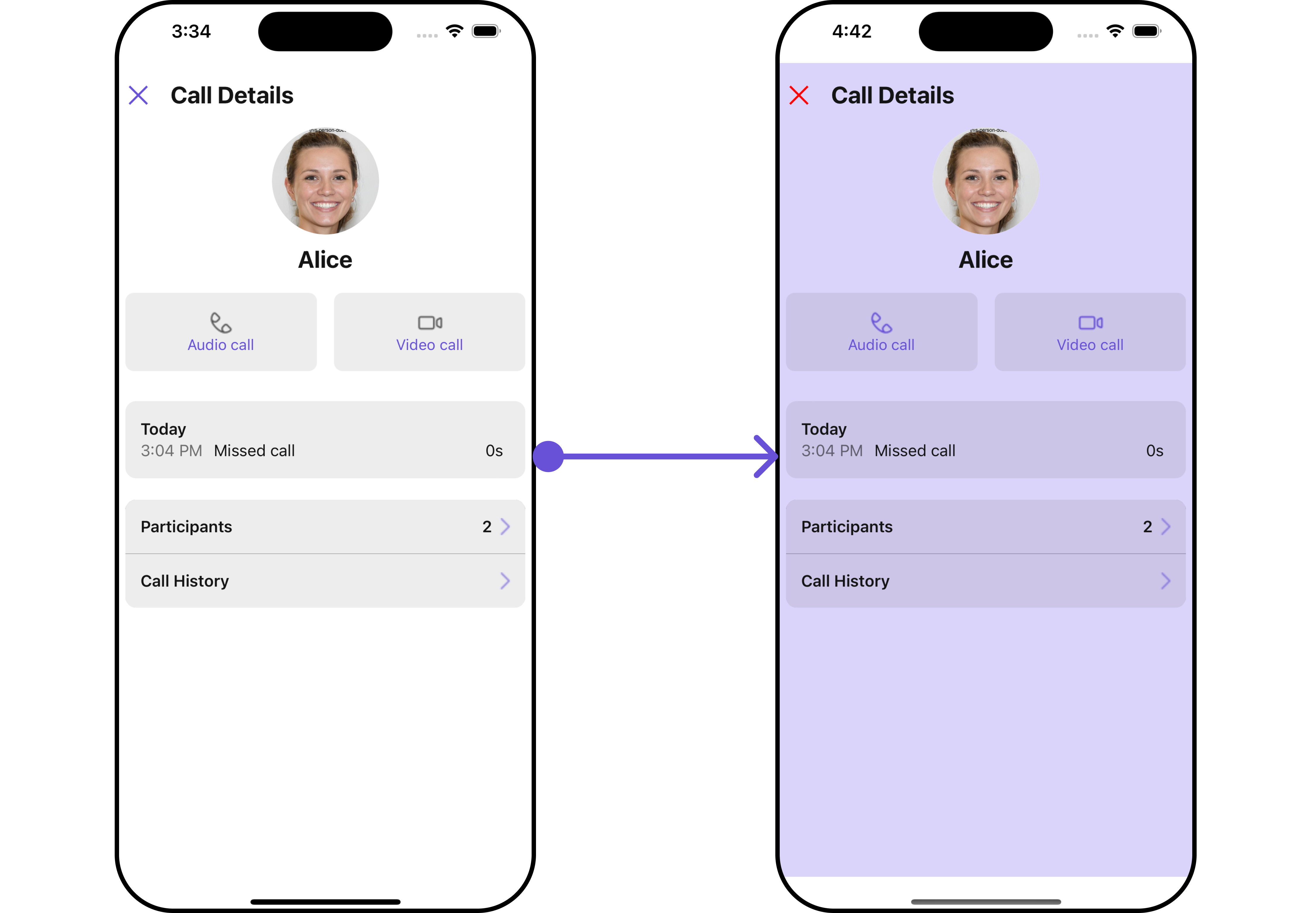
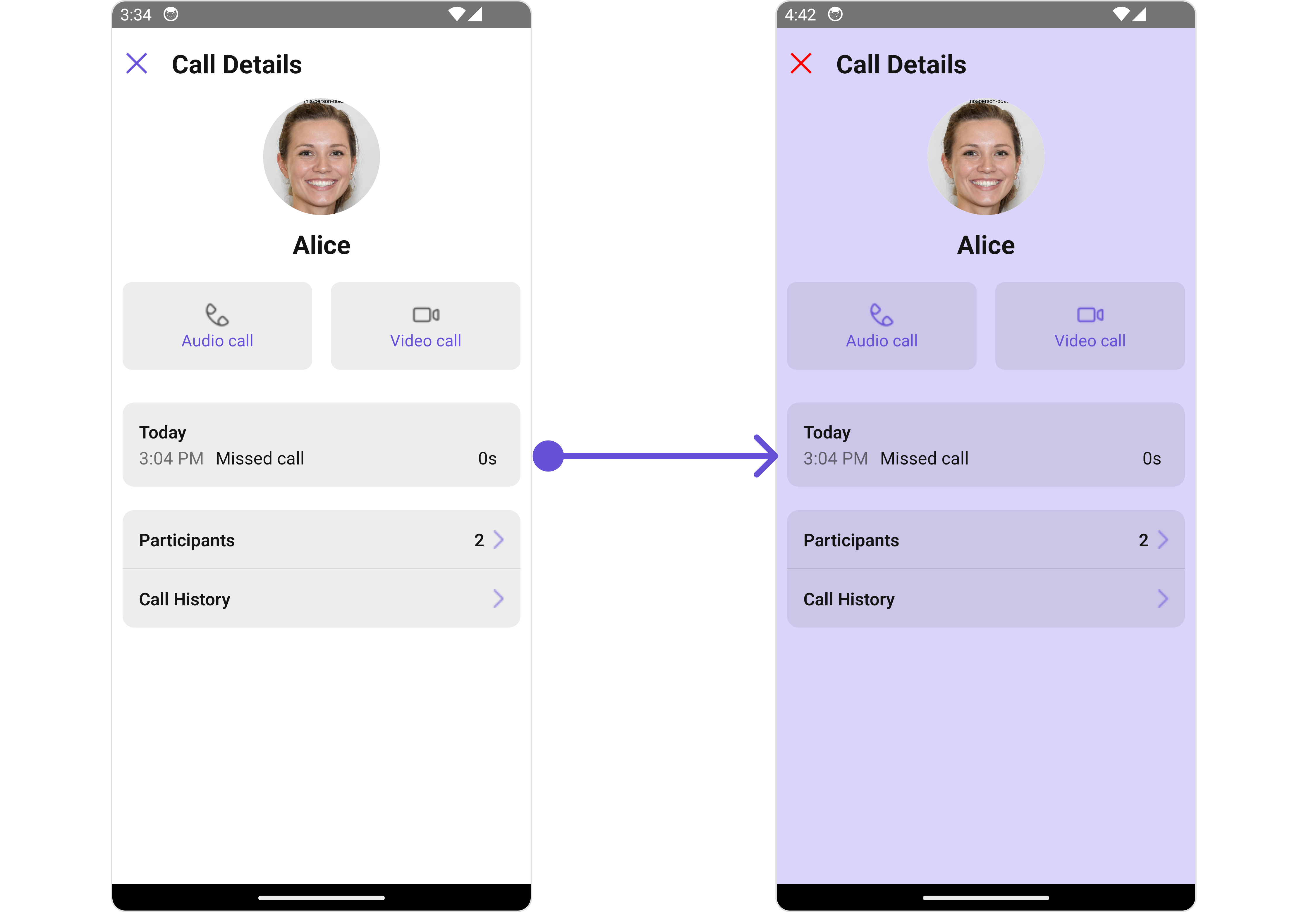
CallLogDetailsStyle.
- App.tsx
CallLogDetails Style:
2. Avatar Style
If you want to apply customized styles to theAvatar component within the CallLogDetails Component, you can use the following code snippet. For more information you can refer Avatar Styles.
- App.tsx
Functionality
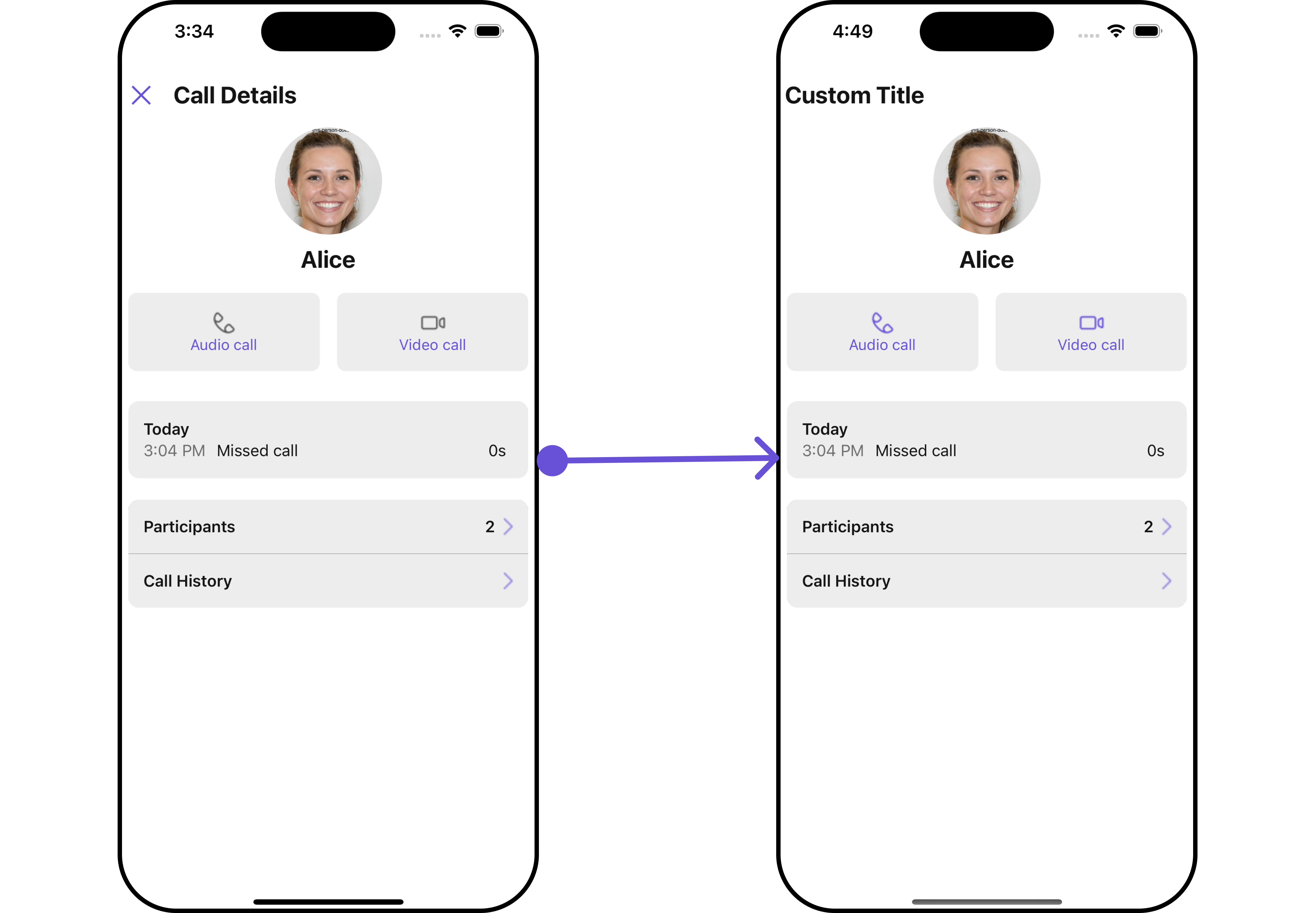
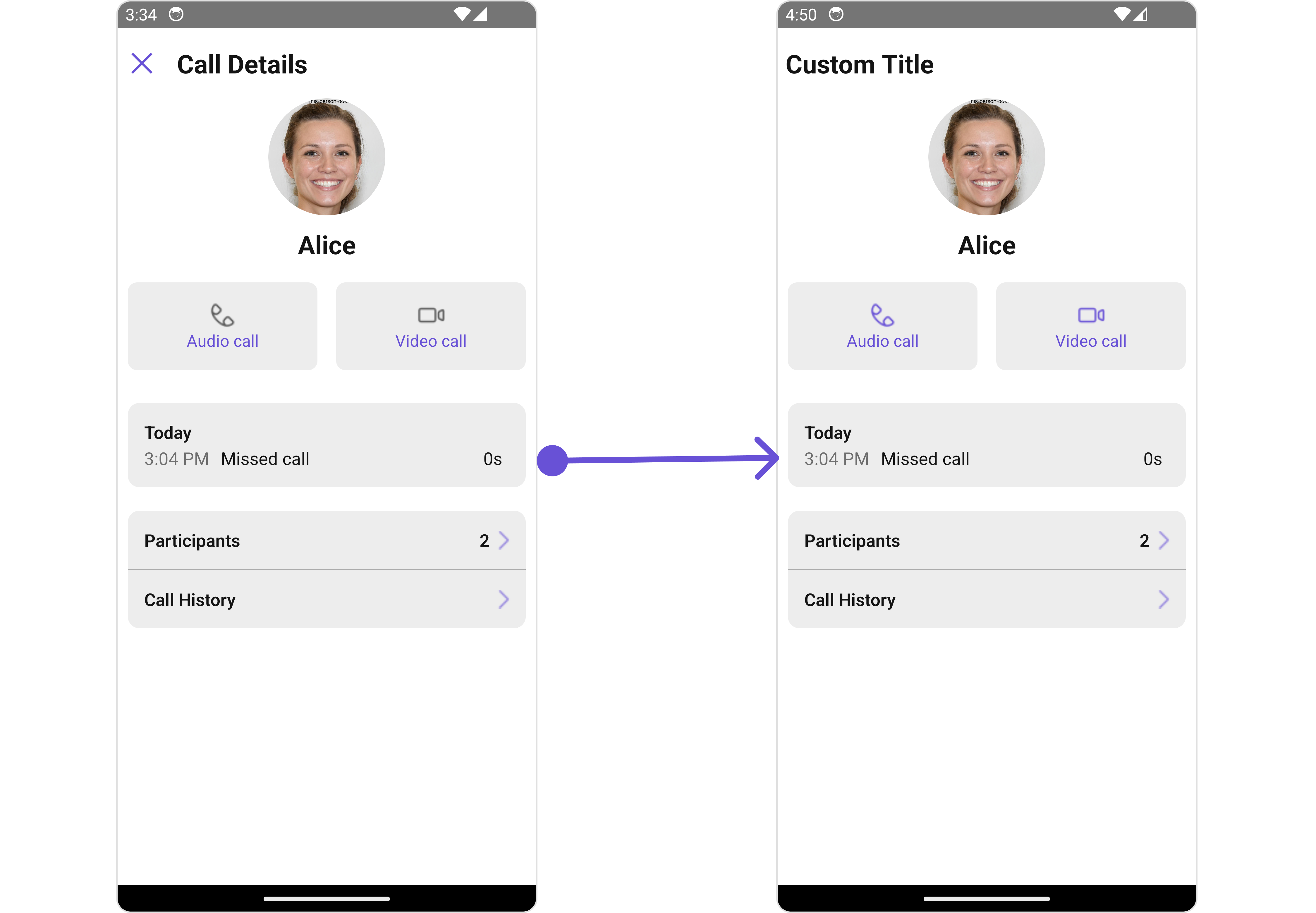
These are a set of small functional customizations that allow you to fine-tune the overall experience of the component. With these, you can change text, set custom icons, and toggle the visibility of UI elements. Here is a code snippet demonstrating how you can customize the functionality of theCallLogDetails component.
- App.tsx
- iOS
- Android
Advanced
For advanced-level customization, you can set custom views to the component. This lets you tailor each aspect of the component to fit your exact needs and application aesthetics. You can create and define your views, layouts, and UI elements and then incorporate those into the component.DetailsTemplate
TheCometChatDetailsTemplate offers a structure for organizing information in the CometChat details component. It serves as a blueprint, defining how user-related details are presented. This structure allows for customization and organization within the CometChat interface.
This defines the structure of template data for the details component.
DetailsOption
TheDetailsOption defines the structure for individual options within the CometChat details component, facilitating customization and functionality for user interactions.
This defines the structure of each option for a template in the details component.
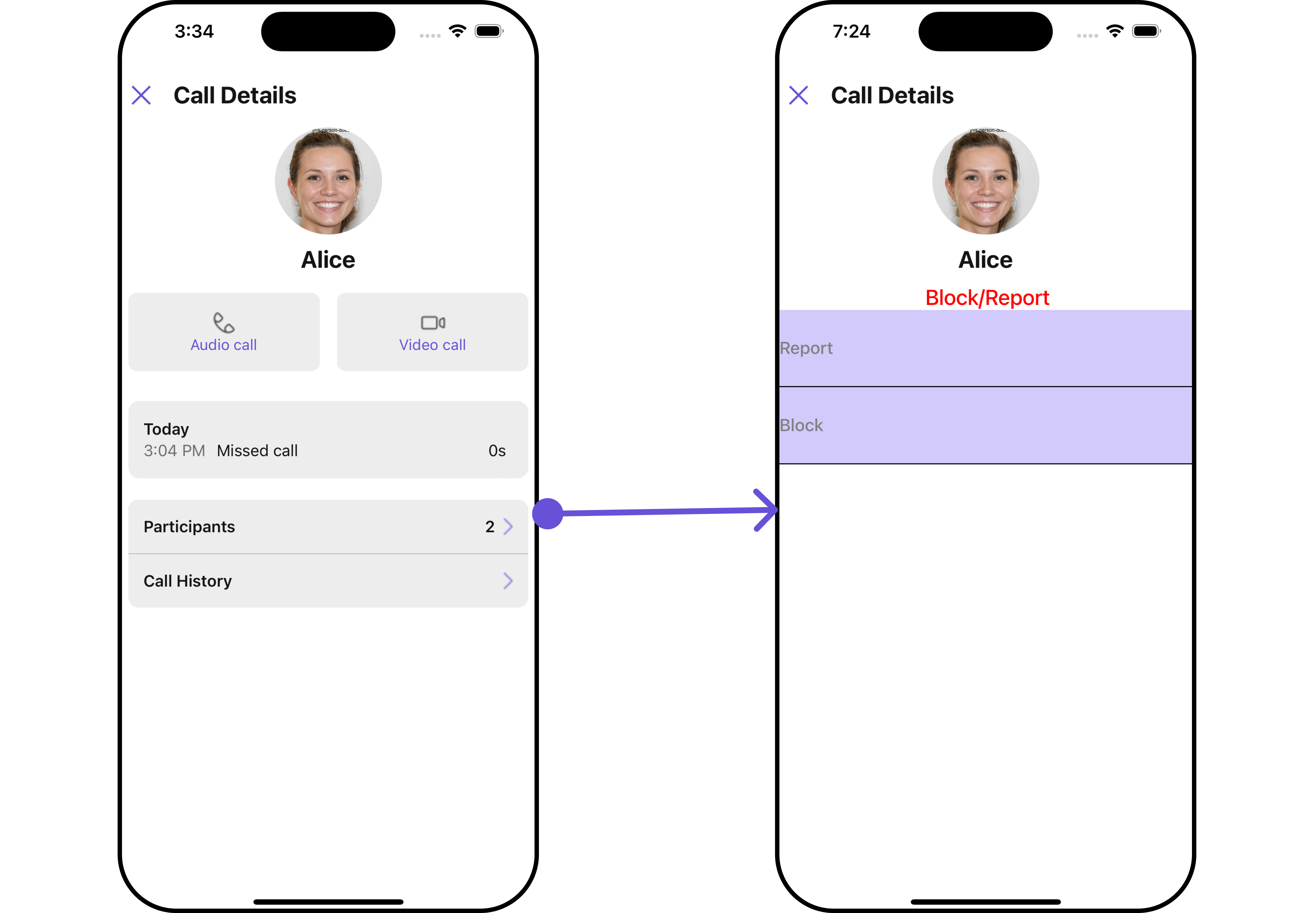
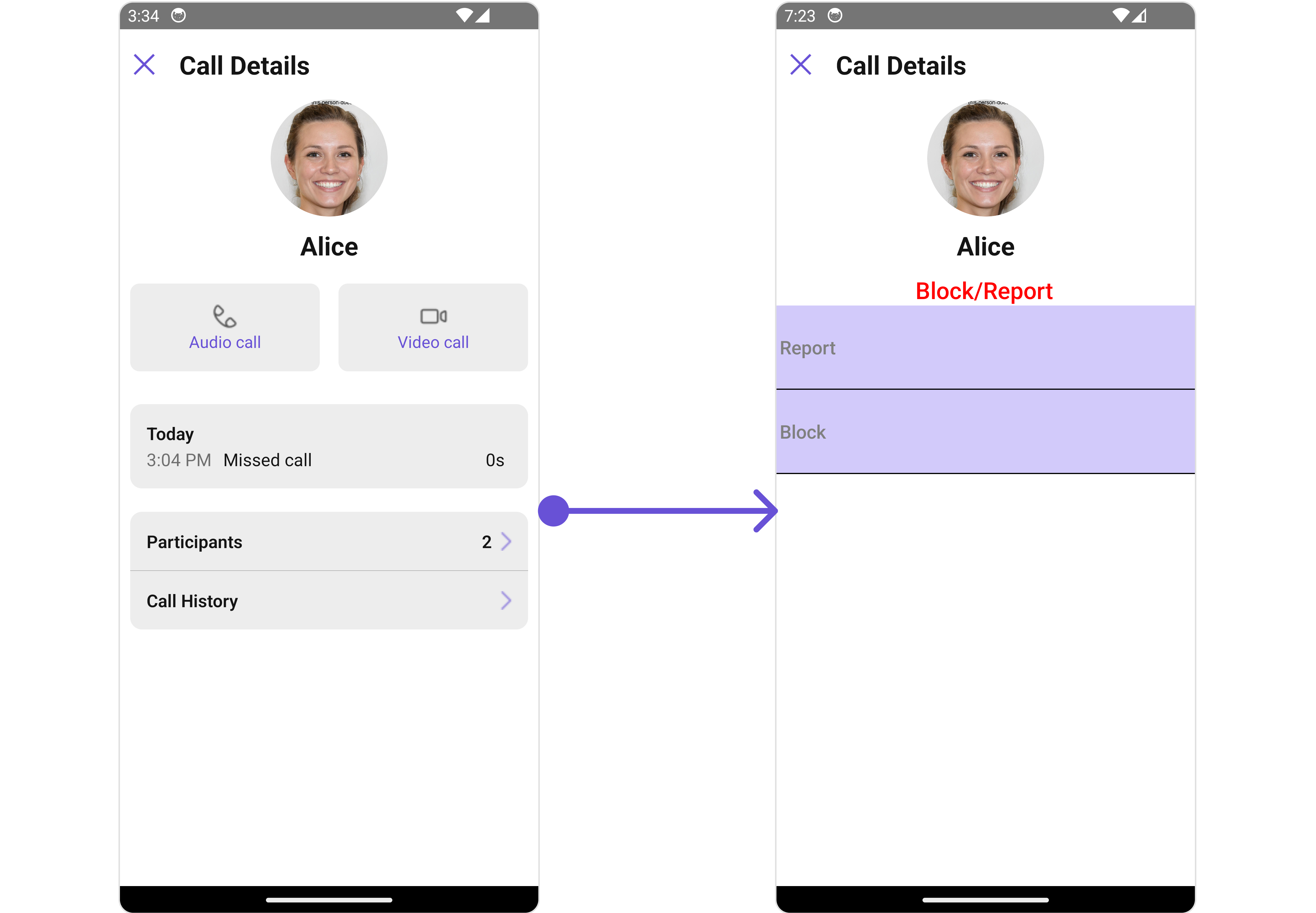
Below is an example of using Custom Details templates:
- App.tsx
- iOS
- Android
Configurations
Configurations offer the ability to customize the properties of each component within a Composite Component. CallLogDetails hasCallLogHistory, CallLogParticipants and CallLogRecordings component. Hence, each of these components will have its individual `Configuration“.
Configurationsexpose properties that are available in its individual components.
CallLogHistory
You can customize the properties of the Groups component by making use of thecallLogHistoryConfiguration. You can accomplish this by employing the callLogHistoryConfiguration props as demonstrated below:
- App.tsx
GroupsConfiguration can be found under Groups. Properties marked with the symbol are not accessible within the Configuration Object.
Example
Let’s say you want to change the style of the Groups subcomponent and, in addition, you only want to display the Group List based on only joined groups and setting the limit to 3.
You can modify the CallLogHistory list item style using the ListItemStyle property.
- iOS
- Android
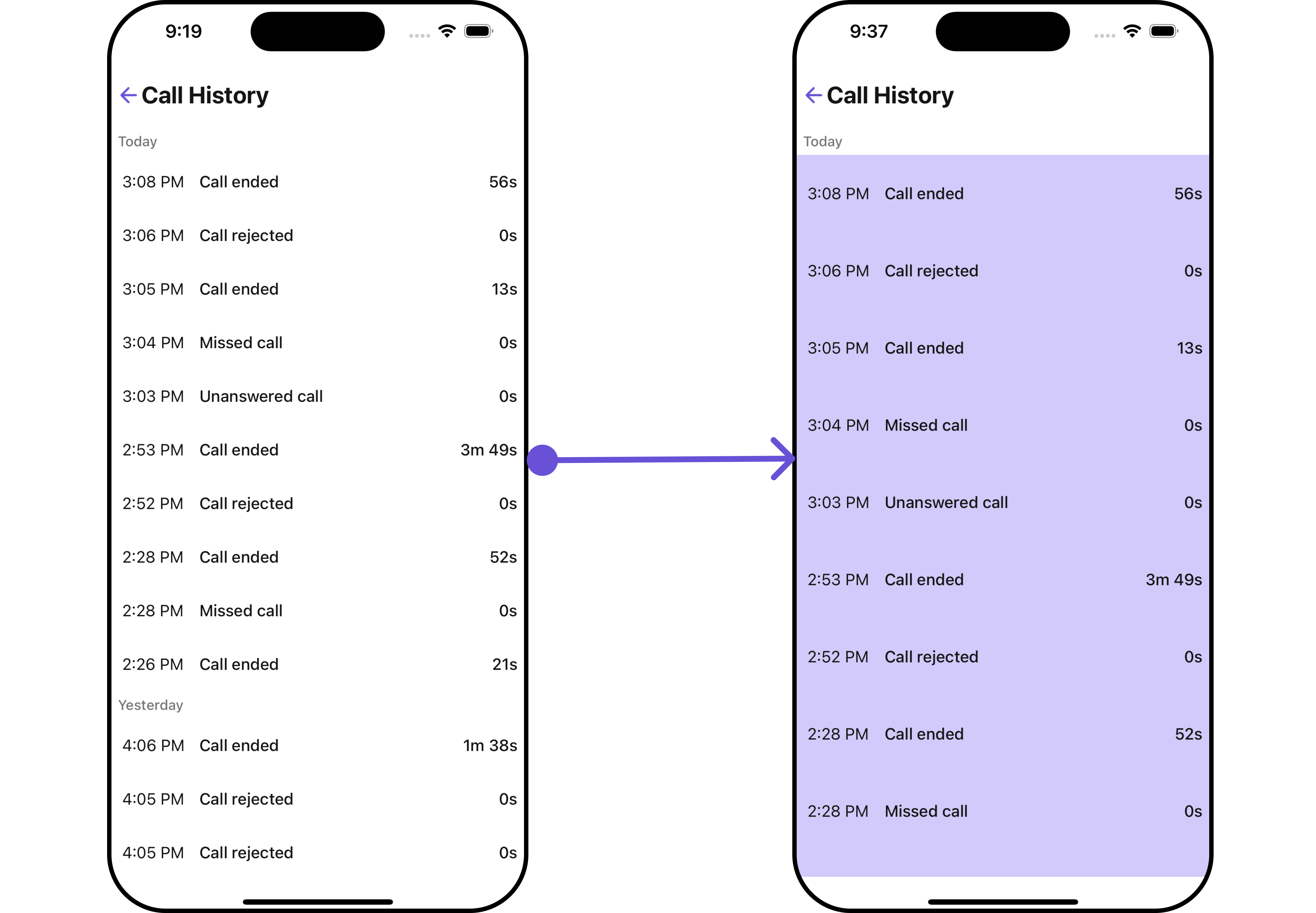
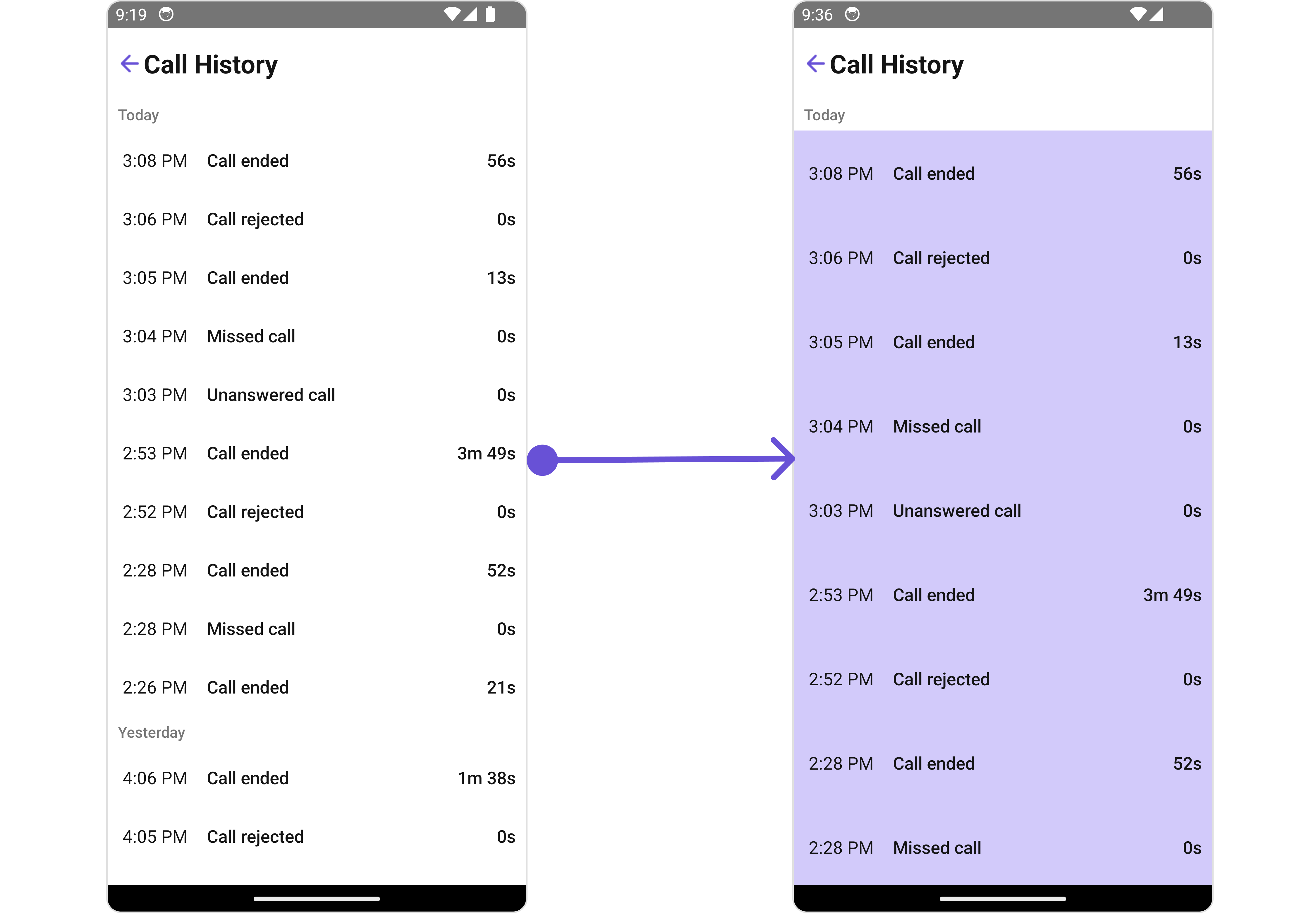
- App.tsx
CallLogParticipants
You can customize the properties of the Messages component by making use of the messagesConfiguration. You can accomplish this by employing theCallLogParticipantsConfiguration props as demonstrated below:
- App.tsx
CallLogParticipantsConfiguration can be found under Messages. Properties marked with the symbol are not accessible within the Configuration Object.
Example
Let’s say you want to change the style of the Messages subcomponent and, in addition, you only want to hide message header.
You can modify the CallLogParticipants list item style using the ListItemStyle property.
- iOS
- Android
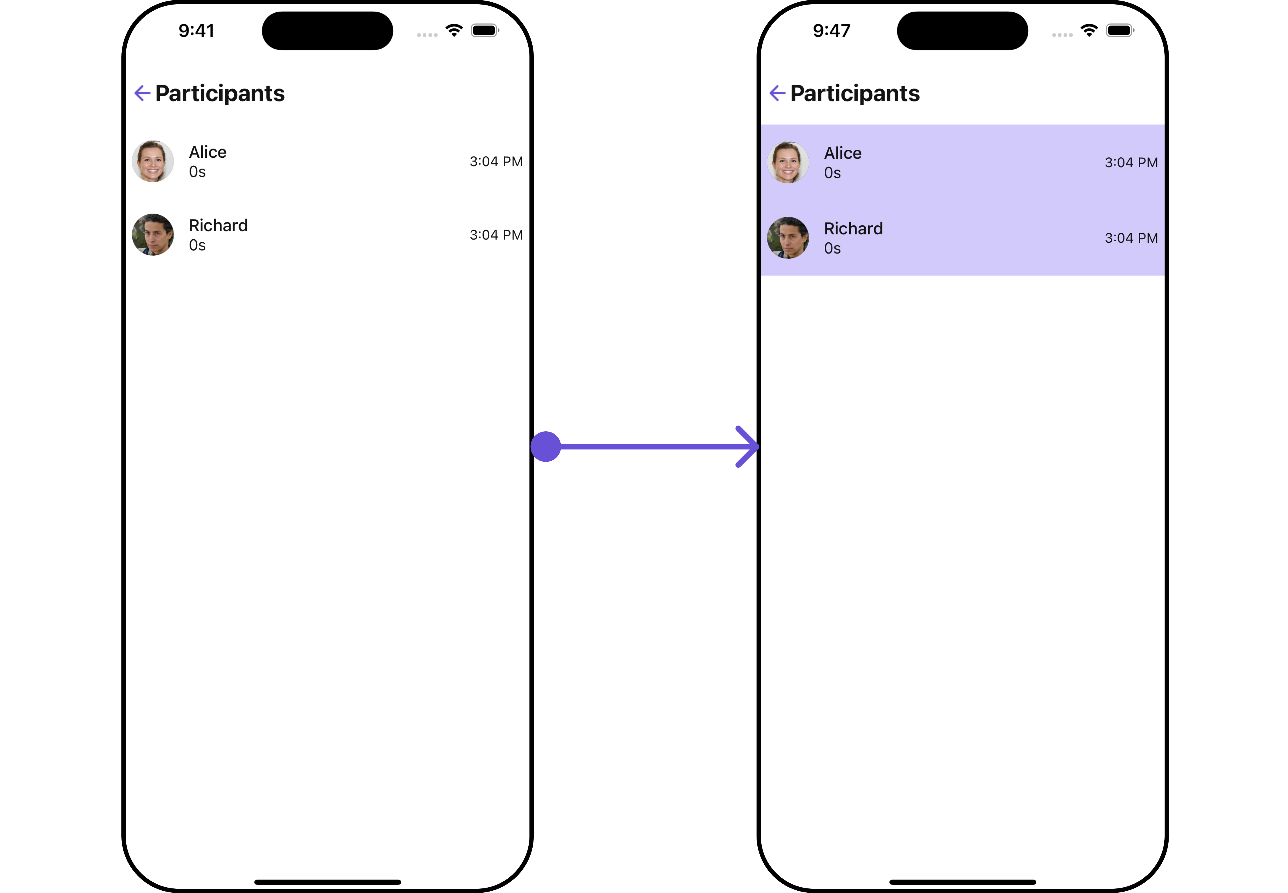
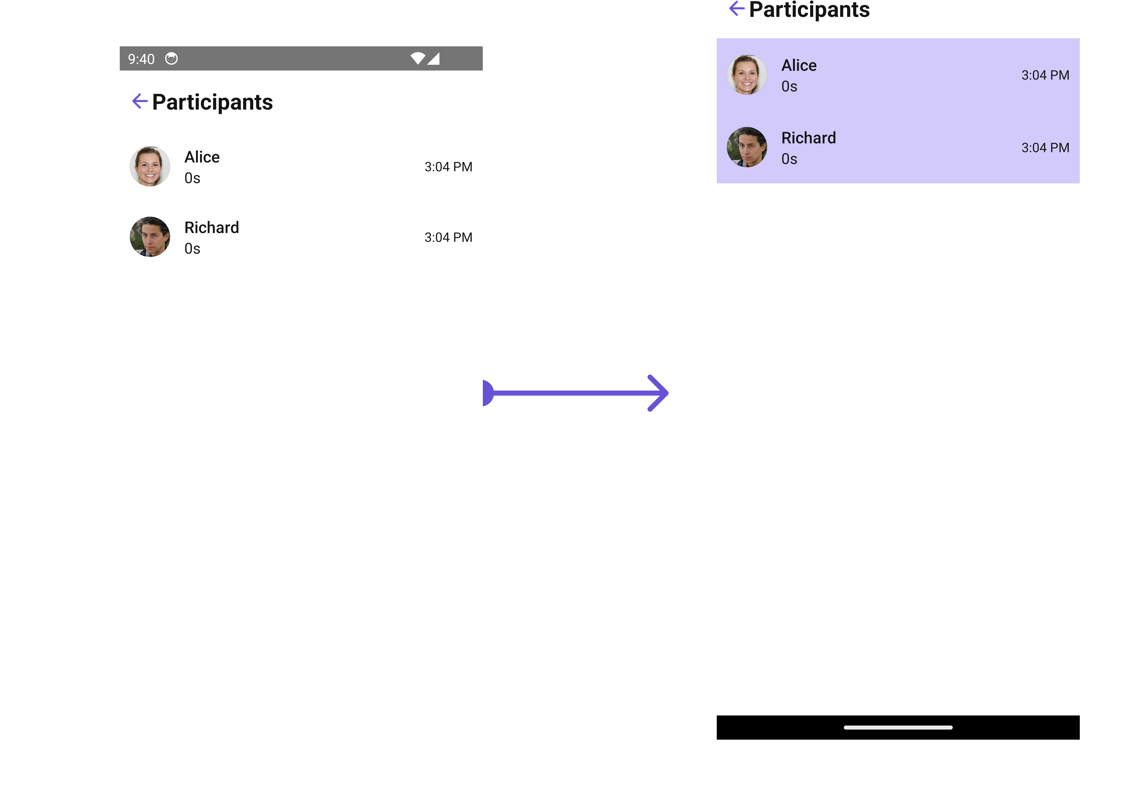
- App.tsx