

AI Integration Quick Reference
AI Integration Quick Reference
Overview
CometChatUsers is a list component that renders all available users in the app. It emits the selected CometChat.User via onItemClick. Wire it to CometChatMessages or use it as a user picker in flows like “new conversation” or “add members to group.”
Live Preview — interact with the default users list.Open in Storybook ↗
The component handles:
- Paginated fetching with infinite scroll
- Real-time presence updates (online/offline)
- Search filtering
- Alphabetical section headers
- Selection mode (single/multiple) with optional preview chips
Usage
Flat API
Compound Composition
New Conversation Example
Filtering
Pass aCometChat.UsersRequestBuilder to usersRequestBuilder to control which users load. Pass the builder instance — not the result of .build(). Refer to UsersRequestBuilder for the full builder API.
Search
The component includes a built-in search bar. When the user types, it fetches matching users from the server. For custom search behavior, pass asearchRequestBuilder:
Filter Recipes
Actions and Events
Callback Props
Events Emitted
This component does not emit any UI events.Events Received
UI events this component subscribes to (published by other components):SDK Listeners (Automatic)
These SDK listeners are attached internally. The component updates its state automatically — no manual subscription needed:- Presence:
onUserOnline,onUserOffline
Customization
View Props
Use view props to replace sections of the default UI while keeping the component’s behavior intact:itemView
Replace the entire list item row. Default: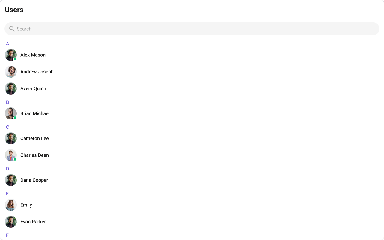
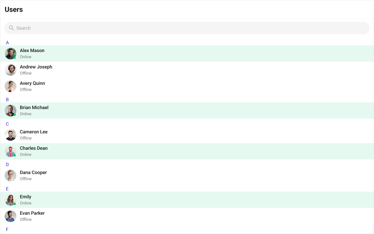
- TypeScript
- CSS
leadingView
Replace the avatar / left section.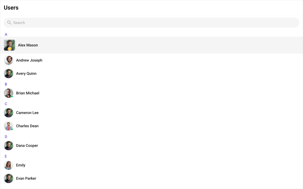
- TypeScript
- CSS
titleView
Replace the name / title text. Role badge inline example.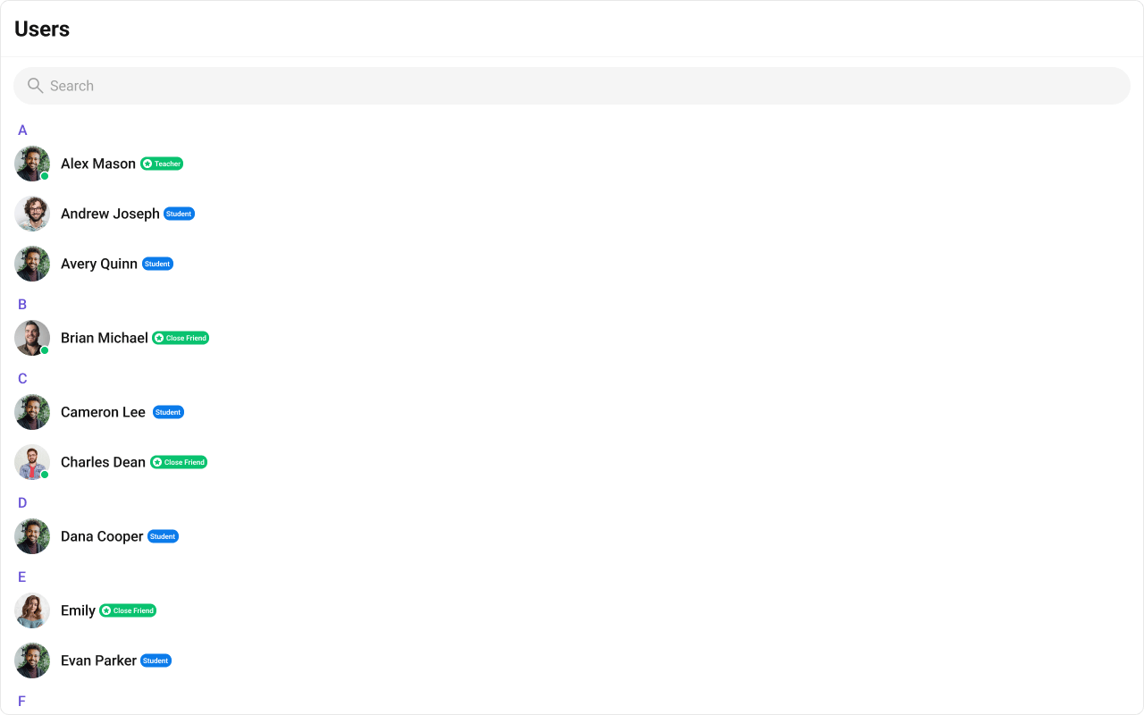
- TypeScript
- CSS
subtitleView
Replace the subtitle text for each user. Default: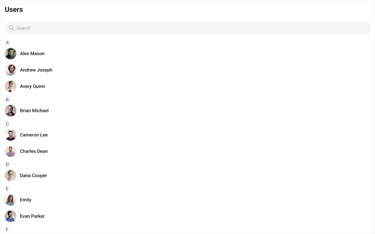
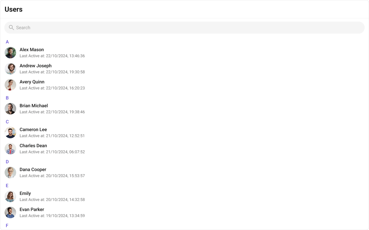
- TypeScript
- CSS
trailingView
Replace the right section.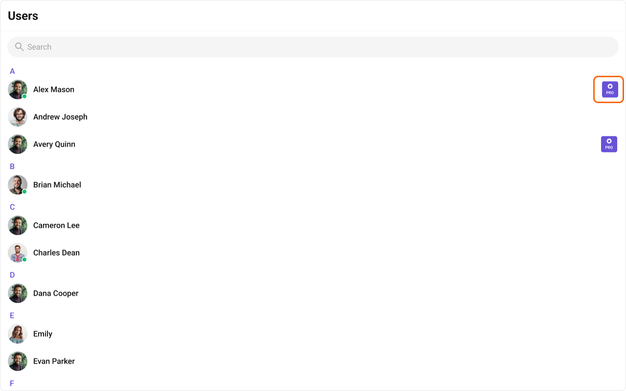
- TypeScript
- CSS
Compound Composition
For full layout control, use sub-components. Omit any sub-component to hide it:CSS Styling
Override design tokens on the component selector:Props
All props are optional.View slot props (
headerView, loadingView, emptyView, errorView, itemView, leadingView, titleView, subtitleView, trailingView) are convenience props available only on the flat API. The search input is the SearchBar sub-component (with a placeholder prop), not a view slot. In compound composition mode, use the corresponding sub-components directly.usersRequestBuilder
Custom request builder for fetching users. Controls pagination, filtering, and sorting.searchRequestBuilder
Custom request builder used specifically when the user searches. Separate from the main builder.searchKeyword
Initial search keyword to pre-filter users on mount.hideUserStatus
Hide the online/offline status indicator on user avatars.hideSearch
Hide the search bar entirely.showSectionHeader
Show alphabetical section headers (A, B, C…) in the user list.showSelectedUsersPreview
Show a preview strip of selected user chips above the list (useful in multi-select mode).showScrollbar
Show the native scrollbar on the user list.selectionMode
Enable selection mode for single or multi-select operations.activeUser
The currently active/highlighted user. The matching item receives an active visual state.sectionHeaderKey
The property ofCometChat.User used to group users into sections (e.g., first letter of name).
options
Function that returns context menu options for each user item (shown on hover/swipe).onItemClick
Callback when a user item is clicked.onSelect
Callback when a user is selected or deselected (only fires in selection mode).onError
Callback when an SDK error occurs during fetch or real-time operations.onEmpty
Callback when the user list is empty after the initial fetch completes.CSS Selectors
Next Steps
Conversations
View recent conversations for the logged-in user
Groups
Browse and join groups
Message List
Display messages for the selected user
Theming
Customize colors, fonts, and spacing