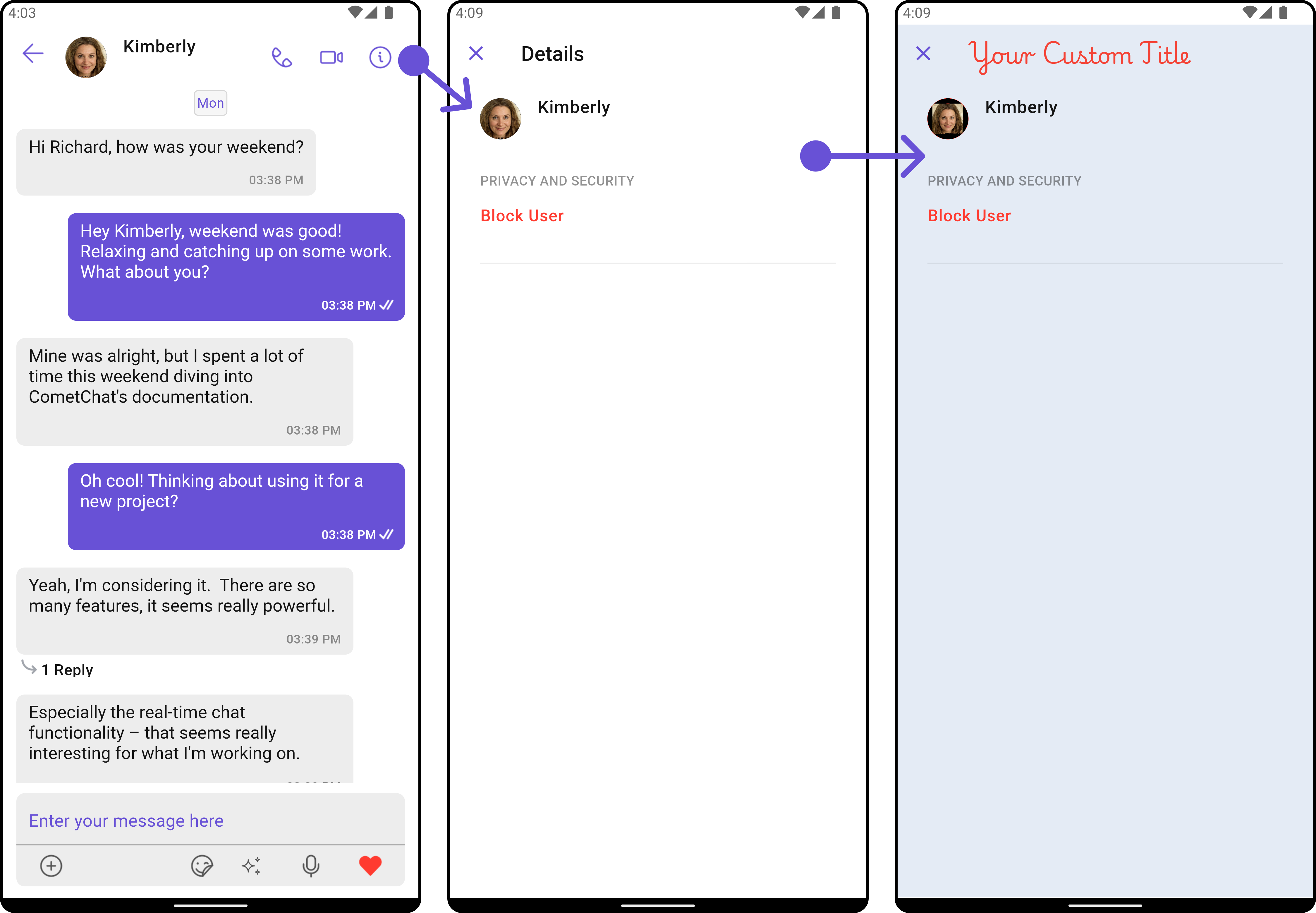
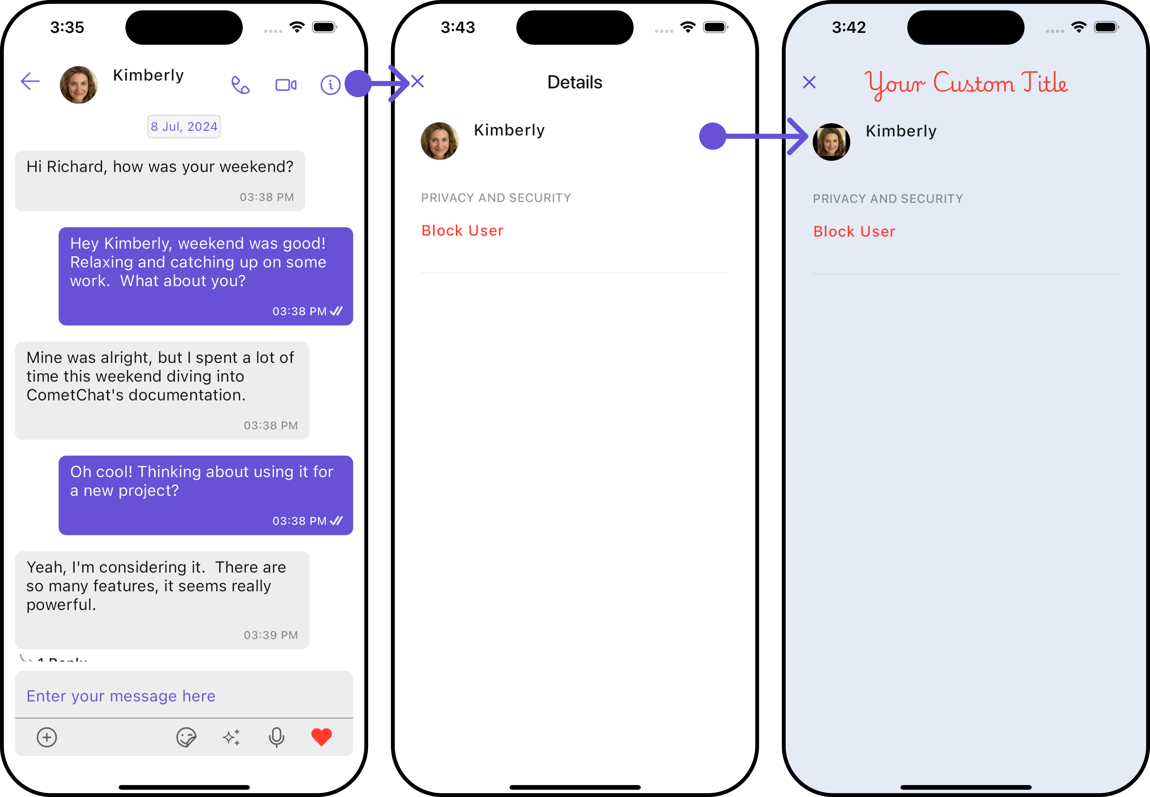
Overview
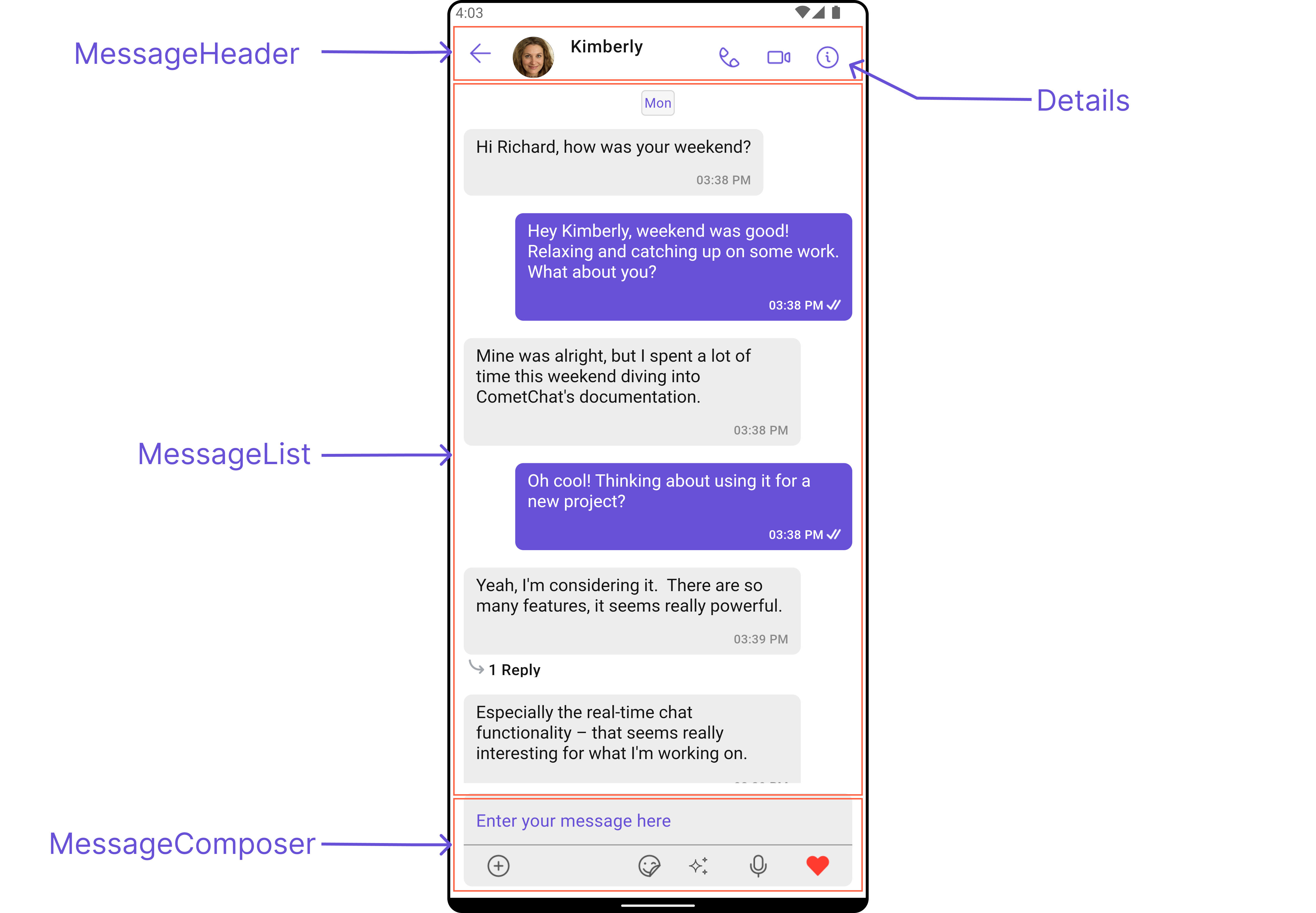
The Messages is a Composite Widget that manages messages for users and groups.- Android
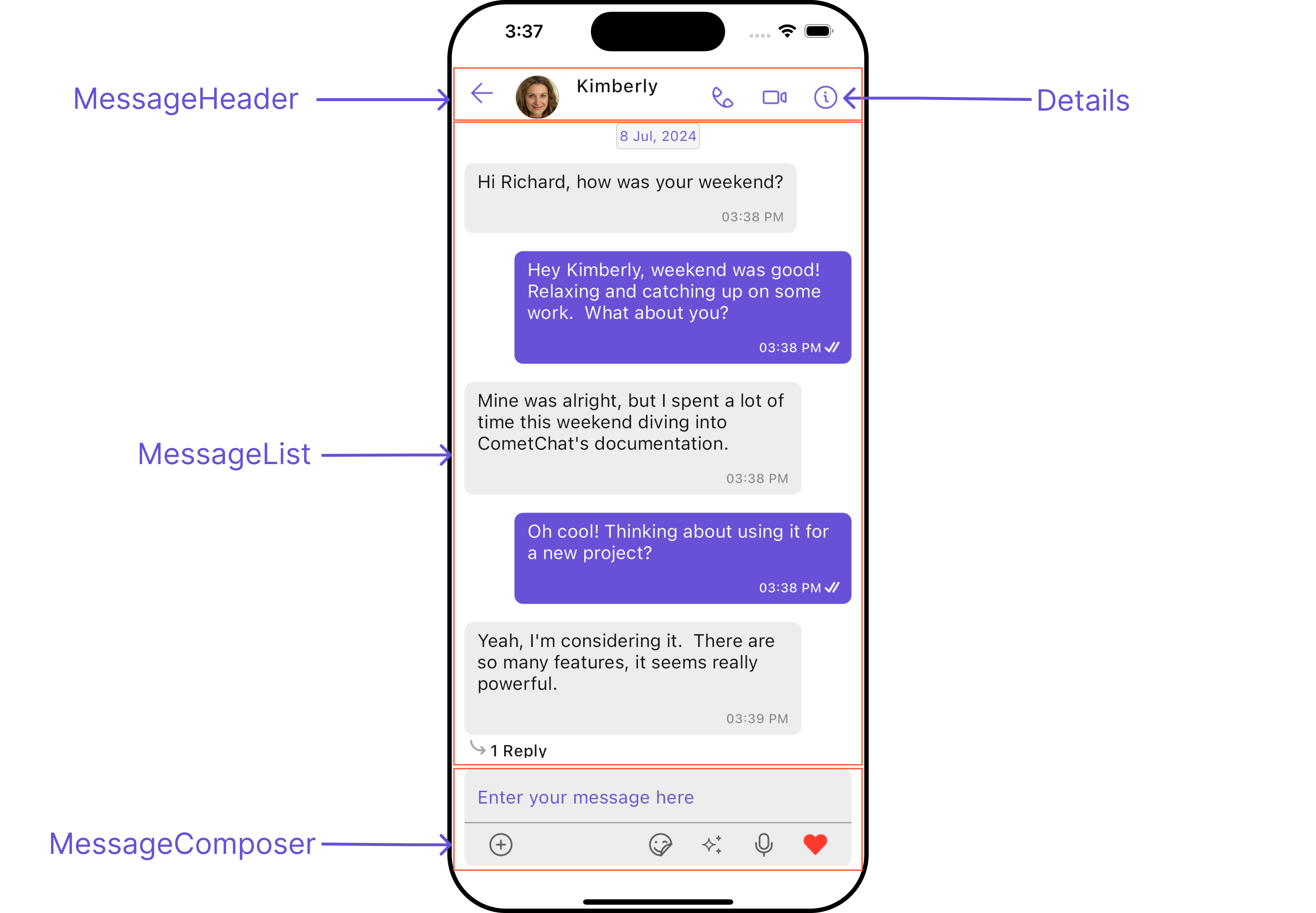
- iOS
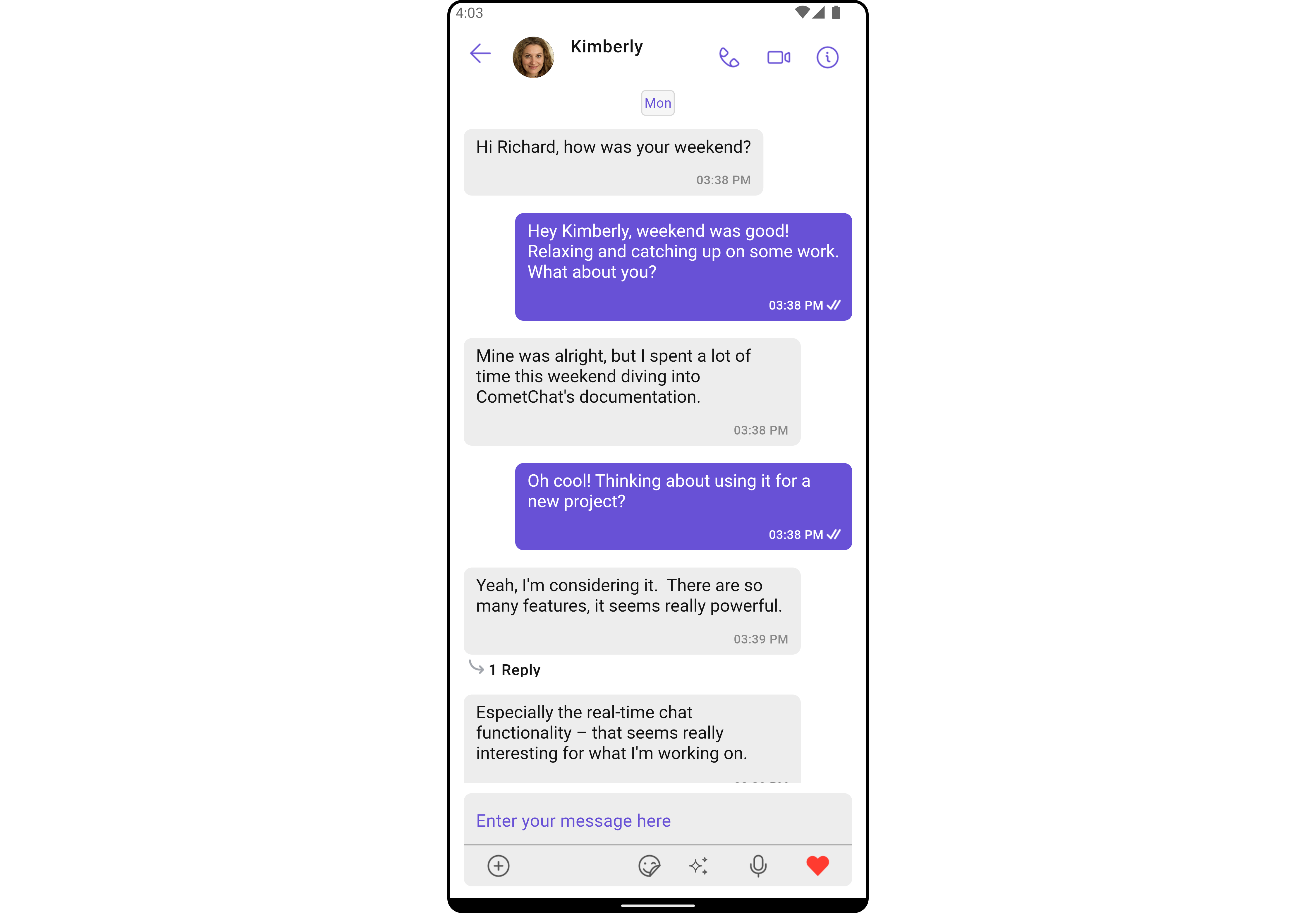
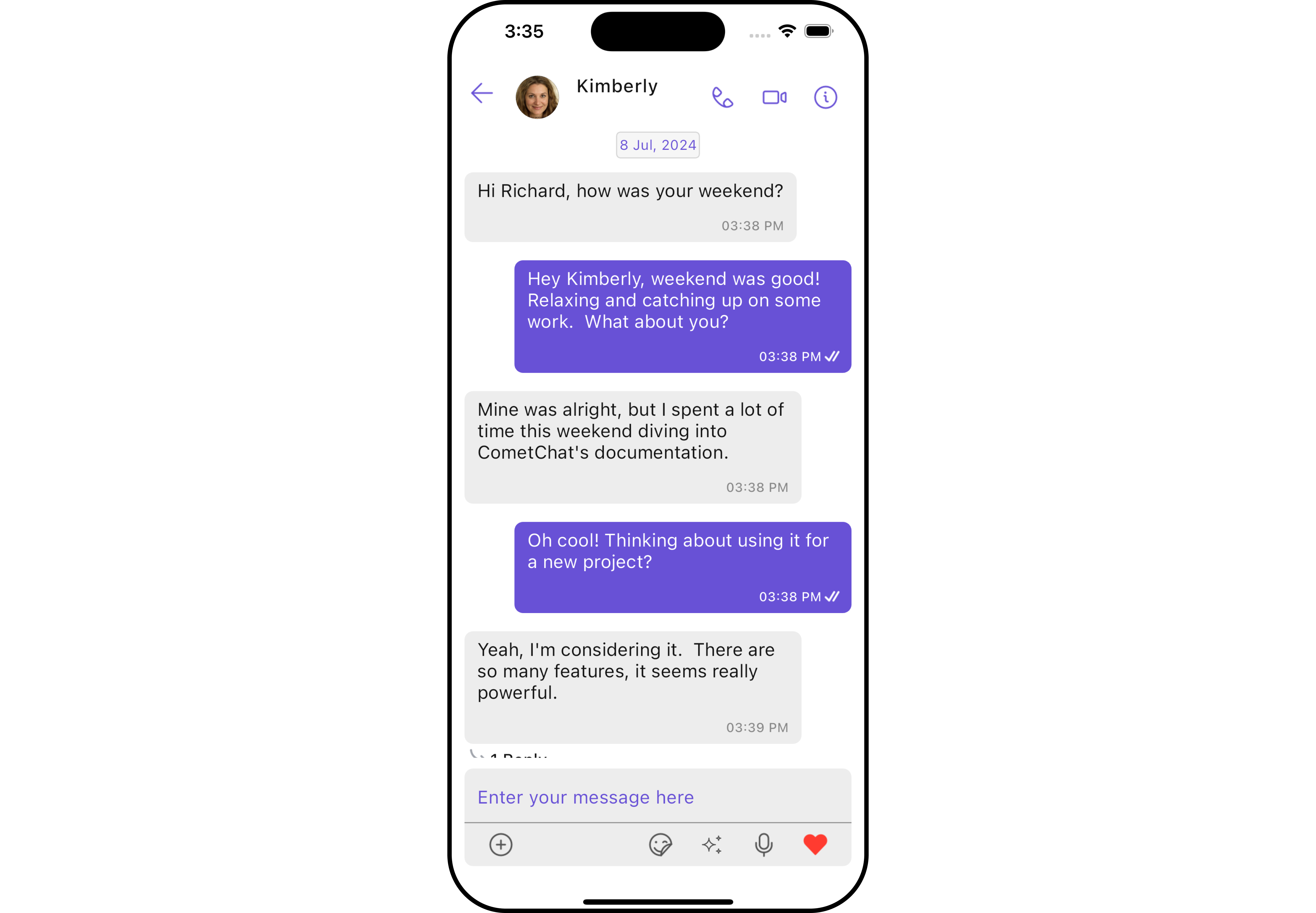
Usage
Integration
You can launchCometChatMessages directly using Navigator.push, or you can define it as a widget within the build method of your State class.
1. Using Navigator to Launch CometChatMessages
- Dart
2. Embedding CometChatMessages as a Widget in the build Method
- Dart
Actions
Actions dictate how a widget functions. They are divided into two types: Predefined and User-defined. You can override either type, allowing you to tailor the behavior of the widget to fit your specific needs. The Messages widget does not have its actions. However, since it’s a Composite Widget, you can use the actions of its widgets by utilizing the Configurations object of each component. Example In this example, we are employing the ThreadRepliesClick action from the MessageList Widget through the MessageListConfiguration object.- Dart
- Android
- iOS
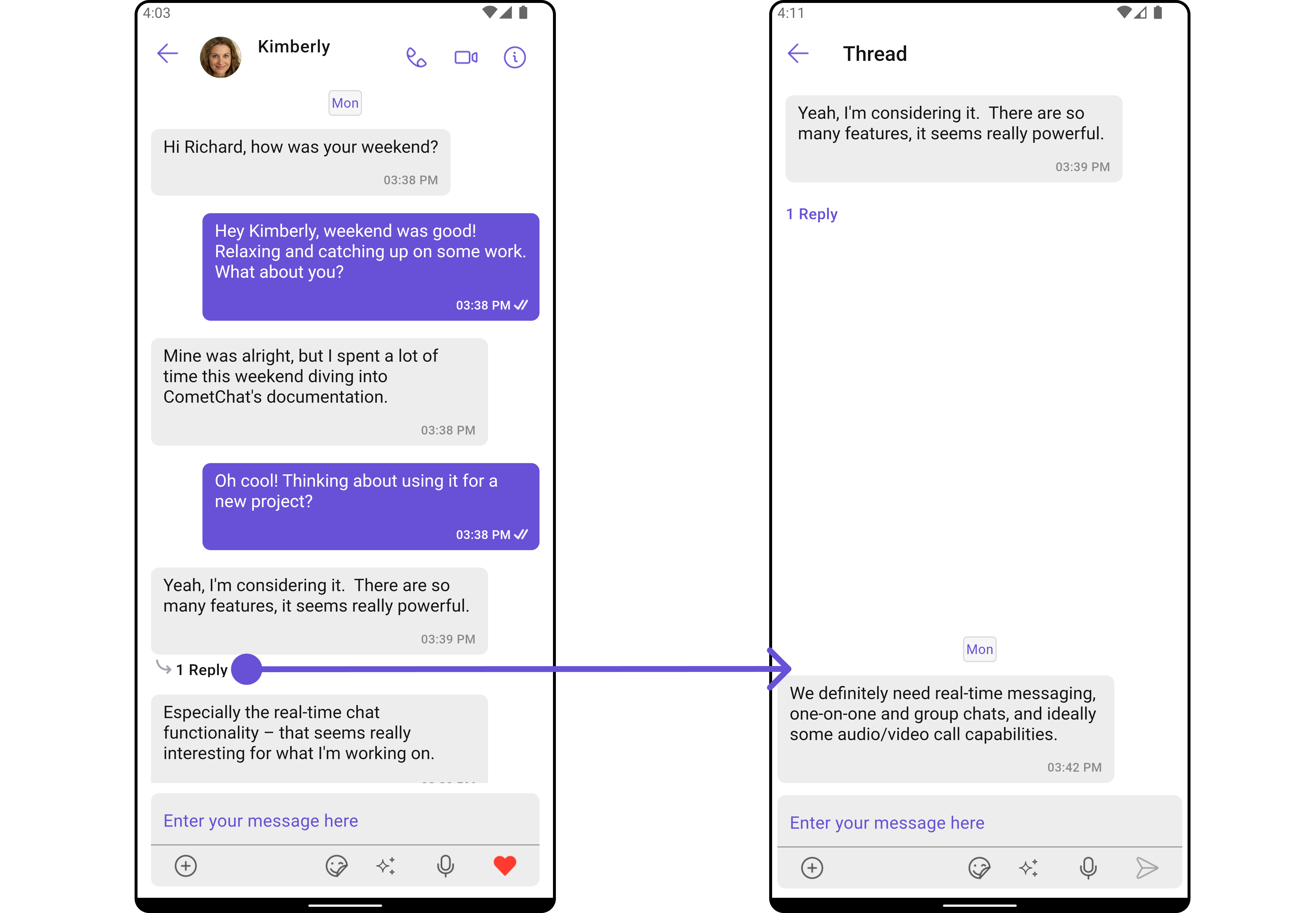
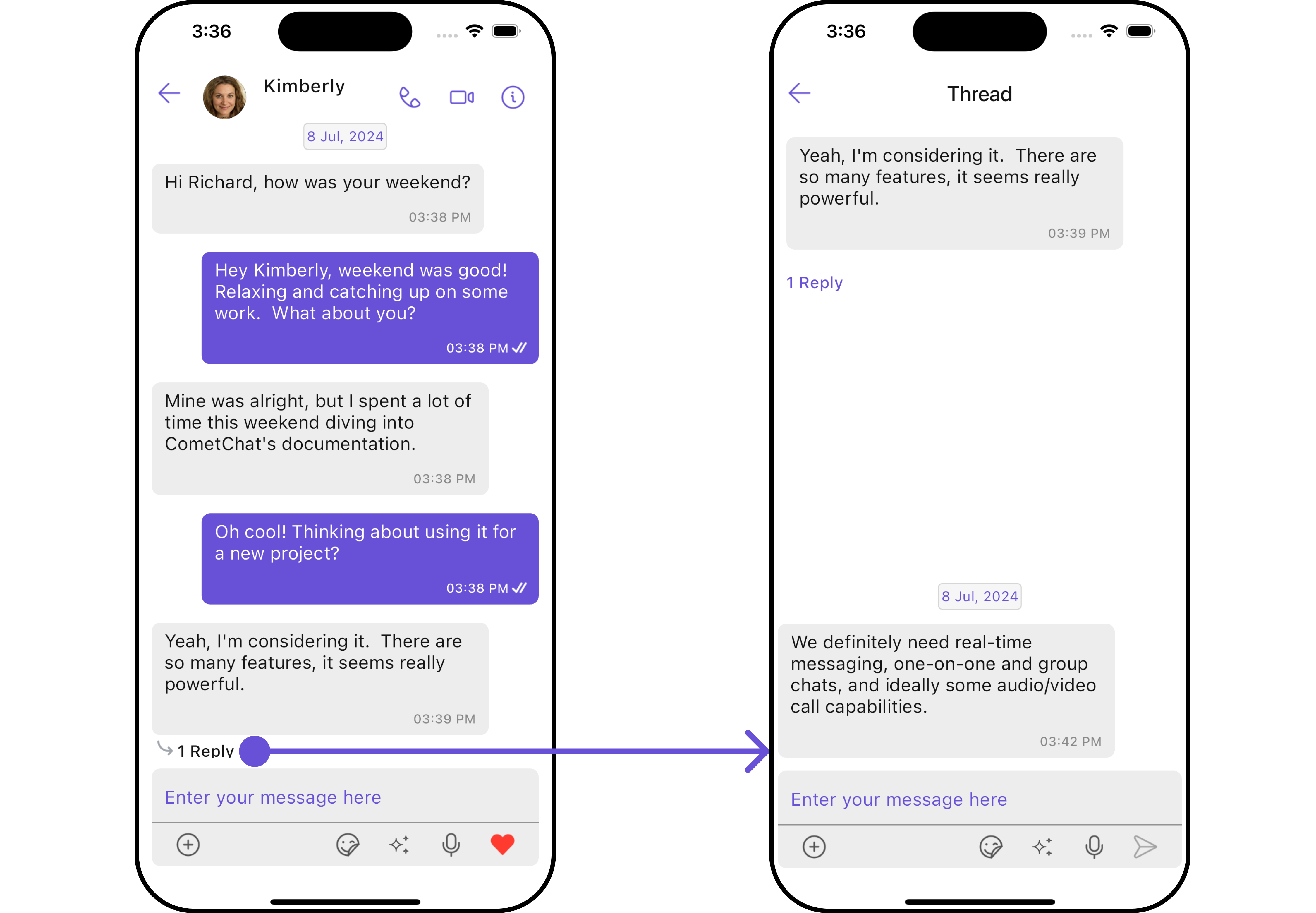
The Messages Widget overrides the ThreadRepliesClick action to navigate to the ThreadedMessages component. If you override ThreadRepliesClick, it will also override the default behavior of the Messages Widget.
Filters
Filters allow you to customize the data displayed in a list within a Widget. You can filter the list based on your specific criteria, allowing for a more customized. Filters can be applied using RequestBuilders of Chat SDK. The Messages widget does not have its filters. But as it is a Composite Widget, you can use the filters of its widgets by using the Configurations object of each component. For more details on the filters of its widgets, please refer to MessageList Filters. Example In this example, we’re applying the MessageList Widget filter to the Messages Widget usingMessageListConfiguration.
- Dart
Events
Events are emitted by aWidget. By using event you can extend existing functionality. Being global events, they can be applied in Multiple Locations and are capable of being Added or Removed.
The list of events emitted by the Messages widget is as follows.
Example
- Dart
Customization
To fit your app’s design requirements, you can customize the appearance of the conversation component. We provide exposed methods that allow you to modify the experience and behavior according to your specific needs.Style
Using Style you can customize the look and feel of the widget in your app, These parameters typically control elements such as the color, size, shape, and fonts used within the component.1. Messages Style
You can customize the appearance of the Messages Widget by applying the MessagesStyle to it using the following code snippet.- Dart
- Android
- iOS
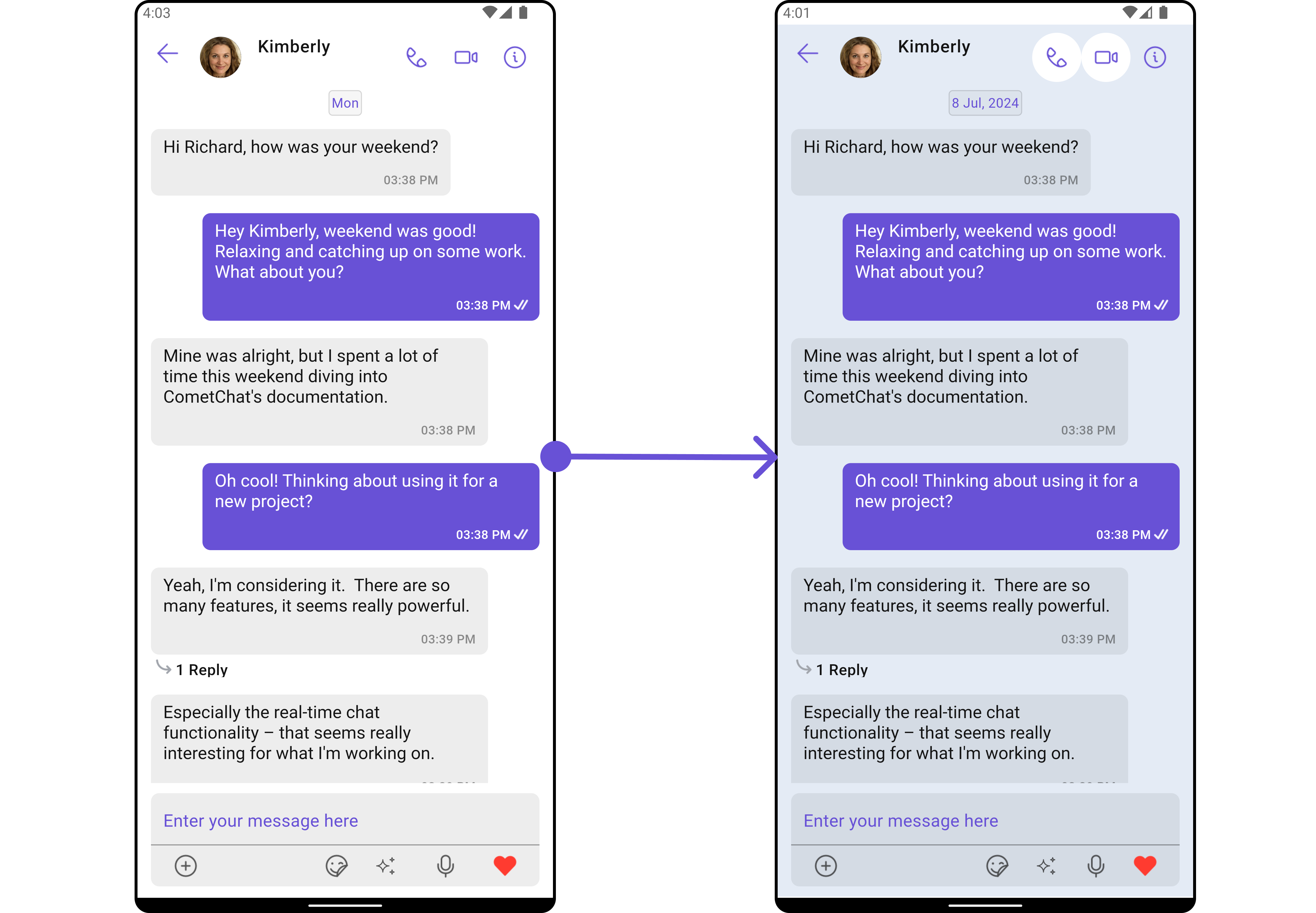
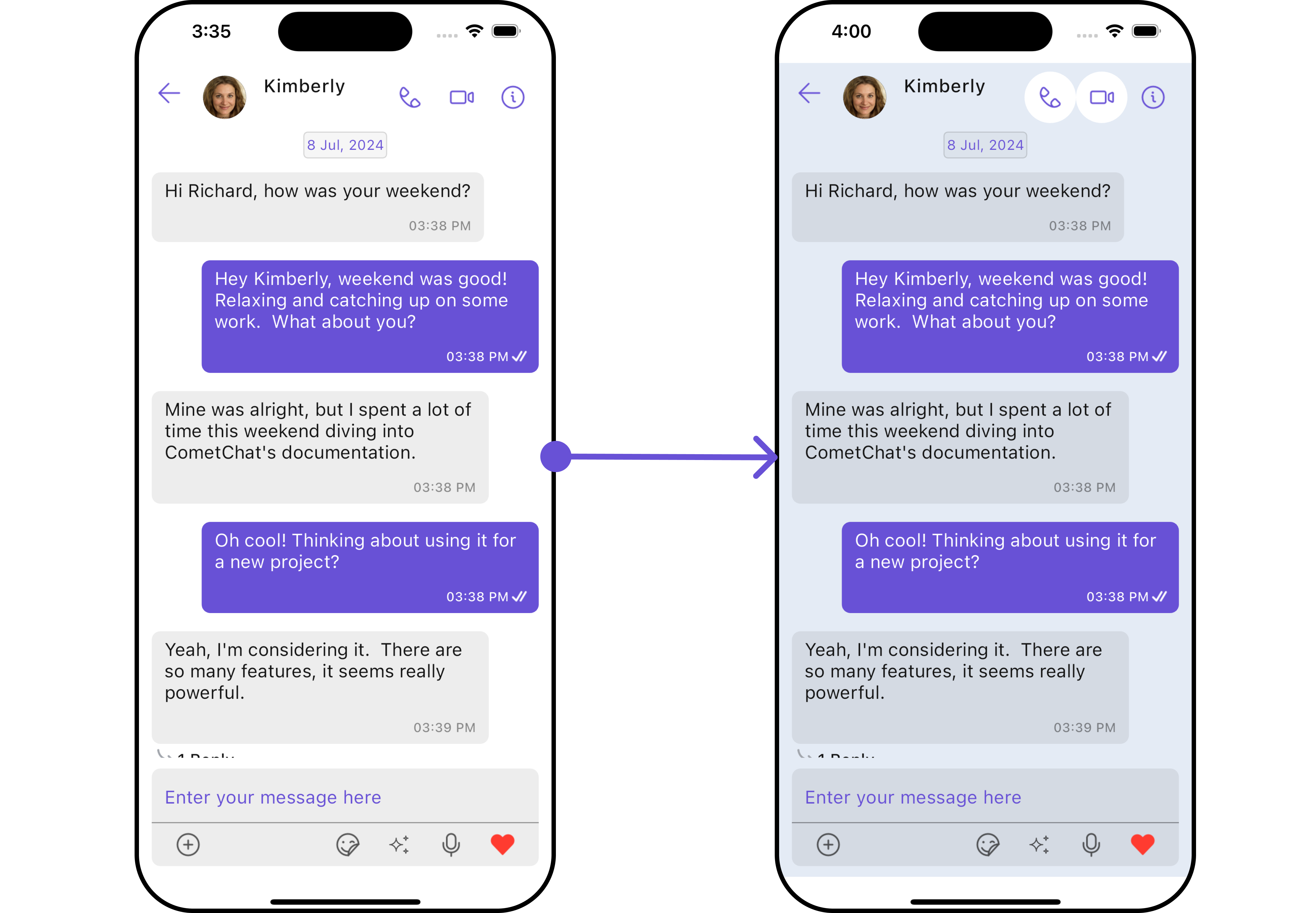
MessagesStyle
2. Widget’s Styles
Being a Composite component, the Messages Widget allows you to customize the styles of its widgets using their respective Configuration objects. For a list of all available properties, refer to each component’s styling documentation: MesssageHeader Styles, MessageList Styles, MessageComposer Styles, Details Styles, ThreadMessages Styles. Example In this example, we are creatingMessageListStyle and MessageComposerStyle and then applying them to the Messages Widget using MessageListConfiguration and MessageComposerConfiguration.
- Dart
Functionality
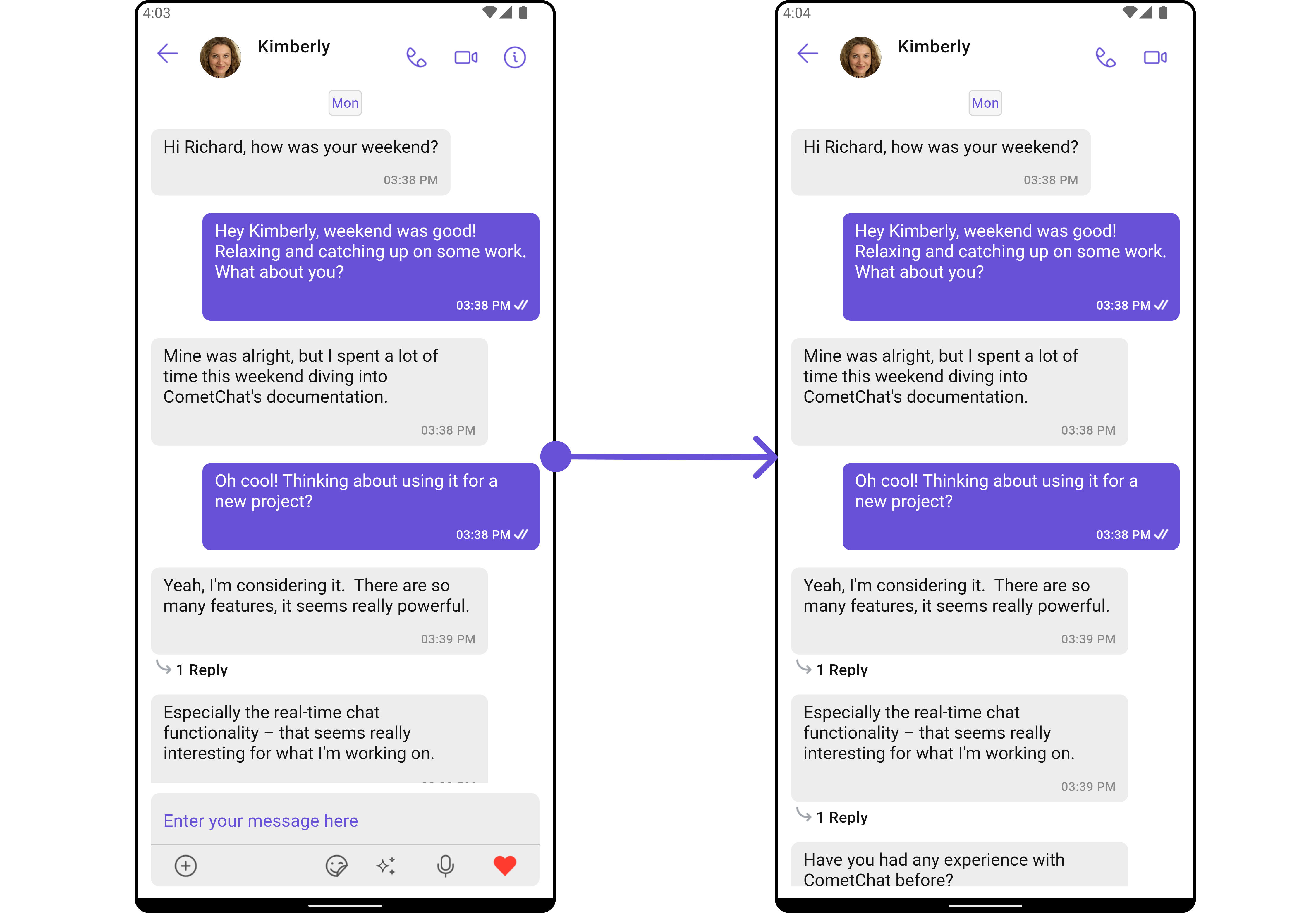
These are a set of small functional customizations that allow you to fine-tune the overall experience of the component. With these, you can change text, set custom icons, and toggle the visibility of UI elements.- Android
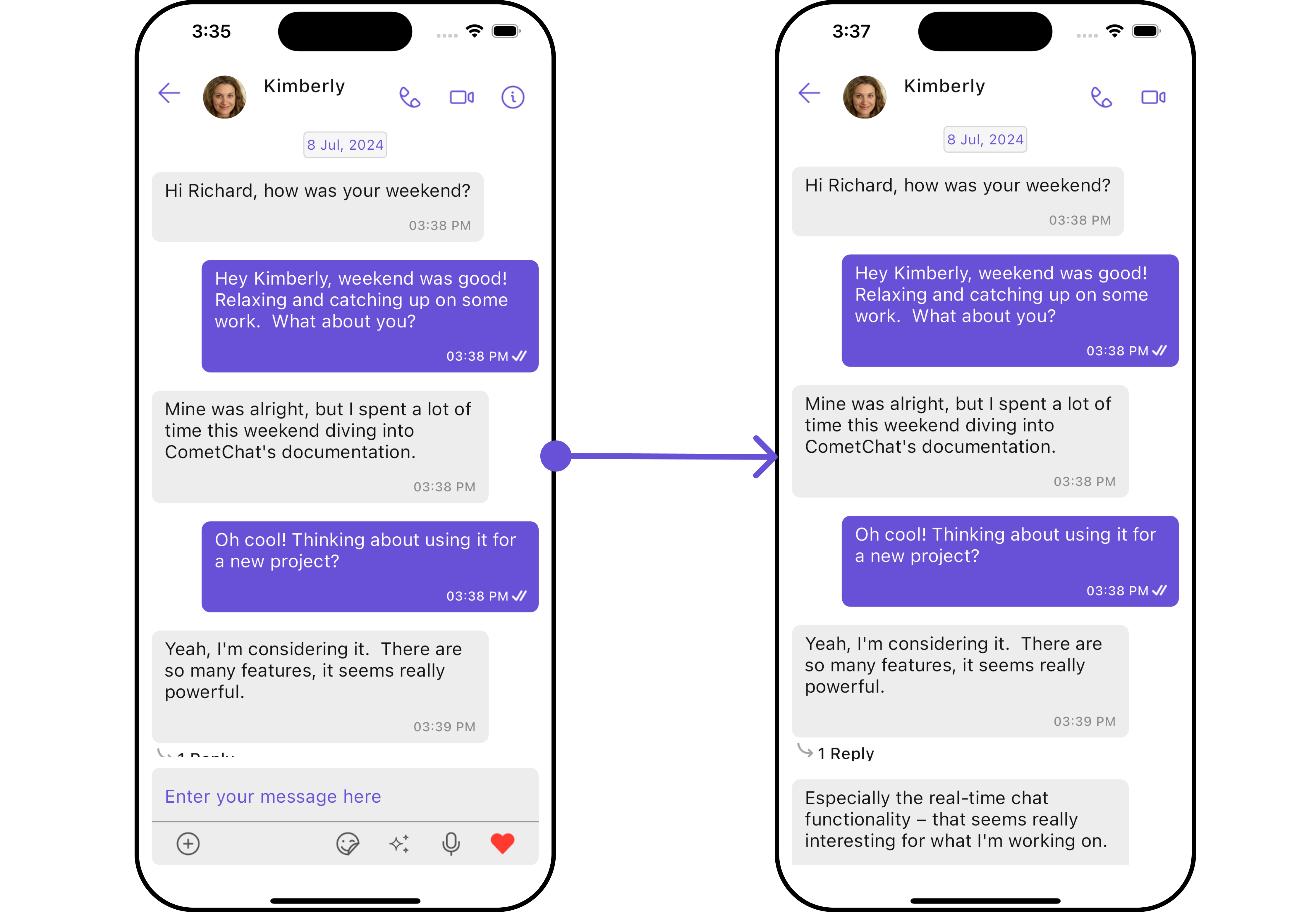
- iOS
- Dart
- Android
- iOS
CometChatMessages
Advanced
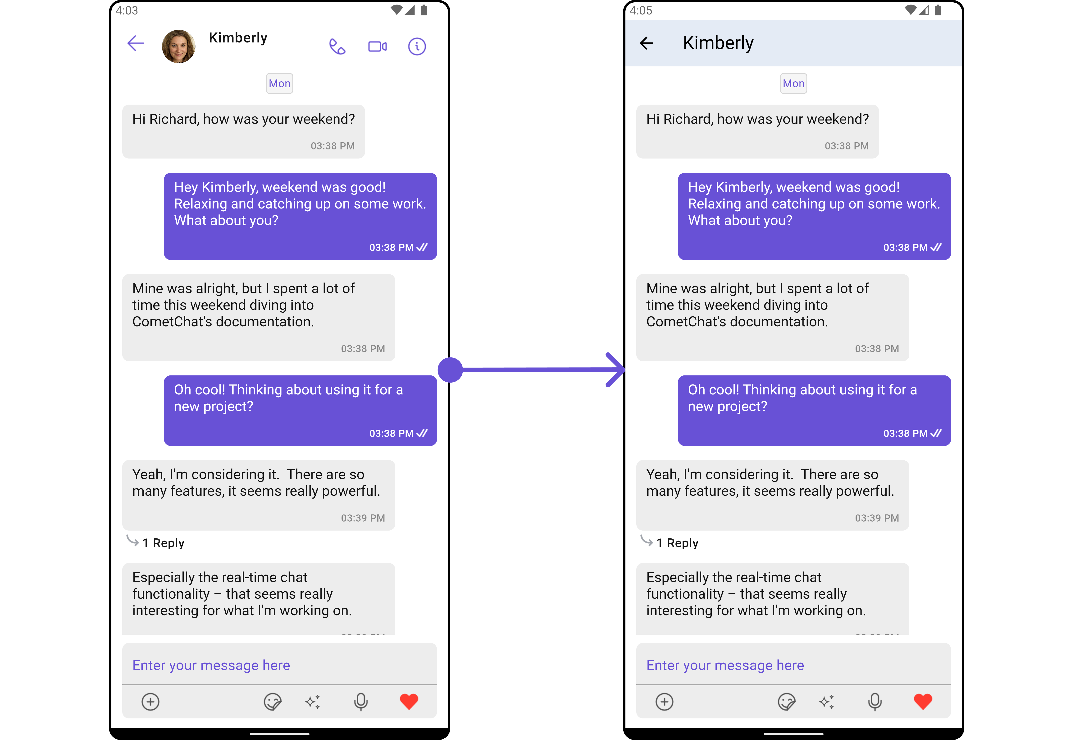
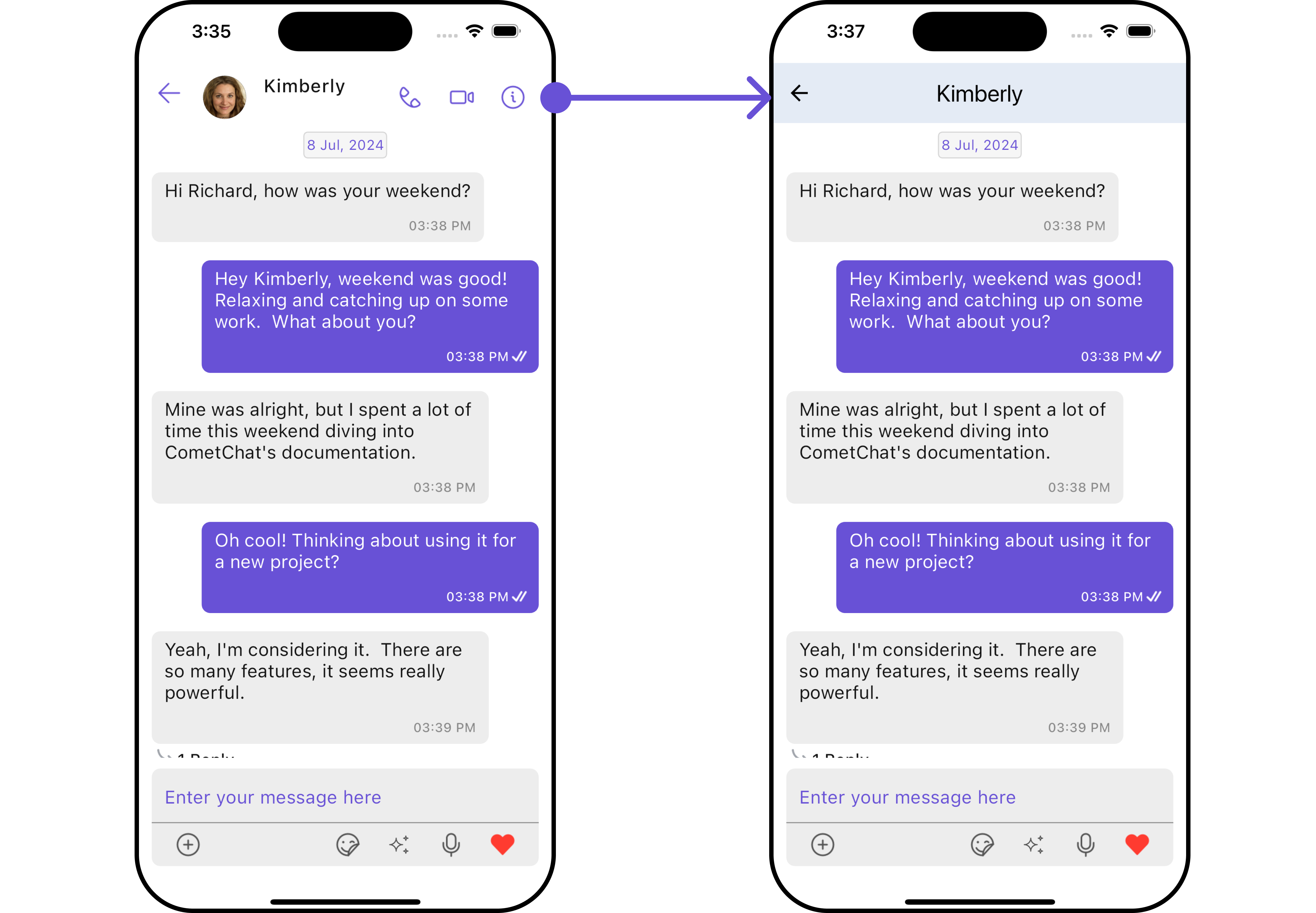
For advanced-level customization, you can set custom widgets to the component. This lets you tailor each aspect of the widget to fit your exact needs and application aesthetics. You can create and define your widgets and then incorporate those into the component.MessageHeaderView
You can set your custom message header widget using themessageHeaderView method. But keep in mind, by using this you will override the default message header functionality.
Here is the complete example for reference:
Example
- Dart
- Android
- iOS
MessageListView
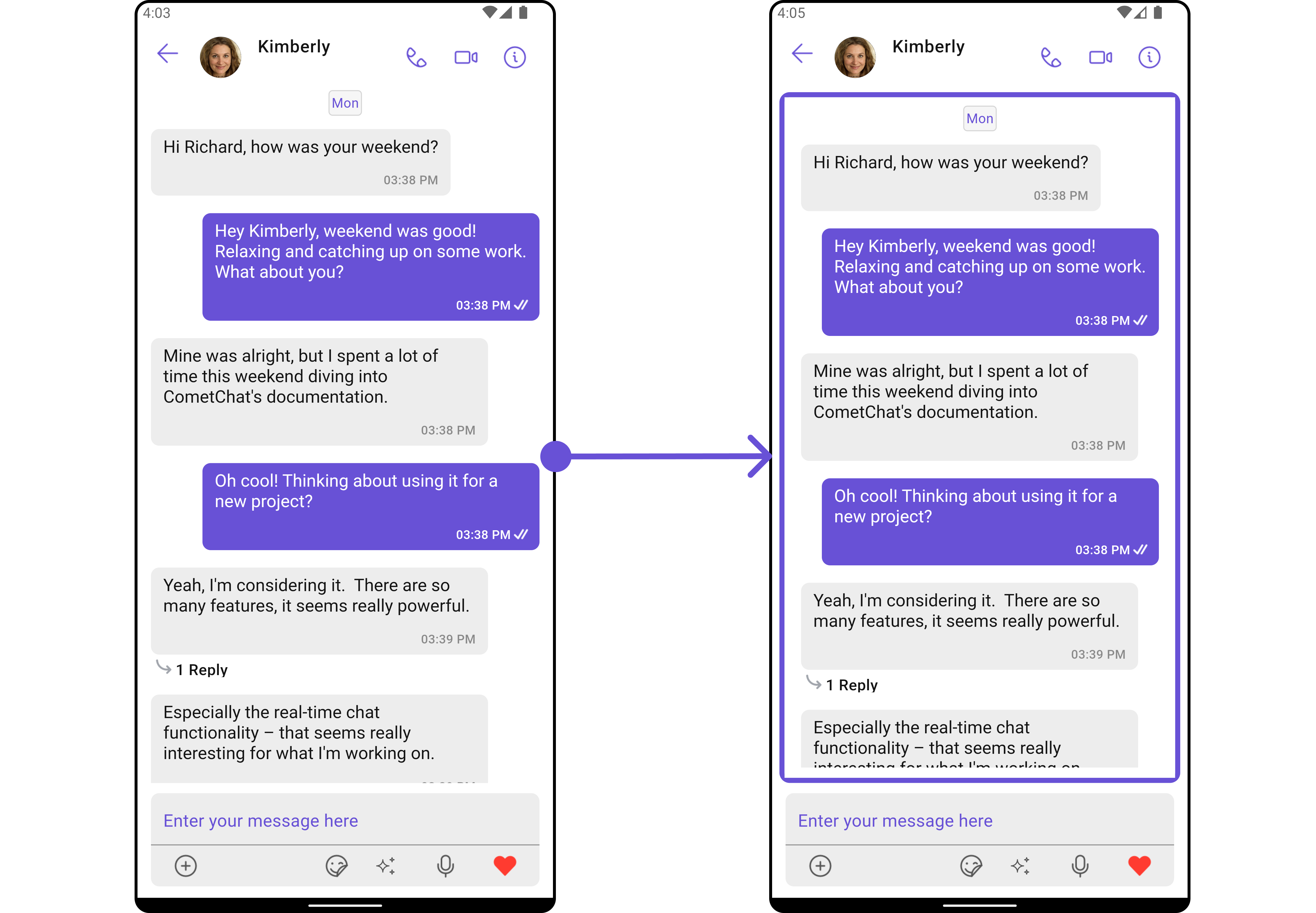
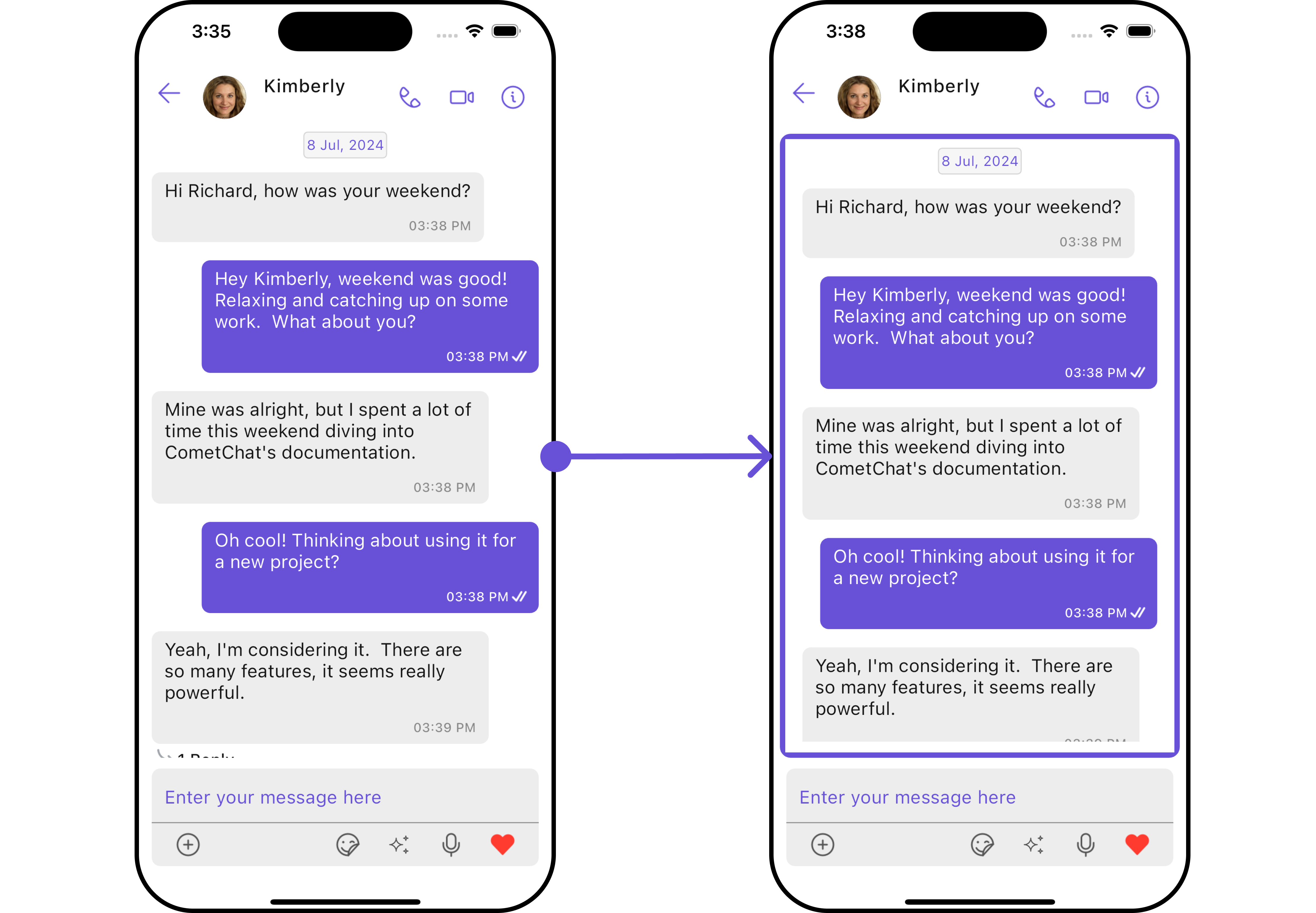
You can set your custom message list widget using themessageListView method. But keep in mind, by using this you will override the default message ListView functionality.
Here is the complete example for reference:
Example
- Dart
- Android
- iOS
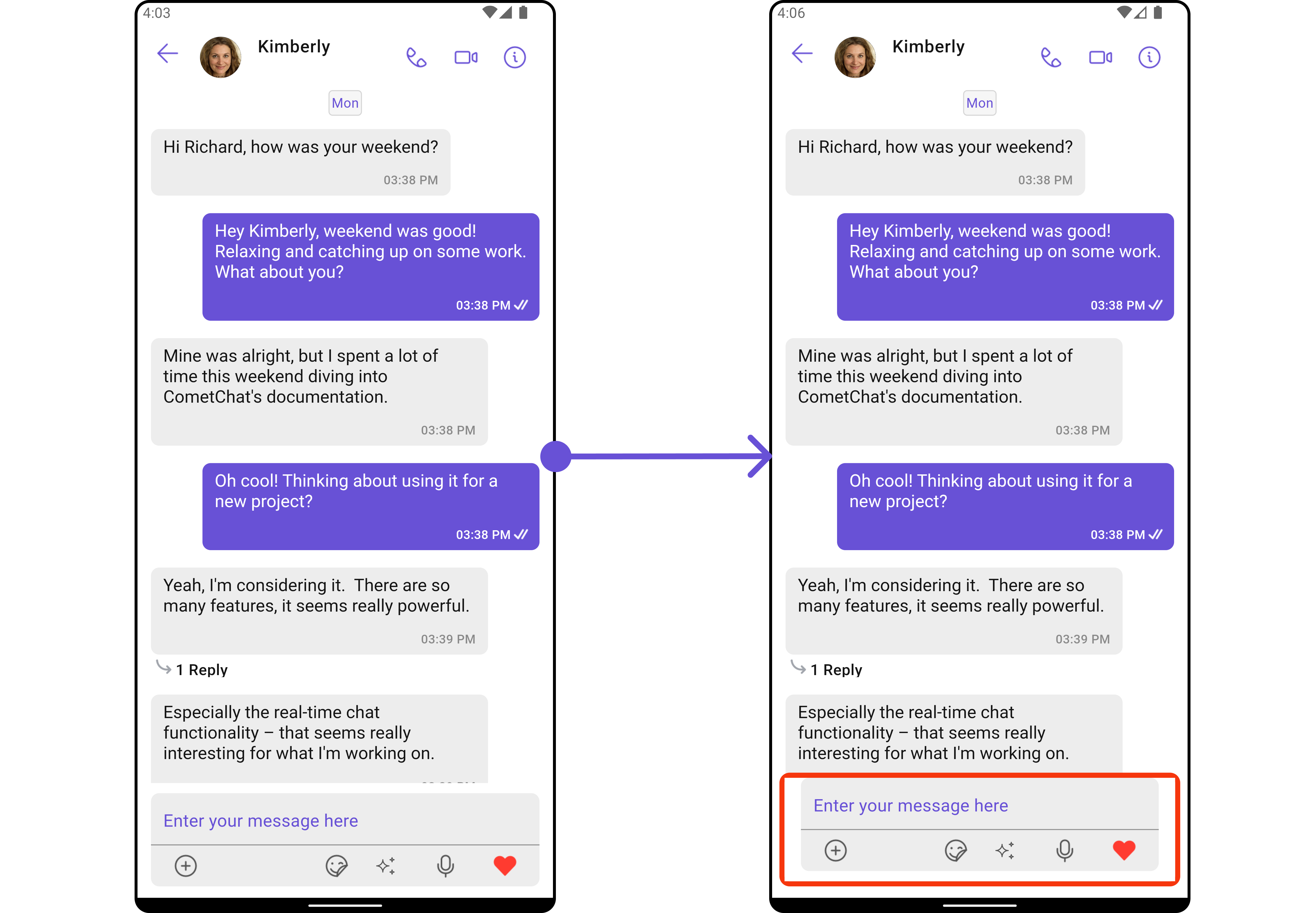
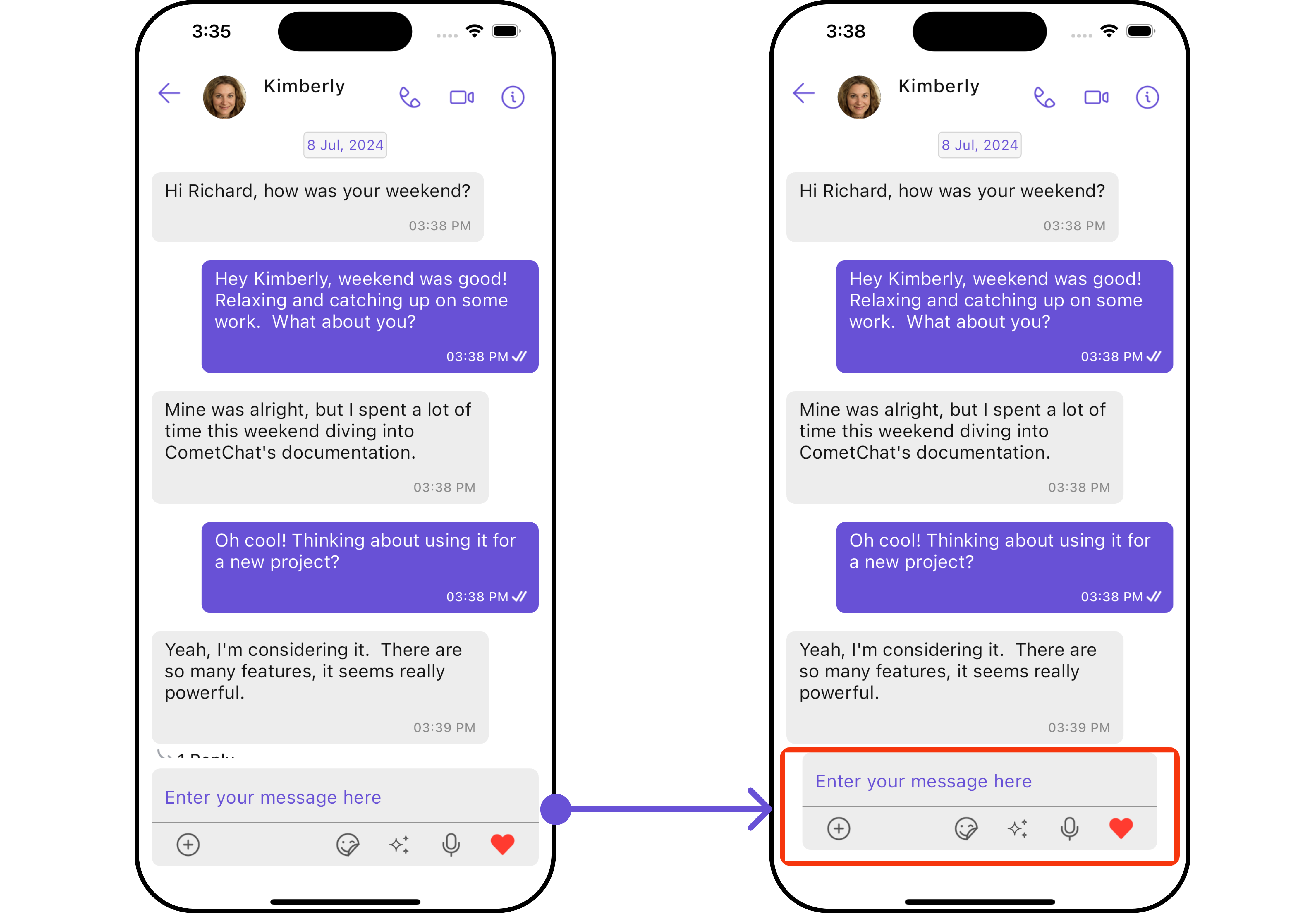
MessageComposerView
You can set your custom Message Composer widget using themessageComposerView method. But keep in mind, by using this you will override the default message composer functionality.
Here is the complete example for reference:
Example
- Dart
- Android
- iOS
Configuration
Configurations offer the ability to customize the properties of each individual widget within a Composite Widget. The Messages Widget is a Composite Widget and it has a specific set of configuration for each of its widgets.MessageHeader
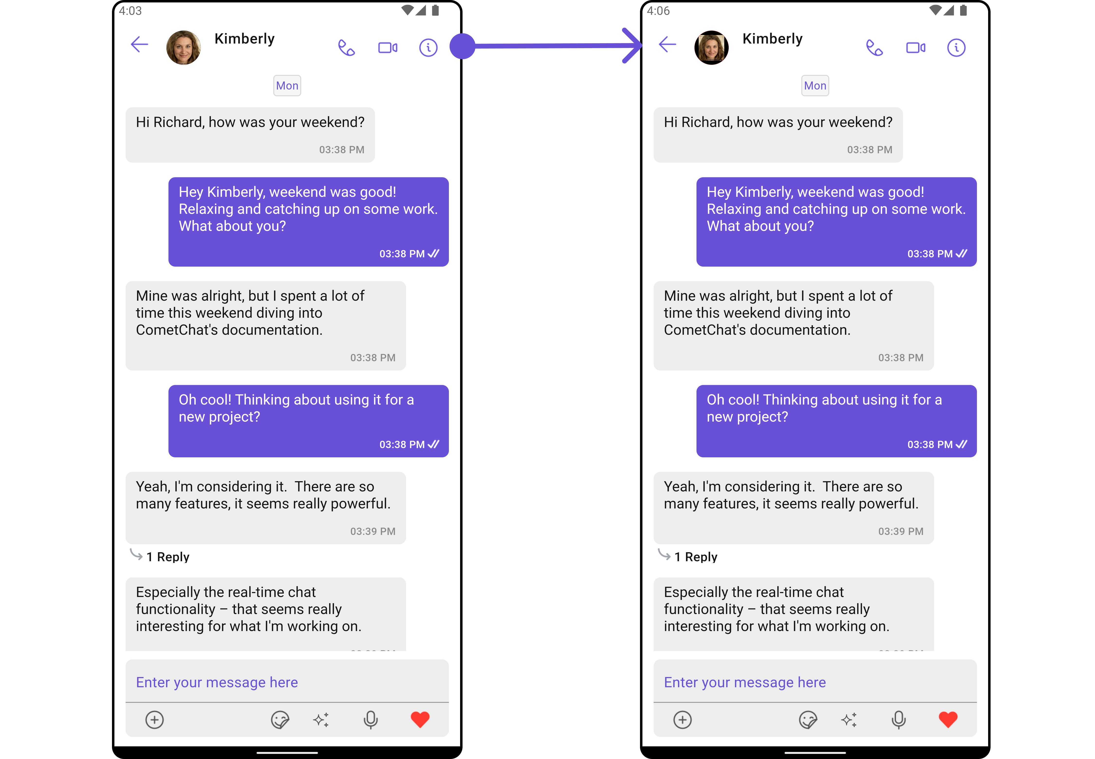
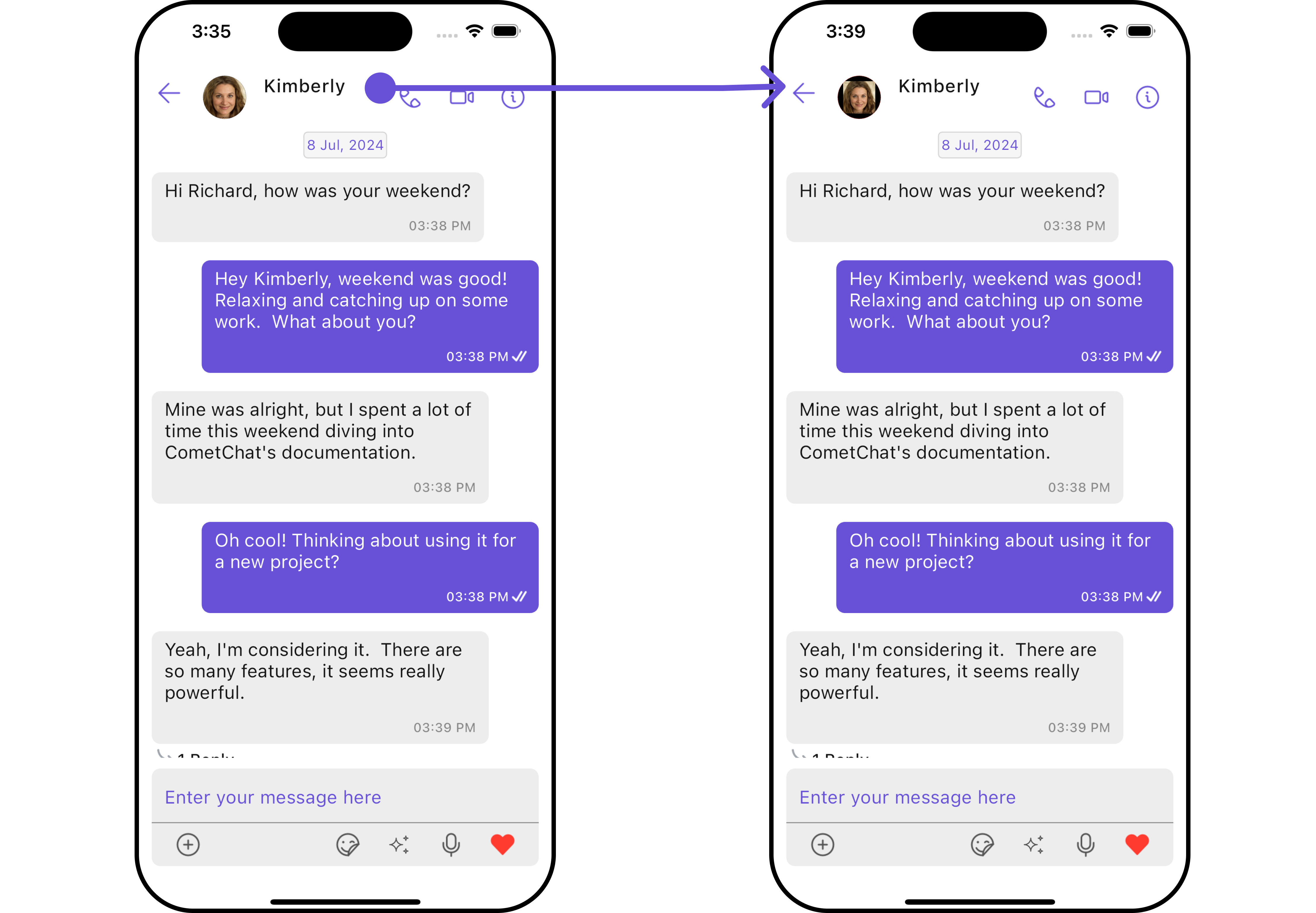
If you want to customize the properties of the MessageHeader Widget inside Messages Widget, you need use theMessageHeaderConfiguration object.
- Dart
MessageHeaderConfiguration provides access to all the Action, Filters, Styles, Functionality, and Advanced properties of the MessageHeader component.
Please note that the properties marked with the 🛑 symbol are not accessible within the Configuration Object.Example In this example, we will be adding a custom back button and styling a few properties of the Avatar widget of the MessageHeader widget using
MessageHeaderConfiguration.
- Dart
- Android
- iOS
MessageList
If you want to customize the properties of the MessageList Widget inside Messages Widget, you need use theMessageListConfiguration object.
- Dart
MessageListConfiguration provides access to all the Action, Filters, Styles, Functionality, and Advanced properties of the MessageList component.
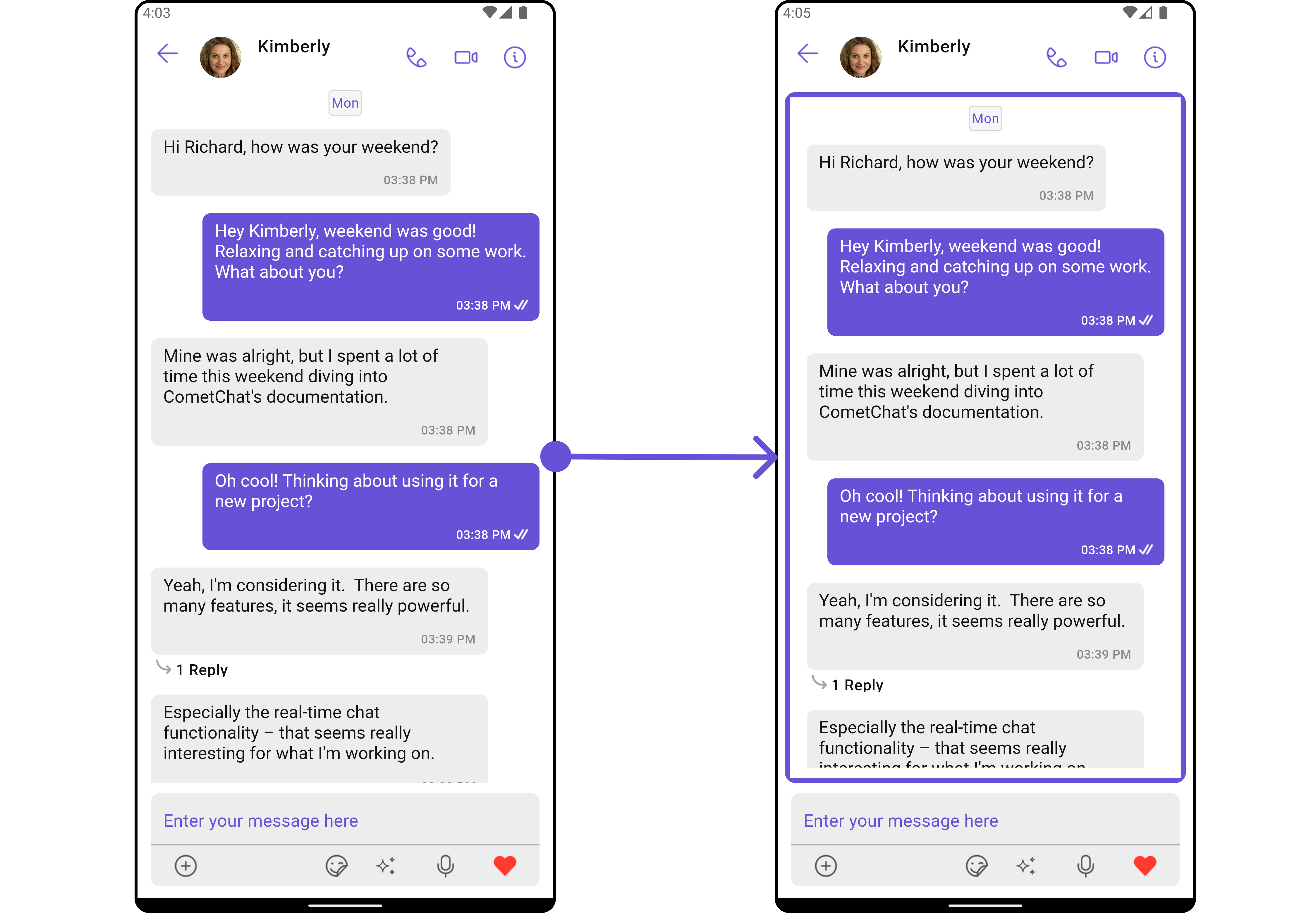
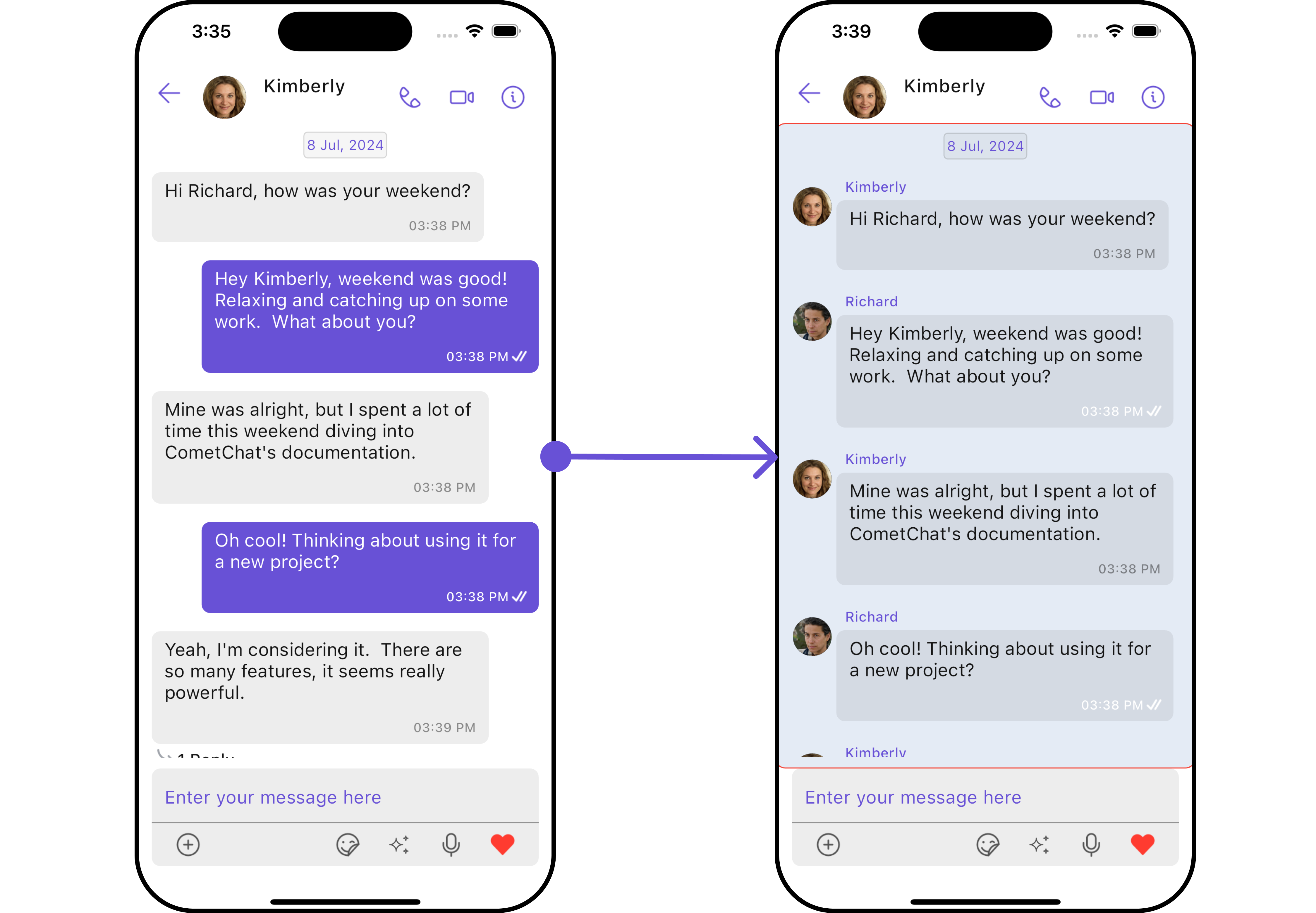
Please note that the properties marked with the 🛑 symbol are not accessible within the Configuration Object.Example In this example, we will be changing the list alignment and modifying the message bubble styles in the MessageList widget using
MessageListConfiguration.
- Dart
- Android
- iOS
MessageComposer
If you want to customize the properties of the MessageComposer Widget inside Messages Widget, you need use theMessageComposerConfiguration object.
- Dart
MessageComposerConfiguration provides access to all the Action, Filters, Styles, Functionality, and Advanced properties of the MessageComposer component.
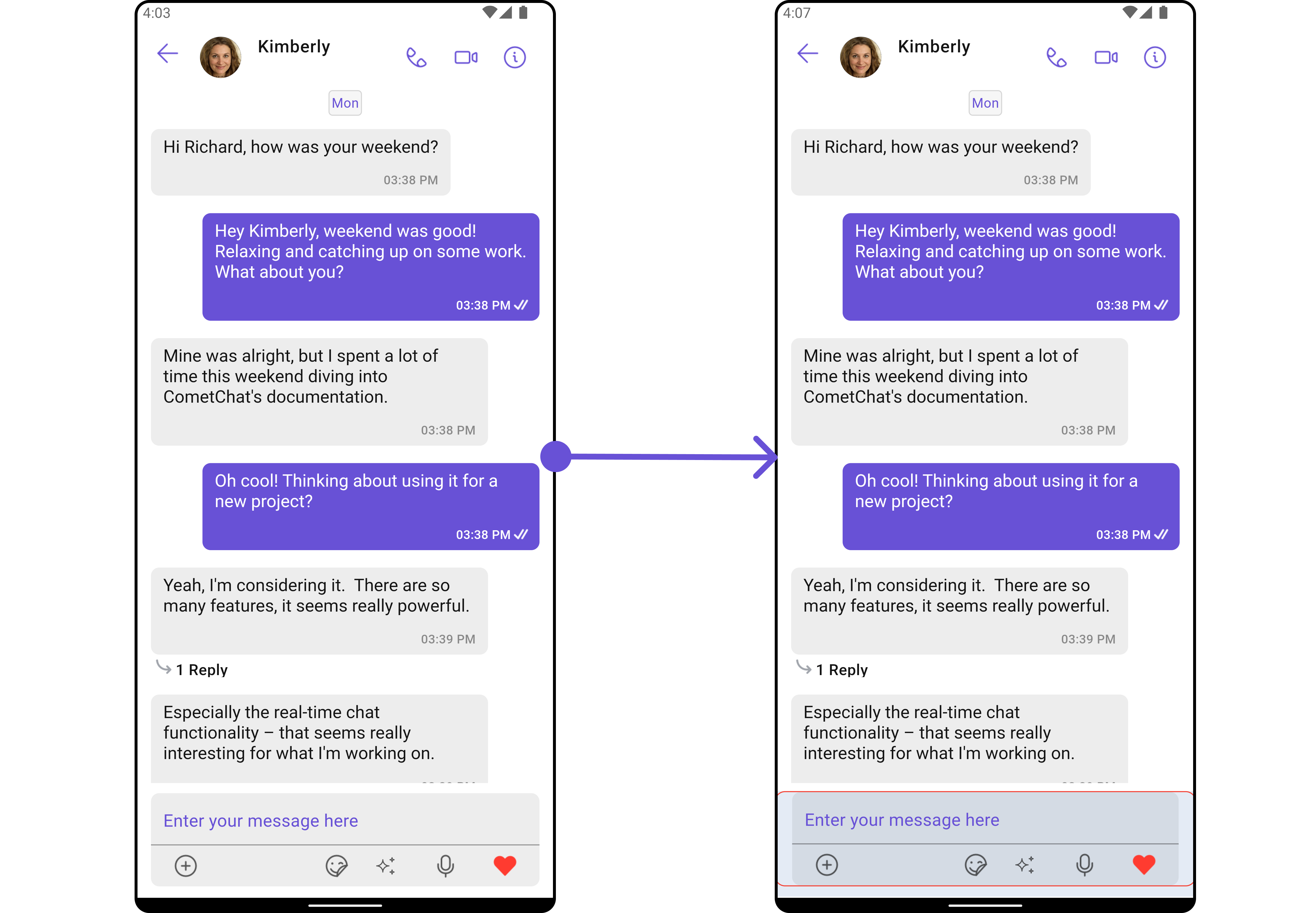
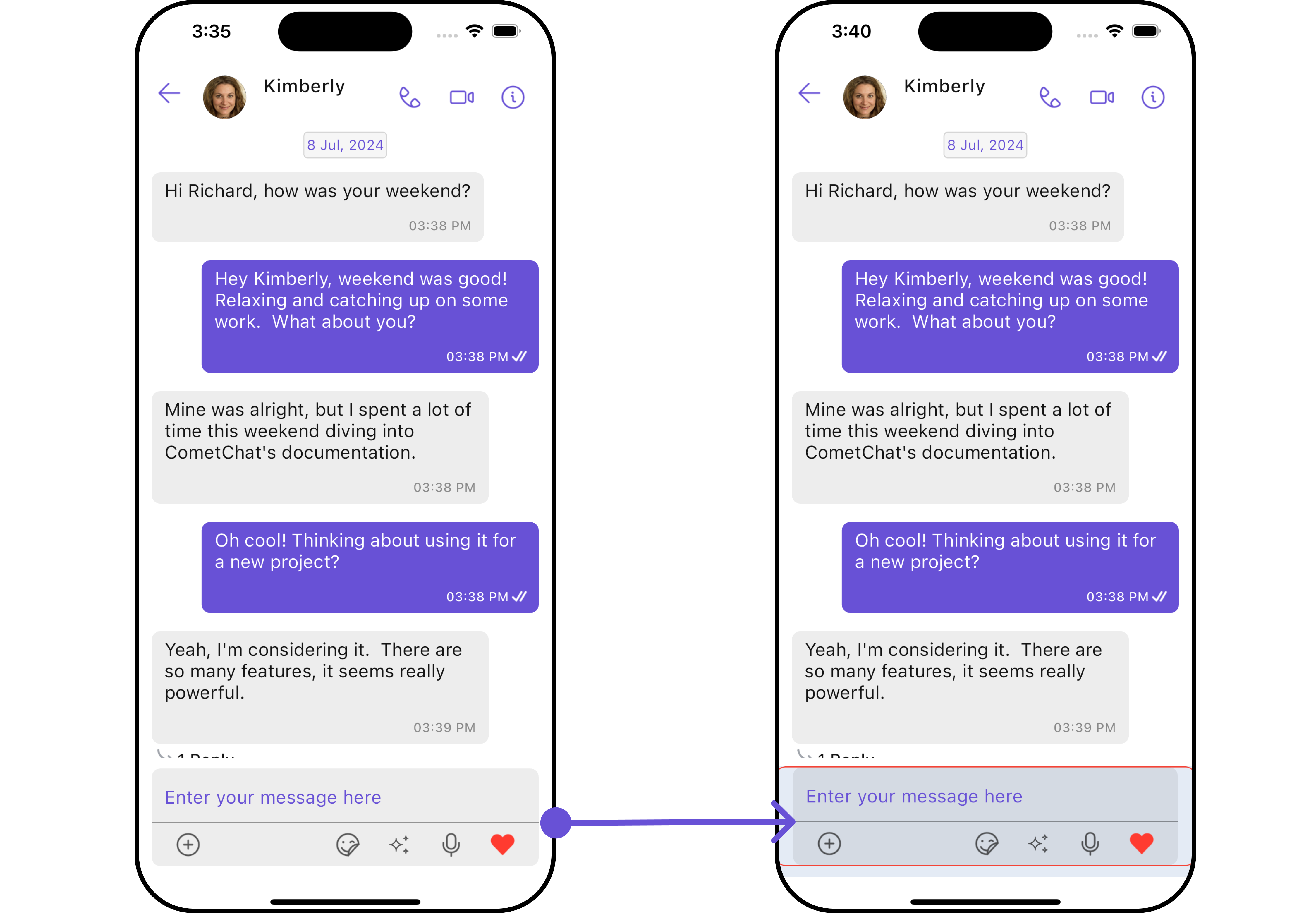
Please note that the properties marked with the 🛑 symbol are not accessible within the Configuration Object.Example In this example, we’ll be adding a custom header widget and customizing some properties of the MessageComposer widget using
MessageComposerConfiguration.
- Dart
- Android
- iOS
ThreadedMessages
If you want to customize the properties of the ThreadedMessages Widget inside Messages Widget, you need use theThreadedMessagesConfiguration object.
- Dart
ThreadedMessagesConfiguration provides access to all the Action, Filters, Styles, Functionality, and Advanced properties of the ThreadedMessages component.
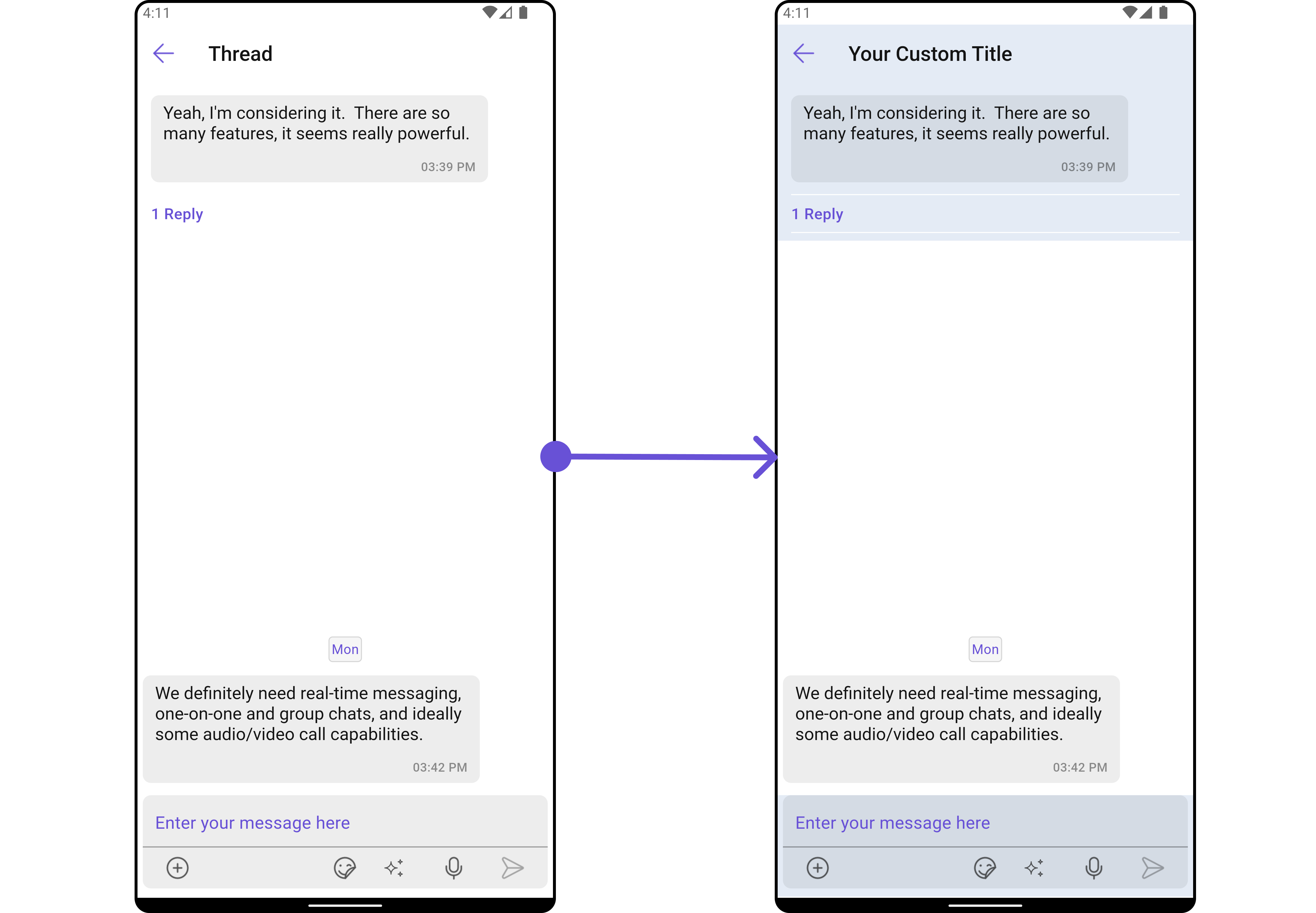
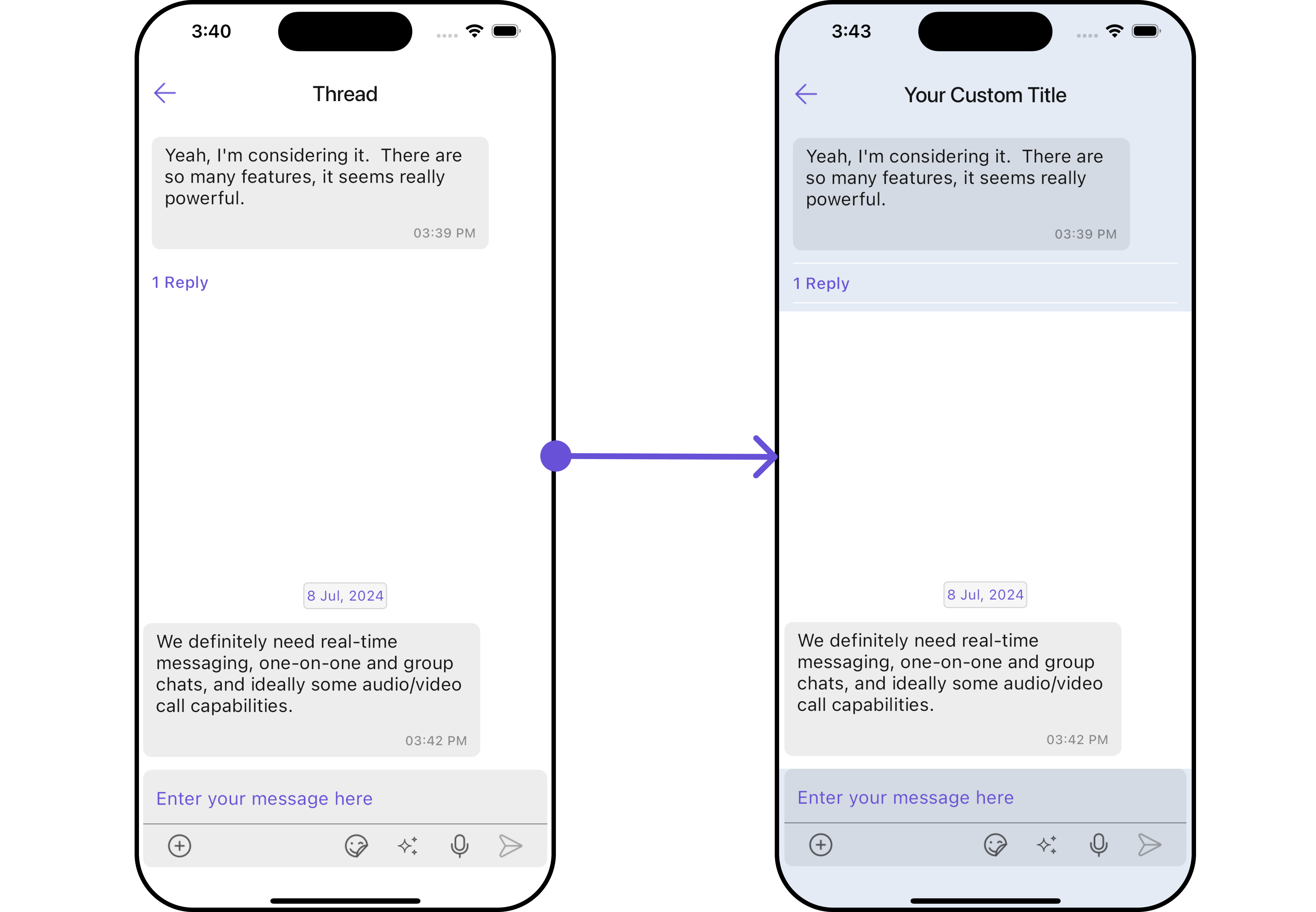
Please note that the properties marked with the 🛑 symbol are not accessible within the Configuration Object.Example In this example, we are adding a custom title to the Threaded Message widget and also adding custom properties to the MessageList using
MessageListConfiguration. We then apply these changes to the ThreadedMessages widget using ThreadedMessagesConfiguration.
- Dart
- Android
- iOS
Details
If you want to customize the properties of the Details Widget inside Messages Widget, you need use theDetailsConfiguration object.
- Dart
DetailsConfiguration provides access to all the Action, Filters, Styles, Functionality, and Advanced properties of the MessageComposer component.
Please note that the properties marked with the 🛑 symbol are not accessible within the Configuration Object.Example In this example, we’ll be customizing some properties of the MessageComposer widget using
DetailsConfiguration.
- Dart
- Android
- iOS